Getting Started with WPF Tab Splitter
18 Oct 20227 minutes to read
This section explains about how to create TabSplitter control.
Assembly deployment
Refer to the control dependencies section to get the list of assemblies or NuGet package that needs to be added as a reference to use the control in any application.
Click here to find more details on how to install nuget packages in WPF application.
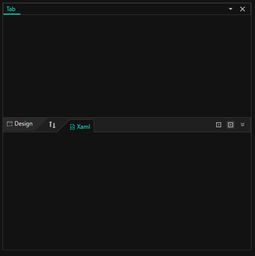
Adding the TabSplitter control via XAML
NOTE
Download demo application from GitHub
-
Create a new WPF application via Visual Studio.
-
Add the following assembly reference to this project.
- Syncfusion.Shared.WPF
- Syncfusion.Tools.WPF
-
Import Syncfusion WPF schema http://schemas.syncfusion.com/wpf, and declare the TabSplitter control in XAML page.
<Window x:Class="TabSplitter.MainWindow"
        xmlns="http://schemas.microsoft.com/winfx/2006/xaml/presentation"
        xmlns:x="http://schemas.microsoft.com/winfx/2006/xaml"
        xmlns:d="http://schemas.microsoft.com/expression/blend/2008"
        xmlns:mc="http://schemas.openxmlformats.org/markup-compatibility/2006"
        xmlns:syncfusion="http://schemas.syncfusion.com/wpf"
        xmlns:local="clr-namespace:TabSplitter"
        mc:Ignorable="d"
        Title="MainWindow" Height="450" Width="800">

<Grid Name="grid">
        <syncfusion:TabSplitter Name="tabSplitter" Height="280" Width="400" />
</Grid>
Adding the TabSplitter control via C#
-
Create a new WPF application via Visual Studio.
-
Add the following required assembly references to the project.
- Syncfusion.Shared.WPF
- Syncfusion.Tools.WPF
-
Include the required namespace.
using Syncfusion.Windows.Tools.Controls; -
Create an instance of TabSplitter control and add it to the window.
//Instance of TabSplitter
TabSplitter tabSplitter = new TabSplitter();
tabSplitter.Height = 280;
tabSplitter.Width = 400;

//Add control into the window
grid.Children.Add(tabSplitter);
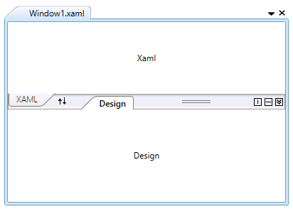
Adding splitter item
-
You can add the splitter item into the TabSplitter control by using Header property. The TabSplitter items contains a collection of panel items. The panel items are TopPanelItems and BottomPanelItems. You can also split the pages in TabSplitter item by using the SplitterPage.
<syncfusion:TabSplitterItem Header="Window1.xaml">
    <syncfusion:TabSplitterItem.TopPanelItems>
        <syncfusion:SplitterPage Header="XAML" />
    </syncfusion:TabSplitterItem.TopPanelItems>
    <syncfusion:TabSplitterItem.BottomPanelItems>
        <syncfusion:SplitterPage Header="Design" />
    </syncfusion:TabSplitterItem.BottomPanelItems>
</syncfusion:TabSplitterItem>
//Create an instances of splitter page SplitterPage splitterPage = new SplitterPage(); splitterPage.Header = "XAML"; SplitterPage splitterPage1 = new SplitterPage(); splitterPage1.Header = "Design"; //Create the tab splitter item TabSplitterItem tabSplitterItem1 = new TabSplitterItem(); tabSplitterItem1.Header = "MainWindow.XAML"; //Add the splitter page into the tabSplitterItem tabSplitterItem1.TopPanelItems.Add(splitterPage); tabSplitterItem1.BottomPanelItems.Add(splitterPage1); //Add tabSplitterItem into the tabSplitter tabSplitter.Items.Add(tabSplitterItem1); -
Add any one of the control to the splitter page of TabSplitter and add the content into the splitter page.
<syncfusion:TabSplitterItem Header="Window1.xaml">
    <syncfusion:TabSplitterItem.TopPanelItems>
        <syncfusion:SplitterPage Header="XAML">
            <Label Content="Xaml" HorizontalContentAlignment="Center" VerticalContentAlignment="Center" />
        </syncfusion:SplitterPage>
    </syncfusion:TabSplitterItem.TopPanelItems>
    <syncfusion:TabSplitterItem.BottomPanelItems>
        <syncfusion:SplitterPage Header="Design">
            <Label Content="Design" HorizontalContentAlignment="Center" VerticalContentAlignment="Center" />
        </syncfusion:SplitterPage>
    </syncfusion:TabSplitterItem.BottomPanelItems>
</syncfusion:TabSplitterItem>
Label label = new Label(); label.Content = "XAML"; label.HorizontalContentAlignment = HorizontalAlignment.Center; label.VerticalContentAlignment = VerticalAlignment.Center; Label label1 = new Label(); label1.Content = "Design"; label1.HorizontalContentAlignment = HorizontalAlignment.Center; label1.VerticalContentAlignment = VerticalAlignment.Center; splitterPage.Content = label; splitterPage1.Content = label1;
Tab orientation
The Tabsplitter items are placed horizontally or vertically by using the Orientation property.
<syncfusion:TabSplitterItem Header="Window1.xaml" Orientation="Vertical">
</syncfusion:TabSplitterItem>tabSplitterItem1.Orientation = Orientation.Vertical;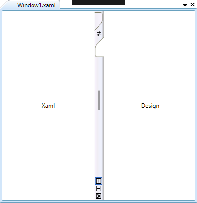
Collapsing bottom panel
You can collapse or expand the bottom panel by setting the IsCollapsedBottomPanel property to true. The default value is false.
<syncfusion:TabSplitterItem Header="Window1.xaml" IsCollapsedBottomPanel="True">
</syncfusion:TabSplitterItem>tabSplitterItem1.IsCollapsedBottomPanel = true;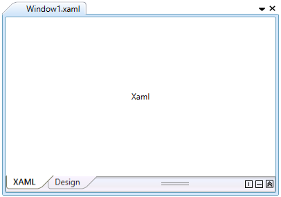
Theme
TabSplitter supports various built-in themes. Refer to the below links to apply themes for the TabSplitter,