How can I help you?
Layout Related Features in WPF Tab Splitter
7 May 20213 minutes to read
This section illustrates the following Layout-related feature of TabSplitter control.
Customizing the Appearance of TabSplitter
The appearance of the TabSplitter control is customized by using the appearance properties available in the control. You can set the color for the MouseOverBackground, MouseOverForeground, SelectedForeground and SelectedBackground of the TabSplitter control. Here is the code snippet.
<Grid>
        <!-- Adding TabSplitter With Selected Brush -->
    <syncfusion:TabSplitter Name="tabsplitter" MouseOverBackground="Green" MouseOverForeground="Yellow" SelectedBackground="Red" SelectedForeground="YellowGreen">

        <!-- Adding TabSplitterItem -->
    <syncfusion:TabSplitterItem Header="Window1.xml" Name="tabSplitterItem1">

        <!-- Adding TopPanelItems -->
        <syncfusion:TabSplitterItem.TopPanelItems>
            <syncfusion:SplitterPage Name="splitterPage1" Header="XAML" />
        </syncfusion:TabSplitterItem.TopPanelItems>

        <!-- Adding BottomPanelItems -->
        <syncfusion:TabSplitterItem.BottomPanelItems>
            <syncfusion:SplitterPage Name="splitterPage2" Header="Design" />
        </syncfusion:TabSplitterItem.BottomPanelItems>

    </syncfusion:TabSplitterItem>
</syncfusion:TabSplitter>
</Grid>
// Set the selected background.
tabsplitter.SelectedBackground = Brushes.Red;
// Set the selected foreground.
tabsplitter.SelectedForeground = Brushes.YellowGreen;
// Set the MouseOverBackground.
tabsplitter.MouseOverBackground = Brushes.Green;
// Set the MouseOverForeground.
tabsplitter.MouseOverForeground = Brushes.Yellow;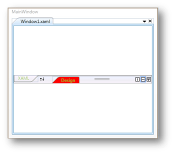
Hide TabSplitterItem header tab in TabSplitter
You can hide the TabSplitterItem header tab in TabSplitter by enabling the HideHeaderOnSingleChild property. This property works only if TabSplitter control has one TabSplitterItem in it.
<Grid>
    <syncfusion:TabSplitter Name="tabsplitter" HideHeaderOnSingleChild="True">
        <syncfusion:TabSplitterItem Header="Window1.xml" Name="tabSplitterItem1">
            <syncfusion:TabSplitterItem.TopPanelItems>
                <syncfusion:SplitterPage Name="splitterPage1" Header="XAML" />
            </syncfusion:TabSplitterItem.TopPanelItems>

            <syncfusion:TabSplitterItem.BottomPanelItems>
                <syncfusion:SplitterPage Name="splitterPage2" Header="Design" />
            </syncfusion:TabSplitterItem.BottomPanelItems>
        </syncfusion:TabSplitterItem>
    </syncfusion:TabSplitter>
</Grid>
TabSplitter tabSplitter = new TabSplitter() { HideHeaderOnSingleChild = true};
TabSplitterItem tabSplitterItem = new TabSplitterItem() { Header= "Window1.xml" };
SplitterPage page1 = new SplitterPage() { Header = "XAML" };
SplitterPage page2 = new SplitterPage() { Header = "Design" };
tabSplitterItem.TopPanelItems.Add(page1);
tabSplitterItem.BottomPanelItems.Add(page2);
tabSplitter.Items.Add(tabSplitterItem);