How can I help you?
Layouts in WPF Step ProgressBar (SfStepProgressBar)
8 May 202611 minutes to read
You can customize the layout of the Step progress bar in the following ways.
ItemsStretch
Represents how the item size is increased to fill the unused space. The default value of ItemsStretch property is None.
Types:
- None
- Fill
- Auto
None
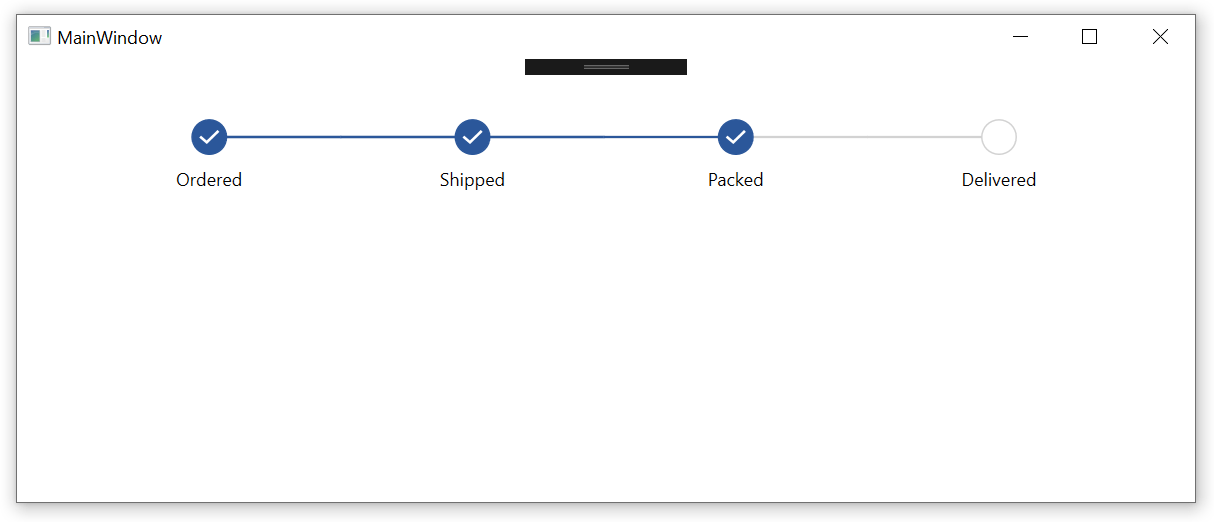
The step view items retain their its natural size. You can change the spacing between the adjacent step view items by using the ItemSpacing property. The default value of this property is 80.
NOTE
The single step size is calculated using the ItemSpacing and MarkerWidth or MarkerHeight based on the Orientation. The ItemSpacing applies between the current step view item and the previous step view item.
<Grid x:Name="grid">
    <syncfusion:SfStepProgressBar SelectedIndex="2" ItemSpacing="150">
        <syncfusion:StepViewItem Content="Ordered" />
        <syncfusion:StepViewItem Content="Shipped" />
        <syncfusion:StepViewItem Content="Packed" />
        <syncfusion:StepViewItem Content="Delivered" />
    </syncfusion:SfStepProgressBar>
</Grid>
public partial class MainWindow : Window
{
public MainWindow()
{
InitializeComponent();
SfStepProgressBar stepProgressBar = new SfStepProgressBar();
StepViewItem orderedStepViewItem = new StepViewItem();
StepViewItem shippedStepViewItem = new StepViewItem();
StepViewItem packedStepViewItem = new StepViewItem();
StepViewItem deliveredStepViewItem = new StepViewItem();
orderedStepViewItem.Content = "Ordered";
shippedStepViewItem.Content = "Shipped";
packedStepViewItem.Content = "Packed";
deliveredStepViewItem.Content = "Delivered";
stepProgressBar.Items.Add(orderedStepViewItem);
stepProgressBar.Items.Add(shippedStepViewItem);
stepProgressBar.Items.Add(packedStepViewItem);
stepProgressBar.Items.Add(deliveredStepViewItem);
stepProgressBar.SelectedIndex = 2;
stepProgressBar.ItemSpacing = 150;
grid.Children.Add(stepProgressBar);
}
}
Fill
The step view items are sized to fill the available space.
<Grid x:Name="grid">
    <syncfusion:SfStepProgressBar SelectedIndex="2" ItemsStretch="Fill">
        <syncfusion:StepViewItem Content="Ordered" />
        <syncfusion:StepViewItem Content="Shipped" />
        <syncfusion:StepViewItem Content="Packed" />
        <syncfusion:StepViewItem Content="Delivered" />
    </syncfusion:SfStepProgressBar>
</Grid>
public partial class MainWindow : Window
{
public MainWindow()
{
InitializeComponent();
SfStepProgressBar stepProgressBar = new SfStepProgressBar();
StepViewItem orderedStepViewItem = new StepViewItem();
StepViewItem shippedStepViewItem = new StepViewItem();
StepViewItem packedStepViewItem = new StepViewItem();
StepViewItem deliveredStepViewItem = new StepViewItem();
orderedStepViewItem.Content = "Ordered";
shippedStepViewItem.Content = "Shipped";
packedStepViewItem.Content = "Packed";
deliveredStepViewItem.Content = "Delivered";
stepProgressBar.Items.Add(orderedStepViewItem);
stepProgressBar.Items.Add(shippedStepViewItem);
stepProgressBar.Items.Add(packedStepViewItem);
stepProgressBar.Items.Add(deliveredStepViewItem);
stepProgressBar.SelectedIndex = 2;
stepProgressBar.ItemsStretch = ItemsStretch.Fill;
grid.Children.Add(stepProgressBar);
}
}
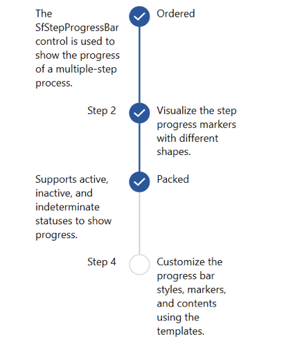
Auto
The step view item size is determined by the size of the content and secondary content. It is applicable only when the Orientation property is Vertical. If the size of the content and secondary content is less than the MarkerHeight, then the MinimumItemSpacing is used.
<Window.Resources>
    <DataTemplate x:Key="FirstStepContentTemplate">
        <TextBlock Width="100" Text="The SfStepProgressBar control is used to show the progress of a multiple-step process." TextWrapping="Wrap">
        <LineBreak/>
        </TextBlock>
    </DataTemplate>
    <DataTemplate x:Key="SecondStepContentTemplate">
        <TextBlock Width="100" Text="Visualize the step progress markers with different shapes." TextWrapping="Wrap">
        <LineBreak/>
        </TextBlock>
    </DataTemplate>
    <DataTemplate x:Key="SecondStepSecondaryContentTemplate">
        <TextBlock Width="100" Text="Step 2" Margin="120,0,0,0" TextWrapping="Wrap"/>
    </DataTemplate>
    <DataTemplate x:Key="ThirdStepContentTemplate">
        <TextBlock Width="100" Text="Supports active, inactive, and indeterminate statuses to show progress." TextWrapping="Wrap">
        <LineBreak/>
        </TextBlock>
    </DataTemplate>
    <DataTemplate x:Key="FourthStepContentTemplate">
        <TextBlock Width="100" Text="Customize the progress bar styles, markers, and contents using the templates." TextWrapping="Wrap">
        <LineBreak/>
        </TextBlock>
    </DataTemplate>
    <DataTemplate x:Key="FourthStepSecondaryContentTemplate">
        <TextBlock Width="100" Text="Step 4" Margin="120,0,0,0" TextWrapping="Wrap"/>
    </DataTemplate>
</Window.Resources>
<Grid Name="grid">
    <syncfusion:SfStepProgressBar SelectedIndex="2" Margin="20" Orientation="Vertical" ItemsStretch="Auto">
        <syncfusion:StepViewItem Content="Ordered" SecondaryContentTemplate="{StaticResource FirstStepContentTemplate}"/>
        <syncfusion:StepViewItem ContentTemplate="{StaticResource SecondStepContentTemplate}" SecondaryContentTemplate="{StaticResource SecondStepSecondaryContentTemplate}"/>
        <syncfusion:StepViewItem Content="Packed" SecondaryContentTemplate="{StaticResource ThirdStepContentTemplate}"/>
        <syncfusion:StepViewItem ContentTemplate="{StaticResource FourthStepContentTemplate}" SecondaryContentTemplate="{StaticResource FourthStepSecondaryContentTemplate}"/>
    </syncfusion:SfStepProgressBar>
</Grid>
public partial class MainWindow : Window
{
public MainWindow()
{
InitializeComponent();
SfStepProgressBar stepProgressBar = new SfStepProgressBar();
stepProgressBar.Orientation = Orientation.Vertical;
StepViewItem orderedStepViewItem = new StepViewItem();
StepViewItem shippedStepViewItem = new StepViewItem();
StepViewItem packedStepViewItem = new StepViewItem();
StepViewItem deliveredStepViewItem = new StepViewItem();
orderedStepViewItem.Content = "Ordered";
shippedStepViewItem.ContentTemplate = FindResource("SecondStepContentTemplate") as DataTemplate;
packedStepViewItem.Content = "Packed";
deliveredStepViewItem.ContentTemplate = FindResource("FourthStepContentTemplate") as DataTemplate;
orderedStepViewItem.SecondaryContentTemplate = FindResource("FirstStepContentTemplate") as DataTemplate;
shippedStepViewItem.SecondaryContentTemplate = FindResource("SecondStepSecondaryContentTemplate") as DataTemplate;
packedStepViewItem.SecondaryContentTemplate = FindResource("ThirdStepContentTemplate") as DataTemplate;
deliveredStepViewItem.SecondaryContentTemplate = FindResource("FourthStepSecondaryContentTemplate") as DataTemplate;
stepProgressBar.Items.Add(orderedStepViewItem);
stepProgressBar.Items.Add(shippedStepViewItem);
stepProgressBar.Items.Add(packedStepViewItem);
stepProgressBar.Items.Add(deliveredStepViewItem);
stepProgressBar.SelectedIndex = 2;
stepProgressBar.ItemsStretch = ItemsStretch.Fill;
grid.Children.Add(stepProgressBar);
}
}
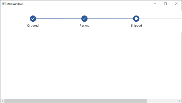
MinimumItemSpacing
You can customize the value that indicates the minimum space between the step view items when the ItemStretch is Fill. The default value of this property is 40. The following example shows how to customize the step view item’s minimum space.
<ScrollViewer HorizontalScrollBarVisibility="Auto" VerticalScrollBarVisibility="Auto">
    <Grid>
        <Grid.ColumnDefinitions>
                <ColumnDefinition Width="Auto" />
         </Grid.ColumnDefinitions>
        <Syncfusion:SfStepProgressBar
            ItemsStretch="Fill"
            MinimumItemSpacing="220"
            SelectedIndex="2"
            SelectedItemStatus="Indeterminate">
                <Syncfusion:StepViewItem Content="Ordered" />
                <Syncfusion:StepViewItem Content="Packed" />
                <Syncfusion:StepViewItem Content="Shipped" />
                <Syncfusion:StepViewItem Content="Delivered" />
        </Syncfusion:SfStepProgressBar>
    </Grid>
</ScrollViewer>
Implementing the above code will create the following Step ProgressBar control.