How can I help you?
Customizing Data Templates in WPF Step ProgressBar (SfStepProgressBar)
20 Jan 202522 minutes to read
Data templates can be customized for the step markers and step content. The next sections explain how to customize the data templates.
Item Template
You can customize the content of StepViewItem by using the ItemTemplate property. The following example shows how to customize the step view item’s content with DataTemplate.
<syncfusion:SfStepProgressBar ItemsSource="{Binding StepViewItems}" SelectedIndex="2">
    <syncfusion:SfStepProgressBar.ItemTemplate>
        <DataTemplate>
            <Grid>
                <Path
                    Width="25"
                    Height="25"
                    HorizontalAlignment="Center"
                    VerticalAlignment="Center"
                    Data="M9 16.2L4.8 12l-1.4 1.4L9 19 21 7l-1.4-1.4L9 16.2z"
                    Fill="#2B579A"
                    Stroke="#2B579A" />
            </Grid>
        </DataTemplate>
    </syncfusion:SfStepProgressBar.ItemTemplate>
</syncfusion:SfStepProgressBar>
Implementing the above code will create the following Step ProgressBar control.

Item Template Selector
Using the ItemTemplateSelector, you can use the different templates for step content depends on the step view item status. The following example shows this.
Use this template selector to choose a template for the Step ProgressBar control.
<Window.Resources>
    <DataTemplate x:Key="ActiveContentTemplate">
        <Grid>
            <Path
                Width="25"
                Height="25"
                HorizontalAlignment="Center"
                VerticalAlignment="Center"
                Data="M9 16.2L4.8 12l-1.4 1.4L9 19 21 7l-1.4-1.4L9 16.2z"
                Fill="#2B579A"
                Stroke="#2B579A" />
        </Grid>
    </DataTemplate>
    <DataTemplate x:Key="IndeterminateContentTemplate">
        <Grid>
            <Path
                Width="25"
                Height="25"
                HorizontalAlignment="Center"
                VerticalAlignment="Center"
                Data="M12 4V1L8 5l4 4V6c3.31 0 6 2.69 6 6 0 1.01-.25 1.97-.7 2.8l1.46 1.46C19.54 15.03 20 13.57 20 12c0-4.42-3.58-8-8-8zm0 14c-3.31 0-6-2.69-6-6 0-1.01.25-1.97.7-2.8L5.24 7.74C4.46 8.97 4 10.43 4 12c0 4.42 3.58 8 8 8v3l4-4-4-4v3z"
                Fill="#2B579A"
                Stroke="#2B579A" />
        </Grid>
    </DataTemplate>
    <DataTemplate x:Key="InactiveContentTemplate">
        <Grid>
            <Path
                Width="25"
                Height="25"
                HorizontalAlignment="Center"
                VerticalAlignment="Center"
                Data="M19 6.41L17.59 5 12 10.59 6.41 5 5 6.41 10.59 12 5 17.59 6.41 19 12 13.41 17.59 19 19 17.59 13.41 12z"
                Fill="#D2D2D2"
                Stroke="#D2D2D2" />
        </Grid>
    </DataTemplate>
    <local:StepViewItemTemplateSelector x:Key="stepViewItemTemplateSelector" />
</Window.Resources>

<syncfusion:SfStepProgressBar
    x:Name="stepperControlName"
    ItemsSource="{Binding StepViewItems}"
    SelectedIndex="2"
    ItemTemplateSelector="{StaticResource stepViewItemTemplateSelector}">
</syncfusion:SfStepProgressBar>
/// <summary>
/// Represents the step view item template selector class.
/// </summary>
public class StepViewItemTemplateSelector : DataTemplateSelector
{
/// <summary>
/// Selects the template based on the step view item status.
/// </summary>
/// <param name="item">step view item.</param>
/// <param name="container">step progress bar.</param>
/// <returns></returns>
public override DataTemplate SelectTemplate(object item, DependencyObject container)
{
StepViewItem stepViewItem = item as StepViewItem;
if (stepViewItem != null)
{
if (stepViewItem.Status == StepStatus.Indeterminate)
{
return (item as StepViewItem).FindResource("IndeterminateContentTemplate") as DataTemplate;
}
else if (stepViewItem.Status == StepStatus.Active)
{
return (item as StepViewItem).FindResource("ActiveContentTemplate") as DataTemplate;
}
else
return (item as StepViewItem).FindResource("InactiveContentTemplate") as DataTemplate;
}
return null;
}
}This will generate the following Step ProgressBar control.

Download demo from GitHub.
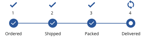
Marker Template Selector
With the MarkerTemplateSelector, you can use the different templates for step marker depends on the step view item status. The following example shows this.
Use this marker template selector to choose a template for the Step ProgressBar control.
<Window.Resources>
    <DataTemplate x:Key="IndeterminateTemplate">
        <Grid>
            <Ellipse
                Width="35"
                Height="35"
                Fill="#00ccb1"
                Stroke="#00ccb1" />
            <Path
                Width="12"
                Height="12"
                HorizontalAlignment="Center"
                VerticalAlignment="Center"
                Data="M8,0 C12.411011,0 16,3.5890198 16,8 16,12.411011 12.411011,16 8,16 3.5889893,16 0,12.411011 0,8 0,3.5890198 3.5889893,0 8,0 z"
                Fill="White"
                Stretch="Fill" />
        </Grid>
    </DataTemplate>
    <DataTemplate x:Key="ActiveTemplate">
        <Grid>
            <Ellipse
                Width="35"
                Height="35"
                Fill="#00ccb1"
                Stroke="#00ccb1" />
            <Path
                Width="16"
                Height="11"
                HorizontalAlignment="Center"
                VerticalAlignment="Center"
                Data="M15.288992,0 L15.997,0.70702839 5.7260096,11.000999 0,5.8859658 0.66601563,5.1399964 5.6870084,9.6239898 z"
                Fill="White"
                Stretch="Fill"
                Stroke="White" />
        </Grid>
    </DataTemplate>
    <DataTemplate x:Key="InactiveTemplate">
        <Grid>
            <Ellipse
                Width="35"
                Height="35"
                Fill="#FFFFFF"
                Stroke="#D2D2D2" />
        </Grid>
    </DataTemplate>
    <local:StepViewItemMarkerTemplateSelector x:Key="stepViewItemMarkerTemplateSelector" />
</Window.Resources>

<syncfusion:SfStepProgressBar
    x:Name="stepperControlName"
    Margin="40"
    ItemsSource="{Binding StepViewItems}"
    MarkerTemplateSelector="{StaticResource stepViewItemMarkerTemplateSelector}"
    SelectedItemStatus="Indeterminate"
    ActiveConnectorColor="#00ccb1"
    SelectedIndex="2" >
    <syncfusion:SfStepProgressBar.ItemContainerStyle>
        <Style TargetType="syncfusion:StepViewItem">
            <Setter Property="MarkerWidth" Value="35"/>
            <Setter Property="MarkerHeight" Value="35"/>
        </Style>
    </syncfusion:SfStepProgressBar.ItemContainerStyle>
</syncfusion:SfStepProgressBar>
/// <summary>
/// Represents the step view item template selector class.
/// </summary>
public class StepViewItemMarkerTemplateSelector : DataTemplateSelector
{
/// <summary>
/// Selects the template based on the step view item status.
/// </summary>
/// <param name="item">step view item.</param>
/// <param name="container">step progress bar.</param>
/// <returns></returns>
public override DataTemplate SelectTemplate(object item, DependencyObject container)
{
StepViewItem stepViewItem = item as StepViewItem;
if (stepViewItem != null)
{
if (stepViewItem.Status == StepStatus.Indeterminate)
return (item as StepViewItem).FindResource("IndeterminateTemplate") as DataTemplate;
else if (stepViewItem.Status == StepStatus.Active)
return (item as StepViewItem).FindResource("ActiveTemplate") as DataTemplate;
else
return (item as StepViewItem).FindResource("InactiveTemplate") as DataTemplate;
}
return null;
}
}This will populate the Step ProgressBar control.

Download demo from GitHub.
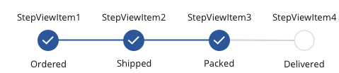
Secondary content in Step Progressbar
You can get or set the data template used to display the secondary content of StepViewItem by using the SecondaryContentTemplate property. The following example shows how to customize the step view item’s secondary content with DataTemplate.
<syncfusion:SfStepProgressBar
    ItemsSource="{Binding StepViewItems}"
    Orientation="Horizontal"
    SelectedIndex="2">
    <syncfusion:SfStepProgressBar.ItemContainerStyle>
        <Style TargetType="syncfusion:StepViewItem">
            <Setter Property="Content" Value="{Binding Text}" />
        </Style>
    </syncfusion:SfStepProgressBar.ItemContainerStyle>
    <syncfusion:SfStepProgressBar.SecondaryContentTemplate>
        <DataTemplate>
            <TextBlock
            HorizontalAlignment="Center"
            VerticalAlignment="Center"
            Text="{Binding SecondaryText}"
            TextWrapping="Wrap" />
        </DataTemplate>
    </syncfusion:SfStepProgressBar.SecondaryContentTemplate>
    <syncfusion:SfStepProgressBar.DataContext>
        <local:ViewModel />
    </syncfusion:SfStepProgressBar.DataContext>
</syncfusion:SfStepProgressBar>
Implementing the above code will create the following Step ProgressBar control.
Secondary Content Template Selector
Using the SecondaryContentTemplateSelector property, you can use the different templates for the step secondary content depends on the step view item status. The following example shows this.
Use this template selector to choose a template for the Step ProgressBar control.
<Window.Resources>
    <DataTemplate x:Key="ActiveContentTemplate">
        <Grid>
            <Grid.RowDefinitions>
                <RowDefinition Height="Auto" />
                <RowDefinition Height="Auto" />
            </Grid.RowDefinitions>
            <Path
                Width="25"
                Height="25"
                HorizontalAlignment="Center"
                VerticalAlignment="Center"
                Data="M9 16.2L4.8 12l-1.4 1.4L9 19 21 7l-1.4-1.4L9 16.2z"
                Fill="#2B579A"
                Stroke="#2B579A" />
            <TextBlock
                Grid.Row="1"
                Width="10"
                HorizontalAlignment="Center"
                VerticalAlignment="Center"
                Text="{Binding XPath=@PrimaryText}"
                TextWrapping="Wrap" />
        </Grid>
    </DataTemplate>
    <DataTemplate x:Key="IndeterminateContentTemplate">
        <Grid>
            <Grid.RowDefinitions>
                <RowDefinition Height="Auto" />
                <RowDefinition Height="Auto" />
            </Grid.RowDefinitions>
            <Path
                Width="25"
                Height="25"
                HorizontalAlignment="Center"
                VerticalAlignment="Center"
                Data="M12 4V1L8 5l4 4V6c3.31 0 6 2.69 6 6 0 1.01-.25 1.97-.7 2.8l1.46 1.46C19.54 15.03 20 13.57 20 12c0-4.42-3.58-8-8-8zm0 14c-3.31 0-6-2.69-6-6 0-1.01.25-1.97.7-2.8L5.24 7.74C4.46 8.97 4 10.43 4 12c0 4.42 3.58 8 8 8v3l4-4-4-4v3z"
                Fill="#2B579A"
                Stroke="#2B579A" />
            <TextBlock
                Grid.Row="1"
                Width="10"
                HorizontalAlignment="Center"
                VerticalAlignment="Center"
                Text="{Binding XPath=@PrimaryText}"
                TextWrapping="Wrap" />
        </Grid>
    </DataTemplate>
    <local:StepViewItemTemplateSelector x:Key="stepViewItemTemplateSelector" />
    <XmlDataProvider x:Key="xmlSource" Source="Data.xml" XPath="StepItems" />
</Window.Resources>

<syncfusion:SfStepProgressBar
    ItemsSource="{Binding Source={StaticResource xmlSource}, XPath=Step}"
    SecondaryContentTemplateSelector="{StaticResource stepViewItemTemplateSelector}"
    SelectedIndex="{Binding Source={StaticResource xmlSource}, XPath=@SelectedIndex}"
    SelectedItemStatus="Indeterminate">
    <syncfusion:SfStepProgressBar.ItemContainerStyle>
        <Style TargetType="syncfusion:StepViewItem">
            <Setter Property="Content" Value="{Binding XPath=@Name}" />
        </Style>
    </syncfusion:SfStepProgressBar.ItemContainerStyle>
</syncfusion:SfStepProgressBar>
/// <summary>
/// Represents the step view item template selector class.
/// </summary>
public class StepViewItemTemplateSelector : DataTemplateSelector
{
/// <summary>
/// Selects the template based on the step view item status.
/// </summary>
/// <param name="item">step view item.</param>
/// <param name="container">step progress bar.</param>
/// <returns></returns>
public override DataTemplate SelectTemplate(object item, DependencyObject container)
{
StepViewItem stepViewItem = item as StepViewItem;
if (stepViewItem != null)
{
if (stepViewItem.Status == StepStatus.Indeterminate)
{
return (item as StepViewItem).FindResource("IndeterminateContentTemplate") as DataTemplate;
}
else
return (item as StepViewItem).FindResource("ActiveContentTemplate") as DataTemplate;
}
return null;
}
}This will generate the following Step ProgressBar control.
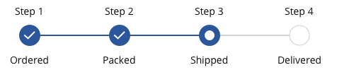
Secondary Content Template in Step View Item
You can get or set the data template used to display the secondary content of the StepViewItem by using the SecondaryContentTemplate property. The following example shows how to customize the step view item’s secondary content with the DataTemplate.
<Window.Resources>
    <DataTemplate x:Key="FirstStepSecondaryContentTemplate">
        <TextBlock VerticalAlignment="Center" HorizontalAlignment="Center" Text="Step 1"/>
    </DataTemplate>
    <DataTemplate x:Key="SecondStepSecondaryContentTemplate">
        <TextBlock VerticalAlignment="Center" HorizontalAlignment="Center" Text="Step 2"/>
    </DataTemplate>
    <DataTemplate x:Key="ThirdStepSecondaryContentTemplate">
        <TextBlock VerticalAlignment="Center" HorizontalAlignment="Center" Text="Step 3"/>
    </DataTemplate>
    <DataTemplate x:Key="FourthStepSecondaryContentTemplate">
        <TextBlock VerticalAlignment="Center" HorizontalAlignment="Center" Text="Step 4"/>
    </DataTemplate>
</Window.Resources>

<Syncfusion:SfStepProgressBar SelectedIndex="2" SelectedItemStatus="Indeterminate">
    <Syncfusion:StepViewItem Content="Ordered" SecondaryContentTemplate="{StaticResource FirstStepSecondaryContentTemplate}" />
    <Syncfusion:StepViewItem Content="Packed" SecondaryContentTemplate="{StaticResource SecondStepSecondaryContentTemplate}" />
    <Syncfusion:StepViewItem Content="Shipped" SecondaryContentTemplate="{StaticResource ThirdStepSecondaryContentTemplate}" />
    <Syncfusion:StepViewItem Content="Delivered" SecondaryContentTemplate="{StaticResource FourthStepSecondaryContentTemplate}" />
</Syncfusion:SfStepProgressBar>
Implementing the above code will create the following Step ProgressBar control.