Icon Support in WPF Menu (MenuAdv)
23 Jun 20251 minute to read
MenuItemAdv allows users to display an image on the left of the control. Icon for MenuItemAdv can be set by providing the image source as a value for the Icon property of the MenuItemAdv class.
Use Case Scenarios
MenuAdv helps users to display an image on the left of the control.
Adding the Icon Support to an Application
The Icon support can be added to an application by using the Icon property of MenuItemAdv, as shown in the following code snippet.
<shared:MenuAdv x:Name="Menu">
    <shared:MenuItemAdv Header="File">
        <shared:MenuItemAdv Header="New">
            <shared:MenuItemAdv.Icon>
                <Image Source="/MenuControlDemo;component/Images/NewIcon.jpg"/>
            </shared:MenuItemAdv.Icon>
        </shared:MenuItemAdv>
        <shared:MenuItemAdv Header="Copy">
            <shared:MenuItemAdv.Icon>
                <Image Source="/MenuControlDemo;component/Images/CopyIcon.jpg"/>
            </shared:MenuItemAdv.Icon>
        </shared:MenuItemAdv>
        <shared:MenuItemAdv Header="Cut">
            <shared:MenuItemAdv.Icon>
                <Image Source="/MenuControlDemo;component/Images/CutIcon.jpg"/>
            </shared:MenuItemAdv.Icon>
        </shared:MenuItemAdv>
    </shared:MenuItemAdv>
    <shared:MenuItemAdv Header="Edit"/>
</shared:MenuAdv>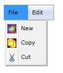
Properties
The property for the Icon support is described in the following tabulation:
| Property | Description | Type | Data Type |
|---|---|---|---|
| Icon | Gets or sets the Icon of MenuItemAdv. | DependencyProperty | Object(null) |
Sample Link
WPF Sample Browser-> Tools -> MenuAdv -> MenuAdv Demo