Check Box and Radio Button Support in WPF Menu (MenuAdv)
23 Jun 20254 minutes to read
MenuAdv provides a support for selecting several items. MenuItemAdv can be checked by setting the IsCheckable property of the MenuItemAdv to “true”. You can change the icon type (Check Box or Radio Button) by using the CheckIcon property also it can be checked by using the IsChecked property.
Use Case Scenarios
MenuAdv helps users to use MenuItemAdv with the CheckBox or RadioButton support.
Using the Check Box and Radio Button Support in an Application
If you set the CheckIcon property to RadioButton, then MenuItemAdv’s will be grouped based on the value of the GroupName property and end user can select only one item from the group. Similarly, if you set the CheckIcon property to CheckBox, then MenuItemAdv can be checked and unchecked. The Check Box and Radio Button support can be used in an application, as shown in the following the code snippet.
<shared:MenuAdv x:Name="Menu" Margin="10">
    <shared:MenuItemAdv Header="File" />
    <shared:MenuItemAdv Header="Edit" />
    <shared:MenuItemAdv Header="View">
        <shared:MenuItemAdv Header="Immediate"
                             IsCheckable="True"
                             CheckIconType="CheckBox"
                             IsChecked="True" />
        <shared:MenuItemAdv Header="CallStack"
                             IsCheckable="True"
                             CheckIconType="CheckBox"
                             IsChecked="False" />
        <shared:MenuItemSeparator />
        <shared:MenuItemAdv Header="SolutionExplorer"
                             IsCheckable="True"
                             CheckIconType="RadioButton"
                             GroupName="group1"
                             IsChecked="False" />
        <shared:MenuItemAdv Header="TeamExplorer"
                             IsCheckable="True"
                             CheckIconType="RadioButton"
                             GroupName="group1"
                             IsChecked="True" />
        <shared:MenuItemAdv Header="ServerExplorer"
                             IsCheckable="True"
                             CheckIconType="RadioButton"
                             GroupName="group1"
                             IsChecked="False" />
    </shared:MenuItemAdv>
    <shared:MenuItemAdv Header="Project" />
    <shared:MenuItemAdv Header="Build" />
</shared:MenuAdv>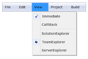
Properties
The properties for the Check box and Radio button support are described in the following tabulation:
| Property | Description | Type | Data Type |
|---|---|---|---|
| IsCheckable | Gets or sets the value of IsCheckable in MenuItemAdv. | DependencyProperty | bool(false) |
| CheckIconType | Gets or sets the CheckIconType of MenuItemAdv. | DependencyProperty | CheckIconType(CheckBox) |
| IsChecked | Gets or sets the IsChecked value of MenuItemAdv. | DependencyProperty | bool(false) |
Sample Link
WPF Sample Browser-> Tools -> MenuAdv -> MenuAdv Demo