Getting Started with WPF MaskedTextBox (SfMaskedEdit)
18 Nov 201810 minutes to read
This section explains how to create a WPF MaskedTextBox and describes its structure and features. The WPF MaskedTextBox control is implemented through the SfMaskedEdit class.
Control Structure

Assembly deployment
Refer to the control dependencies section to get the list of assemblies or NuGet package that needs to be added as reference to use the control in any application.
You can find more details about installing the NuGet package in a WPF application in the following link:
Adding WPF MaskedTextBox via designer
You can add the SfMaskedEdit control to an application by dragging it from the toolbox to a view of the designer. The following dependent assembly will be added automatically.
- Syncfusion.SfInput.WPF
- Syncfusion.SfShared.WPF
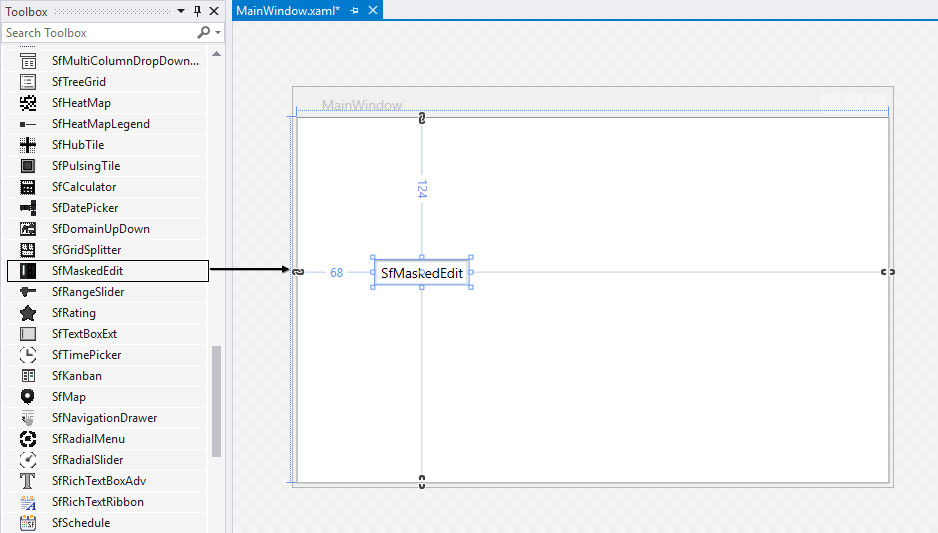
Adding WPF MaskedTextBox via XAML
To add the SfMaskedEdit control manually in XAML, follow these steps:
-
Create a new WPF project in Visual Studio.
-
Add the following assembly references to the project,
- Syncfusion.SfInput.WPF
- Syncfusion.SfShared.WPF
-
Import Syncfusion® WPF schema http://schemas.syncfusion.com/wpf and declare the
SfMaskedEditcontrol in XAML page. -
Declare the
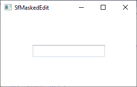
SfMaskedEditcontrol in XAML page.<Window xmlns="http://schemas.microsoft.com/winfx/2006/xaml/presentation" xmlns:x="http://schemas.microsoft.com/winfx/2006/xaml" xmlns:syncfusion="http://schemas.syncfusion.com/wpf" x:Class="SfMaskedEditSample.MainWindow" Title="SfMaskedEdit Sample" Height="350" Width="525"> <Grid> <!--Adding SfMaskedEdit control --> <syncfusion:SfMaskedEdit x:Name="sfMaskedEdit" Width="100" Height="25" /> </Grid> </Window>
Adding WPF MaskedTextBox through C#
To add the SfMaskedEdit control manually in C#, follow these steps:
-
Create a new WPF application via Visual Studio.
- Add the following assembly references to the project,
- Syncfusion.SfInput.WPF
- Syncfusion.SfShared.WPF
-
Include the required namespace, create an instance of
SfMaskedEdit, and add it to the window. -
Declare the
SfMaskedEditcontrol using C#.using Syncfusion.Windows.Controls.Input; public partial class MainWindow : Window { public MainWindow() { InitializeComponent(); //Creating an instance of SfMaskedEdit control SfMaskedEdit sfMaskedEdit = new SfMaskedEdit(); sfMaskedEdit.Width = 100; sfMaskedEdit.Height = 25; //Adding SfMaskedEdit as window content this.Content = sfMaskedEdit; } }
View Sample in GitHub
Restrict the user to enter valid data
You can restrict valid input without custom validation by creating a mask pattern. Enable the mask by setting the mask pattern to the Mask property and set the MaskType property to RegEx. The default value of the Mask property is null, and the default value of the MaskType property is Simple.
<syncfusion:SfMaskedEdit Mask="-?\d+\.?\d*"
                         MaskType="RegEx"
                         Name="sfMaskedEdit"/>
SfMaskedEdit sfMaskedEdit = new SfMaskedEdit();
sfMaskedEdit.MaskType = MaskType.RegEx;
sfMaskedEdit.Mask = @"-?\d+\.?\d*";
Here, the SfMaskedEdit accepts the positive and negative whole or float type numbers.
Please refer the Restrict the user to enter valid data page to know more about the various mask patterns with examples.
View Sample in GitHub
Setting the value
You can set the value for the SfMaskedEdit by using the Value property. Based on the mask, the value of the Value property is formatted. The default value of the Value property is null.
<syncfusion:SfMaskedEdit Value="4553456789"
                         Mask="\([0-9]\d{2}\) [0-9]\d{2}-[0-9]\d{3}"
                         MaskType = "RegEx"
                         Name="sfMaskedEdit"/>
SfMaskedEdit sfMaskedEdit = new SfMaskedEdit();
sfMaskedEdit.Value="4553456789";
sfMaskedEdit.MaskType = MaskType.RegEx;
sfMaskedEdit.Mask = @"\([0-9]\d{2}\) [0-9]\d{2}-[0-9]\d{3}";
View Sample in GitHub
Get the value in various formats
By default, the Value property holds your input characters, prompt characters, and the literals defined in the mask. You can modify this and allow the Value property to hold the characters without prompt and literals by setting the ValueMaskFormat property. The value can be formatted by any one of the following formatting options,
- ExcludePromptAndLiterals
- IncludeLiterals
- IncludePrompt
- IncludePromptAndLiterals
<syncfusion:SfMaskedEdit ValueMaskFormat="ExcludePromptAndLiterals"
                         Mask="\([0-9]\d{2}\) [0-9]\d{2}-[0-9]\d{3}"
                         MaskType = "RegEx"
                         Name="sfMaskedEdit"/>
SfMaskedEdit sfMaskedEdit = new SfMaskedEdit();
sfMaskedEdit.ValueMaskFormat = MaskFormat.ExcludePromptAndLiterals;
sfMaskedEdit.MaskType = MaskType.RegEx;
sfMaskedEdit.Mask = @"\([0-9]\d{2}\) [0-9]\d{2}-[0-9]\d{3}";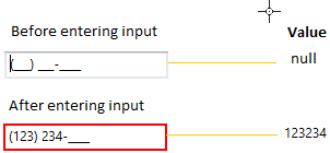
View Sample in GitHub
Indicates error on invalid input
After input validation fails, you can indicate invalid input to the user by showing an error border. The error border automatically disappears when input validation succeeds. You can change the error border color by using the ErrorBorderBrush property. The default value of the ErrorBorderBrush property is Red.
<syncfusion:SfMaskedEdit ErrorBorderBrush="Yellow"
                         Name="sfMaskedEdit"/>
SfMaskedEdit sfMaskedEdit = new SfMaskedEdit();
sfMaskedEdit.ErrorBorderBrush = Brushes.Yellow;
View Sample in GitHub
Indicates the missed input
You can indicate to the user to enter the missed input by using the prompt character. You can change the prompt character by using the PromptChar property. The default prompt character is _.
<syncfusion:SfMaskedEdit PromptChar="X"
                         MaskType="RegEx"
                         Mask="\+1 [0-9]\d{2}-[0-9]\d{2}-[0-9]\d{3}"
                         Name="sfMaskedEdit"/>
SfMaskedEdit sfMaskedEdit = new SfMaskedEdit();
sfMaskedEdit.PromptChar = 'X';
sfMaskedEdit.MaskType = MaskType.RegEx;
sfMaskedEdit.Mask = @"\+1 [0-9]\d{2}-[0-9]\d{2}-[0-9]\d{3}";
View Sample in GitHub
Value changed notification
You can receive a notification when the value of the SfMaskedEdit.Value property changes by using the ValueChanged event.
Your valid input character is updated to the
Valueproperty based on theValidationModeproperty.
Refer Input Validation to know more about theValidationMode.
<syncfusion:SfMaskedEdit ValueChanged="SfMaskedEdit_ValueChanged"
                         Name="sfMaskedEdit"/>
SfMaskedEdit sfMaskedEdit = new SfMaskedEdit();
sfMaskedEdit.ValueChanged += SfMaskedEdit_ValueChanged;You can handle the event as follows,
private void SfMaskedEdit_ValueChanged(object sender, EventArgs e) {
   MessageBox.Show("Value changed");
}
Theme
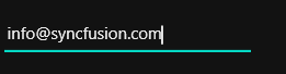
The WPF MaskedTextBox supports various built-in themes. Refer to the following links to apply them.
View Sample in GitHub