How can I help you?
Range Adorner in WPF IntegerTextBox
18 Feb 20251 minute to read
Value of IntegerTextBox can be visually indicated like a progress bar using range-adorner feature, this feature is disabled by default. You can show the adorner over IntegerTextBox control by setting EnableRangeAdorner property to true. Default value of EnableRangeAdorner is false. The adorner layer can be filled in the control area on the basis of the minimum and maximum values with considering the given value. Range Adorner is not displayed when a MinValue or MaxValue property is not set.
<syncfusion:IntegerTextBox x:Name="integerTextBox" Value="63" MinValue="0" MaxValue="100" EnableRangeAdorner="True" />IntegerTextBox integerTextBox = new IntegerTextBox();
integerTextBox.MinValue = 0;
integerTextBox.MaxValue = 100;
integerTextBox.Value = 63;
integerTextBox.EnableRangeAdorner =true;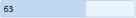
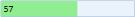
Changing background of range-adorner
You can change the background color of the range adorner using RangeAdornerBackground property.
<syncfusion:IntegerTextBox x:Name="integerTextBox" MinValue="0" MaxValue="100" Value="57" EnableRangeAdorner="True" RangeAdornerBackground="LightGreen"/>IntegerTextBox integerTextBox = new IntegerTextBox();
integerTextBox.MinValue = 0;
integerTextBox.MaxValue = 100;
integerTextBox.Value = 57;
integerTextBox.EnableRangeAdorner = true;
integerTextBox.RangeAdornerBackground = Brushes.LightGreen;