Styling and Templates in WPF Docking (DockingManager)
18 Feb 202524 minutes to read
The UI for Dock, Float and Document windows of DockingManager can be changed using different Styles and Templates.
Theme
DockingManager supports various built-in themes. Refer to the below links to apply themes for the DockingManager,
Dock Window Style
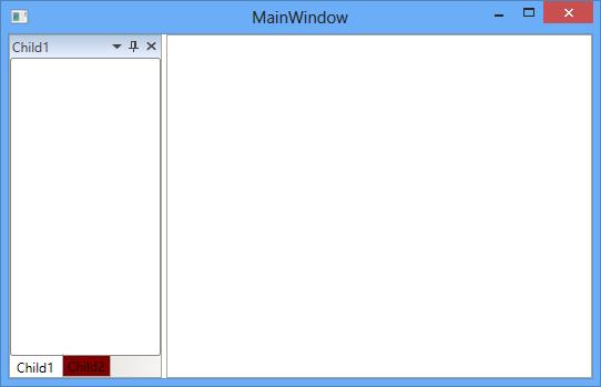
DockingManager allows to set style for some of the Docking controls such as DockedHeaderPresenter, DockedElementTabbedHost. This is explained in detail under the DockHeaderStyle and DockedElementTabbedHostStyle section.
AwlButtonTemplate
The style of the pin button of the Dock window can customized using the AwlButtonTemplate property of DockingManager with the TargetType as ToggleButton to have a customized look and feel for the Pin Button.
<syncfusion:DockingManager  x:Name="DockingManager1">

<syncfusion:DockingManager.AwlButtonTemplate>

<ControlTemplate TargetType="{x:Type ToggleButton}">

<Border x:Name="Border1">

<TextBlock x:Name="Text1" Text="PinButton" Foreground="White"></TextBlock>

</Border>

<ControlTemplate.Triggers>

<Trigger Property="IsMouseOver" Value="True">

<Setter TargetName="Border1" Property="Background" Value="Black"></Setter>

<Setter TargetName="Text1" Property="Foreground" Value="Red"></Setter>

</Trigger>

</ControlTemplate.Triggers>

</ControlTemplate>

</syncfusion:DockingManager.AwlButtonTemplate>

<ContentControl syncfusion:DockingManager.Header="Child1"/>

<ContentControl syncfusion:DockingManager.Header="Child2"/>

</syncfusion:DockingManager>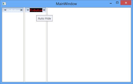
CloseButtonTemplate
The close button for the Docked window can be customized using the CloseButtonTemplate and can be used to get or set the control template for the close button for the windows of DockingManager with TargetType as ToggleButton.
<syncfusion:DockingManager  x:Name="DockingManager1">

<syncfusion:DockingManager.CloseButtonTemplate>

<ControlTemplate TargetType="{x:Type ToggleButton}">

<StackPanel

<Border x:Name="Border1">

<TextBlock x:Name="Block" Background="Red" Text="Close" Foreground="Black"></TextBlock>

</Border>

</StackPanel>

</ControlTemplate>

</syncfusion:DockingManager.CloseButtonTemplate>

<ContentControl

syncfusion:DockingManager.Header="Child1"/>

<ContentControl

syncfusion:DockingManager.Header="Child2"/>

</syncfusion:DockingManager>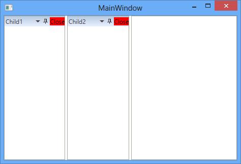
MenuButtonTemplate
The context menu button appearance in the Dock window header can be customized using MenuButtonTemplate property by setting with the Target Type as ToggleButton.
<syncfusion:DockingManager  x:Name="DockingManager1">

<syncfusion:DockingManager.MenuButtonTemplate>

<ControlTemplate TargetType="{x:Type ToggleButton}">

<StackPanel>

<Border x:Name="Border1">

<TextBlock x:Name="TextBlock" Text="Menu" Foreground="Black"></TextBlock>

</Border>

</StackPanel>

<ControlTemplate.Triggers>

<Trigger Property="IsMouseOver" Value="True">

<Setter TargetName="Border1" Property="Background" Value="Black"></Setter>

<Setter TargetName="TextBlock" Property="Foreground" Value="Red"/>

</Trigger>

</ControlTemplate.Triggers>

</ControlTemplate>

</syncfusion:DockingManager.MenuButtonTemplate>

<ContentControl syncfusion:DockingManager.Header="Child1"/>

<ContentControl syncfusion:DockingManager.Header="Child2"/>

</syncfusion:DockingManager>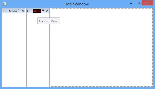
MinimizeButton Template
The minimize button for the dock window can be customized using the MinimizeButtonTemplate by setting with the TargetType as ToggleButton.
<syncfusion:DockingManager  x:Name="DockingManager1" MinimizeButtonEnabled="True" >

<syncfusion:DockingManager.MinimizeButtonTemplate>

<ControlTemplate TargetType="{x:Type ToggleButton}">

<Border x:Name="Border1">

<TextBlock x:Name="Block" Background="Red" Text="mini" ></TextBlock>

</Border>

<ControlTemplate.Triggers>

<Trigger Property="IsMouseOver" Value="True">

<Setter TargetName="Border1" Property="Background" Value="Black"></Setter>

</Trigger>

</ControlTemplate.Triggers>

</ControlTemplate>

</syncfusion:DockingManager.MinimizeButtonTemplate>

<ContentControl syncfusion:DockingManager.Header="Child1"/>

<ContentControl syncfusion:DockingManager.Header="Child2"/>

</syncfusion:DockingManager>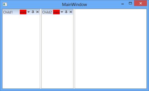
MaximizeButtonTemplate
The maximize button for the dock window can be customized using the MaximizeButtonTemplate property with the TargetType as ToggleButton.
<syncfusion:DockingManager  x:Name="DockingManager1" MaximizeButtonEnabled="True" MinimizeButtonEnabled="True" >

<syncfusion:DockingManager.MaximizeButtonTemplate>

<ControlTemplate TargetType="{x:Type ToggleButton}">

<Border x:Name="Border1">

<TextBlock x:Name="Block" Background="Red" Text="Maxi"/>

</Border>

<ControlTemplate.Triggers>

<Trigger Property="IsMouseOver" Value="True">

<Setter TargetName="Border1" Property="Background" Value="Black"/>

</Trigger>

</ControlTemplate.Triggers>

</ControlTemplate>

</syncfusion:DockingManager.MaximizeButtonTemplate>

<ContentControl syncfusion:DockingManager.Header="Child1"/>

<ContentControl syncfusion:DockingManager.Header="Child2"/>

</syncfusion:DockingManager>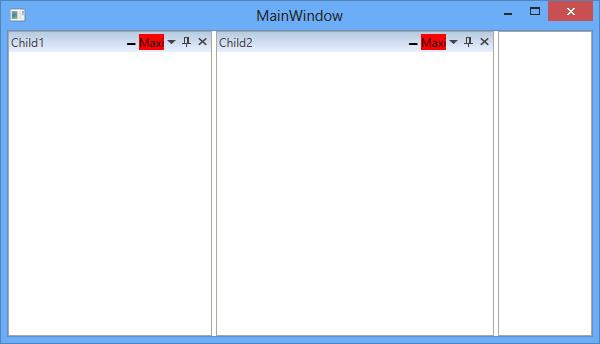
RestoreButtonTemplate
The Restore button for the dock window can be customized using the RestoreButtonTemplate property with the TargetType as ToggleButton.
<syncfusion:DockingManager  x:Name="DockingManager1" MaximizeButtonEnabled="True">

<syncfusion:DockingManager.RestoreButtonTemplate>

<ControlTemplate TargetType="{x:Type ToggleButton}">

<Border x:Name="Border1">

<TextBlock x:Name="text1" Background="Red" Text="Maxim"/>

</Border>

<ControlTemplate.Triggers>

<Trigger Property="IsMouseOver" Value="True">

<Setter TargetName="Border1" Property="Background" Value="Black"></Setter>

</Trigger>

</ControlTemplate.Triggers>

</ControlTemplate>

</syncfusion:DockingManager.RestoreButtonTemplate>

<ContentControl syncfusion:DockingManager.Header="Child1" syncfusion:DockingManager.State="Dock"/>

<ContentControl syncfusion:DockingManager.Header="Child2" syncfusion:DockingManager.State="Dock"/>

<ContentControl syncfusion:DockingManager.Header="Child3" syncfusion:DockingManager.State="Dock"/>

<ContentControl syncfusion:DockingManager.Header="Child4" syncfusion:DockingManager.State="Dock"/>

<ContentControl syncfusion:DockingManager.Header="Child5" syncfusion:DockingManager.State="Dock"/>

</syncfusion:DockingManager>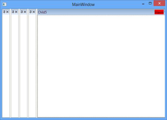
TabItemTemplate
DockedElementTabbedHost have internal TabControl for Tabbed Windows in DockingManager and its tab item template can be customized using TabItemTemplate with the TargetType as TabItem.
<Window.Resources>

<Style x:Key="TabItemStyle1" TargetType="{x:Type TabItem}" >

<Setter Property="Header" Value="{Binding Path=(Syncfusion:DockingManager.Header)}" />

<Setter Property="Syncfusion:DockingManager.ListenTabItemEvents" Value="True" />

<Setter Property="MinWidth" Value="21" />

<Setter Property="MinHeight" Value="21" />

<Setter Property="SnapsToDevicePixels" Value="True" />

<Setter Property="Tag" Value="IsInternalTabItem" />

<Setter Property="Template">

<Setter.Value>

<ControlTemplate TargetType="{x:Type TabItem}">

<Grid Name="Transform">

<Syncfusion:ContextMenuBorder Name="Border" Background="{TemplateBinding Background}"
                              BorderBrush="{TemplateBinding BorderBrush}"BorderThickness="1">

<Border.ContextMenu>

<Syncfusion:CustomContextMenu Name="PART_ContextMenu"  Focusable="false"  />

</Border.ContextMenu>

<Border.LayoutTransform>

<RotateTransform Angle="0" />

</Border.LayoutTransform>

<DockPanel LastChildFill="True" Background="Red">

<Border Name="Icon" DockPanel.Dock="Left" Margin="1" Width="16"
        Background="{Binding Path=(TabItem.Content).(Syncfusion:DockingManager.Icon),
        RelativeSource={RelativeSource TemplatedParent}}" />

<ContentPresenter x:Name="ContentSite" VerticalAlignment="Center" HorizontalAlignment="Center"
                  ContentSource="Header" Margin="2,2,2,2" RecognizesAccessKey="True"
                  ContentTemplate="{Binding Path=(TabItem.Content).(Syncfusion:DockingManager.HeaderTemplate),
                  RelativeSource={RelativeSource FindAncestor, AncestorType={x:Type TabItem}}}"/>

</DockPanel>

</Syncfusion:ContextMenuBorder>

</Grid>

</ControlTemplate>

</Setter.Value>

</Setter>

</Style>

</Window.Resources>

<Grid x:Name="Grid1">

<Syncfusion:DockingManager x:Name="DockingManager1" UseDocumentContainer="True" TabItemStyle="{StaticResource TabItemStyle1}">

<ContentControl Syncfusion:DockingManager.Header="Window1" x:Name="Content1" Syncfusion:DockingManager.State="Dock"/>

<ContentControl Syncfusion:DockingManager.Header="Window2"
                Syncfusion:DockingManager.State="Dock" x:Name="Content2"
                Syncfusion:DockingManager.TargetNameInDockedMode="Content1" Syncfusion:DockingManager.SideInDockedMode="Tabbed"/>

</Syncfusion:DockingManager>

</Grid>

</Window>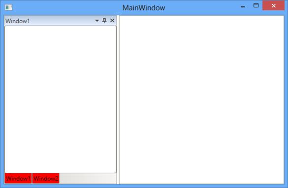
DockedElementTabbedHostStyle
The DockedElementTabbedHost can be customized using the DockedElementTabbedHostStyle with the TargetType as DockedElementTabbedHost
<Syncfusion:DockingManager.DockedElementTabbedHostStyle>

<Style TargetType="{x:Type Syncfusion:DockedElementTabbedHost}">

<Setter Property="Syncfusion:DockingManager.InternalDataContext"
        Value="{Binding Path=(Syncfusion:DockedElementTabbedHost.HostedElement), RelativeSource={RelativeSource Self}}"/>

<Setter Property="FocusVisualStyle" Value="{Binding Path=(Syncfusion:DockedElementTabbedHost.DockingManager).
        (Syncfusion:DockingManager.FocusVisualStyle),RelativeSource={RelativeSource TemplatedParent}}"/>

<Setter Property="Template">

<Setter.Value>

<ControlTemplate TargetType="{x:Type Syncfusion:DockedElementTabbedHost}">

<Border x:Name="BorderWrap" Width="Auto" FocusVisualStyle="{Binding Path=(Syncfusion:DockedElementTabbedHost.DockingManager).
        (Syncfusion:DockingManager.FocusVisualStyle), RelativeSource={RelativeSource TemplatedParent}}"
        SnapsToDevicePixels="True" BorderBrush="{TemplateBinding BorderBrush}" Background="Pink" BorderThickness="1">

<DockPanel x:Name="DockPanel" Width="Auto" LastChildFill="True" Focusable="False">

<Syncfusion:DockHeaderPresenter x:Name="header"DockPanel.Dock="Top" RenderTransformOrigin="0.5,0.5"
            Style="{Binding Path=(Syncfusion:DockedElementTabbedHost.DockingManager).(Syncfusion:DockingManager.DockHeaderStyle),
            RelativeSource={RelativeSource AncestorType={x:Type Syncfusion:DockedElementTabbedHost}}}"
            IsTemplateParenKeyboardFocusWithin="{TemplateBinding IsKeyboardFocusWithin}"/>

<Grid>

<ContentPresenter Name="HostedElement" ClipToBounds="True" ContentSource="HostedElement"
                  ContentTemplate="{TemplateBinding ContentControl.ContentTemplate}"
                  ContentTemplateSelector="{TemplateBinding ContentControl.ContentTemplateSelector}"/>

<Border Name="PART_CoverletControl" Visibility="Collapsed" Background="Transparent" />

</Grid>

</DockPanel>

</Border>

</ControlTemplate>

</Setter.Value>

</Setter>

</Style>

</Syncfusion:DockingManager.DockedElementTabbedHostStyle>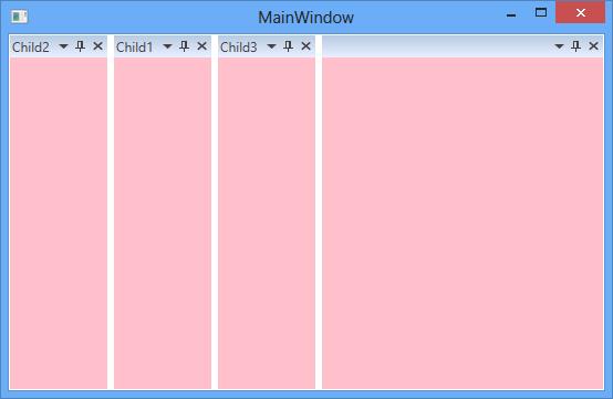
Custom header for all child
A common header style for all dock window can be customized using the property DockHeaderStyle with the TargetType as DockHeaderPresenter.
<syncfusion:DockingManager x:Name="DockingManager1" UseDocumentContainer="True"   >

<syncfusion:DockingManager.DockHeaderStyle>

<Style TargetType="{x:Type syncfusion:DockHeaderPresenter}">

<Setter Property="MinHeight" Value="60"></Setter>

</Style>

</syncfusion:DockingManager.DockHeaderStyle>

<ContentControl x:Name="Content1" syncfusion:DockingManager.State="Dock" syncfusion:DockingManager.Header="Child1" />

<ContentControl x:Name="Content2" syncfusion:DockingManager.Header="Child2" />

</syncfusion:DockingManager>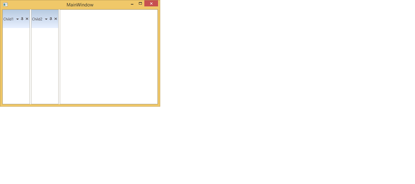
Custom header for individual child
Header of individual dock child can be customized through the HeaderStyle property of DockingManager. The customized style will apply to dock, auto hidden and tabbed windows. The following code illustrate the dock windows with customized header style,
<Window.Resources>
        <Style TargetType="Syncfusion:DockHeaderPresenter" x:Key="headerStyle1" >
            <Setter Property="Background" Value="Red"/>
            <Setter Property="Foreground" Value="Yellow"/>
            <Setter Property="BorderBrush" Value="Orange"/>
            <Setter Property="BorderThickness" Value="2"/>
            <Style.Triggers>
                <DataTrigger Binding="{Binding Path=IsTemplateParenKeyboardFocusWithin, RelativeSource={RelativeSource Self}}"
						Value="True">
                    <Setter Property="Foreground"
						Value="White" />
                    <Setter Property="Background"
						Value="Green" />
                </DataTrigger>
                <MultiDataTrigger>
                    <MultiDataTrigger.Conditions>
                        <Condition Binding="{Binding Path=IsMouseOver
							       , RelativeSource={RelativeSource Self}}"
						    Value="True" />
                    </MultiDataTrigger.Conditions>
                    <Setter Property="Foreground"
                        Value="Pink"/>
                    <Setter Property="Background"
                        Value="Brown"/>
                </MultiDataTrigger>
            </Style.Triggers>
        </Style>
    </Window.Resources>
    <Syncfusion:DockingManager Grid.Row="1" x:Name="dockingManager" DockFill="True">
        <ContentControl Syncfusion:DockingManager.Header="Dock1" Syncfusion:DockingManager.HeaderStyle="{StaticResource headerStyle1}"/>

        <ContentControl Syncfusion:DockingManager.Header="Dock2" Syncfusion:DockingManager.HeaderStyle="{StaticResource headerStyle1}"/>

        <ContentControl Syncfusion:DockingManager.Header="Dock3"/>

        <ContentControl Syncfusion:DockingManager.Header="Dock4" Syncfusion:DockingManager.HeaderStyle="{StaticResource headerStyle1}"/>

        <ContentControl Syncfusion:DockingManager.Header="Dock5" Syncfusion:DockingManager.HeaderStyle="{StaticResource headerStyle1}"/>

        <ContentControl Syncfusion:DockingManager.Header="Dock6" Syncfusion:DockingManager.HeaderStyle="{StaticResource headerStyle1}"/>
    </Syncfusion:DockingManager>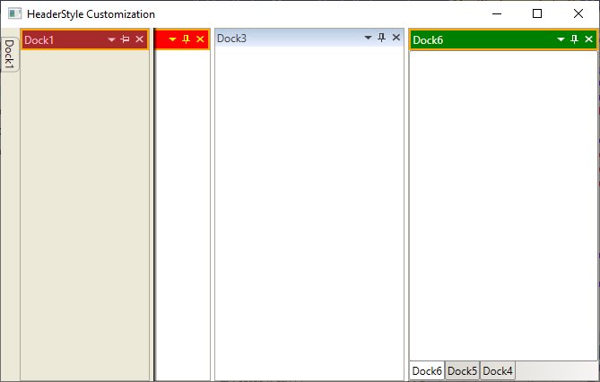
Refer to this sample to know how the header of the dock windows are customized through style of the Header.
DockWindowContextMenuItemStyle
The context menu of DockingManager can be customized using the DockWindowContextMenuItemStyle by setting its Target Type as CustomMenuItem.
<Syncfusion:DockingManager UseDocumentContainer="True" ContainerMode="TDI" UseNativeFloatWindow="True">

<Syncfusion:DockingManager.DockWindowContextMenuItemStyle>

<Style TargetType="{x:Type Syncfusion:CustomMenuItem}">

<Setter Property="Foreground" Value="Red"></Setter>

</Style>

</Syncfusion:DockingManager.DockWindowContextMenuItemStyle>

<Syncfusion:DockingManager.CustomMenuItems>

<Syncfusion:CustomMenuItemCollection>

<Syncfusion:CustomMenuItem Header="CustomItem1"/>

<Syncfusion:CustomMenuItem Header="CustomItem2"/>

</Syncfusion:CustomMenuItemCollection>

</Syncfusion:DockingManager.CustomMenuItems>

<ContentControl Syncfusion:DockingManager.Header="Child1" Syncfusion:DockingManager.State="Dock"/>

<ContentControl Syncfusion:DockingManager.Header="Child2" Syncfusion:DockingManager.State="Dock"/>

<ContentControl Syncfusion:DockingManager.Header="Child3" Syncfusion:DockingManager.State="Dock"/>

</Syncfusion:DockingManager>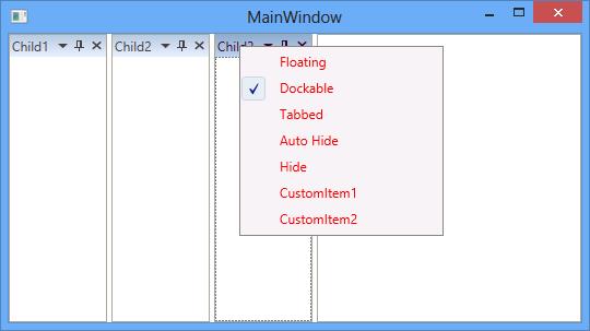
Float Window Style
The float window can be customized using its template and style.
FloatWindowTemplate
Template of FloatWindow can be customized using the FloatWindowTemplate with the TargetType as ContentControl.
<Syncfusion:DockingManager UseDocumentContainer="True" ContainerMode="TDI" EnableDocumentTabHeaderEdit="True">

<Syncfusion:DockingManager.FloatWindowTemplate>

<ControlTemplate  TargetType="{x:Type ContentControl}">

<AdornerDecorator>

<DockPanel Focusable="False" LastChildFill="True" Opacity="{Binding Path=Opacity,
           RelativeSource={RelativeSource AncestorType={x:Type Syncfusion:IWindow}}}">

<Border Name="FloatWindowOutBorder" Focusable="False"
        BorderBrush="{TemplateBinding BorderBrush}" BorderThickness="{TemplateBinding BorderThickness}" Background="Red" >

<Grid Focusable="False">

<Grid.RowDefinitions>

<RowDefinition Name="TopRow"/>

<RowDefinition Height="*" />

<RowDefinition Name="BottomRow" Height="7" />

</Grid.RowDefinitions>

<Grid.ColumnDefinitions>

<ColumnDefinition Name="LeftCol" Width="7" />

<ColumnDefinition Width="*"/>

<ColumnDefinition Name="RightCol" Width="7" />

</Grid.ColumnDefinitions>

<Syncfusion:FloatWindowBorder BorderMode="LeftTop" Name="BorderLeftTop" Grid.Column="0" Grid.Row="0" />

<Syncfusion:FloatWindowBorder BorderMode="Header" Name="BorderHeader" Grid.Column="1" Grid.Row="0" />

<Syncfusion:FloatWindowBorder BorderMode="RightTop" Name="BorderRightTop" Grid.Column="2" Grid.Row="0" />

<Syncfusion:FloatWindowBorder BorderMode="Left" Name="BorderLeft" Grid.Column="0" Grid.Row="1" />

<ContentPresenter Name="ContentPresenter" Grid.Column="1" Grid.Row="1"
                  ContentTemplate="{TemplateBinding ContentControl.ContentTemplate}"
                  Content="{TemplateBinding ContentControl.Content}" />

<Syncfusion:FloatWindowBorder BorderMode="Right" Name="BorderRight" Grid.Column="2" Grid.Row="1" />

<Syncfusion:FloatWindowBorder BorderMode="LeftBottom" Name="BorderLeftBottom" Grid.Column="0" Grid.Row="2" />

<Syncfusion:FloatWindowBorder BorderMode="Bottom" Name="BorderBottom" Grid.Column="1" Grid.Row="2" />

<Syncfusion:FloatWindowBorder BorderMode="RightBottom" Name="BorderRightBottom" Grid.Column="2" Grid.Row="2" />

</Grid>

</Border>

</DockPanel>

</AdornerDecorator>

</ControlTemplate>

</Syncfusion:DockingManager.FloatWindowTemplate>

<ContentControl Syncfusion:DockingManager.Header="Child1" Syncfusion:DockingManager.State="Float"/>

<ContentControl Syncfusion:DockingManager.Header="Child2" Syncfusion:DockingManager.State="Document"/>

<ContentControl Syncfusion:DockingManager.Header="Child3" Syncfusion:DockingManager.State="Document"/>

</Syncfusion:DockingManager>
FloatWindowStyle
The style for the float window can be applied using the FloatWindowStyle property of the DockingManager by setting its TargetType as AutoTemplatedContentControl. It gets or sets the style for the FloatWindow when it is rendered.
<syncfusion:DockingManager x:Name="DockingManager1">

<syncfusion:DockingManager.FloatWindowStyle>

<Style TargetType="{x:Type syncfusion:AutoTemplatedContentControl}">

<Setter Property="Background" Value="Red"></Setter>

</Style>

</syncfusion:DockingManager.FloatWindowStyle>

<ContentControl syncfusion:DockingManager.Header="Child"
                syncfusion:DockingManager.State="Float" syncfusion:DockingManager.SideInDockedMode="Left"/>

<ContentControl syncfusion:DockingManager.Header="Child2"></ContentControl>

</syncfusion:DockingManager>
NativeWindowStyle
The NativeFloatWindow of DockingManager can be customized using the NativeWindowStyle property of the DockingManager with the TargetType as NativeFloatWindow.
<Syncfusion:DockingManager UseDocumentContainer="True" ContainerMode="TDI" UseNativeFloatWindow="True">

<Syncfusion:DockingManager.NativeWindowStyle>

<Style TargetType="{x:Type Syncfusion:NativeFloatWindow}">

<Setter Property="Background" Value="Red"></Setter>

</Style>

</Syncfusion:DockingManager.NativeWindowStyle>

<ContentControl Syncfusion:DockingManager.Header="Child1" Syncfusion:DockingManager.State="Float"/>

<ContentControl Syncfusion:DockingManager.Header="Child2" Syncfusion:DockingManager.State="Document"/>

<ContentControl Syncfusion:DockingManager.Header="Child3" Syncfusion:DockingManager.State="Document"/>

</Syncfusion:DockingManager>
Auto Hide Window Style
AutoHidden window is constructed by SidePanels and SideTabItems. To customize the AutoHidden window, the following style and Templates are used as follows:
SideTabItemTemplate
The template of the SideTabItem of the DockingManager can be customized using the SideTabItemTemplate with the TargetType as TabItem.
<ControlTemplate x:Key="SideTabItemTemplate" TargetType="{x:Type TabItem}">

<Border Name="Border" CornerRadius="5,5,0,0"
        BorderBrush="{StaticResource TabItemBorderBrush}" BorderThickness="1">

<Border.LayoutTransform>

<RotateTransform Angle="90" />

</Border.LayoutTransform>

<Grid>

<DockPanel LastChildFill="True" Background="Orange">

<Rectangle Fill="Transparent"  Height="Auto" Width="Auto" RadiusX="5" RadiusY="5" />

<Border Name="Icon" DockPanel.Dock="Left" Margin="1" Width="16"
        Background="{Binding Path=(TabItem.Content).
        (Syncfusion:DockingManager.Icon), RelativeSource={RelativeSource TemplatedParent}}" />

<ContentPresenter x:Name="ContentSite" VerticalAlignment="Center" HorizontalAlignment="Center"
                  ContentSource="Header" Margin="2,2,2,2" RecognizesAccessKey="True"
                  ContentTemplate="{Binding Path=(Border.DataContext).(Syncfusion:DockingManager.HeaderTemplate),
                  ElementName=Border}" ContentTemplateSelector="{StaticResource TabItemTrimmingTemplate}"
                  TextBlock.Foreground={StaticResource Default.TabForeground}"/>

</DockPanel>

</Grid>

</Border>

</ControlTemplate>
SideItemStyle
The style for the sideTabItem can be changed using SideItemStyle by settings its TargetType as TabItem
<syncfusion:DockingManager  x:Name="DockingManager1" UseDocumentContainer="True" ContainerMode="TDI" >

<syncfusion:DockingManager.SideItemStyle>

<Style TargetType="{x:Type TabItem}">

<Setter Property="Background" Value="Red"></Setter>

<Setter Property="MinHeight" Value="500"></Setter>

<Setter Property="MinWidth" Value="200"></Setter>

</Style>

</syncfusion:DockingManager.SideItemStyle>

<ContentControl syncfusion:DockingManager.Header="Child1" syncfusion:DockingManager.State="Dock"/>

<ContentControl syncfusion:DockingManager.Header="Child2" syncfusion:DockingManager.State="AutoHidden"/>

<ContentControl syncfusion:DockingManager.Header="Child3" syncfusion:DockingManager.State="Dock"/>

</syncfusion:DockingManager>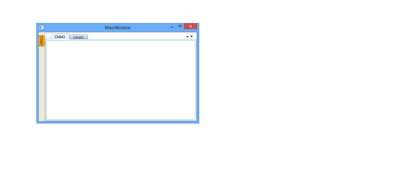
SidePanelTemplate
SidePanel template in AutoHidden window can changed using SidePanelTemplate with the TargetType SidePanel.
<ControlTemplate x:Key="SidePanelTemplate" TargetType="{x:Type Syncfusion:SidePanel}" >

<Canvas KeyboardNavigation.TabNavigation="Local" ClipToBounds="False" >

<Border Name="PART_BorderName"  Height="{TemplateBinding ActualHeight}" Width="{TemplateBinding ActualWidth}"
        Margin="0" ClipToBounds="True" Background="Orange"Panel.ZIndex="1" KeyboardNavigation.TabIndex="1"
        BorderThickness="{Binding Path=SidePanelBorderThickness, RelativeSource={RelativeSource FindAncestor,
        AncestorType={x:Type Syncfusion:DockingManager}}}" BorderBrush="{StaticResource TabItemBorderBrush}">

<Border.ContextMenu>

<ContextMenu Style="{StaticResource SideContextMenuStyle}" ItemsSource="{TemplateBinding TabChildren}"/>

</Border.ContextMenu>

<Syncfusion:DirectTabPanel Name="PART_PanelName" KeyboardNavigation.TabNavigation="Local" IsItemsHost="True"/>

</Border>

<Syncfusion:OpacityDockPanel LastChildFill="True"
                             Opacity="{Binding Path=ContentOpacity,
                             RelativeSource={RelativeSource TemplatedParent}}"/>

</ Canvas >

</ControlTemplate>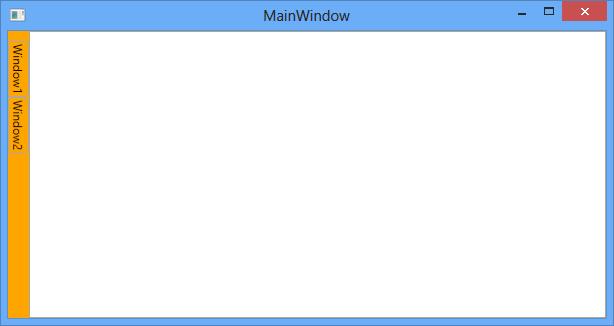
SidePanelStyle
The style for the SidePanel of the DockingManager can be customized using the SidePanelStyle property with the TargetType as SidePanel.
<syncfusion:DockingManager  x:Name="DockingManager1" UseDocumentContainer="True" ContainerMode="TDI">

<syncfusion:DockingManager.SidePanelStyle>

<Style TargetType="{x:Type syncfusion:SidePanel}">

<Setter Property="Background" Value="Red"></Setter>

</Style>

</syncfusion:DockingManager.SidePanelStyle>

<ContentControl syncfusion:DockingManager.Header="Child1" syncfusion:DockingManager.State="AutoHidden"/>

<ContentControl syncfusion:DockingManager.Header="Child2"syncfusion:DockingManager.State="Document"/>

<ContentControl syncfusion:DockingManager.Header="Child3"syncfusion:DockingManager.State="Document"/>

</syncfusion:DockingManager>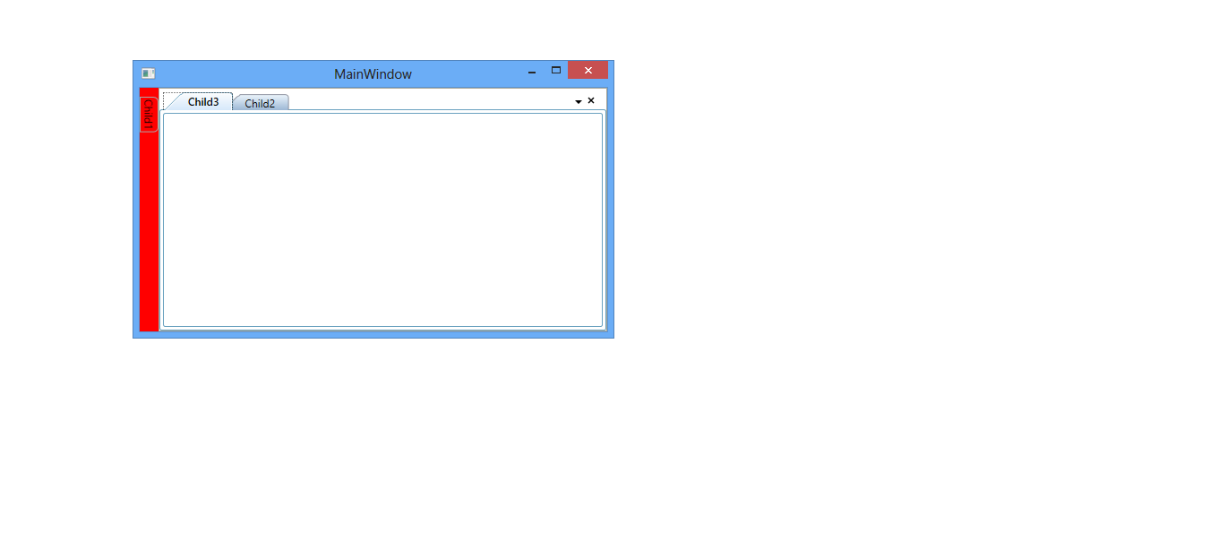
Drag Provider Style
DragProviders are appear while dragging a window. DragProviders are displayed for providing options to dock the FloatWindow while dragging and this drag provider button templates can be changed by the following templates.
BottomDragProvider
The BottomDragProvider is used to dock the children of the Docking in the bottom side and it’s template can be customized using the BottomDragProviderTemplate by setting its TargetType as ContentControl.
<syncfusion:DockingManager  x:Name="DockingManager1" UseDocumentContainer="True" EnableDocumentTabHeaderEdit="True" >

<syncfusion:DockingManager.BottomDragProvider>

<ControlTemplate TargetType="{x:Type ContentControl}">

<Image Name="Img" syncfusion:DockPreviewManagerVS2005.ProviderAction="GlobalLeft" Source="Images\synclogo.png" />

<ControlTemplate.Triggers>

<DataTrigger Binding="{Binding Path=IsSideButtonActive,
             RelativeSource={RelativeSource FindAncestor,
             AncestorType={x:Type syncfusion:DockPreviewMainButtonVS2005}}}" Value="true">

<Setter TargetName="Img" Property="Source" Value="Images\synclogo.png"/>

</DataTrigger>

</ControlTemplate.Triggers>

</ControlTemplate>

</syncfusion:DockingManager.BottomDragProvider>

<ContentControlsyncfusion:DockingManager.Header="Child1" syncfusion:DockingManager.State="Dock"/>

</syncfusion:DockingManager>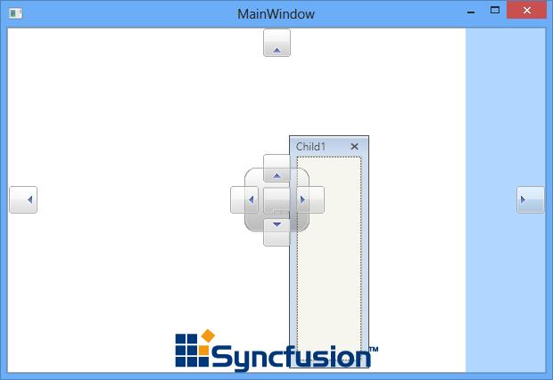
LeftDragProvider
The LeftDragProvider is used to dock the dock window to the left side and it can be customized using the LeftDragProvider property that helps to customize the template for the Left DragProvider by setting its Target as ContentControl. The same has been explained below:
<syncfusion:DockingManager x:Name="DockingManager1" UseDocumentContainer="True" EnableDocumentTabHeaderEdit="True" >

<syncfusion:DockingManager.LeftDragProvider>

<ControlTemplate TargetType="{x:Type ContentControl}">

<Image Name="Img" syncfusion:DockPreviewManagerVS2005.ProviderAction="GlobalLeft" Source="Images\synclogo.png" />

<ControlTemplate.Triggers>

<DataTrigger Binding="{Binding Path=IsSideButtonActive,
            RelativeSource={RelativeSource FindAncestor,
            AncestorType={x:Type syncfusion:DockPreviewMainButtonVS2005}}}" Value="true">

<Setter TargetName="Img" Property="Source" Value="Images\synclogo.png"/>

</DataTrigger>

</ControlTemplate.Triggers>

</ControlTemplate>

</syncfusion:DockingManager.LeftDragProvider>

<ContentControl syncfusion:DockingManager.Header="Child1" syncfusion:DockingManager.State="Dock"/>

</syncfusion:DockingManager>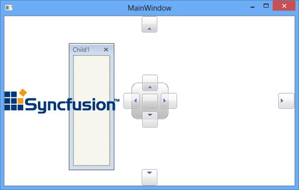
RightDragProvider
To dock the DockWindow to the right side, RightDragProvider is used. It can be customized using the RightDragProviderTemplate with the TargetType as ContentControl.
<syncfusion:DockingManager  x:Name="DockingManager1" UseDocumentContainer="True" EnableDocumentTabHeaderEdit="True" >

<syncfusion:DockingManager.RightDragProvider>

<ControlTemplate TargetType="{x:Type ContentControl}">

<Image Name="Img" syncfusion:DockPreviewManagerVS2005.ProviderAction="GlobalLeft" Source="Images\synclogo.png" />

<ControlTemplate.Triggers>

<DataTrigger Binding="{Binding Path=IsSideButtonActive,
             RelativeSource={RelativeSource FindAncestor,
             AncestorType={x:Type syncfusion:DockPreviewMainButtonVS2005}}}" Value="true">

<Setter TargetName="Img" Property="Source" Value="Images\synclogo.png"/>

</DataTrigger>

</ControlTemplate.Triggers>

</ControlTemplate>

</syncfusion:DockingManager.RightDragProvider>

<ContentControl syncfusion:DockingManager.Header="Child1" syncfusion:DockingManager.State="Dock"/>

</syncfusion:DockingManager>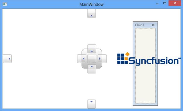
TopDragProvider
To dock the DockWindow at top, the TopDragProvider is used. It can be customized using the TopDragProviderTemplate with the TargetType as ContentControl.
<syncfusion:DockingManager  x:Name="DockingManager1" UseDocumentContainer="True" EnableDocumentTabHeaderEdit="True" >

<syncfusion:DockingManager.LeftDragProvider>

<ControlTemplate TargetType="{x:Type ContentControl}">

<Image Name="Img" syncfusion:DockPreviewManagerVS2005.ProviderAction="GlobalLeft" Source="Images\synclogo.png" />

<ControlTemplate.Triggers>

<DataTrigger Binding="{Binding Path=IsSideButtonActive,
             RelativeSource={RelativeSource FindAncestor,
             AncestorType={x:Type syncfusion:DockPreviewMainButtonVS2005}}}" Value="true">

<Setter TargetName="Img" Property="Source" Value="Images\synclogo.png"/>

</DataTrigger>

</ControlTemplate.Triggers>

</ControlTemplate>

</syncfusion:DockingManager.LeftDragProvider>

<ContentControl syncfusion:DockingManager.Header="Child1" syncfusion:DockingManager.State="Dock"/>

</syncfusion:DockingManager>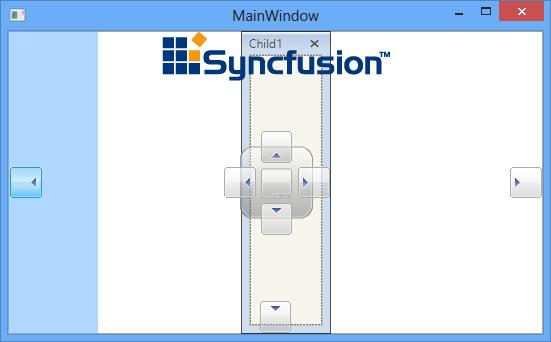
CenterDragProvider
CenterDragProvider is used to dock the children of the DockingManager at the center Position and its template can be customized using the property CenterDragProvider.
<syncfusion:DockingManager  x:Name="DockingManager1" UseDocumentContainer="True">

<syncfusion:DockingManager.CenterDragProvider>

<ControlTemplate TargetType="{x:Type ContentControl}">

<Image Name="Img" syncfusion:DockPreviewManagerVS2005.ProviderAction="GlobalLeft" Source="Images\synclogo.png" />

<ControlTemplate.Triggers>

<DataTrigger Binding="{Binding Path=IsSideButtonActive,
             RelativeSource={RelativeSource FindAncestor,
             AncestorType={x:Type syncfusion:DockPreviewMainButtonVS2005}}}" Value="true">

<Setter TargetName="Img" Property="Source" Value="Images\synclogo.png"/>

</DataTrigger>

</ControlTemplate.Triggers>

</ControlTemplate>

</syncfusion:DockingManager.CenterDragProvider>

<ContentControl syncfusion:DockingManager.Header="Child1" syncfusion:DockingManager.State="Dock"/>

</syncfusion:DockingManager>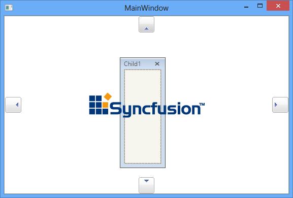
DocumentTabControlStyle
Document state in DockingManager used the DocumentTabControl and its style can be customized using DocumentTabControlStyle with the TargetType as DocumentTabControl.
<syncfusion:DockingManager  x:Name="DockingManager1" UseDocumentContainer="True">

<syncfusion:DockingManager.DocumentTabControlStyle>

<Style TargetType="{x:Type syncfusion:DocumentTabControl}">

<Setter Property="TabItemSelectedBackground" Value="Red" />

</Style>

</syncfusion:DockingManager.DocumentTabControlStyle>

<ContentControl syncfusion:DockingManager.Header="Child1" syncfusion:DockingManager.State="Document"/>

<ContentControl syncfusion:DockingManager.Header="Child2" syncfusion:DockingManager.State="Document"/>

<ContentControl syncfusion:DockingManager.Header="Child3" syncfusion:DockingManager.State="Document"/>

</syncfusion:DockingManager>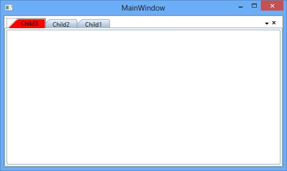
DocumentTabItemStyle
Each Document TabItem in DockingManager constructed by the TabItemExt and its style can be customized using DocumentTabItemStyle with the TargetType as TabItemExt.
<syncfusion:DockingManager  x:Name="DockingManager1" UseDocumentContainer="True"   >

<syncfusion:DockingManager.DocumentTabItemStyle>

<Style TargetType="{x:Type syncfusion:TabItemExt}">

<Setter Property="BorderBrush" Value="Red" />

</Style>

</syncfusion:DockingManager.DocumentTabItemStyle>

<ContentControl syncfusion:DockingManager.Header="Child1" syncfusion:DockingManager.State="Document"/>

<ContentControl syncfusion:DockingManager.Header="Child2" syncfusion:DockingManager.State="Document"/>

<ContentControl syncfusion:DockingManager.Header="Child3" syncfusion:DockingManager.State="Document"/>

</syncfusion:DockingManager>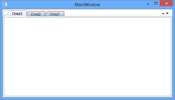
DocumentMDIHeaderStyle
The header style for the MDI Document can be changed using the DocumentMDIHeaderStyle with the TargetType as DocumentHeader.
<syncfusion:DockingManager  x:Name="DockingManager1" UseDocumentContainer="True" ContainerMode="MDI">

<syncfusion:DockingManager.DocumentMDIHeaderStyle>

<Style TargetType="{x:Type syncfusion:DocumentHeader}">

<Setter Property="Background" Value="Maroon"/>

<Setter Property="Foreground" Value="White"/>

<Setter Property="HeaderTemplate">

<Setter.Value>

<DataTemplate >

<TextBlock x:Name="Block" Text="Text1" />

</DataTemplate>

</Setter.Value>

</Setter>

</Style>

</syncfusion:DockingManager.DocumentMDIHeaderStyle>

<ContentControl syncfusion:DockingManager.Header="Child1" syncfusion:DockingManager.State="Document"/>

<ContentControl syncfusion:DockingManager.Header="Child2" syncfusion:DockingManager.State="Document"/>

<ContentControl syncfusion:DockingManager.Header="Child3" syncfusion:DockingManager.State="Document"/>

</syncfusion:DockingManager>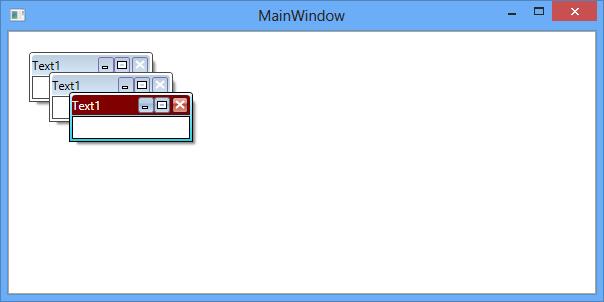
TabControl style
TabControl inside the Tabbed DockWindow can be customized using TabControlStyle with the TargetType TabControl in the DockingManager
<Syncfusion:DockingManager  x:Name="DockingManager1" UseDocumentContainer="True"   >

<Syncfusion:DockingManager.TabControlStyle>

<Style TargetType="{x:Type TabControl}">

<Setter Property="Background" Value="Orange" />

<Setter Property="ItemContainerStyle"
        Value="{Binding Path=(Syncfusion:DockedElementTabbedHost.DockingManager).
        (Syncfusion:DockingManager.TabItemStyle), RelativeSource={RelativeSource
        AncestorType={x:Type Syncfusion:DockedElementTabbedHost}}}" />

</Style>

</Syncfusion:DockingManager.TabControlStyle>

<ContentControl Syncfusion:DockingManager.State="Dock" Syncfusion:DockingManager.Header="Child1" />

<ContentControl Syncfusion:DockingManager.SideInDockedMode="Tabbed"
                Syncfusion:DockingManager.Header="Child2" Syncfusion:DockingManager.TargetNameInDockedMode="Content1">

</ContentControl>

</Syncfusion:DockingManager>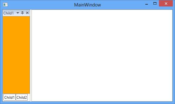
TabItemStyle
The style for the Tabbed children of DockingManager can be customized using the TabItemStyle property with the Target Type as TabItem.
<Syncfusion:DockingManager  x:Name="DockingManager1" UseDocumentContainer="True">

<Syncfusion:DockingManager.TabItemStyle>

<Style TargetType="{x:Type TabItem}">

<Setter Property="Background" Value="Maroon"/>

<Setter Property="Header" Value="{Binding Path=(Syncfusion:DockingManager.Header)}" />

</Style>

</Syncfusion:DockingManager.TabItemStyle>

<ContentControl Syncfusion:DockingManager.State="Dock" x:Name="Content1" Syncfusion:DockingManager.Header="Child1"/>

<ContentControl Syncfusion:DockingManager.Header="Child2"
                Syncfusion:DockingManager.SideInDockedMode="Tabbed"
                Syncfusion:DockingManager.TargetNameInDockedMode="Content1"/>

</Syncfusion:DockingManager>