DateTime Editing in WPF DateTimePicker (DateTimeEdit)
5 May 202124 minutes to read
The DateTimeEdit control provides support for changing date time using text box. It supports both free form editing and mask based editing.
Mask editing
Mask editing is the default editing mode. In this mode, you can provide only valid input. Any invalid input given will be automatically corrected or ignored. In mask editing mode, the date will be separated into different fields such as date, month, year, minutes, hours, and seconds. The field can be updated by selecting the field and edit the value for the respectively fields or pressing the up (or) down arrow keys to increase or decrease the selected field respectively.
<syncfusion:DateTimeEdit Name="dateTimeEdit"
                         Height="25"
                         Width="200"/>
DateTimeEdit dateTimeEdit = new DateTimeEdit();
dateTimeEdit.Width = 150;
dateTimeEdit.Height = 25;
NOTE
View Sample in GitHub
Validation
In mask editing mode, value will be validated and corrected immediately based on the edited input value. The following table demonstrates some of the validation in DateTimeEdit control:
|
Validation |
Example |
|---|---|
| If the Space or next field character is pressed, focus will automatically navigated to next valid date / time field that can be edited. | In short pattern, "/" character is used as the date separators: MM/dd/yyyy. On pressing "/" the focus will automatically navigated to next valid field. |
| Field focus will be automatically navigated when value of the selected field is filled. |
 |
| DateTimeEdit value will be validated and corrected immediately based on the edited input value. |
 Ex: If the month field is February, then if we type 29 in day field year field will be automatically validated and moved to next leap year based on corresponding date.
 |
| Day field of DateTimeEdit can not be selected as it cannot be edited. | - |
NOTE
View Sample in GitHub
DateTime field navigation
By default, the focus field will be navigated automatically after the value has been validated to the corresponding field. If you want to manually change the date, month, year, hour or minute values, before that you navigate to the respective field by using the mouse or move the Left-Right keys in the keyboard.
Keyboard Navigation between datetime fields
The following table explains how the navigation performed between datetime fields,
| S.No | Key | Description | Image |
|---|---|---|---|
| 1 | Up | Increase selected date, month or year value by 1. |

|
| 2 | Down | Decrease selected date, month or year value by 1. |

|
| 3 | Right | Navigate to the previous field from the currently selected field. |

|
| 4 | Left | Navigate to the next field from the currently selected field. |

|
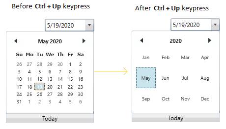
| 5 | Ctrl + Up | Move forward from current selection view to next month or year selection view. |
|
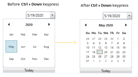
| 6 | Ctrl + Down | Move backward from current selection view to previous month or date selection view. |
|
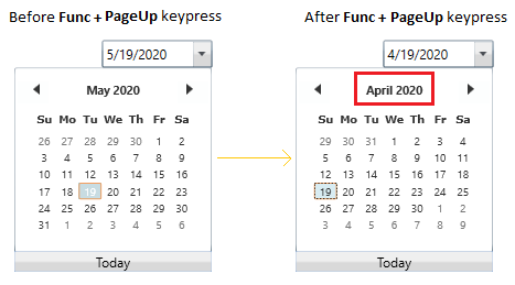
| 7 | PageUp | Move to previous month, date or year from the corresponding selection view. |
|
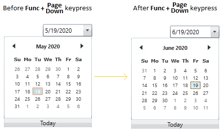
| 8 | PageDown | Move to next month, date or year from the corresponding selection view. |
|
| 9 | Home | Select first date or month or year or decade of the current selection view. |
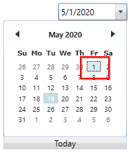
|
| 10 | End | Select last date or month or year or decade of the current selection view. |
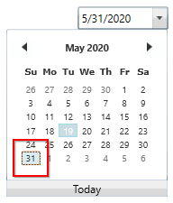
|
NOTE
View Sample in GitHub
Change date time programmatically
You can set or change the selected datetime of the DateTimeEdit programmatically by setting the value to the DateTime property.
<syncfusion:DateTimeEdit DateTime="08/06/2020"
                         Name="dateTimeEdit"/>
DateTimeEdit dateTimeEdit = new DateTimeEdit();
dateTimeEdit.DateTime = new DateTime(2020, 06, 30);
NOTE
View Sample in GitHub
Binding date time value
You can bind the selected date time value by using the DateTime property.
The following code snippets illustrate the value binding from one DateTimeEdit to another.
//ViewModel.cs
class ViewModel : NotificationObject {
    private DateTime selectedDate = DateTime.Now;

    public DateTime SelectedDate {
        get {
            return selectedDate;
        }
        set {
            selectedDate = value;
            this.RaisePropertyChanged(nameof(SelectedDate));
        }
    }
}<Window.DataContext>
<local:ViewModel/>
</Window.DataContext>
<StackPanel HorizontalAlignment="Center"
VerticalAlignment="Center">
<syncfusion:DateTimeEdit Name="dateTimeEdit1"
Height="25"
Width="200"
DateTime="{Binding SelectedDate, Mode=TwoWay}"/>
<syncfusion:DateTimeEdit Name="dateTimeEdit2"
Height="25"
Width="200"
DateTime="{Binding SelectedDate, Mode=TwoWay}"
Margin="10"/>
</StackPanel>
NOTE
View Sample in GitHub
Free form editing
You can change the DateTime value like a normal textbox editing by setting the CanEdit property value as true. Input given by an end-user, will be validated when pressing Enter key or if control lost its focus. If the entered value is invalid, it set the previously selected date as DateTime value. Otherwise, it will accept the given input.
<syncfusion:DateTimeEdit Name="dateTimeEdit"
                         CanEdit="True"/>
DateTimeEdit dateTimeEdit= new DateTimeEdit();
dateTimeEdit.CanEdit = true;
NOTE
View Sample in GitHub
Change date time on mouse wheel
You can increase or decrease the datetime by select the respective fields and mouse scrolling over the DateTimeEdit. If you want to restrict the user to change datetime by using mouse scrolling, use the EnableMouseWheelEdit property value as false. The default value of EnableMouseWheelEdit property is true.
<syncfusion:DateTimeEdit EnableMouseWheelEdit="True"
                         Name="dateTimeEdit"/>
DateTimeEdit dateTimeEdit= new DateTimeEdit();
dateTimeEdit.EnableMouseWheelEdit = true;
NOTE
View Sample in GitHub
Change date time using up-down button
You can change the value of the datetime by selecting the respective date, month, year, minutes, hours, or seconds field and pressing the up or down button to increase or decrease the selected field respectively. By default, the updown button are hidden. you can show the UpDown button by setting the IsVisibleRepeatButton property value as true.
<syncfusion:DateTimeEdit IsVisibleRepeatButton="True"
                         IsEnabledRepeatButton="True"
                         Name="dateTimeEdit"/>
DateTimeEdit dateTimeEdit = new DateTimeEdit();
dateTimeEdit.IsVisibleRepeatButton= true;
dateTimeEdit.IsEnabledRepeatButton= true;
NOTE
View Sample in GitHub
Disable up-down button
You can disable the updown button by setting the IsEnabledRepeatButton property as false. The default value of IsEnabledRepeatButton property is true.
<syncfusion:DateTimeEdit IsEnabledRepeatButton="False"
                         IsVisibleRepeatButton="True"
                         Name="dateTimeEdit"/>
DateTimeEdit dateTimeEdit = new DateTimeEdit();
dateTimeEdit.IsEnabledRepeatButton= false;
dateTimeEdit.IsVisibleRepeatButton= true;
NOTE
View Sample in GitHub
Show only the up-down button
You can show only the updown button by hiding the dropdown button. You can hide the dropdown button by setting the IsButtonPopUpEnabled property value as false.
<syncfusion:DateTimeEdit IsButtonPopUpEnabled="False"
                         IsVisibleRepeatButton="True"
                         IsEnabledRepeatButton="True"
                         Name="dateTimeEdit"/>
DateTimeEdit dateTimeEdit = new DateTimeEdit();
dateTimeEdit.IsVisibleRepeatButton= true;
dateTimeEdit.IsEnabledRepeatButton= true;
dateTimeEdit.IsButtonPopUpEnabled = false;
NOTE
View Sample in GitHub
Customize up-down appearance
You can change the background and UI of the updown button.
Change updown background
If you want to change the updown button background, use the RepeatButtonBackground property. You can also change the margin of the up and down button separately by using the DownRepeatButtonMargin and UpRepeatButtonMargin properties. The default value of RepeatButtonBackground property is Gainsboro and UpRepeatButtonMargin & DownRepeatButtonMargin properties is {0,0,0,0}.
<syncfusion:DateTimeEdit RepeatButtonBackground="Red"
                         DownRepeatButtonMargin="1"
                         UpRepeatButtonMargin="1"
                         IsVisibleRepeatButton="True"
                         Width="150"
                         Height="25"
                         Name="dateTimeEdit"/>
DateTimeEdit dateTimeEdit = new DateTimeEdit();
dateTimeEdit.RepeatButtonBackground= Brushes.Red;
dateTimeEdit.DownRepeatButtonMargin= new Thickness(1);
dateTimeEdit.UpRepeatButtonMargin = new Thickness(1);
dateTimeEdit.IsVisibleRepeatButton= true;
NOTE
View Sample in GitHub
Custom UI for up and down button
You can customize the up and down button appearance separately by using the UpRepeatButtonTemplate and DownRepeatButtonTemplate properties.
<syncfusion:DateTimeEdit IsVisibleRepeatButton="True"
                         Name="dateTimeEdit">
    <!--Custom UI for up button-->
    <syncfusion:DateTimeEdit.UpRepeatButtonTemplate>
        <ControlTemplate>
            <TextBlock Foreground="Yellow"
                       TextAlignment="Center"
                       FontSize="15"
                       FontWeight="ExtraBold"
                       Text="+"
                       Background="Green"/>
        </ControlTemplate>
    </syncfusion:DateTimeEdit.UpRepeatButtonTemplate>

    <!--Custom UI for down button-->
    <syncfusion:DateTimeEdit.DownRepeatButtonTemplate>
        <ControlTemplate>
            <TextBlock Foreground="Yellow"
                       TextAlignment="Center"
                       FontSize="15"
                       FontWeight="ExtraBold"
                       Text="-"
                       Background="Red"/>
        </ControlTemplate>
    </syncfusion:DateTimeEdit.DownRepeatButtonTemplate>
</syncfusion:DateTimeEdit>
NOTE
View Sample in GitHub
Change month using alpha keys
You can change the month which is in abbreviated form or digit form, can be edited by select the month field and pressing the initial letter of respective month. You can enable it by setting the EnableAlphaKeyNavigation value as true and CanEdit property as false. The default value of EnableAlphaKeyNavigation property is false.
For example, If you pressing the j key, then it will selects January. On subsequent presses of the j key selects June and then July.
<syncfusion:DateTimeEdit EnableAlphaKeyNavigation="True"
                         CanEdit="False"
                         Pattern="LongDate"
                         Name="dateTimeEdit"/>
DateTimeEdit dateTimeEdit = new DateTimeEdit();
dateTimeEdit.EnableAlphaKeyNavigation = true;
dateTimeEdit.CanEdit = false;
dateTimeEdit.Pattern = DateTimePattern.LongDate;
NOTE
View Sample in GitHub
Delete and edit the date time value
By default, date time field will be selected and you can only override the date time field value without deleting the old value. You can delete the existing field values by pressing the BackSpace or Delete key and enter the new values. You can enable it by setting the EnableBackspaceKey and EnableDeleteKey properties as true. The default value of EnableBackspaceKey and EnableDeleteKey property is false.
<syncfusion:DateTimeEdit EnableBackspaceKey="True"
                         EnableDeleteKey="True"
                         Name="dateTimeEdit"/>
DateTimeEdit dateTimeEdit = new DateTimeEdit();
dateTimeEdit.EnableBackspaceKey = true;
dateTimeEdit.EnableDeleteKey = true;
NOTE
View Sample in GitHub
Change date time using custom calendar and clock
You can add your own calendar and clock control in DateTimeEdit to selected the date and time.
Custom calendar
If you want to select the Date from the own calendar, use the DateTimeCalender property and set the custom date selector. You can enable the calendar by setting DropDownView property as Calendar.
//ViewModel.cs
class ViewModel : NotificationObject {
    private DateTime selectedDate = DateTime.Now;

    public DateTime SelectedDate {
        get {
            return selectedDate;
        }
        set {
            selectedDate = value;
            this.RaisePropertyChanged(nameof(SelectedDate));
        }
    }
}<Window.DataContext>
<local:ViewModel/>
</Window.DataContext>
<syncfusion:DateTimeEdit DateTime="{Binding SelectedDate, Mode=TwoWay}"
DropDownView="Calendar"
Pattern="ShortDate"
Name="dateTimeEdit">
<syncfusion:DateTimeEdit.DateTimeCalender>
<syncfusion:SfDateSelector SelectorItemWidth="80"
SelectorItemHeight="80"
ShowDoneButton="False"
SelectedDateTime="{Binding SelectedDate, Mode=TwoWay}"/>
</syncfusion:DateTimeEdit.DateTimeCalender>
</syncfusion:DateTimeEdit>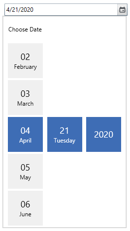
NOTE
View Sample in GitHub
Custom clock
If you want to select the time from the own clock, use the Clock property and set the custom time selector. You can enable the custom clock by setting DropDownView property as Clock.
//ViewModel.cs
class ViewModel : NotificationObject {
    private DateTime selectedTime = DateTime.Now;

    public DateTime SelectedTime {
        get {
            return selectedTime;
        }
        set {
            selectedTime = value;
            this.RaisePropertyChanged(nameof(SelectedTime));
        }
    }
}<syncfusion:DateTimeEdit DateTime="{Binding SelectedTime, Mode=TwoWay}"
DropDownView="Clock"
Pattern="ShortDate"
Name="dateTimeEdit">
<syncfusion:DateTimeEdit.Clock>
<syncfusion:SfTimeSelector SelectorItemWidth="70"
SelectorItemHeight="70"
ShowCancelButton="False"
ShowDoneButton="False"
SelectedTime="{Binding SelectedTime, Mode=TwoWay}"/>
</syncfusion:DateTimeEdit.Clock>
</syncfusion:DateTimeEdit>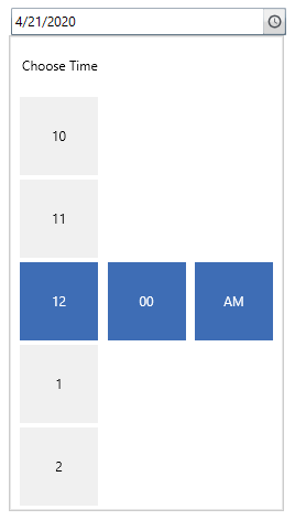
NOTE
View Sample in GitHub
NOTE
You can also use both custom clock and calendar in the full datetime pattern by setting the
DropDownViewproperty asCombined. View Sample in GitHub
Setting the null value
If you want to set or change the null value for the DateTimeEdit, use the NullValue property. you can enable it only by setting the IsEmptyDateEnabled property as true and ShowMaskOnNullValue property as false. If IsEmptyDateEnabled property is false, then the default date time is displayed. If the ShowMaskOnNullValue property true, then datetime mask is shown.
<syncfusion:DateTimeEdit ShowMaskOnNullValue="False"
                         NullValue="{x:Null}"
                         IsEmptyDateEnabled="True"
                         x:Name="dateTimeEdit"
                         Height="25"
                         Width="200"  />
DateTimeEdit dateTimeEdit = new DateTimeEdit();
dateTimeEdit.ShowMaskOnNullValue= false;
dateTimeEdit.IsEmptyDateEnabled= true;
dateTimeEdit.NullValue = null;
NOTE
View Sample in GitHub
Show mask on null value
you can show only the mask on null value by setting the ShowMaskOnNullValue property value as true.
<syncfusion:DateTimeEdit ShowMaskOnNullValue="True"
                         NullValue="{x:Null}"
                         IsEmptyDateEnabled="True"
                         Name="dateTimeEdit" />
DateTimeEdit dateTimeEdit = new DateTimeEdit();
dateTimeEdit.ShowMaskOnNullValue= true;
dateTimeEdit.IsEmptyDateEnabled= true;
dateTimeEdit.NullValue = null;
Show watermark when value is null
If you want to display any watermark text instead of null value, use the NoneDateText property to setting the watermark text. you can enable it only by setting the IsEmptyDateEnabled property as true, ShowMaskOnNullValue property as false and NullValue property as null. The default value of NoneDateText property is string.Empty.
<syncfusion:DateTimeEdit NoneDateText="Select the date"
                         ShowMaskOnNullValue="True"
                         NullValue="{x:Null}"
                         IsEmptyDateEnabled="True"
                         Name="dateTimeEdit"/>
DateTimeEdit dateTimeEdit = new DateTimeEdit();
dateTimeEdit.NoneDateText= "Select the date";
dateTimeEdit.ShowMaskOnNullValue= true;
dateTimeEdit.IsEmptyDateEnabled= true;
dateTimeEdit.NullValue = null;
NOTE
View Sample in GitHub
Select the date time field on focus
By default, the first field of the date time is selected to edit when control got focus. you can set the last field of date time as selected field when control got focus by setting the OnFocusBehavior property as CursorAtEnd. The default value of OnFocusBehavior property is CursorOnFirstCharacter.
NOTE
If control got focus by directly clicking the date time field,
OnFocusBehaviorproperty value not take effects.
<syncfusion:DateTimeEdit OnFocusBehavior="CursorAtEnd"
                         Name="dateTimeEdit" />
DateTimeEdit dateTimeEdit = new DateTimeEdit();
dateTimeEdit.OnFocusBehavior = OnFocusBehavior.CursorAtEnd;
NOTE
View Sample in GitHub
Restrict automatic focus to next field
You can prevent the focus in DateTimeEdit automatically moving from one field to another by setting the AutoForwarding property value as false. By default, the value of AutoForwarding property is true.
<syncfusion:DateTimeEdit x:Name="dateTimeEdit" AutoForwarding="False" />DateTimeEdit dateTimeEdit = new DateTimeEdit();
dateTimeEdit.AutoForwarding = false;Value Changed Notification
The selected datetime changed in DateTimeEdit can be examined using DateTimeChanged event. The DateTimeChanged event contains the old and newly selected date time values in the OldValue and NewValue properties.
<syncfusion:DateTimeEdit DateTimeChanged="dateTimeEdit_DateTimeChanged"
                          Name="dateTimeEdit"/>
DateTimeEdit dateTimeEdit = new DateTimeEdit();
dateTimeEdit.DateTimeChanged += dateTimeEdit_DateTimeChanged;You can handle the event as follows,
private void dateTimeEdit_DateTimeChanged(DependencyObject d, DependencyPropertyChangedEventArgs e) {
    //Get old and new values
    var oldValue = e.OldValue;
    var newValue = e.NewValue;
}