Selection in WPF AutoComplete (SfTextBoxExt)
18 Nov 201824 minutes to read
The WPF AutoComplete control supports single and multiple selection. You can configure selection by using the MultiSelectMode property. The default value of the MultiSelectMode property is None, which enables single selection.
Single selection
You can enable single selection by setting the MultiSelectMode property to None. In this mode, you can set and retrieve the selected item by using the SelectedItem property.
Multi selection
The multi-selection, there are two ways to display the selection in the control.
-
Token
-
Delimiter
Multiple selection using tokens
Each selected item can be displayed as a token representation having a close button for each token.
In token representation, the control behavior of arranging the items can be done in two ways, which is handled by the property TokensWrapMode.
-
Wrap- The selected items will be wrapped to the next line of the WPF AutoComplete. -
None- The selected items will be arranged in horizontal layout in single line.
The SelectedItems property can be used to set and retrieve the items in MultiSelectMode.
<editors:SfTextBoxExt HorizontalAlignment="Left"
                      AutoCompleteMode="Suggest"
                      SearchItemPath="Name"
                      MultiSelectMode="Token"
                      Height="40"
                      AutoCompleteSource="{Binding Employees}"
                      VerticalAlignment="Center"
Width="200"/>textBoxExt.MultiSelectMode = MultiSelectMode.Token;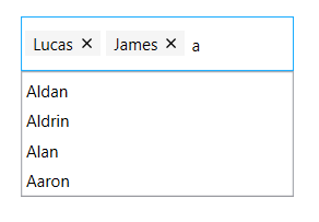
Customization of tokens using TokenItem style
The token can be customized by overriding the default style targeting the TokenItem class.
<Window.Resources>
<Style TargetType="editors:TokenItem">
<Setter Property="Template">
<Setter.Value>
<ControlTemplate TargetType="editors:TokenItem">
<Border x:Name="TokenBorder" Margin="4,4,2,4" Background="Black" CornerRadius="10" Height="{TemplateBinding Height}" >
<Grid Margin="2" x:Name="TokenGrid">
<Grid.ColumnDefinitions>
<ColumnDefinition Width="auto"/>
<ColumnDefinition Width="*"/>
<ColumnDefinition Width="auto"/>
</Grid.ColumnDefinitions>
<TextBlock x:Name="TokenTextBlock" Text="{TemplateBinding Text}" Foreground="White" Grid.Column="1" Margin="2,0,2,3" VerticalAlignment="Center" Padding="4,0,0,0" />
<Button Grid.Column="2" Margin="2" x:Name="TokenCloseButton" IsTabStop="False" Background="White" CommandParameter="{Binding RelativeSource={RelativeSource Mode=TemplatedParent}}" >
<Button.Content>
<TextBlock x:Name="TokenButtonContent" Text="" VerticalAlignment="Center" FontSize="10" Foreground="Black" FontFamily="Segoe MDL2 Assets" />
</Button.Content>
<Button.Resources>
<Style TargetType="{x:Type Border}">
<Setter Property="CornerRadius" Value="13"/>
</Style>
</Button.Resources>
</Button>
</Grid>
</Border>
</ControlTemplate>
</Setter.Value>
</Setter>
</Style>
</Window.Resources>
<editors:SfTextBoxExt HorizontalAlignment="Left"
AutoCompleteMode="Suggest"
SearchItemPath="Name"
MultiSelectMode="Token"
Height="40"
AutoCompleteSource="{Binding Employees}"
VerticalAlignment="Center"
Width="200"/>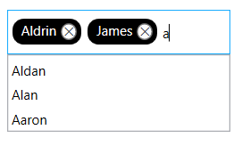
Customization of tokens using TokenItemTemplate
The TokenItemTemplate property allows you to customize the content displayed within a token when the MultiSelectMode is set to Token. This property accepts a DataTemplate and enables rendering custom content such as images, icons, and formatted text instead of the default token text representation.
The TokenItemTemplate property can also be used to maintain a consistent appearance between suggestion items and generated tokens by using the same DataTemplate for both AutoCompleteItemTemplate and TokenItemTemplate.
<Window.Resources>
    <DataTemplate x:Key="EmployeeTemplate">
        <StackPanel Orientation="Horizontal">
            <Image Width="20"
                Height="20"
                Source="{Binding Image}" />
            <StackPanel Orientation="Vertical">
                <TextBlock
                    Margin="4,2,4,0"
                    Text="{Binding Name}" />
                <TextBlock
                    Margin="4,1,2,2"
                    Text="{Binding Email}" />
            </StackPanel>
        </StackPanel>
    </DataTemplate>
</Window.Resources>

<editors:SfTextBoxExt x:Name="textBoxExt"
                      Width="250"
                      Height="30"
                      SearchItemPath="Name"
                      AutoCompleteMode="Suggest"
                      TokensWrapMode="Wrap"
                      EnableAutoSize="True"
                      AutoCompleteSource="{Binding Employees}"
                      TokenItemTemplate="{StaticResource EmployeeTemplate}"
                      AutoCompleteItemTemplate="{StaticResource EmployeeTemplate}"/>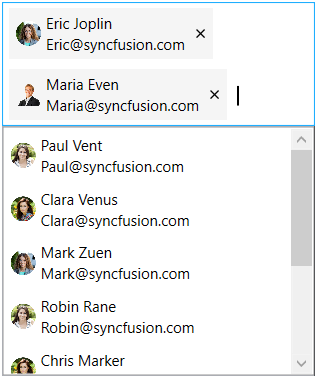
Customization of tokens using TokenItemContainerStyle
The TokenItemContainerStyle property allows you to customize the appearance and behavior of the generated token items without overriding the default TokenItem control template. Since TokenItem derives from ContentControl, you can customize various properties such as Background, Foreground, BorderThickness, BorderBrush, ContentTemplate, and ContentTemplateSelector to control the visual representation of tokens while retaining the default token structure and functionality.
<editors:SfTextBoxExt x:Name="textBoxExt"
                      Width="250"
                      Height="30"
                      SearchItemPath="Name"
                      AutoCompleteMode="Suggest"
                      TokensWrapMode="Wrap"
                      EnableAutoSize="True"
                      AutoCompleteSource="{Binding Employees}">
    <editors:SfTextBoxExt.TokenItemContainerStyle>
        <Style TargetType="editors:TokenItem">
                <Setter Property="Background" Value="LightCoral"/>
                <Setter Property="Foreground" Value="White"/>
        </Style>
    </editors:SfTextBoxExt.TokenItemContainerStyle>
</editors:SfTextBoxExt>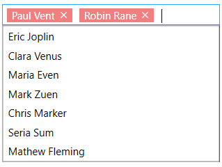
The
TokenItemTemplateproperty is applicable only whenMultiSelectModeis set toToken.
When displaying images using controls defined inside the
TokenItemTemplate, do not set theImageMemberPathproperty simultaneously. Use either the TokenItemTemplate or the ImageMemberPath property to display images in tokens.
Enable autosize in token mode
In token representation, when the Wrap mode is set, enabling the EnableAutoSize property re-renders the control height based on the number of lines the tokens are wrapped inside the control.
To use this feature, you need to set the MultiSelectMode as Token and the TokensWrapMode as Wrap. By default, this feature is disabled.
<editors:SfTextBoxExt HorizontalAlignment="Left"
                      AutoCompleteMode="Suggest"
                      SearchItemPath="Name"
                      MultiSelectMode="Token"
                      TokensWrapMode="Wrap"
                      EnableAutoSize="True"
                      AutoCompleteSource="{Binding Employees}"
                      VerticalAlignment="Center"
Width="200"/>textBoxExt.MultiSelectMode = MultiSelectMode.Token;
textBoxExt.TokensWrapMode = TokensWrapMode.Wrap;
textBoxExt.EnableAutoSize = true;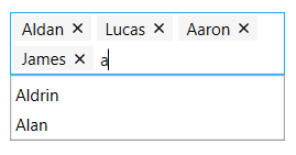
ShowClearButton
This feature allows you to show or hide the clear button in Token mode for the WPF AutoComplete control using the ShowClearButton property.
<editors:SfTextBoxExt
            x:Name="textBoxExt"
            Width="200"
            HorizontalAlignment="Center"
            VerticalAlignment="Center"
            AutoCompleteMode="Suggest"
            AutoCompleteSource="{Binding Employees}"
            MultiSelectMode="Token"
            SearchItemPath="Name"
ShowClearButton="True" />textBoxExt.ShowClearButton = true;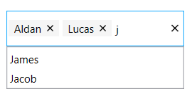
The default
ShowClearButtonproperty value is false. It is applicable only whenMultiSelectModeis set toToken.
See also Multiple selection using tokens topic in WPF AutoComplete.
Multiple selection using delimiter
In Delimiter mode, each item is separated by a character that is set to the Delimiter property. By default the items are separated by ,(Comma).
<editors:SfTextBoxExt HorizontalAlignment="Center"
                      VerticalAlignment="Center"
                      Width="300"
                      Height="40"
                      MultiSelectMode="Delimiter"
                      SearchItemPath="Name"
                      AutoCompleteMode="Suggest"
AutoCompleteSource="{Binding Employees}" />textBoxExt.MultiSelectMode = MultiSelectMode.Delimiter;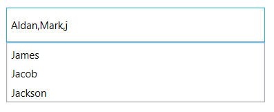
Setting and retrieving SelectedItem
The SelectedItem property is used to select a particular item from the suggestion list or to retrieve the item that is selected. The SelectedItem property can be used in single selection where the MultiSelectMode as None. For multi-selection where the MultiSelectMode is set either as Token or Delimiter the selected items can be set or retrieved using the SelectedItems property.
The SelectedItem and SelectedItems contains the object of the custom data and using the
SearchItemPath property the value displayed in the text field can be retrieved.
Model Class:
public class Employee
{
        string name;
        string email;

        public string Name
        {
            get { return name; }
            set { name = value; }
        }

        public string Email
        {
            get { return email; }
            set { email = value; }
        }
}
In the EmployeeViewModel class, the SelectedItem property is updated initially from the Employees collection.
public class EmployeeViewModel
{
        private List<Employee> employees;
        public List<Employee> Employees
        {
            get { return employees; }

            set { employees = value; }
        }

        private object selectedItem;
        public object SelectedItem
        {
            get { return selectedItem; }

            set { selectedItem = value; }
        }

        public EmployeeViewModel()
        {
            Employees = new List<Employee>();
            Employees.Add(new Employee() { Name = "Eric", Email = "[email protected]" });
            Employees.Add(new Employee() { Name = "James", Email = "[email protected]" });
            Employees.Add(new Employee() { Name = "Jacob", Email = "[email protected]" });
            Employees.Add(new Employee() { Name = "Jackson", Email = "[email protected]" });
            Employees.Add(new Employee() { Name = "Lucas", Email = "[email protected]" });
            SelectedItem = Employees[0];
        }
}<editors:SfTextBoxExt HorizontalAlignment="Center"
x:Name="autoComplete"
MaxDropDownHeight="100"
MultiSelectMode="None"
AutoCompleteMode="Suggest"
SearchItemPath="Name"
SelectedItem="{Binding SelectedItem}"
AutoCompleteSource="{Binding Employees}"
VerticalAlignment="Center"
Height="40"
Width="200"/>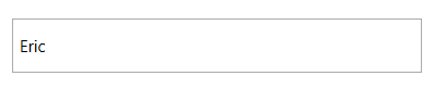
private void TextBoxExt_SelectedItemChanged(DependencyObject d, DependencyPropertyChangedEventArgs e)
{
         SfTextBoxExt textBoxExt = d as SfTextBoxExt;
         string selectedItem = "";
         if (textBoxExt.SelectedItem != null)
         {
            selectedItem =((textBoxExt.SelectedItem as Employee).Name).ToString();
         }

         MessageBox.Show(selectedItem, "SelectedItem", MessageBoxButton.OK, MessageBoxImage.None);
}
Model Class:
public class Employee
{
        string name;
        string email;

        public string Name
        {
            get { return name; }
            set { name = value; }
        }

        public string Email
        {
            get { return email; }
            set { email = value; }
        }
}
In EmployeeViewModel class the SelectedItems updated initially from the Employees collection.
public class EmployeeViewModel
{
        private List<Employee> employees;
        public List<Employee> Employees
        {
            get { return employees; }

            set { employees = value; }
        }

        private ObservableCollection<object> selectedItems;
        public ObservableCollection<object> SelectedItems
        {
            get { return selectedItems; }

            set { selectedItems = value; }
        }

        public EmployeeViewModel()
        {
            Employees = new List<Employee>();
            SelectedItems = new ObservableCollection<object>();
            Employees.Add(new Employee() { Name = "Eric", Email = "[email protected]" });
            Employees.Add(new Employee() { Name = "James", Email = "[email protected]" });
            Employees.Add(new Employee() { Name = "Jacob", Email = "[email protected]" });
            Employees.Add(new Employee() { Name = "Jackson", Email = "[email protected]" });
            Employees.Add(new Employee() { Name = "Lucas", Email = "[email protected]" });
            SelectedItems.Add(Employees[2]);
            SelectedItems.Add(Employees[0]);
            SelectedItems.Add(Employees[1]);
        }
}<editors:SfTextBoxExt HorizontalAlignment="Center"
x:Name="autoComplete"
MaxDropDownHeight="100"
MultiSelectMode="Token"
AutoCompleteMode="Suggest"
SearchItemPath="Name"
SelectedItems="{Binding SelectedItems}"
AutoCompleteSource="{Binding Employees}"
VerticalAlignment="Center"
Height="40"
Width="200"/>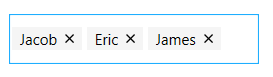
Retrieving SelectedValue
The SelectedValue property is used to retrieve the selected values from the suggestion list. We have to set the ValueMemberPath property when using custom data for the value we want to retrieve from SelectedValue based on the SelectedItem object.
<editors:SfTextBoxExt HorizontalAlignment="Left"
                      x:Name="autoComplete"
                      MaxDropDownHeight="100"
                      MultiSelectMode="None"
                      AutoCompleteMode="Suggest"
                      SearchItemPath="Name"
                      ValueMemberPath="Email"
                      AutoCompleteSource="{Binding Employees}"
                      VerticalAlignment="Center"
                      SelectedItemChanged="AutoComplete_SelectedItemChanged"
                      Height="40"
                      Width="200"/>
private void AutoComplete_SelectedItemChanged(DependencyObject d, DependencyPropertyChangedEventArgs e)
{
SfTextBoxExt textBoxExt = d as SfTextBoxExt;
if (textBoxExt.SelectedValue != null)
{
MessageBox.Show(textBoxExt.SelectedValue.ToString(), "SelectedValue", MessageBoxButton.OK, MessageBoxImage.None);
}
}Retrieving SuggestionIndex
When an item is selected from suggestion list, their index can be retrieved using the SuggestionIndex property.
<editors:SfTextBoxExt HorizontalAlignment="Left"
                      x:Name="autoComplete"
                      MaxDropDownHeight="100"
                      MultiSelectMode="None"
                      AutoCompleteMode="Suggest"
                      SearchItemPath="Name"
                      ValueMemberPath="Email"
                      AutoCompleteSource="{Binding Employees}"
                      VerticalAlignment="Center"
                      SelectedItemChanged="AutoComplete_SelectedItemChanged"
                      Height="40"
                      Width="200"/>
private void AutoComplete_SelectedItemChanged(DependencyObject d, DependencyPropertyChangedEventArgs e)
{
string suggestionIndex = "";
suggestionIndex = ((d as SfTextBoxExt).SuggestionIndex).ToString();
MessageBoxResult messageBoxResult = MessageBox.Show(suggestionIndex, "SuggestionIndex");
}Displaying images
This feature allows to provide the path for the image to be displayed in the text box control using the ImageMemberPath property.
This feature is applicable only for MultiSelectMode with Token mode.
For further details, refer to Showing image in token and dropdown.
View sample in GitHub