Getting Started with WinUI Calendar Date Picker
19 Oct 202216 minutes to read
This section explains the steps required to add the WinUI Calendar Date Picker control and its date selection options. This section covers only basic features needed to get started with Syncfusion Calendar Date Picker control.
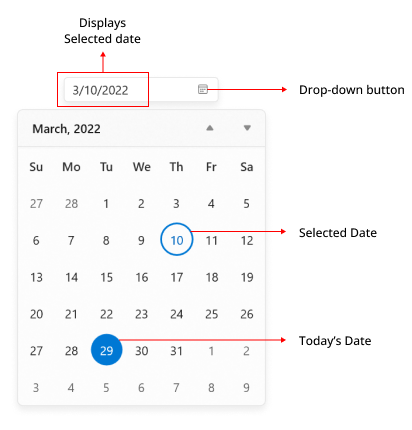
Structure of Calendar Date Picker control
Creating an application with WinUI Calendar Date Picker
- Create a WinUI 3 desktop app for C# and .NET 5.
- Add reference to Syncfusion.Calendar.WinUI NuGet.
- Import the control namespace
Syncfusion.UI.Xaml.Calendarin XAML or C# code. -
Initialize the
SfCalendarDatePickercontrol.<Window x:Class="GettingStarted.MainWindow" xmlns="http://schemas.microsoft.com/winfx/2006/xaml/presentation" xmlns:x="http://schemas.microsoft.com/winfx/2006/xaml" xmlns:local="using:GettingStarted" xmlns:d="http://schemas.microsoft.com/expression/blend/2008" xmlns:mc="http://schemas.openxmlformats.org/markup-compatibility/2006" xmlns:calendar="using:Syncfusion.UI.Xaml.Calendar" mc:Ignorable="d"> <Grid Name="grid"> <!--Adding Calendar Date Picker control --> <calendar:SfCalendarDatePicker Name="sfCalendarDatePicker"/> </Grid> </Window>using Syncfusion.UI.Xaml.Calendar; namespace GettingStarted { /// <summary> /// An empty page that can be used on its own or navigated to within a Frame. /// </summary> public sealed partial class MainWindow : Window { public MainWindow() { this.InitializeComponent(); // Creating an instance of the Calendar control SfCalendarDatePicker sfCalendarDatePicker = new SfCalendarDatePicker(); this.Content = sfCalendarDatePicker; } } }

NOTE
Download demo application from GitHub.
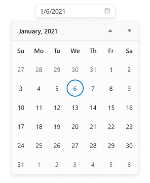
Select the date programmatically
You can set or change the selected date programmatically by using the SelectedDate property. If no value is assigned to the SelectedDate property, Calendar Date Picker will automatically assign the current system date as the SelectedDate.
SfCalendarDatePicker sfCalendarDatePicker= new SfCalendarDatePicker();
sfCalendarDatePicker.SelectedDate = new DateTimeOffset(new DateTime(2021, 01, 06));
NOTE
Download demo application from GitHub.
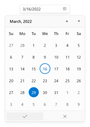
Select date interactively
You can change the selected date interactively by entering the date value using keyboard or selecting from the drop-down calendar menu. You can also get the selected date from the SelectedDate property.
<calendar:SfCalendarDatePicker Name="sfCalendarDatePicker" />SfCalendarDatePicker sfCalendarDatePicker= new SfCalendarDatePicker();
NOTE
Download demo application from GitHub.
Setting null value
If you want to set null value for the Calendar Date Picker, set the AllowNull property as true and set SelectedDate property as null. If AllowNull property is false, then the current system date is updated in SelectedDate property and displayed instead of null.
<calendar:SfCalendarDatePicker Name="sfCalendarDatePicker"
                               SelectedDate="{x:Null}"
                               AllowNull="True"
                                />
SfCalendarDatePicker sfCalendarDatePicker= new SfCalendarDatePicker();
sfCalendarDatePicker.SelectedDate = null;
sfCalendarDatePicker.AllowNull = true;

NOTE
Download demo application from GitHub.
Header and description
This section explains about header and description properties of CalendarDatePicker.
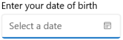
Header
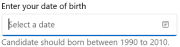
The Header property is used to display the title for the CalendarDatePicker Control.
<editors:SfCalendarDatePicker x:Name="CalendarDatePicker"
                              Header="Enter your date of birth"
                              Width="180"
                              Height="60" />
SfCalendarDatePicker calendarDatePicker = new SfCalendarDatePicker();
calendarDatePicker.Header = "Enter your date of birth";
Header customization
By using the controls HeaderTemplate property, you can customize the appearance of controls’ header. The following code sample shows how to use a header template to customize the header.
<editors:SfCalendarDatePicker Width="180" Height="75" >
<editors:SfCalendarDatePicker.HeaderTemplate>
<DataTemplate>
<StackPanel Orientation="Horizontal">
<FontIcon FontFamily="Segoe MDL2 Assets" Glyph=""/>
<TextBlock Text="Birthday Date" FontSize="14" Margin="5"/>
</StackPanel>
</DataTemplate>
</editors:SfCalendarDatePicker.HeaderTemplate>
</editors:SfCalendarDatePicker>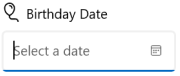
Description
The Description support is used to display the content beneath the control as well as to provide guidance on the input that the control expects.
<editors:SfCalendarDatePicker x:Name="CalendarDatePicker"
                              Header="Enter your date of birth"
                              Width="300"
                              Height="80"
                              Description="Candidate should born between 1990 to 2010."
                              />
SfCalendarDatePicker calendarDatePicker = new SfCalendarDatePicker();
calendarDatePicker.Description = "Candidate should born between 1990 to 2010.";
Setting watermark text
You can prompt the user with some information by using the PlaceholderText property. This will be displayed only when the Calendar Date Picker contains the SelectedDate property as null and AllowNull property as true. If AllowNull property is false, then the current system date is updated in SelectedDate property and displayed instead of PlaceholderText.
<calendar:SfCalendarDatePicker Name="sfCalendarDatePicker"
                               PlaceholderText="Select the Date"
                               SelectedDate="{x:Null}"
                               AllowNull="True"
                                />
SfCalendarDatePicker sfCalendarDatePicker= new SfCalendarDatePicker();
sfCalendarDatePicker.PlaceholderText = "Select the Date";
sfCalendarDatePicker.SelectedDate = null;
sfCalendarDatePicker.AllowNull = true;

NOTE
Download demo application from GitHub
Selection changed notification
You will be notified when selected date is changed in Calendar Date Picker by using the SelectedDateChanged event. The SelectedDateChanged event contains the old and newly selected date in the OldDate and NewDate properties.
-
OldDate- Gets a date, which is previously selected. -
NewDate- Gets a date, which is currently selected.
<calendar:SfCalendarDatePicker Name="sfCalendarDatePicker"
                               SelectedDateChanged="SfCalendarDatePicker_SelectedDateChanged"
                               />
SfCalendarDatePicker sfCalendarDatePicker = new SfCalendarDatePicker();
sfCalendarDatePicker.SelectedDateChanged += SfCalendarDatePicker_SelectedDateChanged;
You can handle the event as follows:
private void SfCalendarDatePicker_SelectedDateChanged(object sender, SelectedDateChangedEventArgs e)
{
    var oldDate = e.OldDate;
    var newDate = e.NewDate;
}
Edit date using free form editing
Since, the default value of EditMode property is Mask, each input numbers entered in editor are automatically validated with the DisplayDateFormat’s formats and the proper value is assigned in current field. Then, focus will move to next input field of the date format.
If you want to perform the validation after the user completely entered their date inputs, set the EditMode property value as Normal. Then, the entered date value is validated with the DisplayDateFormat property value by pressing the Enter key or lost focus. If the entered value does not suit the DisplayDateFormat property, the previously selected date value is set to the SelectedDate property.
<calendar:SfCalendarDatePicker x:Name="sfCalendarDatePicker"
                               EditMode="Normal"
                               />
SfCalendarDatePicker sfCalendarDatePicker = new SfCalendarDatePicker();
sfCalendarDatePicker.EditMode = DateTimeEditMode.Normal;

NOTE
Download demo application from GitHub.
Cancel a date that is being changed
The SelectedDateChanging event will be triggered as soon as a date is selected but before the SelectedDate property is updated. If the change is considered invalid, it can be canceled. The SelectedDateChanging event contains the following properties:
-
OldDate- Gets a date, which is previously selected. -
NewDate- Gets a date, which is currently selected. -
Cancel- Gets or sets whether to cancel the selected date value update.
Users are restricted to select a blackout date from a drop-down menu, but you can provide text input by the editor. Because selecting a blackout date leads to crash, you can cancel the change using the SelectedDateChanging event.
NOTE
SelectedDateChangingevent is called before theSelectedDateChangedevent, when a date is selected.
<calendar:SfCalendarDatePicker Height="30" Width="250"
                               x:Name="SfCalendarDatePicker"
                               SelectedDateChanging="SfCalendarDatePicker_DateChanging" />
SfCalendarDatePicker sfCalendarDatePicker = new SfCalendarDatePicker();
sfCalendarDatePicker.SelectedDateChanging += SfCalendarDatePicker_DateChanging;
You can handle the event as follows:
private void SfCalendarDatePicker_DateChanging(object sender, Syncfusion.UI.Xaml.Editors.DateChangingEventArgs e)
{
    var OldDate = e.OldDate;
    var NewDate = e.NewDate;

    //Cancel Selected date update
    e.Cancel = true;
}
Hide the drop-down button
You can hide the drop-down button in Calendar Date Picker by setting the ShowDropDownButton property value as false. The default value of ShowDropDownButton property is true.
NOTE
When the drop-down button is hidden, you can still open the drop-down calendar using ALT + DownArrow keyboard shortcut.
<calendar:SfCalendarDatePicker
                               x:Name="sfCalendarDatePicker"
                               ShowDropDownButton="False"  />
SfCalendarDatePicker sfCalendarDatePicker = new SfCalendarDatePicker();
sfCalendarDatePicker.ShowDropDownButton = false;

NOTE
Download demo application from GitHub.
Show submit button
If you want to select the date from drop-down calendar only by clicking the Ok button, use the ShowSubmitButtons property value as true. The default value of ShowSubmitButtons property is false.
NOTE
When the submit buttons are hidden,
SelectedDateproperty will be updated as soon you choose start and end date from the drop-down.
<calendar:SfCalendarDatePicker
                               x:Name="sfCalendarDatePicker"
                               ShowSubmitButtons="true" />
SfCalendarDatePicker sfCalendarDatePicker = new SfCalendarDatePicker();
sfCalendarDatePicker.ShowSubmitButtons = true;
NOTE
Download demo application from GitHub.
Restrict selection
You can restrict users from:
- Selecting a date within a specific minimum and maximum range using
MinDateandMaxDateproperties. - Selecting a date from blocked dates using
BlackoutDatesproperty. - Selecting a date from specifically blocked set of dates (example : blocking weekend dates) using
ItemPreparedevent.
For further details, refer Date Selection and Restriction.
Navigation between views
- You can navigate between month, year, decade, and century views in
Calendar Date Pickercontrol. - You can also restrict the users to navigate between specific views only (month and year selection for credit card) using
MinDisplayModeandMaxDisplayModeproperties.

For further details, refer Navigation.