UI customization in WinUI Calendar Date Picker (SfCalendarDatePicker)
19 Oct 202224 minutes to read
This section describes how to select a date from drop-down calendar and the customization options in the SfCalendarDatePicker control.
Hide clear button in textbox
By default, the clear button X will be displayed in the textbox of the SfCalendarDatePicker control, which can be used to clear the entered input. You can hide the clear button in the Calendar Date Picker control using the ShowClearButton property. The default value of ShowClearButton property value is true.
<calendar:SfCalendarDatePicker x:Name="sfCalendarDatePicker"
                               ShowClearButton="False">
</calendar:SfCalendarDatePicker>
SfCalendarDatePicker sfCalendarDatePicker = new SfCalendarDatePicker();
sfCalendarDatePicker.ShowClearButton = false;


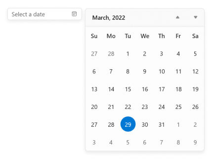
Change drop-down alignment
You can change the alignment of the drop-down calendar as full, center, left, right, top, or bottom edge by using the DropDownPlacement property. The default value of DropDownPlacement property is Auto.
NOTE
If you change the drop-down alignment by using the
DropDownPlacementproperty and there is not sufficient space, thenCalendar Date Pickersmartly shifts the drop-down calendar alignment.
<calendar:SfCalendarDatePicker x:Name="sfCalendarDatePicker"
                               DropDownPlacement="Right">
</calendar:SfCalendarDatePicker>
SfCalendarDatePicker sfCalendarDatePicker = new SfCalendarDatePicker();
sfCalendarDatePicker.DropDownPlacement = FlyoutPlacementMode.Right;
NOTE
Download demo application from GitHub.
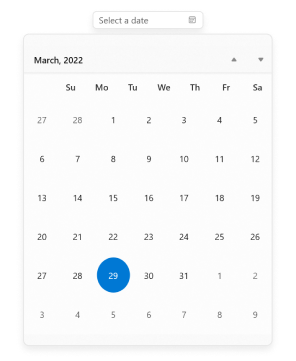
Change drop-down size
You can change the size of drop-down calendar by using DropDownWidth and DropDownHeight properties. The default value of DropDownHeight and DropDownWidth properties is NaN.
<calendar:SfCalendarDatePicker x:Name="sfCalendarDatePicker"
                               DropDownWidth="400"
                               DropDownHeight="500">
</calendar:SfCalendarDatePicker>
SfCalendarDatePicker sfCalendarDatePicker = new SfCalendarDatePicker();
sfCalendarDatePicker.DropDownWidth = 400;
sfCalendarDatePicker.DropDownHeight = 500;
NOTE
Download demo application from GitHub.
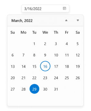
Hide days that is out of scope
You can hide the days that are out of scope of the current view in the drop-down calendar by setting the OutOfScopeVisibility property value as Hidden. The default value of OutOfScopeVisibility property is set to Enabled.
<calendar:SfCalendarDatePicker x:Name="sfCalendarDatePicker"
                               OutOfScopeVisibility="Hidden">
</calendar:SfCalendarDatePicker>
SfCalendarDatePicker sfCalendarDatePicker = new SfCalendarDatePicker();
sfCalendarDatePicker.OutOfScopeVisibility = OutOfScopeVisibility.Hidden;
NOTE
Download demo application from GitHub.
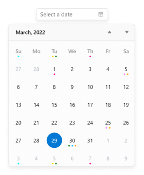
Customize individual items in calendar
You can change the UI of specific cells in the Calendar Date Picker drop-down calendar by using the AttachedFlyout and DropDownFlyout properties.
-
Create a EventDataConverter class and set the special dates for specific events.
public class EventDataConverter : IValueConverter { Dictionary<DateTimeOffset, string> SpecialDates; public EventDataConverter() { SpecialDates = new Dictionary<DateTimeOffset, string>(); SpecialDates.Add(DateTimeOffset.Now.AddMonths(-1).AddDays(1), "SingleEvent_1"); SpecialDates.Add(DateTimeOffset.Now.AddMonths(-1).AddDays(5), "DoubleEvent_1"); SpecialDates.Add(DateTimeOffset.Now.AddMonths(-1).AddDays(-2), "TripleEvent_2"); SpecialDates.Add(DateTimeOffset.Now.AddDays(1), "TripleEvent_1"); SpecialDates.Add(DateTimeOffset.Now.AddDays(5), "SingleEvent_2"); SpecialDates.Add(DateTimeOffset.Now.AddDays(7), "DoubleEvent_2"); SpecialDates.Add(DateTimeOffset.Now.AddDays(9), "SingleEvent_1"); SpecialDates.Add(DateTimeOffset.Now.AddDays(12), "TripleEvent_2"); SpecialDates.Add(DateTimeOffset.Now.AddDays(-4), "DoubleEvent_1"); SpecialDates.Add(DateTimeOffset.Now.AddMonths(1).AddDays(1), "DoubleEvent_3"); SpecialDates.Add(DateTimeOffset.Now.AddMonths(1).AddDays(3), "SingleEvent_2"); SpecialDates.Add(DateTimeOffset.Now.AddMonths(1).AddDays(-5), "DoubleEvent_2"); } public object Convert(object value, Type targetType, object parameter, string language) { DateTimeOffset dateTimeOffset = SpecialDates.Keys.FirstOrDefault(x => x.Date == (DateTime)value); if (dateTimeOffset != DateTimeOffset.MinValue) { string template = SpecialDates[dateTimeOffset]; StackPanel stackPanel; switch (template) { case "SingleEvent_1": return new List<Brush>() { new SolidColorBrush(Colors.DeepPink) }; case "SingleEvent_2": return new List<Brush>() { new SolidColorBrush(Colors.Cyan) }; case "DoubleEvent_1": return new List<Brush>() { new SolidColorBrush(Colors.Violet), new SolidColorBrush(Colors.Orange) }; case "DoubleEvent_2": return new List<Brush>() { new SolidColorBrush(Colors.Gold), new SolidColorBrush(Colors.Green) }; case "DoubleEvent_3": return new List<Brush>() { new SolidColorBrush(Colors.Brown), new SolidColorBrush(Colors.Blue) }; case "TripleEvent_1": return new List<Brush>() { new SolidColorBrush(Colors.Green), new SolidColorBrush(Colors.DeepSkyBlue), new SolidColorBrush(Colors.Orange) }; case "TripleEvent_2": return new List<Brush>() { new SolidColorBrush(Colors.Red), new SolidColorBrush(Colors.Green), new SolidColorBrush(Colors.Gold) }; } } return null; } public object ConvertBack(object value, Type targetType, object parameter, string language) { return null; } } -
Create a DataTemplate to customize the date cells of calendar. Now, add the
Calendarcontrol inside theFlyoutBase.AttachedFlyoutproperty andDropDownFlyoutcontrol.<Grid> <Grid.Resources> <local:EventDataConverter x:Key="EventDataConverterKey" /> <DataTemplate x:Key="customTemplate"> <ItemsControl ItemsSource="{Binding Path=Date, Converter={StaticResource EventDataConverterKey}}"> <ItemsControl.ItemTemplate> <DataTemplate > <Ellipse MinHeight="4" MinWidth="4" Margin="2" Fill="{Binding}"/> </DataTemplate> </ItemsControl.ItemTemplate> <ItemsControl.ItemsPanel> <ItemsPanelTemplate> <StackPanel Orientation="Horizontal"/> </ItemsPanelTemplate> </ItemsControl.ItemsPanel> </ItemsControl> </DataTemplate> </Grid.Resources> <calendar:SfCalendarDatePicker x:Name="calendarDatePicker" MinWidth="180" HorizontalAlignment="Center" VerticalAlignment="Top"> <FlyoutBase.AttachedFlyout> <editors:DropDownFlyout> <calendar:SfCalendar SelectedDate="{x:Bind calendarDatePicker.SelectedDate, Mode=TwoWay}" > <calendar:SfCalendar.Resources> <ResourceDictionary> <!-- Resources and color keys for Calendar Control --> <SolidColorBrush x:Key="SyncfusionCalendarItemOutOfScopeForeground" Color="SlateGray" Opacity="0.5" /> <SolidColorBrush x:Key="SyncfusionCalendarWeekItemForeground" Color="{ThemeResource SystemBaseMediumLowColor}" /> <x:Double x:Key="SyncfusionSubtitleAltFontSize">16</x:Double> <Thickness x:Key="SyncfusionCalendarItemMargin">1</Thickness> <x:Double x:Key="SyncfusionBodyFontSize">13</x:Double> <Style TargetType="calendar:CalendarItem"> <Setter Property="CornerRadius" Value="14"/> <Setter Property="HorizontalContentAlignment" Value="Stretch"/> <Setter Property="VerticalContentAlignment" Value="Stretch"/> <Setter Property="ContentTemplate"> <Setter.Value> <DataTemplate> <Grid MinWidth="40" MinHeight="40"> <ContentControl HorizontalAlignment="Center" VerticalAlignment="Center" Margin="2" Content="{Binding DisplayText}"/> <ContentControl Margin="3" HorizontalAlignment="Center" VerticalAlignment="Bottom" Content="{Binding Date}" ContentTemplate="{StaticResource customTemplate}" /> </Grid> </DataTemplate> </Setter.Value> </Setter> </Style> </ResourceDictionary> </calendar:SfCalendar.Resources> </calendar:SfCalendar> </editors:DropDownFlyout> </FlyoutBase.AttachedFlyout> </calendar:SfCalendarDatePicker> </Grid>
NOTE
Download demo application from GitHub.
Customize using theme keys
You can customize the colors of day names and headers of month, year, decade, and century by changing the theme keys values in a ResourceDictionary used in the Calendar control and by using the AttachedFlyout and DropDownFlyout properties.
| Name of the key | Description |
|---|---|
| SyncfusionCalendarNavigationButtonForeground | Key to change the color of calendar navigation button foreground color. |
| SyncfusionCalendarWeekItemForeground | Key to change the color of calendar week days name foreground color. |
| SyncfusionCalendarTodayItemForeground | Key to change the color of calendar today date foreground color. |
| SyncfusionCalendarItemBackground | Key to change the color of calendar date cells background color except today date cell. |
| SyncfusionCalendarItemBorderBrush | Key to change the color of calendar date cells border brush. |
| SyncfusionCalendarTodayItemBackground | Key to change the color of calendar today date cell background color |
| SyncfusionCalendarTodayItemBorderBrush | Key to change the color of calendar today date cell border brush. |
| SyncfusionCalendarItemOutOfScopeForeground | Key to change the color of calendar date cells foreground color which are out of scope. |
| SyncfusionCalendarItemMargin | Key to change the margin of calendar item. |
| SyncfusionSubtitleAltFontSize | Key to change the font size of calendar header region. |
| SyncfusionBodyFontSize | Key to change the font size of calendar items region. |
<calendar:SfCalendarDatePicker
                        x:Name="calendarDatePicker"
                        MinWidth="180"
                        HorizontalAlignment="Center"
                        VerticalAlignment="Top">
        <FlyoutBase.AttachedFlyout>
            <editors:DropDownFlyout>
                <calendar:SfCalendar SelectedDate="{x:Bind calendarDatePicker.SelectedDate, Mode=TwoWay}" >
                <calendar:SfCalendar.Resources>
                    <ResourceDictionary>
                        <SolidColorBrush x:Key="SyncfusionCalendarNavigationButtonForeground"
                                                     Color="#FF248D92" />
                        <SolidColorBrush x:Key="SyncfusionCalendarWeekItemForeground"
                                                     Color="#FF248D92" />
                        <SolidColorBrush x:Key="SyncfusionCalendarTodayItemForeground"
                                                     Color="{ThemeResource SystemBaseHighColor}" />
                        <SolidColorBrush x:Key="SyncfusionCalendarItemBackground"
                                                     Color="{ThemeResource SystemListLowColor}" />
                        <SolidColorBrush x:Key="SyncfusionCalendarItemBorderBrush"
                                                     Color="{ThemeResource SystemListLowColor}"/>
                        <SolidColorBrush x:Key="SyncfusionCalendarTodayItemBackground"
                                                     Color="#FF9BC5ED" />
                        <SolidColorBrush x:Key="SyncfusionCalendarTodayItemBorderBrush"
                                                     Color="#FF9BC5ED" />
                        <SolidColorBrush x:Key="SyncfusionCalendarItemOutOfScopeForeground"
                                                     Color="SlateGray " Opacity="0.5" />
                        <Thickness x:Key="SyncfusionCalendarItemMargin">1</Thickness>
                        <x:Double x:Key="SyncfusionBodyFontSize">13</x:Double>
                        <FontFamily x:Key="SyncfusionControlThemeFontFamily">SimSun</FontFamily>
                        <x:Double x:Key="SyncfusionSubtitleAltFontSize">16</x:Double>
                        <Style TargetType="calendar:CalendarItem">
                            <Setter Property="CornerRadius" Value="5"/>
                            <Setter Property="HorizontalContentAlignment" Value="Stretch"/>
                            <Setter Property="VerticalContentAlignment" Value="Stretch"/>
                            <Setter Property="ContentTemplate">
                                <Setter.Value>
                                    <DataTemplate>
                                        <Grid MinWidth="40" MinHeight="40">
                                            <ContentControl
                                                            HorizontalAlignment="Center"
                                                            VerticalAlignment="Center"
                                                            Margin="3"
                                                            Content="{Binding DisplayText}"/>
                                        </Grid>
                                    </DataTemplate>
                                </Setter.Value>
                            </Setter>
                        </Style>
                    </ResourceDictionary>
                </calendar:SfCalendar.Resources>
            </calendar:SfCalendar>
        </editor:DropDownFlyout>
    </FlyoutBase.AttachedFlyout>
</calendar:SfCalendarDatePicker>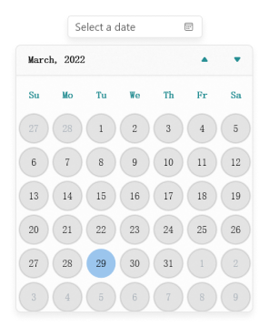
NOTE
Download demo application from GitHub.