Date selection in WinUI Calendar Date Picker (SfCalendarDatePicker)
31 May 20229 minutes to read
This section explains about the date selection in WinUI Calendar Date Picker control and how to restrict or limit the users to select date within a range.
Select the date
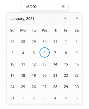
You can set or change the selected date programmatically by using SelectedDate property. By default, SelectedDate property value is null.
SfCalendarDatePicker sfCalendarDatePicker= new SfCalendarDatePicker();
sfCalendarDatePicker.SelectedDate = new DateTimeOffset(new DateTime(2021, 01, 06));
NOTE
Download demo application from GitHub.
You can also change the selected date interactively by selecting a date from the drop-down calendar or by entering the date value in editor of Calendar Date Picker. You can get the selected date from the SelectedDate property.

Limit available dates
You can restrict the users from selecting a date within the particular range by specifying MinDate and MaxDate properties. The default value of MinDate property is 1/1/1920 and MaxDate property is 12/31/2120.
NOTE
Dates that appears outside the minimum and maximum date range will be disabled (blackout).
<calendar:Calendar x:Name="sfCalendarDatePicker"/>SfCalendarDatePicker sfCalendarDatePicker = new SfCalendarDatePicker();
sfCalendarDatePicker.MinDate = new DateTimeOffset(new DateTime(2021, 01, 5));
sfCalendarDatePicker.MaxDate = new DateTimeOffset(new DateTime(2021, 01, 24));
NOTE
When
MinDisplayModeproperty value is set to Year andMinDatevalue is set to 15/01/2021, selecting the month of the minimum date will set the starting date value from the minimum date, i.e., from January 15, 2021.
NOTE
The
MinDateproperty value should not be greater than theMaxDateproperty value.
NOTE
Download demo application from GitHub.
Block dates using BlackoutDates
You can block particular dates from the date selection by adding respective dates in the BlackoutDates collection property. The default value of BlackoutDates property is null.
public class ViewModel
{
    public DateTimeOffsetCollection BlockedDates { get; set; }
    public ViewModel()
    {
        BlockedDates = new DateTimeOffsetCollection();
        BlockedDates.Add(new DateTimeOffset(new DateTime(2021, 1, 17)));
        BlockedDates.Add(new DateTimeOffset(new DateTime(2021, 1, 4)));
        BlockedDates.Add(new DateTimeOffset(new DateTime(2021, 2, 5)));
        BlockedDates.Add(new DateTimeOffset(new DateTime(2021, 2, 6)));
        BlockedDates.Add(new DateTimeOffset(new DateTime(2021, 1, 9)));
        BlockedDates.Add(new DateTimeOffset(new DateTime(2021, 3, 11)));
        BlockedDates.Add(new DateTimeOffset(new DateTime(2021, 1, 13)));
        BlockedDates.Add(new DateTimeOffset(new DateTime(2021, 4, 14)));
        BlockedDates.Add(new DateTimeOffset(new DateTime(2021, 1, 18)));
        BlockedDates.Add(new DateTimeOffset(new DateTime(2021, 5, 19)));
        BlockedDates.Add(new DateTimeOffset(new DateTime(2021, 1, 26)));
        BlockedDates.Add(new DateTimeOffset(new DateTime(2021, 6, 29)));
        BlockedDates.Add(new DateTimeOffset(new DateTime(2021, 1, 31)));
        BlockedDates.Add(new DateTimeOffset(new DateTime(2021, 1, 27)));
    }
}<calendar:SfCalendarDatePicker
x:Name="sfCalendarDatePicker"
BlackoutDates="{Binding BlockedDates}">
<calendar:SfCalendarDatePicker.DataContext>
<local:ViewModel/>
</calendar:SfCalendarDatePicker.DataContext>
</calendar:SfCalendarDatePicker>sfCalendarDatePicker.DataContext = new ViewModel();
sfCalendarDatePicker.BlackoutDates = (sfCalendarDatePicker.DataContext as ViewModel).BlockedDates;
NOTE
Download demo application from GitHub.
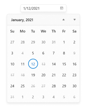
Disable dates dynamically (All weekend days)
You can prevent the users from selecting any dates or days (example: all weekend days) by handling the CalendarItemPrepared event and setting ItemInfo.IsBlackout property value as true for those specific dates.
NOTE
You can also change the text displayed for specific days or dates in the drop-down calendar by using the
ItemInfo.DisplayTextproperty.
<calendar:SfCalendarDatePicker x:Name="sfCalendarDatePicker"
                               CalendarItemPrepared="SfCalendarDatePicker_CalendarItemPrepared"/>
SfCalendarDatePicker sfCalendarDatePicker = new SfCalendarDatePicker();
sfCalendarDatePicker.CalendarItemPrepared += SfCalendarDatePicker_CalendarItemPrepared;
You can handle the event as follows:
private void SfCalendarDatePicker_CalendarItemPrepared(object sender, CalendarItemPreparedEventArgs e)
{
    //Block all weekend days
    if (e.ItemInfo.ItemType == CalendarItemType.Day &&
        (e.ItemInfo.Date.DayOfWeek == DayOfWeek.Saturday ||
        e.ItemInfo.Date.DayOfWeek == DayOfWeek.Sunday))
    {
        e.ItemInfo.IsBlackout = true;
    }
}
NOTE
Download demo application. from GitHub
You can also change the text displayed for specific days or dates in Calendar Date Picker using the ItemInfo.DisplayText property.
private void SfCalendarDatePicker_CalendarItemPrepared(object sender, CalendarItemPreparedEventArgs e)
{
//Block all weekend days
if (e.ItemInfo.ItemType == CalendarItemType.Day &&
(e.ItemInfo.Date.DayOfWeek == DayOfWeek.Saturday ||
e.ItemInfo.Date.DayOfWeek == DayOfWeek.Sunday))
{
e.ItemInfo.IsBlackout = true;
e.ItemInfo.DisplayText = "X";
}
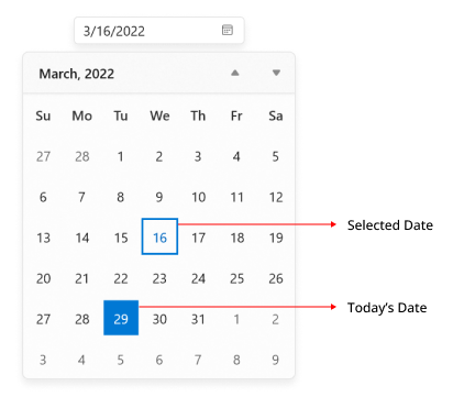
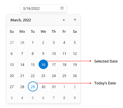
}Highlight today and selected dates
You can highlight the today and selected date in the drop-down calendar using the SelectionHighlightMode property to update the background and border of the dates. The default value of SelectionHighlightMode property is Outline. The default value of SelectionHighlightMode property is Outline.
<calendar:SfCalendarDatePicker x:Name="sfCalendarDatePicker"
                               SelectionHighlightMode="Filled" />
SfCalendarDatePicker sfCalendarDatePicker = new SfCalendarDatePicker();
sfCalendarDatePicker.SelectionHighlightMode = SelectionHighlightMode.Filled;
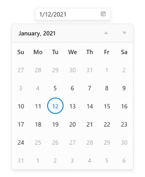
Change shape of today and selected date
You can customize the today and selected date cell shape in dropdown calendar using SelectionShape property to customize the shape of date cells border. The default value of SelectionShape property is Circle.
<calendar:SfCalendarDatePicker
                     x:Name="sfCalendarDatePicker"
                     SelectionShape="Rectangle" />
SfCalendarDatePicker sfCalendarDatePicker = new SfCalendarDatePicker();
sfCalendarDatePicker.SelectionShape = SelectionShape.Rectangle;