Getting Started with UWP Tab Control
18 Nov 201812 minutes to read
This section explains how to create a high level tab navigation using UWP Tab Control control.
Assembly deployment
Refer to the control dependencies section to get the list of assemblies or NuGet package that needs to be added as a reference to use the UWP Tab Control in any application.
You can refer this documentation to find more details about installing the NuGet package in a UWP application.
Creating Application with UWP Tab Control
In this walk through, user will create a UWP application that contains UWP Tab Control.
- Creating project
- Adding control via designer
- Adding control manually in XAML
- Adding control manually in C#
Creating project
Below section provides detailed information to create new project in Visual Studio to display UWP Tab Control.
Adding control via designer
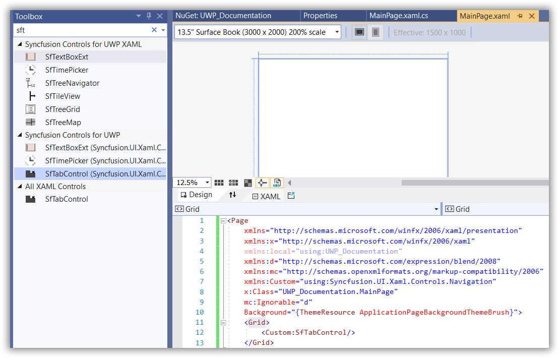
The UWP Tab Control can be added to the application by dragging it from Toolbox and dropping it in designer. The required assembles will be added automatically.
Adding control manually in XAML
In order to add UWP Tab Control manually in XAML, do the below steps,
-
Add the below required assembly references to the project,
- Syncfusion.SfTabControl.UWP
- Syncfusion.SfShared.UWP
-
Include the namespace for Syncfusion.SfTabControl.UWP assembly in MainPage.XAML.
<Page xmlns="http://schemas.microsoft.com/winfx/2006/xaml/presentation"

xmlns:x="http://schemas.microsoft.com/winfx/2006/xaml"

xmlns:syncfusion="using:Syncfusion.UI.Xaml.Controls.Navigation">- Now add the UWP Tab Control in MainPage.XAML.
<Grid>
    <syncfusion:SfTabControl>
        <syncfusion:SfTabItem Header="MainPage"/>
        <syncfusion:SfTabItem Header="App" />
        <syncfusion:SfTabItem Header="Properties" />
    </syncfusion:SfTabControl>
</Grid>
Adding control manually in C#
In order to add UWP Tab Control manually in C#, do the below steps,
-
Add the below required assembly references to the project,
- Syncfusion.SfTabControl.UWP
- Syncfusion.SfShared.UWP
-
Import UWP Tab Control namespace Syncfusion.UI.Xaml.Controls.Navigation.
-
Create UWP Tab Control instance and add it to the page.
SfTabControl sfTabControl1 = new SfTabControl();

SfTabItem tabitem1 = new SfTabItem() { Header = "MainPage" };
SfTabItem tabitem2 = new SfTabItem() { Header = "App" };
SfTabItem tabitem3 = new SfTabItem() { Header = "Properties" };

sfTabControl1.Items.Add(tabitem1);
sfTabControl1.Items.Add(tabitem2);
sfTabControl1.Items.Add(tabitem3);
Dim sfTabControl1 As SfTabControl = New SfTabControl()
Dim tabitem1 As SfTabItem = New SfTabItem() With {
.Header = "MainPage"
}
Dim tabitem2 As SfTabItem = New SfTabItem() With {
.Header = "App"
}
Dim tabitem3 As SfTabItem = New SfTabItem() With {
.Header = "Properties"
}
sfTabControl1.Items.Add(tabitem1)
sfTabControl1.Items.Add(tabitem2)
sfTabControl1.Items.Add(tabitem3)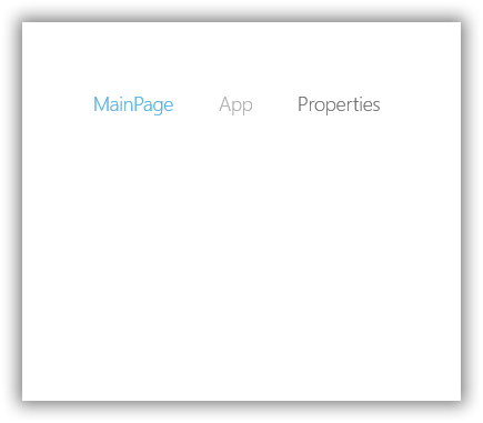
Adding items by DataBinding
In UWP Tab Control you can add tab items by ItemsSource in which each tab item must have property for Header and Content.
1.Define the properties required in Model class.
public class Person
{
    public string Name { get; set; }
    public string Image { get; set; }

    public Person(string name, string image)
    {
        Name = name;
        Image = image;
    }
}
Public Class Person
Public Property Name() As String
Public Property Image() As String
Public Sub New(ByVal name As String, ByVal image As String)
Me.Name = name
Me.Image = image
End Sub
End Class- Define and populate the collection in ViewModel class.
public class TabControlViewModel : NotificationObject
{
    public TabControlViewModel()
    {
	    TabControlItems = new ObservableCollection<Person>();
	    TabControlItems.Add(new Person("James", "Assets/1.jpg"));
        TabControlItems.Add(new Person("Peaches", "Assets/2.jpg"));
        TabControlItems.Add(new Person("Linda", "Assets/3.jpg"));
        TabControlItems.Add(new Person("Carl", "Assets/4.jpg"));
        TabControlItems.Add(new Person("Niko", "Assets/5.jpg"));
        TabControlItems.Add(new Person("Eric", "Assets/Employee2.png"));
        TabControlItems.Add(new Person("Paul", "Assets/Employee4.png"));
        TabControlItems.Add(new Person("Clara", "Assets/Employee6.png"));
        TabControlItems.Add(new Person("Maria", "Assets/Employee11.png"));
        TabControlItems.Add(new Person("Mark", "Assets/Employee13.png"));
        TabControlItems.Add(new Person("Robin", "Assets/Employee16.png"));
        TabControlItems.Add(new Person("Chris", "Assets/Employee21.png"));
        TabControlItems.Add(new Person("James", "Assets/Employee23.png"));
        TabControlItems.Add(new Person("Mathew", "Assets/Employee25.png"));
	}

    private ObservableCollection<Person> items;

    public ObservableCollection<Person> TabControlItems
	{
		get { return items; }
		set { items = value; }
    }
}
Public Class TabControlViewModel
Inherits NotificationObject
Public Sub New()
TabControlItems = New ObservableCollection(Of Person)()
TabControlItems.Add(New Person("James", "Assets/1.jpg"))
TabControlItems.Add(New Person("Peaches", "Assets/2.jpg"))
TabControlItems.Add(New Person("Linda", "Assets/3.jpg"))
TabControlItems.Add(New Person("Carl", "Assets/4.jpg"))
TabControlItems.Add(New Person("Niko", "Assets/5.jpg"))
TabControlItems.Add(New Person("Eric", "Assets/Employee2.png"))
TabControlItems.Add(New Person("Paul", "Assets/Employee4.png"))
TabControlItems.Add(New Person("Clara", "Assets/Employee6.png"))
TabControlItems.Add(New Person("Maria", "Assets/Employee11.png"))
TabControlItems.Add(New Person("Mark", "Assets/Employee13.png"))
TabControlItems.Add(New Person("Robin", "Assets/Employee16.png"))
TabControlItems.Add(New Person("Chris", "Assets/Employee21.png"))
TabControlItems.Add(New Person("James", "Assets/Employee23.png"))
TabControlItems.Add(New Person("Mathew", "Assets/Employee25.png"))
End Sub
Private items As ObservableCollection(Of Person)
Public Property TabControlItems As ObservableCollection(Of Person)
Get
Return items
End Get
Set(ByVal value As ObservableCollection(Of Person))
items = value
End Set
End Property
End Class- Add the TabControlViewModel in DataContext of MainPage and bind the the ItemSource property of UWP Tab Control with collection in TabControlViewModel. Bind the property from Model class which will be used as tab item header to DisplayMemberPath property.
- Content of tab items can be set using ContentTemplate property.
<Page.DataContext>
    <local:TabControlViewModel />
</Page.DataContext>
<Grid>
<syncfusion:SfTabControl ItemsSource="{Binding TabControlItems}" DisplayMemberPath="Name">
    <syncfusion:SfTabControl.ContentTemplate>
        <DataTemplate>
            <Image Source="{Binding Image}" />
        </DataTemplate>
    </syncfusion:SfTabControl.ContentTemplate>
</syncfusion:SfTabControl>
</Grid>
Design view for content
You can show scroll button for UWP Tab Control tab items by setting TabScrollButtonVisibility property value to Visible.You can bind the view model collection to ItemsSource property and design the template for content.
<syncfusion:SfTabControl x:Name="tabControl" SelectedIndex="0"
                         DisplayMemberPath="Name"
						 ItemsSource="{Binding TabControlItems}"
						 TabScrollButtonVisibility="Visible">
    <syncfusion:SfTabControl.ContentTemplate>

        <DataTemplate>
        <Grid>
            <Grid.ColumnDefinitions>
                <ColumnDefinition Width="Auto"/>
                <ColumnDefinition Width="*"/>
            </Grid.ColumnDefinitions>
            <Grid.RowDefinitions>
                <RowDefinition Height="Auto"/>
                <RowDefinition />
            </Grid.RowDefinitions>

            <Grid Margin="0 10">
                <Image Source="{Binding Image}" Height="140"
                       VerticalAlignment="Top" Stretch="Uniform"/>
            </Grid>

            <RichTextBlock Grid.Column="1" Margin="10">
                <Paragraph>
                    <Run FontSize="18">
                    TabItem contain the details of Employee in TabControl.
                    </Run>
                </Paragraph>

            </RichTextBlock>
        </Grid>
        </DataTemplate>

    </syncfusion:SfTabControl.ContentTemplate>
</syncfusion:SfTabControl>