How can I help you?
ToolbarCustomization in UWP Image Editor (SfImageEditor)
10 May 202114 minutes to read
You can change the default colors of the ColorPalette and visibility of the toolbar.
Customize toolbar items
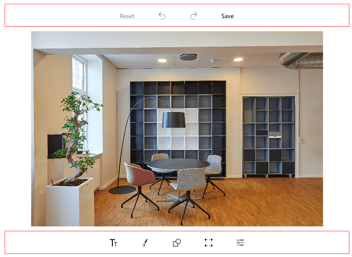
The SfImageEditor control provides support to customize and configure the appearance of toolbar menu. You can customize the toolbar by adding respective FooterToolbarItem and HeaderToolbarItem.
Toolbar item
You can customize each toolbar item using the Text and Icon properties.
The toolbar menu contains a set of header and footer menu items that help to performs editing actions. This can be categorized into the following types:
- HeaderToolbarItem
- FooterToolbarItem
- SubItems
Adding a HeaderToolbarItem
The HeaderToolbarItem is placed on the top of the image editor, and you can customize the HeaderToolbarItem using the Icon and Text properties:
imageEditor.ToolbarSettings.ToolbarItems.Add(new HeaderToolbarItem() { Icon = new BitmapImage(new Uri("ms-appx://Assets/share.png")), Text = "Share" });Adding a FooterToolbarItem
The FooterToolbarItem is placed on the bottom of the image editor, and you can customize the footer toolbar item using the Icon and Text properties:
Refer to the following code sample to customize footer toolbar item.
imageEditor.ToolbarSettings.ToolbarItems.Add(new FooterToolbarItem() { Icon = new BitmapImage(new Uri("ms-appx://Assets/share.png")), Text = "Share" });Adding sub items to the FooterToolbarItem
The SubItems is only applicable for FooterToolbarItem, and it represents grouped action of respective footer toolbar item. The SubItems will be placed above the footer toolbar item layout, and you can also customize the appearance of SubItems as main toolbar items.
Refer to the following code sample, to customize SubItems of FooterToolbarItem.
imageEditor.ToolbarSettings.ToolbarItems.Add(new FooterToolbarItem()
            {
                Text = "More",
                Icon = new BitmapImage(new Uri("ms-appx://Assets/share.more")),
                SubItems = new ObservableCollection<ToolbarItem>()
                {
                   new ToolbarItem() {
                Icon = new BitmapImage(new Uri("ms-appx://Assets/download.png"))
                },
                   new ToolbarItem() {
                Icon = new BitmapImage(new Uri("ms-appx://Assets/share.png"))
                } }
            });
ToolbarItemSelected event
Whenever you tap the toolbar menu item, the ToolbarItemSelected event will be triggered, and you can get the respective tapped toolbar item as an argument as shown in the following code sample.
public MainPage()
        {
            imageEditor.ToolbarSettings.ToolbarItemSelected += ToolbarSettings_ToolbarItemSelected;
        }

        private void ToolbarSettings_ToolbarItemSelected(object sender, ToolbarItemSelectedEventArgs e)
        {
           var text = e.ToolbarItem.Text;
        }
MoveSubItemsToFooterToolbar
The MoveSubItemsToFooterToolbar is boolean property of the ToolbarItemSelected event argument; it decides the placement of each sub items of respective footer toolbar item.
If you set the value to true, the respective sub items of footer item will be placed on footer toolbar layout. If you set false, then the sub items will be placed above the footer toolbar layout.
public MainPage()
            {
                        . . .

                imageEditor.ToolbarSettings.ToolbarItems.Add(new FooterToolbarItem()
                    {
                        Text = "NewFooterItem",
                        SubItems = new ObservableCollection<ToolbarItem>()
                        {
                            new ToolbarItem(){ Text= "Subitem1"},
                            new ToolbarItem(){ Text= "Subitem2"},
                            new ToolbarItem(){ Text= "Subitem3"},
                        }
                    });
                imageEditor.ToolbarSettings.ToolbarItemSelected += ToolbarSettings_ToolbarItemSelected;

                        . . .
            }


    private void ToolbarSettings_ToolbarItemSelected(object sender, ToolbarItemSelectedEventArgs e)
            {
                if(e.ToolbarItem != null && e.ToolbarItem is FooterToolbarItem)
                {
                    if(e.ToolbarItem.Text == "NewFooterItem")
                    {
                        e.MoveSubItemsToFooterToolbar = true;
                    }
                }
            }
NOTE
This is not applicable for built-in footer toolbar items.
To customize the ColorPalette
The following code explains to change the colors of the ColorPalette.
<control:SfImageEditor.ColorPalette>

        <SolidColorBrush>Yellow</SolidColorBrush>
        <SolidColorBrush>Pink</SolidColorBrush>
        <SolidColorBrush>Violet</SolidColorBrush>

</control:SfImageEditor.ColorPalette>List<SolidColorBrush> CustomColorPalette = new List<SolidColorBrush>()
{
new SolidColorBrush(Colors.Yellow),
new SolidColorBrush(Colors.Pink),
new SolidColorBrush(Colors.Violet)
};
imageEditor.ColorPalette = CustomColorPalette;To hide/visible the toolbar
You can customize the toolbar as shown below,
<control:SfImageEditor.ToolbarSettings>
        <control:ToolbarSettings IsToolbarVisiblity="False"/>
</control:SfImageEditor.ToolbarSettings>imageEditor.ToolbarSettings.IsToolbarVisiblity = false;
To hide/visible the toolbar item
You can customize the toolbar items namely, text, path, shapes, transform, rectangle, circle, arrow, flip, crop, rotate, reset, undo, Redo and save as shown below,
imageEditor.SetToolbarItemVisibility("text, save", false);
To hide or show the delete button
You can show or hide the delete button, which employed in deleting the selected shapes added in image editor with the help of ShowDeleteButton property in ToolbarSettings.
Setting false for this property will never show the delete button. On setting true, delete button will get enabled by selecting the shapes.
<syncfusion:SfImageEditor.ToolbarSettings>
                <syncfusion:ToolbarSettings ShowDeleteButton="False"></syncfusion:ToolbarSettings>
            </syncfusion:SfImageEditor.ToolbarSettings>
ToolbarSettings settings = new ToolbarSettings();
settings.ShowDeleteButton = false;
imageEditor.ToolbarSettings = settings;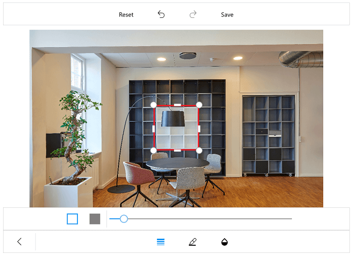
Default color selected index
You can change the default index of the color palette in the toolbar. By default, color palette index value is 2.
<imageeditor:SfImageEditor x:Name="imageEditor" DefaultSelectedColorIndex="0"/>imageEditor.DefaultSelectedColorIndex = 4;Customization of toolbar height
You can customize height of the toolbar and also toolbar items icon and text.
Customize toolbar height
The image editor control supports to customize the default height of the Header, Footer, and Sub item using the following properties:
The toolbar items will be resized based on the height. To change the height of the toolbar, refer to the following code sample.
<imageeditor:SfImageEditor.ToolbarSettings>
                    <imageeditor:ToolbarSettings
                        HeaderToolbarHeight="70"
                        FooterToolbarHeight="70"
                        SubItemToolbarHeight="70"/>
</imageeditor:SfImageEditor.ToolbarSettings>imageEditor.ToolbarSettings.HeaderToolbarHeight = 70;
imageEditor.ToolbarSettings.FooterToolbarHeight = 70;
imageEditor.ToolbarSettings.SubItemToolbarHeight = 70;Individual toolbar item height customization
You can arrange the toolbar items based on the toolbar height using the following properties:
To change the toolbar items, TextHeight and IconHeight, refer to the following code sample.
FooterToolbarItem footerItem = new FooterToolbarItem()
            {
                IconHeight = 40,
                TextHeight = 20,
                Icon = new BitmapImage(new Uri("ms-appx://Assets/share.png")),
                Text = "Share"
            };

            imageEditor.ToolbarSettings.ToolbarItems.Add(footerItem);
Toolbar color customization
Border color of the toolbar can be customized with the help of BorderColor property in ToolbarSettings.
<syncfusion:SfImageEditor.ToolbarSettings>
                <syncfusion:ToolbarSettings BorderColor="Red"></syncfusion:ToolbarSettings>
            </syncfusion:SfImageEditor.ToolbarSettings>
ToolbarSettings settings = new ToolbarSettings();
settings.BorderColor = new SolidColorBrush(Colors.Red);
editor.ToolbarSettings = settings;