How can I help you?
Text in UWP Image Editor (SfImageEditor)
10 May 20214 minutes to read
To add the desired text elements over the image, use the following two ways:
- From Toolbar
- Using Code
From Toolbar
To add text from the toolbar, click on the Text icon in the toolbar. When the Text icon is tapped, a pop-up will appear. To add the text over the image, Type the desired text and click OK. To close the pop-up, click CANCEL button. By dragging, the text can be moved to the desired place.
To Change Color of the selected Text
Select the desired text and click on the color palette available in the sub menu.
Change TextEffect of selected Text
Changes the effects of the text such as Bold, Italic and Underline.
Using Code
programmatically, the desired text elements also can be added over the image. The AddText method in the SfImageEditor control is used to add text based on the string value and TextSettings.
NOTE
If you add the text when the SfImageEditor loaded in a view without image, then you need to call the
AddTextmethod after some time delay. If you add the text when the SfImageEditor loaded in a view with image, then you need to call theAddTextmethod in theImageLoadedevent as shown in the following code sample.
imageEditor.ImageLoaded += (Object sender, ImageLoadedEventArgs args) =>
            {
                 imageEditor.AddText("New Text", new TextSettings());
            };
TextSettings
TextSettings is defined to set the values for Color and FontSize.
imageEditor.AddText("CustomTextView", new TextSettings() { Color = new SolidColorBrush(Colors.Orange), TextEffects = TextEffects.Bold | TextEffects.Italic | TextEffects.Underline });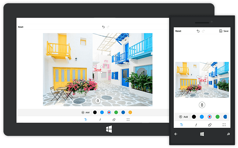
Multiline text and text alignment
Multiline text
You can annotate multiple line text over an image with the help of text preview window.
Text alignment
TextAlignment is an enum type and text can be aligned with the help of text alignment enum values such as left, right and center.
NOTE
The default text alignment is
Leftand text alignment is not applicable for single line text.
imageEditor.AddText("Hello\nGood morning\nHave a nice day", new TextSettings() {TextAlignment = TextAlignment.Right });
Text Rotation
You can rotate and resize the text by enabling the RotatableElements property of image editor. ImageEditorElements is an enum type with values Text, CustomView and None as shown in the following code snippet.
imageEditor.RotatableElements = ImageEditorElements.Text;NOTE
The default value for RotatableElements is
None.
You can rotate the text based on a particular angle using Angle property in TextSettings as shown in the following code snippet.
imageEditor.AddText("Good morning", new TextSettings(){Angle = 45});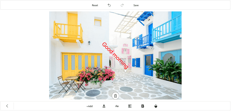
Restricting the edit text box pop-up window
You can restrict the edit text box pop-up window using the IsEditable property. By default, the value of the IsEditable property is true, so you can edit the text in edit text box pop-up window. When setting the IsEditable property to false, the edit text box pop-up window will not be displayed, and you are restricted to edit the text in the edit text box.
imageEditor.AddText("text", new TextSettings { IsEditable=false });Restricting the text resize
You can restrict the text resizing using the IsResizable property. By default, the value of the IsResizable property is true, so you can resize the text added on an image. When the IsResizable property is disabled, text added on an image cannot be resized and you can only drag the text over an image as shown in the following code sample.
imageEditor.AddText("Enter Text", new TextSettings { IsResizable = false });