How can I help you?
Shapes in UWP Image Editor (SfImageEditor)
20 Oct 20225 minutes to read
You can annotate any path on an image by using free hand drawing and adding texts and shapes.
Following shapes can be added.
- Rectangle
- Circle
- Arrow
- Line
- Dotted
- DoubleArrow
- DottedArrow
- DottedDoubleArrow
over the image. The shapes and text can be added in the following two ways:
- From Toolbar
- Using Code
To add a shape over an image
From Toolbar
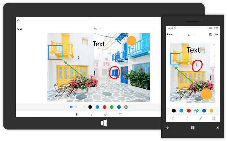
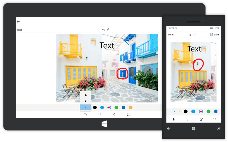
To add shapes from the toolbar, click the Shapes icon in the toolbar. When the Shapes icon is tapped, a sub toolbar will appear on top of that toolbar. From that sub toolbar, choose the shape (Rectangle, Circle or Arrow). Click the desired shape; the shape will be added to the center of the image. The shape will has the handles on each edge; it helps to resize the shape to the desired size and it can be moved to the desired position by dragging.
Change Color and Fill Options of the Shape
You can change the selected shape Color and Mode of the shape as outline or fill. The color palette of the shapes can be customized by using ColorPalette property.
TIPS
By default, the shape color is Red stroke with Transparent fill.
Using Code
Shapes can be added based on the ShapeType and PenSettings by using a method AddShape in the SfImageEditor control.
-
To add a rectangle, circle or arrow over the image, specify the ShapeType as well as the desired PenSettings as shown in below code,
- C#
imageEditor.AddShape(ShapeType.Arrow,new PenSettings()
    {
        StrokeWidth = 2
    });
-
You can annotate any path on an image by using free hand drawing as shown in the below code,
- C#
imageEditor.AddShape(ShapeType.Path,new PenSettings()
    {
        PathStrokeWidth=10
    });
By default, the toolbar contains the Rectangle, Circle, Arrow, and Path shapes. You can add other shapes to the toolbar items by using the VisibleShapesItems in ToolbarSettings.
VisibleShapesItems is an enum property with values of Rectangle, Circle, Arrow, Path, Line, Dotted, DoubleArrow, DottedArrow, and DottedDoubleArrow. You can specify one or more shapes in the property to add shapes into the toolbar.
editor.ToolbarSettings.VisibleShapesItems = ImageEditorShapes.Line | ImageEditorShapes.Dotted |
                                                  ImageEditorShapes.DottedArrow |
                                                  ImageEditorShapes.DottedDoubleArrow |
                                                  ImageEditorShapes.DoubleArrow;
NOTE
If you add the shape when the SfImageEditor loaded in a view without image, then you need to call the
AddShapemethod after some time delay. If you add the shape when the SfImageEditor loaded in a view with image, then you need to call theAddShapemethod in theImageLoadedevent as shown in the following code sample.
imageEditor.ImageLoaded += (Object sender, ImageLoadedEventArgs args) =>
            {
                  imageEditor.AddShape(ShapeType.Circle,new PenSettings() { });
            };
To delete a shape or text from the view
You can delete a selected shape or text from the view in the following two ways:
- Using Code
- From Toolbar
From Toolbar
When a shape is selected, a circular floating button with Delete icon will appear on top of the toolbar. To delete the selected shape from the view, use Delete icon.
Using Code
programmatically, the selected shape can be deleted by using the Delete method as shown below,
imageEditor.Delete();NOTE
You cannot delete the path.
Resize a shape or text or customView
You can resize a selected shape, text, or customView using the ResizableElements property.
Example: imageEditor.ResizableElements = Syncfusion.UI.Xaml.ImageEditor.Enums.ImageEditorResizableElements.Shapes represents that shapes(Rectangle, Circle or Arrow) can be resizable. Other elements such as Text and CustomView cannot be resizable.
Note: By default, all the elements are resizable.
imageEditor.ResizableElements = Syncfusion.UI.Xaml.ImageEditor.Enums.ImageEditorResizableElements.Shapes;Restricting the shape resize
You can restrict the shape resizing using the IsResizable property. By default, the value of the IsResizable property is true, so you can resize the shape added on an image. When the IsResizable property is disabled, shape added on an image cannot be resized and you can only drag the shape over an image as shown in the following code sample.
imageEditor.AddShape(ShapeType.Circle, new PenSettings() { IsResizable=false });