Tabbed Window in UWP Docking (SfDockingManager)
15 Jul 20267 minutes to read
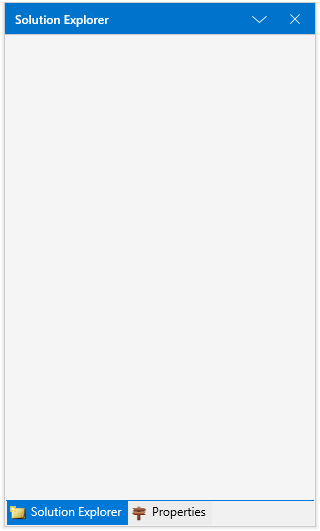
A child window can be arranged as a Tabbed window by setting TargetNameInDockedMode and the side value as Tabbed using the property SideInDockedMode.
<layout:SfDockingManager>

<ContentControl layout:SfDockingManager.Header="SolutionExplorer" Name="SolutionExplorer"
                layout:SfDockingManager.SideInDockedMode="Top"
				/>

<ContentControl layout:SfDockingManager.Header="Properties"
                layout:SfDockingManager.SideInDockedMode="Tabbed"
				layout:SfDockingManager.TargetNameInDockedMode="SolutionExplorer"/>


</layout:SfDockingManager>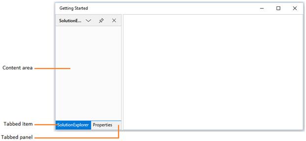
Tab Alignments
By default, tabs of the docked windows are placed at bottom. To place the tabs of the docked window at different sides, set the property DockTabPlacement with desired values such as Top, Bottom, Left and Right.
- Setting
DockTabPlacementasBottom
<syncfusion:SfDockingManager DockTabPlacement="Bottom" x:Name="dockingManager">

<ContentControl x:Name="dock1" syncfusion:SfDockingManager.Header="Item 1"
                               syncfusion:SfDockingManager.DockState="Dock">

<TextBlock Text="This is item 1 content"/>

</ContentControl>

<ContentControl syncfusion:SfDockingManager.Header="Item 2"
                syncfusion:SfDockingManager.DockState="Dock"
				syncfusion:SfDockingManager.SideInDockedMode="Tabbed"
				syncfusion:SfDockingManager.TargetNameInDockedMode="dock1">

<TextBlock Text="This is item 2 content"/>

</ContentControl>

<ContentControl syncfusion:SfDockingManager.Header="Item 3"
                syncfusion:SfDockingManager.DockState="Dock"
				syncfusion:SfDockingManager.SideInDockedMode="Tabbed"
				syncfusion:SfDockingManager.TargetNameInDockedMode="dock1">

<TextBlock Text="This is item 3 content"/>

</ContentControl>

</syncfusion:SfDockingManager>dockingManager.DockTabPlacement = Syncfusion.UI.Xaml.Controls.Layout.TabPlacement.Bottom;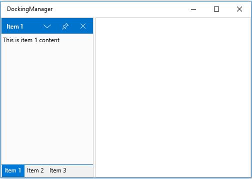
- Setting
DockTabPlacementasTop
<syncfusion:SfDockingManager DockTabPlacement="Top" x:Name="dockingManager">

<ContentControl x:Name="dock1" syncfusion:SfDockingManager.Header="Item 1"
                               syncfusion:SfDockingManager.DockState="Dock">

<TextBlock Text="This is item 1 content"/>

</ContentControl>

<ContentControl syncfusion:SfDockingManager.Header="Item 2"
                syncfusion:SfDockingManager.DockState="Dock"
				syncfusion:SfDockingManager.SideInDockedMode="Tabbed"
				syncfusion:SfDockingManager.TargetNameInDockedMode="dock1">

<TextBlock Text="This is item 2 content"/>

</ContentControl>

<ContentControl syncfusion:SfDockingManager.Header="Item 3"
                syncfusion:SfDockingManager.DockState="Dock"
				syncfusion:SfDockingManager.SideInDockedMode="Tabbed"
				syncfusion:SfDockingManager.TargetNameInDockedMode="dock1">

<TextBlock Text="This is item 3 content"/>

</ContentControl>

</syncfusion:SfDockingManager>dockingManager.DockTabPlacement = Syncfusion.UI.Xaml.Controls.Layout.TabPlacement.Top;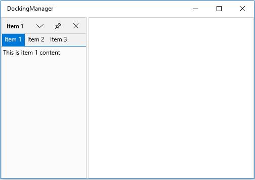
- Setting
DockTabPlacementasLeft
<syncfusion:SfDockingManager DockTabPlacement="Left" x:Name="dockingManager">

<ContentControl x:Name="dock1" syncfusion:SfDockingManager.Header="Item 1"
                               syncfusion:SfDockingManager.DockState="Dock">

<TextBlock Text="This is item 1 content"/>

</ContentControl>

<ContentControl syncfusion:SfDockingManager.Header="Item 2"
                syncfusion:SfDockingManager.DockState="Dock"
				syncfusion:SfDockingManager.SideInDockedMode="Tabbed"
				syncfusion:SfDockingManager.TargetNameInDockedMode="dock1">

<TextBlock Text="This is item 2 content"/>

</ContentControl>

<ContentControl syncfusion:SfDockingManager.Header="Item 3"
                syncfusion:SfDockingManager.DockState="Dock"
				syncfusion:SfDockingManager.SideInDockedMode="Tabbed"
				syncfusion:SfDockingManager.TargetNameInDockedMode="dock1">

<TextBlock Text="This is item 3 content"/>

</ContentControl>

</syncfusion:SfDockingManager>dockingManager.DockTabPlacement= Syncfusion.UI.Xaml.Controls.Layout.TabPlacement.Left;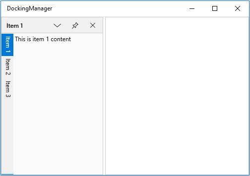
- Setting
DockTabPlacementasRight
<syncfusion:SfDockingManager DockTabPlacement="Right" x:Name="dockingManager">

<ContentControl x:Name="dock1" syncfusion:SfDockingManager.Header="Item 1"
                               syncfusion:SfDockingManager.DockState="Dock">

<TextBlock Text="This is item 1 content"/>

</ContentControl>

<ContentControl syncfusion:SfDockingManager.Header="Item 2"
                syncfusion:SfDockingManager.DockState="Dock"
				syncfusion:SfDockingManager.SideInDockedMode="Tabbed"
				syncfusion:SfDockingManager.TargetNameInDockedMode="dock1">

<TextBlock Text="This is item 2 content"/>

</ContentControl>

<ContentControl syncfusion:SfDockingManager.Header="Item 3"
                syncfusion:SfDockingManager.DockState="Dock"
				syncfusion:SfDockingManager.SideInDockedMode="Tabbed"
				syncfusion:SfDockingManager.TargetNameInDockedMode="dock1">

<TextBlock Text="This is item 3 content"/>

</ContentControl>

</syncfusion:SfDockingManager>dockingManager.DockTabPlacement = Syncfusion.UI.Xaml.Controls.Layout.TabPlacement.Right;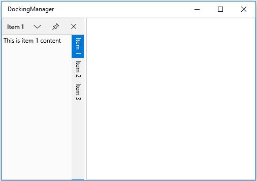
TabbedWindow Customization
DockWindow have an internal DockTabControl for Tabbed Windows in SfDockingManager and its DockTabItem Background and Foreground can be customized. The following table lists the details of the customization properties in DockTabControl.
Customization Properties
| Property | Data Type | Type | Description |
|---|---|---|---|
|
DockTabItemSelectedBackground |
Brush |
Dependency property |
Used to set the background of a Selected Tab Item in the tabbed Dock Window. |
|
DockTabItemSelectedForeground |
Brush |
Dependency property |
Used to set the foreground of a Selected Tab Item in the tabbed Dock Window. |
|
DockTabItemBackground |
Brush |
Dependency property |
Used to set the background of a Tab Items in the tabbed Dock Window. |
|
DockTabItemForeground |
Brush |
Dependency property |
Used to set the foreground of a Tab Items in the tabbed Dock Window. |
|
DockTabItemMouseOverBackground |
Brush |
Dependency property |
Used to set the background of a mouse hovered tab Items in the tabbed Dock Window. |
|
DockTabItemMouseOverForeground |
Brush |
Dependency property |
Used to set the foreground of a mouse hovered tab Items in the tabbed Dock Window. |
|
DockTabPanelBackground |
Brush |
Dependency property |
Used to set the background for Items Panel of the tabbed Dock Window |
<layout:SfDockingManager DockTabPanelBackground="GreenYellow"   DockTabItemBackground="Yellow"              DockTabItemForeground="Red" DockTabItemSelectedBackground="Orange" DockTabItemSelectedForeground="White" DockTabItemMouseOverBackground="Green" DockTabItemMouseOverForeground="Red">
    <ContentControl layout:SfDockingManager.Header="Dock1" Name="Dock1" layout:SfDockingManager.DockState="Dock"/>
    <ContentControl layout:SfDockingManager.Header="Dock2" layout:SfDockingManager.SideInDockedMode="Tabbed" layout:SfDockingManager.TargetNameInDockedMode="Dock1" layout:SfDockingManager.DockState="Dock"/>
</layout:SfDockingManager>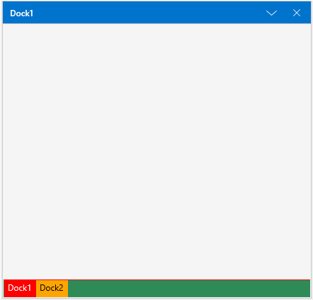
Set icon to TabbedWindow
SetIcon method can be used to set the icon/image for the TabbedWindow.
<!--Setting icon in Tabbed Window -->

<ContentControl x:Name="SolutionExplorer" layout:SfDockingManager.Header="Solution Explorer"  layout:SfDockingManager.DesiredWidthInDockedMode="300"  layout:SfDockingManager.SideInDockedMode="Right" layout:SfDockingManager.DockState="Dock"  >

	<layout:SfDockingManager.Icon>

		<Image Source="/Assets/image1.png" />

	</layout:SfDockingManager.Icon>

</ContentControl>

<ContentControl x:Name="Properties" layout:SfDockingManager.Header="Properties" layout:SfDockingManager.DesiredWidthInDockedMode="300" layout:SfDockingManager.SideInDockedMode="Tabbed" layout:SfDockingManager.TargetNameInDockedMode="SolutionExplorer" >

	<layout:SfDockingManager.Icon>

		<Image Source="/Assets/image2.png" />

	</layout:SfDockingManager.Icon>

</ContentControl>
using Windows.UI.Xaml.Controls;
using Windows.UI.Xaml.Media.Imaging;
using Syncfusion.UI.Xaml.Controls.Layout;
//Initialize image
Image image = new Image();
Image image1 = new Image();
//Get Image
image.Source = new BitmapImage(new Uri("ms-appx:///Assets/image1.png", UriKind.Absolute));
image1.Source = new BitmapImage(new Uri("ms-appx:///Assets/image2.png", UriKind.Absolute));
//Set Image to Tabbed Control
SfDockingManager.SetIcon(Properties, image1);
SfDockingManager.SetIcon(SolutionExplorer, image);