Dealing with Windows in UWP Docking (SfDockingManager)
18 Feb 202510 minutes to read
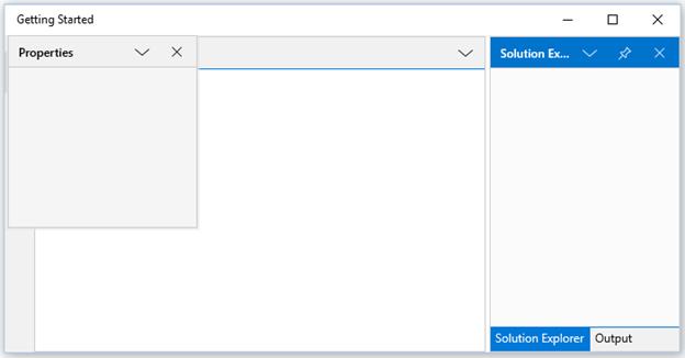
Activating a window
A particular child window can be activated in SfDockingManager using its name or instance reference through the property ActiveWindow and ActivateWindow method that passes the element as argument to activate.
<layout:SfDockingManager x:Name="docking">

<ContentControl x:Name="SolutionExplorer" layout:SfDockingManager.Header="Solution Explorer"
                                          layout:SfDockingManager.SideInDockedMode="Right"/>

<ContentControl x:Name="ToolBox" layout:SfDockingManager.Header="ToolBox"
                                 layout:SfDockingManager.DockState="AutoHidden"/>

<ContentControl x:Name="Properties" layout:SfDockingManager.Header="Properties"
                                    layout:SfDockingManager.DockState="Float"/>

<ContentControl x:Name="Output" layout:SfDockingManager.Header="Output"
                                layout:SfDockingManager.SideInDockedMode="Tabbed"
								layout:SfDockingManager.TargetNameInDockedMode="SolutionExplorer"/>

<ContentControl x:Name="StartPage" layout:SfDockingManager.Header="Start Page"
                                   layout:SfDockingManager.DockState="Document"/>

</layout:SfDockingManager>public MainPage()
{
this.InitializeComponent();
docking.Loaded += Docking_Loaded;
}
private void Docking_Loaded(object sender, RoutedEventArgs e)
{
docking.ActivateWindow(SolutionExplorer);
}
Adding Window Programmatically
Any UI element can be added inside the SfDockingManager as its child windows. The windows are added as Dock windows, since the default value of the DockState is Dock. The UI element is added in the SfDockingManager using the Add method of the DockItems property of the SfDockingManager.
For example, ContentControl is added as a window for SfDockingManager.
SfDockingManager DockingManager1 = new SfDockingManager();

ContentControl content1 = new ContentControl();

SfDockingManager.SetHeader(content1, "Window1");

ContentControl content2 = new ContentControl();

SfDockingManager.SetHeader(content2, "Window2");

ContentControl content3 = new ContentControl();

SfDockingManager.SetHeader(content3, "Window3");

ContentControl content4 = new ContentControl();

SfDockingManager.SetHeader(content4, "Window4");

ContentControl content5 = new ContentControl();

SfDockingManager.SetHeader(content5, "Window5");

DockingManager1.DockItems.Add(content1);

DockingManager1.DockItems.Add(content2);

DockingManager1.DockItems.Add(content3);

DockingManager1.DockItems.Add(content4);

DockingManager1.DockItems.Add(content5);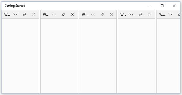
Hiding Window Programmatically
To hide the window, set DockState AttachedProperty of the SfDockingManager as Hidden.
SfDockingManager.SetDockState(content1, DockState.Hidden);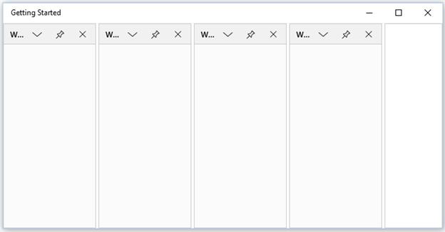
Customizing Docking window
A Docking window can be customized using the property DockWindowCaptionBackground, DockWindowCaptionForeground, DockWindowCaptionFontFamily and DockWindowCaptionMargin with the desired values.
<layout:SfDockingManager DockWindowCaptionBackground="Red" DockWindowCaptionForeground="Yellow">

<ContentControl layout:SfDockingManager.Header="Dock1" Content="Content 1"/>

<ContentControl layout:SfDockingManager.Header="Dock2" Content="Content 2"/>

<ContentControl layout:SfDockingManager.Header="Dock3" Content="Content 3"/>

</layout:SfDockingManager>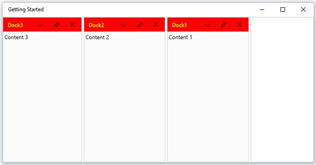
Customizing Active Docking Window
Active docking window can be customized using the property DockWindowActiveForeground, DockWindowActiveBackground with desired brush values.
<layout:SfDockingManager DockWindowActiveForeground="Red" DockWindowActiveBackground="Green">

<ContentControl layout:SfDockingManager.Header="Dock"/>

<ContentControl layout:SfDockingManager.Header="Dock1"/>

<ContentControl layout:SfDockingManager.Header="Dock2"/>

</layout:SfDockingManager>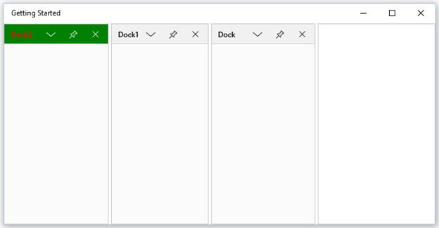
Customizing Inactive Document window
ForeColor and BackColor of Inactive document window can be customized using the properties DocumentTabItemBackground, DocumentTabItemForeground with the desired values.
<layout:SfDockingManager x:Name="dockingmanager" DocumentTabItemBackground="#FF353535" DocumentTabItemForeground="White">

<ContentControl layout:SfDockingManager.Header="Item 1" layout:SfDockingManager.DockState="Document"/>

<ContentControl layout:SfDockingManager.Header="Item 2" layout:SfDockingManager.DockState="Document"/>

<ContentControl layout:SfDockingManager.Header="Item 3" layout:SfDockingManager.DockState="Document"/>

<ContentControl layout:SfDockingManager.Header="Item 4" layout:SfDockingManager.DockState="Document"/>

</layout:SfDockingManager>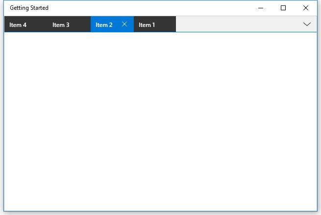
Customizing Selected Document window
Selected Document window can be customized using the property DocumentTabItemSelectedBackground, DocumentTabItemSelectedForeground with desired brush values. Font size of the selected document window can be customized through DocumentTabItemSelectedFontSize property of DockingManager.
<layout:SfDockingManager x:Name="dockingmanager" DocumentTabItemSelectedBackground="DarkBlue" DocumentTabItemSelectedForeground="White" DocumentTabItemSelectedFontSize="20">

<ContentControl layout:SfDockingManager.Header="Item 1" layout:SfDockingManager.DockState="Document"/>

<ContentControl layout:SfDockingManager.Header="Item 2" layout:SfDockingManager.DockState="Document"/>

<ContentControl layout:SfDockingManager.Header="Item 3" layout:SfDockingManager.DockState="Document"/>

<ContentControl layout:SfDockingManager.Header="Item 4" layout:SfDockingManager.DockState="Document"/>

</layout:SfDockingManager>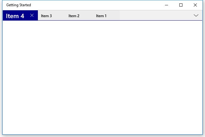
Customizing Floating Window
The float window can be customized by setting FloatWindowBackground, FloatWindowActiveBackground, FloatWindowContentBackground, FloatWindowContentForeground, FloatWindowBorderBrush, FloatWindowBorderThickness, FloatWindowCaptionBackground, FloatWindowContentBorderBrush, FloatWindowContentMargin and FloatWindowContentBorderThickness properties with the required values.
<layout:SfDockingManager FloatWindowBackground="Pink" FloatWindowActiveBackground="Green">

<ContentControl Content="Content 1" layout:SfDockingManager.Header="Dock1"
                                    layout:SfDockingManager.DockState="Float"/>

<ContentControl layout:SfDockingManager.Header="Toolbox"/>

</layout:SfDockingManager>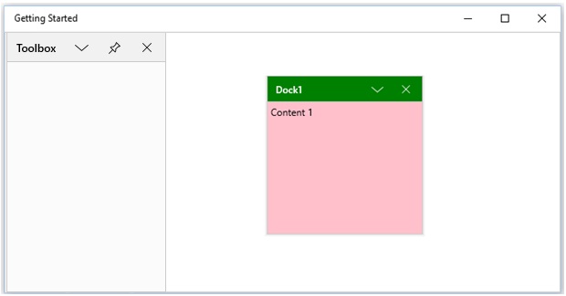
Handling state changing of DockingManager child element
DockStateChanging event will raise whenever the child element changing its State. StateChanging of child element can now be restricted by setting args.Cancel to true. “args” represents the event argument of DockStateChangingEventArgs for DockStateChanging event. The default value of args.Cancel is false.
<syncfusion:SfDockingManager Name="docking" DockStateChanging="docking_DockStateChanging">

<ContentControl syncfusion:SfDockingManager.Header="Solution Explorer"  syncfusion:SfDockingManager.SideInDockedMode="Right"  syncfusion:SfDockingManager.DesiredWidthInDockedMode="200"/>

<ContentControl syncfusion:SfDockingManager.Header="Toolbox" syncfusion:SfDockingManager.DesiredWidthInDockedMode="200"/>

<ContentControl syncfusion:SfDockingManager.Header="MainPage.xaml.cs" syncfusion:SfDockingManager.DockState="Document"/>

<ContentControl syncfusion:SfDockingManager.Header="MainPage.xaml" syncfusion:SfDockingManager.DockState="Document"/>

</syncfusion:SfDockingManager>
private void docking_DockStateChanging(object sender, DockStateChangingEventArgs args)
{
FrameworkElement element = args.TargetElement as FrameworkElement;
if (SfDockingManager.GetHeader(element) == "Toolbox")
{
args.Cancel = true;
}
}Restricting DockingManager child element closing
State of the child element will change to Hidden while closing it. It can be restricted by changing the value of args.Cancel to true. The following code describes how to handle the closing of a child using DockStateChanging event.
<syncfusion:SfDockingManager Name="docking" DockStateChanging="docking_DockStateChanging">

<ContentControl syncfusion:SfDockingManager.Header="Solution Explorer"  syncfusion:SfDockingManager.SideInDockedMode="Right"  syncfusion:SfDockingManager.DesiredWidthInDockedMode="200"/>

<ContentControl syncfusion:SfDockingManager.Header="Toolbox" syncfusion:SfDockingManager.DesiredWidthInDockedMode="200"/>

<ContentControl syncfusion:SfDockingManager.Header="MainPage.xaml.cs" syncfusion:SfDockingManager.DockState="Document"/>

<ContentControl syncfusion:SfDockingManager.Header="MainPage.xaml" syncfusion:SfDockingManager.DockState="Document"/>

</syncfusion:SfDockingManager>
private void docking_DockStateChanging(object sender, DockStateChangingEventArgs args)
{
if (args.NewState == DockState.Hidden)
{
args.Cancel = true;
}
}Enable/Disable Dragging a Window
The AttachedProperty IsDragEnabled helps to enable or disable the dragging functionality of a window by setting its value as true or false respectively. By default, IsDragEnabled value is true. This functionality can be disabled by setting its value as false.
<layout:SfDockingManager>

<ContentControl layout:SfDockingManager.Header="Item1"
                layout:SfDockingManager.IsDragEnabled="false"/>

</layout:SfDockingManager>
Customizing Hint Shadow Fill Color
The fill color of hint shadow/dock preview element can be customized using DockPreviewColor property of SfDockingManager.
<layout:SfDockingManager DockPreviewColor="Red" >

<ContentControl layout:SfDockingManager.Header="Item1" />

</layout:SfDockingManager>
Sizing Docking Windows
SfDockingManager allows to set the desired width and height for the docking windows.
The desired height and width can be set for the Dock windows through the AttachedProperty DesiredWidthInDockedMode and DesiredHeightInDockedMode with the desired values.
<layout:SfDockingManager>

<ContentControl layout:SfDockingManager.Header="Item1"
                layout:SfDockingManager.DesiredHeightInDockedMode="400"
				layout:SfDockingManager.DesiredWidthInDockedMode="300"/>

</layout:SfDockingManager>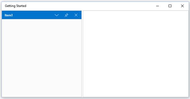
Occupy Whole Window
To arrange the dock windows to a whole available space in the SfDockingManager, set DockFill property of SfDockingManager as true.
<layout:SfDockingManager DockFill="true">

<ContentControl layout:SfDockingManager.Header="Item1"/>

</layout:SfDockingManager>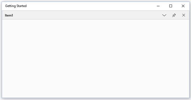
Enable/Disable ContextMenus
SfDockingManager provides ContextMenu’s for docking, floating, auto hiding and document windows.
Enable/Disable context menu for docking, floating, auto hiding windows
Docking, floating and auto hiding windows have a ContextMenu button that contains options for switching between states. The button can be enabled/disabled using ShowMenuButton property. By default, ShowMenuButton value is true. This functionality can be disabled by setting its value as false.
<layout:SfDockingManager ShowMenuButton="false">

<ContentControl layout:SfDockingManager.Header="Item1"/>

</layout:SfDockingManager>
Enable/Disable ContextMenu for Document windows
Document windows have a ContextMenu button, that contains options for switching between TabItems. The button can be enabled/disabled using ShowDocumentTabStripMenu property. By default, ShowDocumentTabStripMenu value is true. This functionality can be disabled by setting its value as false.
<layout:SfDockingManager ShowDocumentTabStripMenu="true">

<ContentControl layout:SfDockingManager.Header="Item1"
                layout:SfDockingManager.DockState="Document"/>

</layout:SfDockingManager>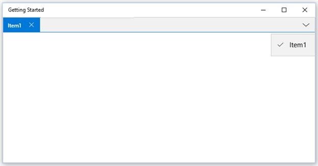
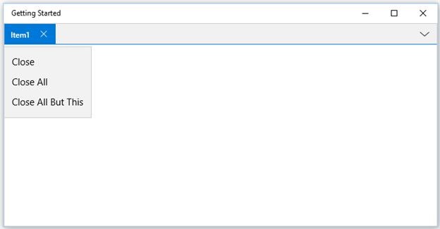
Enable/Disable context menu of DocumentTabItems
One or more DocumentTabItems can be closed using Document TabItem ContextMenu. This ContextMenu can be enabled/disabled through ShowDocumentTabItemContextMenu property. By default, ShowDocumentTabItemContextMenu value is true. This functionality can be disabled by setting its value as false.
<layout:SfDockingManager ShowDocumentTabItemContextMenu="true">

<ContentControl layout:SfDockingManager.Header="Item1"
                layout:SfDockingManager.DockState="Document"/>

</layout:SfDockingManager>