Multiple Selection in UWP AutoComplete (SfTextBoxExt)
10 May 202124 minutes to read
You can select multiple items from a suggestion list. Multiple selection can be performed in the following two ways in AutoComplete:
- Token representation
- Delimiter
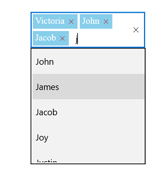
Token representation
The selected items will be displayed with a customizable token representation, and the users can remove each tokenized item using the Close button.
<Page
    x:Class="TextBoxExtSample.MainPage"
    xmlns="http://schemas.microsoft.com/winfx/2006/xaml/presentation"
    xmlns:x="http://schemas.microsoft.com/winfx/2006/xaml"
    xmlns:local="using:TextBoxExtSample"
    xmlns:d="http://schemas.microsoft.com/expression/blend/2008"
    xmlns:mc="http://schemas.openxmlformats.org/markup-compatibility/2006"
    xmlns:editors="using:Syncfusion.UI.Xaml.Controls.Input"
    mc:Ignorable="d"
    xmlns:ListCollection="using:System.Collections.Generic"
    Background="{ThemeResource ApplicationPageBackgroundThemeBrush}">
    <Grid Background="{StaticResource ApplicationPageBackgroundThemeBrush}">

        <editors:SfTextBoxExt x:Name="textBoxExt"
                              HorizontalAlignment="Center"
                              VerticalAlignment="Center"
                              AutoCompleteMode="Suggest"
                              Width="200"
                              MultiSelectMode="Token"
                              TokensWrapMode="Wrap">
        </editors:SfTextBoxExt>
    </Grid>
</Page>
using Syncfusion.UI.Xaml.Controls.Input;
using System.Collections.Generic;
using Windows.UI.Xaml;
using Windows.UI.Xaml.Controls;
// The BlankPage item template is documented at https://go.microsoft.com/fwlink/?LinkId=402352&clcid=0x409.
namespace TextBoxExtSample
{
/// <summary>
/// An empty page that can be used on its own or navigated within a frame.
/// </summary>
public sealed partial class MainPage : Page
{
//TextBlock SearchLabel;
public MainPage()
{
this.InitializeComponent();
SfTextBoxExt textBoxExt = new SfTextBoxExt()
{
HorizontalAlignment = HorizontalAlignment.Center,
VerticalAlignment = VerticalAlignment.Center,
Width = 200,
AutoCompleteMode = AutoCompleteMode.Suggest,
MultiSelectMode = MultiSelectMode.Token,
TokensWrapMode = TokensWrapMode.Wrap
};
List<string> list = new List<string>()
{
"India",
"Ukanda",
"Ukraine",
"Canada",
"United Arab Emirates"
};
textBoxExt.AutoCompleteSource = list;
this.Content = textBoxExt;
}
}
}Wrap mode of token
The selected item can be displayed as token inside AutoComplete in the following two ways:
-
Wrap- WhenTokensWrapModeis set toWrap, the selected items will be wrapped to the next line of AutoComplete. -
None- WhenTokensWrapModeis set toNone, the selected item will be wrapped in horizontal orientation.
<Page
    x:Class="TextBoxExtSample.MainPage"
    xmlns="http://schemas.microsoft.com/winfx/2006/xaml/presentation"
    xmlns:x="http://schemas.microsoft.com/winfx/2006/xaml"
    xmlns:local="using:TextBoxExtSample"
    xmlns:d="http://schemas.microsoft.com/expression/blend/2008"
    xmlns:mc="http://schemas.openxmlformats.org/markup-compatibility/2006"
    xmlns:editors="using:Syncfusion.UI.Xaml.Controls.Input"
    mc:Ignorable="d"
    Background="{ThemeResource ApplicationPageBackgroundThemeBrush}">
    <Page.DataContext>
        <local:EmployeeViewModel/>
    </Page.DataContext>
    <Grid Background="{StaticResource ApplicationPageBackgroundThemeBrush}">

        <editors:SfTextBoxExt x:Name="textBoxExt"
                              HorizontalAlignment="Center"
                              VerticalAlignment="Center"
                              AutoCompleteMode="Suggest"
                              Width="200"
                              SearchItemPath="Name"
                              MultiSelectMode="Token"
                              TokensWrapMode="Wrap"
                              AutoCompleteSource="{Binding EmployeeCollection}">
        </editors:SfTextBoxExt>
    </Grid>
</Page>
using Syncfusion.UI.Xaml.Controls.Input;
using System.Collections.Generic;
using System.Collections.ObjectModel;
using Windows.UI;
using Windows.UI.Xaml;
using Windows.UI.Xaml.Controls;
using Windows.UI.Xaml.Media;
// The BlankPage item template is documented at https://go.microsoft.com/fwlink/?LinkId=402352&clcid=0x409.
namespace TextBoxExtSample
{
/// <summary>
/// An empty page that can be used on its own or navigated within a frame.
/// </summary>
public sealed partial class MainPage : Page
{
public MainPage()
{
this.InitializeComponent();
EmployeeViewModel employeeCollection = new EmployeeViewModel();
this.DataContext = employeeCollection;
SfTextBoxExt textBoxExt = new SfTextBoxExt()
{
HorizontalAlignment = HorizontalAlignment.Center,
VerticalAlignment = VerticalAlignment.Center,
Width = 200,
AutoCompleteMode = AutoCompleteMode.Suggest,
SearchItemPath = "Name",
MultiSelectMode = MultiSelectMode.Token,
TokensWrapMode = TokensWrapMode.Wrap
};
textBoxExt.AutoCompleteSource = employeeCollection.EmployeeCollection;
this.Content = textBoxExt;
}
}
public class Employee
{
private string image;
private string name;
public string Image
{
get
{
return image;
}
set
{
image = value;
}
}
public string Name
{
get
{
return name;
}
set
{
name = value;
}
}
}
public class EmployeeViewModel
{
private ObservableCollection<Employee> employeeCollection;
public ObservableCollection<Employee> EmployeeCollection
{
get
{
return employeeCollection;
}
set
{
employeeCollection = value;
}
}
public EmployeeViewModel()
{
EmployeeCollection = new ObservableCollection<Employee>();
EmployeeCollection.Add(new Employee() { Image = "John.png", Name = "John" });
EmployeeCollection.Add(new Employee() { Image = "James.png", Name = "James" });
EmployeeCollection.Add(new Employee() { Image = "Jacob.png", Name = "Jacob" });
EmployeeCollection.Add(new Employee() { Image = "Joy.png", Name = "Joy" });
EmployeeCollection.Add(new Employee() { Image = "Justin.png", Name = "Justin" });
EmployeeCollection.Add(new Employee() { Image = "Jerome.png", Name = "Jerome" });
EmployeeCollection.Add(new Employee() { Image = "Jessica.png", Name = "Jessica" });
EmployeeCollection.Add(new Employee() { Image = "Victoria.png", Name = "Victoria" });
}
}
}
Token customization
Tokens can be customized in the following ways:
-
Foreground: Sets the color of the text inside the token. -
FontSize: Sets the size of the font inside the token. -
FontFamily: Sets the font family for the text inside the token. -
Background: Sets the background color of the token. -
ShowDeleteButton: Enables and disables the Close button inside AutoComplete. -
DeleteButtonColor: Sets the color of the Close button inside AutoComplete. -
DeleteButtonAlignment: Sets the placement of the delete button toLeftorRight. By default, it is placed at the right side of the token.
NOTE
The SelectedBackgroundColor and CornerRadius supports have been enhanced in only on the iOS and Android platforms.
<Page
    x:Class="TextBoxExtSample.MainPage"
    xmlns="http://schemas.microsoft.com/winfx/2006/xaml/presentation"
    xmlns:x="http://schemas.microsoft.com/winfx/2006/xaml"
    xmlns:local="using:TextBoxExtSample"
    xmlns:d="http://schemas.microsoft.com/expression/blend/2008"
    xmlns:mc="http://schemas.openxmlformats.org/markup-compatibility/2006"
    xmlns:editors="using:Syncfusion.UI.Xaml.Controls.Input"
    mc:Ignorable="d"
    Background="{ThemeResource ApplicationPageBackgroundThemeBrush}">
    <Page.DataContext>
        <local:EmployeeViewModel/>
    </Page.DataContext>
    <Grid Background="{StaticResource ApplicationPageBackgroundThemeBrush}">

        <editors:SfTextBoxExt x:Name="textBoxExt"
                              HorizontalAlignment="Center"
                              VerticalAlignment="Center"
                              AutoCompleteMode="Suggest"
                              Width="200"
                              SearchItemPath="Name"
                              MultiSelectMode="Token"
                              TokensWrapMode="Wrap"
                              AutoCompleteSource="{Binding EmployeeCollection}">
            <editors:SfTextBoxExt.TokenSettings>
                <editors:TokenSettings
                    FontSize="16"
                    Background="SkyBlue"
                    Foreground="White"
                    DeleteButtonColor="Brown"
                    FontFamily="Times New Roman"
                    DeleteButtonAlignment="Right"
                    ShowDeleteButton="true"/>
            </editors:SfTextBoxExt.TokenSettings>
        </editors:SfTextBoxExt>
    </Grid>
</Page>
using Syncfusion.UI.Xaml.Controls.Input;
using System.Collections.Generic;
using System.Collections.ObjectModel;
using Windows.UI;
using Windows.UI.Xaml;
using Windows.UI.Xaml.Controls;
using Windows.UI.Xaml.Media;
// The BlankPage item template is documented at https://go.microsoft.com/fwlink/?LinkId=402352&clcid=0x409.
namespace TextBoxExtSample
{
/// <summary>
/// An empty page that can be used on its own or navigated within a frame.
/// </summary>
public sealed partial class MainPage : Page
{
public MainPage()
{
this.InitializeComponent();
EmployeeViewModel employeeCollection = new EmployeeViewModel();
this.DataContext = employeeCollection;
SfTextBoxExt textBoxExt = new SfTextBoxExt()
{
HorizontalAlignment = HorizontalAlignment.Center,
VerticalAlignment = VerticalAlignment.Center,
Width = 200,
AutoCompleteMode = AutoCompleteMode.Suggest,
SearchItemPath = "Name",
MultiSelectMode = MultiSelectMode.Token,
TokensWrapMode = TokensWrapMode.Wrap
};
TokenSettings tokenSettings = new TokenSettings()
{
FontSize = 16,
Background = new SolidColorBrush(Colors.SkyBlue),
Foreground = new SolidColorBrush(Colors.White),
DeleteButtonColor = new SolidColorBrush(Colors.Brown),
FontFamily = new FontFamily("Times New Roman"),
DeleteButtonAlignment = DeleteButtonAlignment.Right,
ShowDeleteButton = true
};
textBoxExt.TokenSettings = tokenSettings;
textBoxExt.AutoCompleteSource = employeeCollection.EmployeeCollection;
this.Content = textBoxExt;
}
}
public class Employee
{
private string image;
private string name;
public string Image
{
get
{
return image;
}
set
{
image = value;
}
}
public string Name
{
get
{
return name;
}
set
{
name = value;
}
}
}
public class EmployeeViewModel
{
private ObservableCollection<Employee> employeeCollection;
public ObservableCollection<Employee> EmployeeCollection
{
get
{
return employeeCollection;
}
set
{
employeeCollection = value;
}
}
public EmployeeViewModel()
{
EmployeeCollection = new ObservableCollection<Employee>();
EmployeeCollection.Add(new Employee() { Image = "John.png", Name = "John" });
EmployeeCollection.Add(new Employee() { Image = "James.png", Name = "James" });
EmployeeCollection.Add(new Employee() { Image = "Jacob.png", Name = "Jacob" });
EmployeeCollection.Add(new Employee() { Image = "Joy.png", Name = "Joy" });
EmployeeCollection.Add(new Employee() { Image = "Justin.png", Name = "Justin" });
EmployeeCollection.Add(new Employee() { Image = "Jerome.png", Name = "Jerome" });
EmployeeCollection.Add(new Employee() { Image = "Jessica.png", Name = "Jessica" });
EmployeeCollection.Add(new Employee() { Image = "Victoria.png", Name = "Victoria" });
}
}
}
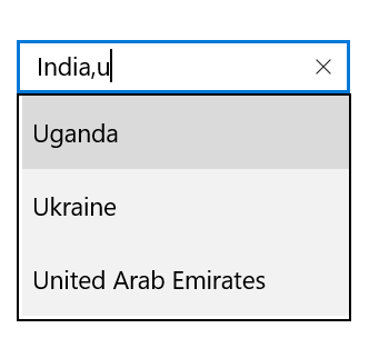
Delimiter
When selecting the multiple items, the selected items can be divided with a desired character given for a delimiter. You can set delimiter character using the Delimiter property.
<Page
    x:Class="TextBoxExtSample.MainPage"
    xmlns="http://schemas.microsoft.com/winfx/2006/xaml/presentation"
    xmlns:x="http://schemas.microsoft.com/winfx/2006/xaml"
    xmlns:local="using:TextBoxExtSample"
    xmlns:d="http://schemas.microsoft.com/expression/blend/2008"
    xmlns:mc="http://schemas.openxmlformats.org/markup-compatibility/2006"
    xmlns:editors="using:Syncfusion.UI.Xaml.Controls.Input"
    mc:Ignorable="d"
    Background="{ThemeResource ApplicationPageBackgroundThemeBrush}">
    <Grid Background="{StaticResource ApplicationPageBackgroundThemeBrush}">

        <editors:SfTextBoxExt x:Name="textBoxExt"
                              HorizontalAlignment="Center"
                              VerticalAlignment="Center"
                              AutoCompleteMode="Suggest"
                              Width="200"
                              MultiSelectMode="Delimiter"
                              Delimiter=",">
        </editors:SfTextBoxExt>
    </Grid>
</Page>
using Syncfusion.UI.Xaml.Controls.Input;
using System.Collections.Generic;
using Windows.UI.Xaml;
using Windows.UI.Xaml.Controls;
namespace TextBoxExtSample
{
/// <summary>
/// An empty page that can be used on its own or navigated within a frame.
/// </summary>
public sealed partial class MainPage : Page
{
//TextBlock SearchLabel;
public MainPage()
{
this.InitializeComponent();
SfTextBoxExt textBoxExt = new SfTextBoxExt()
{
HorizontalAlignment = HorizontalAlignment.Center,
VerticalAlignment = VerticalAlignment.Center,
Width = 200,
AutoCompleteMode = AutoCompleteMode.Suggest,
MultiSelectMode = MultiSelectMode.Delimiter,
Delimiter = ","
};
List<string> list = new List<string>()
{
"India",
"Uganda",
"Ukraine",
"Canada",
"United Arab Emirates"
};
textBoxExt.AutoCompleteSource = list;
this.Content = textBoxExt;
}
}
}