How can I help you?
Customizing AutoComplete in UWP AutoComplete (SfTextBoxExt)
10 May 202124 minutes to read
AutoComplete provides user-friendly customizing options for both text box and drop-down. This section explains how to customize the entire AutoComplete control.
Customizing the text box
The Text, FontSize, FontWeight, and FontFamily properties are used to customize the text box.
<Page
    x:Class="TextBoxExtSample.MainPage"
    xmlns="http://schemas.microsoft.com/winfx/2006/xaml/presentation"
    xmlns:x="http://schemas.microsoft.com/winfx/2006/xaml"
    xmlns:local="using:TextBoxExtSample"
    xmlns:d="http://schemas.microsoft.com/expression/blend/2008"
    xmlns:mc="http://schemas.openxmlformats.org/markup-compatibility/2006"
    mc:Ignorable="d"
    xmlns:editors="using:Syncfusion.UI.Xaml.Controls.Input"
    Background="{ThemeResource ApplicationPageBackgroundThemeBrush}">

    <Grid Background="{StaticResource ApplicationPageBackgroundThemeBrush}">

        <editors:SfTextBoxExt x:Name="textBoxExt"
                              Text="TextBox"
                              FontSize="20"
                              FontWeight="Bold"
                              FontFamily="Times New Roman"
                              HorizontalAlignment="Center"
                              VerticalAlignment="Center"
                              Width="200">
        </editors:SfTextBoxExt>
    </Grid>
</Page>
using Syncfusion.UI.Xaml.Controls.Input;
using Windows.UI.Xaml;
using Windows.UI.Xaml.Controls;
using Windows.UI.Xaml.Media;
// The BlankPage item template is documented at https://go.microsoft.com/fwlink/?LinkId=402352&clcid=0x409.
namespace TextBoxExtSample
{
/// <summary>
/// An empty page that can be used on its own or navigated within a frame.
/// </summary>
public sealed partial class MainPage : Page
{
public MainPage()
{
this.InitializeComponent();
SfTextBoxExt textBoxExt = new SfTextBoxExt()
{
Text = "TextBox",
FontSize = 20,
FontWeight = Windows.UI.Text.FontWeights.Bold,
FontFamily = new FontFamily("Time New Roman"),
HorizontalAlignment = HorizontalAlignment.Center,
VerticalAlignment = VerticalAlignment.Center,
Width = 200
};
this.Content = textBoxExt;
}
}
}
Customizing the suggestion box
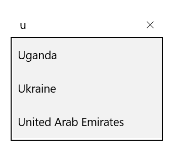
Changing suggestion item height
The SuggestionItemHeight property is used to modify the height of suggestion items in the drop-down list.
<Page
    x:Class="TextBoxExtSample.MainPage"
    xmlns="http://schemas.microsoft.com/winfx/2006/xaml/presentation"
    xmlns:x="http://schemas.microsoft.com/winfx/2006/xaml"
    xmlns:local="using:TextBoxExtSample"
    xmlns:d="http://schemas.microsoft.com/expression/blend/2008"
    xmlns:mc="http://schemas.openxmlformats.org/markup-compatibility/2006"
    mc:Ignorable="d"
    xmlns:editors="using:Syncfusion.UI.Xaml.Controls.Input"
    Background="{ThemeResource ApplicationPageBackgroundThemeBrush}">

    <Grid Background="{StaticResource ApplicationPageBackgroundThemeBrush}">

        <editors:SfTextBoxExt x:Name="textBoxExt"
                              HorizontalAlignment="Center"
                              VerticalAlignment="Center"
                              AutoCompleteMode="Suggest"
                              SuggestionItemHeight="20"
                              Width="200">
        </editors:SfTextBoxExt>
    </Grid>
</Page>
using Syncfusion.UI.Xaml.Controls.Input;
using System.Collections.Generic;
using Windows.UI.Xaml;
using Windows.UI.Xaml.Controls;
// The BlankPage item template is documented at https://go.microsoft.com/fwlink/?LinkId=402352&clcid=0x409.
namespace TextBoxExtSample
{
/// <summary>
/// An empty page that can be used on its own or navigated within a frame.
/// </summary>
public sealed partial class MainPage : Page
{
public MainPage()
{
this.InitializeComponent();
SfTextBoxExt textBoxExt = new SfTextBoxExt()
{
HorizontalAlignment = HorizontalAlignment.Center,
VerticalAlignment = VerticalAlignment.Center,
Width = 200,
AutoCompleteMode = AutoCompleteMode.Suggest,
SuggestionItemHeight = 20
};
List<string> list = new List<string>()
{
"India",
"Uganda",
"Ukraine",
"Canada",
"United Arab Emirates"
};
textBoxExt.AutoCompleteSource = list;
this.Content = textBoxExt;
}
}
}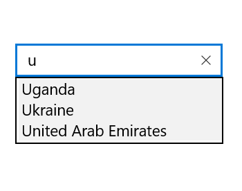
Changing the corner radius of suggestion box
The DropDownCornerRadius property is used to modify the corner radius of suggestion box. The following code example demonstrates how to change the corner radius of suggestion box.
<Page
    x:Class="TextBoxExtSample.MainPage"
    xmlns="http://schemas.microsoft.com/winfx/2006/xaml/presentation"
    xmlns:x="http://schemas.microsoft.com/winfx/2006/xaml"
    xmlns:local="using:TextBoxExtSample"
    xmlns:d="http://schemas.microsoft.com/expression/blend/2008"
    xmlns:mc="http://schemas.openxmlformats.org/markup-compatibility/2006"
    mc:Ignorable="d"
    xmlns:editors="using:Syncfusion.UI.Xaml.Controls.Input"
    Background="{ThemeResource ApplicationPageBackgroundThemeBrush}">

    <Grid Background="{StaticResource ApplicationPageBackgroundThemeBrush}">

        <editors:SfTextBoxExt x:Name="textBoxExt"
                              HorizontalAlignment="Center"
                              VerticalAlignment="Center"
                              AutoCompleteMode="Suggest"
                              DropDownCornerRadius="5"
                              Width="200">
        </editors:SfTextBoxExt>
    </Grid>
</Page>
using Syncfusion.UI.Xaml.Controls.Input;
using System.Collections.Generic;
using Windows.UI.Xaml;
using Windows.UI.Xaml.Controls;
// The BlankPage item template is documented at https://go.microsoft.com/fwlink/?LinkId=402352&clcid=0x409.
namespace TextBoxExtSample
{
/// <summary>
/// An empty page that can be used on its own or navigated within a frame.
/// </summary>
public sealed partial class MainPage : Page
{
public MainPage()
{
this.InitializeComponent();
SfTextBoxExt textBoxExt = new SfTextBoxExt()
{
HorizontalAlignment = HorizontalAlignment.Center,
VerticalAlignment = VerticalAlignment.Center,
Width = 200,
AutoCompleteMode = AutoCompleteMode.Suggest,
DropDownCornerRadius = 5
};
List<string> list = new List<string>()
{
"India",
"Uganda",
"Ukraine",
"Canada",
"United Arab Emirates"
};
textBoxExt.AutoCompleteSource = list;
this.Content = textBoxExt;
}
}
}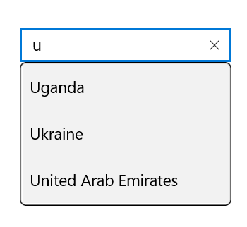
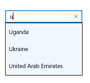
Changing the background color of suggestion box
The DropDownBackground property is used to modify the background color of suggestion box. The following code example demonstrates how to change the background color of suggestion box.
<Page
    x:Class="TextBoxExtSample.MainPage"
    xmlns="http://schemas.microsoft.com/winfx/2006/xaml/presentation"
    xmlns:x="http://schemas.microsoft.com/winfx/2006/xaml"
    xmlns:local="using:TextBoxExtSample"
    xmlns:d="http://schemas.microsoft.com/expression/blend/2008"
    xmlns:mc="http://schemas.openxmlformats.org/markup-compatibility/2006"
    mc:Ignorable="d"
    xmlns:editors="using:Syncfusion.UI.Xaml.Controls.Input"
    Background="{ThemeResource ApplicationPageBackgroundThemeBrush}">

    <Grid Background="{StaticResource ApplicationPageBackgroundThemeBrush}">

        <editors:SfTextBoxExt x:Name="textBoxExt"
                              HorizontalAlignment="Center"
                              VerticalAlignment="Center"
                              AutoCompleteMode="Suggest"
                              DropDownBackground="AliceBlue"
                              Width="200">
        </editors:SfTextBoxExt>
    </Grid>
</Page>
using System.Collections.Generic;
using Syncfusion.UI.Xaml.Controls.Input;
using Windows.UI.Xaml;
using Windows.UI.Xaml.Controls;
// The BlankPage item template is documented at https://go.microsoft.com/fwlink/?LinkId=402352&clcid=0x409.
namespace TextBoxExtSample
{
/// <summary>
/// An empty page that can be used on its own or navigated within a frame.
/// </summary>
public sealed partial class MainPage : Page
{
public MainPage()
{
this.InitializeComponent();
SfTextBoxExt textBoxExt = new SfTextBoxExt()
{
HorizontalAlignment = HorizontalAlignment.Center,
VerticalAlignment = VerticalAlignment.Center,
Width = 200,
AutoCompleteMode = AutoCompleteMode.Suggest,
DropDownBackground = new Windows.UI.Xaml.Media.SolidColorBrush(Windows.UI.Colors.AliceBlue)
};
List<string> list = new List<string>()
{
"India",
"Uganda",
"Ukraine",
"Canada",
"United Arab Emirates"
};
textBoxExt.AutoCompleteSource = list;
this.Content = textBoxExt;
}
}
}
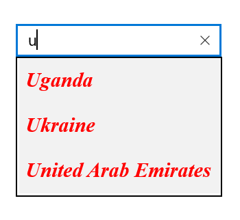
Customizing suggestion items
The suggestion box items can be customized using the SuggestionItemFontWeight, SuggestionItemFontStyle, SuggestionItemForeground, SuggestionItemFontSize, and SuggestionItemFontFamily properties.
<Page
    x:Class="TextBoxExtSample.MainPage"
    xmlns="http://schemas.microsoft.com/winfx/2006/xaml/presentation"
    xmlns:x="http://schemas.microsoft.com/winfx/2006/xaml"
    xmlns:local="using:TextBoxExtSample"
    xmlns:d="http://schemas.microsoft.com/expression/blend/2008"
    xmlns:mc="http://schemas.openxmlformats.org/markup-compatibility/2006"
    mc:Ignorable="d"
    xmlns:editors="using:Syncfusion.UI.Xaml.Controls.Input"
    Background="{ThemeResource ApplicationPageBackgroundThemeBrush}">

    <Grid Background="{StaticResource ApplicationPageBackgroundThemeBrush}">

        <editors:SfTextBoxExt x:Name="textBoxExt"
                              HorizontalAlignment="Center"
                              VerticalAlignment="Center"
                              AutoCompleteMode="Suggest"
                              SuggestionItemFontWeight="Bold"
                              SuggestionItemFontStyle="Italic"
                              SuggestionItemFontFamily="Times New Roman"
                              SuggestionItemFontSize="20"
                              SuggestionItemForeground="Red"
                              Width="200">
        </editors:SfTextBoxExt>
    </Grid>
</Page>
using Syncfusion.UI.Xaml.Controls.Input;
using System.Collections.Generic;
using Windows.UI.Xaml;
using Windows.UI.Xaml.Controls;
// The BlankPage item template is documented at https://go.microsoft.com/fwlink/?LinkId=402352&clcid=0x409.
namespace TextBoxExtSample
{
/// <summary>
/// An empty page that can be used on its own or navigated within a frame.
/// </summary>
public sealed partial class MainPage : Page
{
public MainPage()
{
this.InitializeComponent();
SfTextBoxExt textBoxExt = new SfTextBoxExt()
{
HorizontalAlignment = HorizontalAlignment.Center,
VerticalAlignment = VerticalAlignment.Center,
Width = 200,
AutoCompleteMode = AutoCompleteMode.Suggest,
SuggestionItemFontWeight = Windows.UI.Text.FontWeights.Bold,
SuggestionItemFontStyle = Windows.UI.Text.FontStyle.Italic,
SuggestionItemForeground = new Windows.UI.Xaml.Media.SolidColorBrush(Windows.UI.Colors.Red),
SuggestionItemFontSize = 20,
SuggestionItemFontFamily = new Windows.UI.Xaml.Media.FontFamily("Times New Roman")
};
List<string> list = new List<string>()
{
"India",
"Uganda",
"Ukraine",
"Canada",
"United Arab Emirates"
};
textBoxExt.AutoCompleteSource = list;
this.Content = textBoxExt;
}
}
}
Show Clear button
The AutoComplete allows users to show or hide the Clear button using the ShowClearButton property.
<Page
    x:Class="TextBoxExtSample.MainPage"
    xmlns="http://schemas.microsoft.com/winfx/2006/xaml/presentation"
    xmlns:x="http://schemas.microsoft.com/winfx/2006/xaml"
    xmlns:local="using:TextBoxExtSample"
    xmlns:d="http://schemas.microsoft.com/expression/blend/2008"
    xmlns:mc="http://schemas.openxmlformats.org/markup-compatibility/2006"
    mc:Ignorable="d"
    xmlns:editors="using:Syncfusion.UI.Xaml.Controls.Input"
    Background="{ThemeResource ApplicationPageBackgroundThemeBrush}">

    <Grid Background="{StaticResource ApplicationPageBackgroundThemeBrush}">

        <editors:SfTextBoxExt x:Name="textBoxExt"
                              HorizontalAlignment="Center"
                              VerticalAlignment="Center"
                              AutoCompleteMode="Suggest"
                              ShowClearButton="False"
                              Width="200">
        </editors:SfTextBoxExt>
    </Grid>
</Page>
using Syncfusion.UI.Xaml.Controls.Input;
using System.Collections.Generic;
using Windows.UI.Xaml;
using Windows.UI.Xaml.Controls;
// The BlankPage item template is documented at https://go.microsoft.com/fwlink/?LinkId=402352&clcid=0x409.
namespace TextBoxExtSample
{
/// <summary>
/// An empty page that can be used on its own or navigated within a frame.
/// </summary>
public sealed partial class MainPage : Page
{
public MainPage()
{
this.InitializeComponent();
SfTextBoxExt textBoxExt = new SfTextBoxExt()
{
HorizontalAlignment = HorizontalAlignment.Center,
VerticalAlignment = VerticalAlignment.Center,
Width = 200,
AutoCompleteMode = AutoCompleteMode.Suggest,
ShowClearButton = false
};
List<string> list = new List<string>()
{
"India",
"Uganda",
"Ukraine",
"Canada",
"United Arab Emirates"
};
textBoxExt.AutoCompleteSource = list;
this.Content = textBoxExt;
}
}
}Changing border visibility
The ShowBorder property is used to modify the visibility of border. The following code example demonstrates how to change the border visibility.
<Page
    x:Class="TextBoxExtSample.MainPage"
    xmlns="http://schemas.microsoft.com/winfx/2006/xaml/presentation"
    xmlns:x="http://schemas.microsoft.com/winfx/2006/xaml"
    xmlns:local="using:TextBoxExtSample"
    xmlns:d="http://schemas.microsoft.com/expression/blend/2008"
    xmlns:mc="http://schemas.openxmlformats.org/markup-compatibility/2006"
    mc:Ignorable="d"
    xmlns:editors="using:Syncfusion.UI.Xaml.Controls.Input"
    Background="{ThemeResource ApplicationPageBackgroundThemeBrush}">

    <Grid Background="{StaticResource ApplicationPageBackgroundThemeBrush}">

        <editors:SfTextBoxExt x:Name="textBoxExt"
                              HorizontalAlignment="Center"
                              VerticalAlignment="Center"
                              AutoCompleteMode="Suggest"
                              ShowBorder="False"
                              Width="200">
        </editors:SfTextBoxExt>
    </Grid>
</Page>
using Syncfusion.UI.Xaml.Controls.Input;
using System.Collections.Generic;
using Windows.UI.Xaml;
using Windows.UI.Xaml.Controls;
// The BlankPage item template is documented at https://go.microsoft.com/fwlink/?LinkId=402352&clcid=0x409.
namespace TextBoxExtSample
{
/// <summary>
/// An empty page that can be used on its own or navigated within a frame.
/// </summary>
public sealed partial class MainPage : Page
{
public MainPage()
{
this.InitializeComponent();
SfTextBoxExt textBoxExt = new SfTextBoxExt()
{
HorizontalAlignment = HorizontalAlignment.Center,
VerticalAlignment = VerticalAlignment.Center,
Width = 200,
AutoCompleteMode = AutoCompleteMode.Suggest,
ShowBorder=false
};
List<string> list = new List<string>()
{
"India",
"Uganda",
"Ukraine",
"Canada",
"United Arab Emirates"
};
textBoxExt.AutoCompleteSource = list;
this.Content = textBoxExt;
}
}
}