Enable Tooltip for Toolbar items
9 Dec 202524 minutes to read
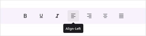
The tooltip is enabled in the view when the TooltipText or Text property is set for the ToolbarItems.
Tooltip Text
You can set the tooltip text by setting the TooltipText property.
The following code sample demonstrates how to create a toolbar control with tooltip.
<?xml version="1.0" encoding="utf-8" ?>
<ContentPage xmlns="http://schemas.microsoft.com/dotnet/2021/maui"
xmlns:x="http://schemas.microsoft.com/winfx/2009/xaml"
xmlns:local="clr-namespace:ToolbarSample"
xmlns:toolbar="clr-namespace:Syncfusion.Maui.Toolbar;assembly=Syncfusion.Maui.Toolbar"
x:Class="ToolbarSample.MainPage">
<StackLayout>
<toolbar:SfToolbar x:Name="Toolbar" HeightRequest="56">
<toolbar:SfToolbar.Items>
<toolbar:SfToolbarItem Name="Bold"
ToolTipText="Bold">
<toolbar:SfToolbarItem.Icon>
<FontImageSource Glyph=""
FontFamily="MauiMaterialAssets" />
</toolbar:SfToolbarItem.Icon>
</toolbar:SfToolbarItem>
<toolbar:SfToolbarItem Name="Underline"
ToolTipText="Underline">
<toolbar:SfToolbarItem.Icon>
<FontImageSource Glyph=""
FontFamily="MauiMaterialAssets" />
</toolbar:SfToolbarItem.Icon>
</toolbar:SfToolbarItem>
<toolbar:SfToolbarItem Name="Italic"
ToolTipText="Italic">
<toolbar:SfToolbarItem.Icon>
<FontImageSource Glyph=""
FontFamily="MauiMaterialAssets" />
</toolbar:SfToolbarItem.Icon>
</toolbar:SfToolbarItem>
<toolbar:SfToolbarItem Name="AlignLeft"
ToolTipText="Align-Left">
<toolbar:SfToolbarItem.Icon>
<FontImageSource Glyph=""
FontFamily="MauiMaterialAssets" />
</toolbar:SfToolbarItem.Icon>
</toolbar:SfToolbarItem>
<toolbar:SfToolbarItem Name="AlignRight"
ToolTipText="Align-Right">
<toolbar:SfToolbarItem.Icon>
<FontImageSource Glyph=""
FontFamily="MauiMaterialAssets" />
</toolbar:SfToolbarItem.Icon>
</toolbar:SfToolbarItem>
<toolbar:SfToolbarItem Name="AlignCenter"
ToolTipText="Align-Center">
<toolbar:SfToolbarItem.Icon>
<FontImageSource Glyph=""
FontFamily="MauiMaterialAssets" />
</toolbar:SfToolbarItem.Icon>
</toolbar:SfToolbarItem>
<toolbar:SfToolbarItem Name="AlignJustify"
ToolTipText="Align-Justify">
<toolbar:SfToolbarItem.Icon>
<FontImageSource Glyph=""
FontFamily="MauiMaterialAssets" />
</toolbar:SfToolbarItem.Icon>
</toolbar:SfToolbarItem>
</toolbar:SfToolbar.Items>
</toolbar:SfToolbar>
</StackLayout>
</ContentPage>using Syncfusion.Maui.Toolbar;
namespace ToolbarGettingStarted
{
public partial class MainPage : ContentPage
{
public MainPage()
{
InitializeComponent();
SfToolbar toolbar = new SfToolbar();
toolbar.HeightRequest = 56;
ObservableCollection<BaseToolbarItem> itemCollection = new ObservableCollection<BaseToolbarItem>
{
new SfToolbarItem
{
Name = "Bold",
ToolTipText = "Bold",
Icon = new FontImageSource { Glyph = "\uE770", FontFamily = "MauiMaterialAssets" }
},
new SfToolbarItem
{
Name = "Underline",
ToolTipText = "Underline",
Icon = new FontImageSource { Glyph = "\uE762", FontFamily = "MauiMaterialAssets" }
},
new SfToolbarItem
{
Name = "Italic",
ToolTipText = "Italic",
Icon = new FontImageSource { Glyph = "\uE771", FontFamily = "MauiMaterialAssets" }
},
new SfToolbarItem
{
Name = "AlignLeft",
ToolTipText = "Align-Left",
Icon = new FontImageSource { Glyph = "\uE751", FontFamily = "MauiMaterialAssets" }
},
new SfToolbarItem
{
Name = "AlignRight",
ToolTipText = "Align-Right",
Icon = new FontImageSource { Glyph = "\uE753", FontFamily = "MauiMaterialAssets" }
},
new SfToolbarItem
{
Name = "AlignCenter",
ToolTipText = "Align-Center",
Icon = new FontImageSource { Glyph = "\uE752", FontFamily = "MauiMaterialAssets" }
},
new SfToolbarItem
{
Name = "AlignJustify",
ToolTipText = "Align-Justify",
Icon = new FontImageSource { Glyph = "\uE74F", FontFamily = "MauiMaterialAssets" }
}
};
toolbar.Items = itemCollection;
this.Content = toolbar;
}
}
}
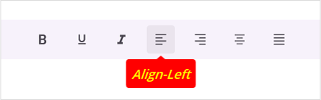
Tooltip Settings
The Toolbar control supports customizing tooltip using ToolTipSettings property. You can set Background, TextStyle and ToolTipPosition.
The properties of ToolTipSettings are:
- Background : Set background color for the tooltip.
- TextStyle : Set text style for the tooltip text.
-
ToolTipPosition : Set the ToolbarRelativePosition for the tooltip. The options are Auto, Top, Bottom, Left and Right. The default value is
Auto.
The following code sample demonstrates how to create a toolbar control with tooltip settings.
<?xml version="1.0" encoding="utf-8" ?>
<ContentPage xmlns="http://schemas.microsoft.com/dotnet/2021/maui"
xmlns:x="http://schemas.microsoft.com/winfx/2009/xaml"
xmlns:toolbar="clr-namespace:Syncfusion.Maui.Toolbar;assembly=Syncfusion.Maui.Toolbar"
x:Class="ToolbarSample.MainPage">
<VerticalStackLayout>
<toolbar:SfToolbar x:Name="Toolbar" HeightRequest="56">
<toolbar:SfToolbar.Items>
<toolbar:SfToolbarItem Name="Bold"
ToolTipText="Bold">
<toolbar:SfToolbarItem.Icon>
<FontImageSource Glyph=""
FontFamily="MauiMaterialAssets" />
</toolbar:SfToolbarItem.Icon>
</toolbar:SfToolbarItem>
<toolbar:SfToolbarItem Name="Underline"
ToolTipText="Underline">
<toolbar:SfToolbarItem.Icon>
<FontImageSource Glyph=""
FontFamily="MauiMaterialAssets" />
</toolbar:SfToolbarItem.Icon>
</toolbar:SfToolbarItem>
<toolbar:SfToolbarItem Name="Italic"
ToolTipText="Italic">
<toolbar:SfToolbarItem.Icon>
<FontImageSource Glyph=""
FontFamily="MauiMaterialAssets" />
</toolbar:SfToolbarItem.Icon>
</toolbar:SfToolbarItem>
<toolbar:SfToolbarItem Name="AlignLeft"
ToolTipText="Align-Left">
<toolbar:SfToolbarItem.Icon>
<FontImageSource Glyph=""
FontFamily="MauiMaterialAssets" />
</toolbar:SfToolbarItem.Icon>
</toolbar:SfToolbarItem>
<toolbar:SfToolbarItem Name="AlignRight"
ToolTipText="Align-Right">
<toolbar:SfToolbarItem.Icon>
<FontImageSource Glyph=""
FontFamily="MauiMaterialAssets" />
</toolbar:SfToolbarItem.Icon>
</toolbar:SfToolbarItem>
<toolbar:SfToolbarItem Name="AlignCenter"
ToolTipText="Align-Center">
<toolbar:SfToolbarItem.Icon>
<FontImageSource Glyph=""
FontFamily="MauiMaterialAssets" />
</toolbar:SfToolbarItem.Icon>
</toolbar:SfToolbarItem>
<toolbar:SfToolbarItem Name="AlignJustify"
ToolTipText="Align-Justify">
<toolbar:SfToolbarItem.Icon>
<FontImageSource Glyph=""
FontFamily="MauiMaterialAssets" />
</toolbar:SfToolbarItem.Icon>
</toolbar:SfToolbarItem>
</toolbar:SfToolbar.Items>
<toolbar:SfToolbar.ToolTipSettings>
<toolbar:ToolbarToolTipSettings Background="Red" ToolTipPosition="Bottom">
<toolbar:ToolbarToolTipSettings.TextStyle>
<toolbar:ToolbarTextStyle TextColor="Yellow"
FontSize="18"
FontAttributes="Italic"
FontAutoScalingEnabled="True"
FontFamily="OpenSansSemibold"/>
</toolbar:ToolbarToolTipSettings.TextStyle>
</toolbar:ToolbarToolTipSettings>
</toolbar:SfToolbar.ToolTipSettings>
</toolbar:SfToolbar>
</VerticalStackLayout>
</ContentPage>using Syncfusion.Maui.Toolbar;
namespace ToolbarSample
{
public partial class MainPage : ContentPage
{
public MainPage()
{
InitializeComponent();
SfToolbar toolbar = new SfToolbar();
toolbar.HeightRequest = 56;
toolbar.Items = itemCollection;
toolbar.ToolTipSettings = toolTipSettings;
this.Content = toolbar;
}
ObservableCollection<BaseToolbarItem> itemCollection = new ObservableCollection<BaseToolbarItem>
{
new SfToolbarItem { Name = "Bold", ToolTipText = "Bold", Icon = new FontImageSource { Glyph = "\uE770", FontFamily = "MauiMaterialAssets" } },
new SfToolbarItem { Name = "Underline", ToolTipText = "Underline", Icon = new FontImageSource { Glyph = "\uE762", FontFamily = "MauiMaterialAssets" } },
new SfToolbarItem { Name = "Italic", ToolTipText = "Italic", Icon = new FontImageSource { Glyph = "\uE771", FontFamily = "MauiMaterialAssets" } },
new SfToolbarItem { Name = "AlignLeft", ToolTipText = "Align-Left", Icon = new FontImageSource { Glyph = "\uE751", FontFamily = "MauiMaterialAssets" } },
new SfToolbarItem { Name = "AlignRight", ToolTipText = "Align-Right", Icon = new FontImageSource { Glyph = "\uE753", FontFamily = "MauiMaterialAssets" } },
new SfToolbarItem { Name = "AlignCenter", ToolTipText = "Align-Center", Icon = new FontImageSource { Glyph = "\uE752", FontFamily = "MauiMaterialAssets" } },
new SfToolbarItem { Name = "AlignJustify", ToolTipText = "Align-Justify", Icon = new FontImageSource { Glyph = "\uE74F", FontFamily = "MauiMaterialAssets" } }
};
ToolbarToolTipSettings toolTipSettings = new ToolbarToolTipSettings
{
Background = Colors.Red,
TextStyle = new ToolbarTextStyle
{
TextColor = Colors.Yellow,
FontSize = 18,
FontAttributes = FontAttributes.Italic,
FontAutoScalingEnabled = true,
FontFamily = "OpenSansSemibold"
},
ToolTipPosition = ToolbarRelativePosition.Bottom,
};
}
}