About Syncfusion® .NET MAUI Toolbar Control
18 Nov 20185 minutes to read
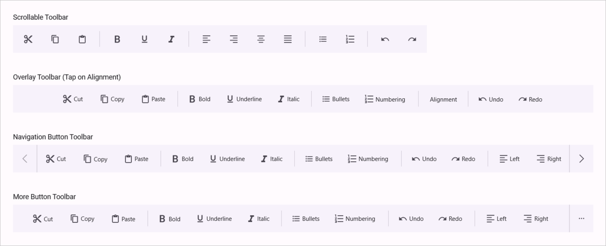
The Syncfusion® .NET MAUI Toolbar control is a customizable UI control that provides quick access to actions or commands through buttons, icons, or menus, enhancing usability and efficiency. It offers a structured, customizable, and user-friendly layout that supports multiple orientations, item alignments, and overflow handling.
Business use cases
- Applications that require quick access to common actions such as save, edit, or navigation commands.
- Productivity and editor apps that provide Toolbar-based command execution for user tasks.
- Dashboard applications that expose frequently used actions in a compact and accessible UI.
- Business applications that require organized command layouts with support for overflow and responsiveness.
Key features
- Toolbar item allows displaying icons, text, or custom views for flexible command representation.
- Orientation allows arranging Toolbar items in horizontal or vertical layouts.
- Item alignment allows positioning items at the start, center, or end of the Toolbar.
- Overflow handling allows managing extra items using scroll, navigation buttons, or a more options menu.
- Overflow positioning allows controlling the placement of overflow items based on available space.
- Overlay Toolbar allows displaying floating Toolbars that appear when needed.
- Separator allows visually dividing Toolbar items for better clarity and grouping.
- Tooltip allows showing additional information when interacting with Toolbar items.
- Enable or disable allows controlling the availability of individual Toolbar actions.
- Interaction allows selecting and highlighting Toolbar items for better usability.
- Keyboard support allows navigating and interacting with Toolbar items through keyboard shortcuts.
Globalization
The following table summarizes the globalization support available in this control.
 Full Support
 Not Applicable
| Control | Localization | RTL | Time zone | Screen reader | Keyboard navigation |
|---|---|---|---|---|---|
| Toolbar | |
|
|
|
|
Related controls
- Navigation Drawer for organizing navigation and actions in a side panel.
- Tab View for grouping content and actions within tabbed interfaces.
- Button for triggering actions and commands.
See Also
- Getting Started shows a step‑by‑step guide to begin using the Toolbar control.
- Toolbar Items explains how to configure toolbar items and commands.
- Customization helps customize layout and appearance.
- UI Kit provides interactive demos and ready‑made UI examples.
Resources
Feature Tour
Get a quick overview of key features and capabilities to kick start your journey.
Explore Features
Tutorial Videos
Watch step‑by‑step video guides to quickly understand concepts and implementation.
Watch now
Knowledge Base
Find practical solutions, troubleshooting tips and how‑to guides for common scenarios.
Search KB's