Configure the Appearance of Tab Item in .NET MAUI Tab View (SfTabView)
17 Apr 202618 minutes to read
A tab item consists of various elements that can be customized in the .NET MAUI Tab View.
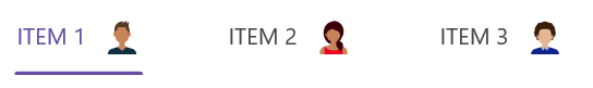
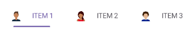
Adding image in tab item
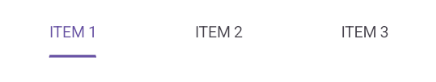
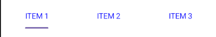
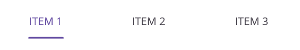
Header
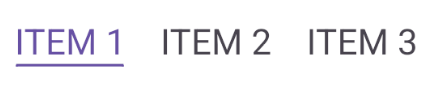
The header holds the text of the tab item displayed in the tab bar.
<tabView:SfTabView>
    <tabView:SfTabItem Header="ITEM 1"/>
</tabView:SfTabView>
var tabView = new SfTabView();
var tabItems = new TabItemCollection
{
new SfTabItem()
{
Header = "ITEM 1",
}
}
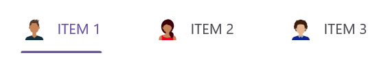
ImageSource
The image to be displayed in the tab bar representing the tab item.
<tabView:SfTabView>
    <tabView:SfTabItem Header="ITEM 1" ImageSource="alexandar"/>
</tabView:SfTabView>
var tabView = new SfTabView();
var tabItems = new TabItemCollection
{
new SfTabItem()
{
Header = "ITEM 1",
ImageSource = "alexandar",
}
}
Content
The assigned view will get displayed in the main area of the Tab View.
<tabView:SfTabView>
    <tabView:SfTabItem Header="ITEM 2">
        <tabView:SfTabItem.Content>
            <ListView>
                ...
            </ListView>
        </tabView:SfTabItem.Content>
        </tabView:SfTabItem>
</tabView>
var tabView = new SfTabView();
var tabItems = new TabItemCollection
{
new SfTabItem()
{
Header = "ITEM 2",
Content = new ListView()
{
/// code
}
}
}
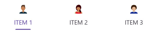
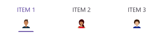
ImagePosition options
The .NET MAUI Tab View provides four options determining how the image of the tab aligns relative to the text. The options are left, top, right and bottom. These can be achieved using the ImagePosition property of SfTabItem.
NOTE
Each tab item can have different image positions. The Visual State Manager can be used to apply the same value to all tabs.
Top
The image will be placed above the text vertically.
<tabView:SfTabView>
     <tabView:SfTabItem ImagePosition="Top"/>
 </tabView:SfTabView>
var tabView = new SfTabView();
var tabItems = new TabItemCollection
{
new SfTabItem()
{
ImagePosition = TabImagePosition.Top,
}
}
Bottom
The image will be placed below the text vertically.
<tabView:SfTabView>
    <tabView:SfTabItem ImagePosition="Bottom"/>
</tabView:SfTabView>
var tabView = new SfTabView();
var tabItems = new TabItemCollection
{
new SfTabItem()
{
ImagePosition = TabImagePosition.Bottom,
}
}
Left
The image will be placed before the text, horizontally.
<tabView:SfTabView>
    <tabView:SfTabItem ImagePosition="Left">
</tabView:SfTabView>
var tabView = new SfTabView();
var tabItems = new TabItemCollection
{
new SfTabItem()
{
ImagePosition = TabImagePosition.Left,
}
}
Right
The image will be placed to the right side of the text, horizontally.
<tabView:SfTabView>
    <tabView:SfTabItem ImagePosition="Right">
</tabView:SfTabView>
var tabView = new SfTabView();
var tabItems = new TabItemCollection
{
new SfTabItem()
{
ImagePosition = TabImagePosition.Right,
}
}
ImageTextSpacing
The ImageTextSpacing property in SfTabItem allows spacing between the image and the text of the tab item.
<tabView:SfTabView>
    <tabView:SfTabItem ImageTextSpacing="20"/>
</tabView:SfTabView>
var tabView = new SfTabView();
var tabItems = new TabItemCollection
{
new SfTabItem()
{
ImageTextSpacing = "20",
}
}
TextColor customization
The text color of the tab item displayed in the tab bar.
<tabView:SfTabView>
    <tabView:SfTabItem TextColor="Blue"/>
</tabView:SfTabView>
var tabView = new SfTabView();
var tabItems = new TabItemCollection
{
new SfTabItem()
{
TextColor = Color.Blue,
}
}
Font customization
This type of customization involves changes to some font elements.
FontFamily
Font family of the tab item text displayed in the tab bar.
<tabView:SfTabView>
    <tabView:SfTabItem FontFamily="OpenSansRegular"/>
</tabView:SfTabView>
var tabView = new SfTabView();
var tabItems = new TabItemCollection
{
new SfTabItem()
{
FontFamily = "OpenSansRegular",
}
}
FontAttribute
The font style of the text of each tab item in the tab bar.
<tabView:SfTabView>
    <tabView:SfTabItem FontAttributes="Bold"/>
</tabView:SfTabView>
var tabView = new SfTabView();
var tabItems = new TabItemCollection
{
new SfTabItem()
{
FontAttributes = FontAttributes.Bold,
}
}
FontSize
The size of the text of each tab item in the tab bar.
<tabView:SfTabView>
    <tabView:SfTabItem FontSize="32"/>
</tabView:SfTabView>
var tabView = new SfTabView();
var tabItems = new TabItemCollection
{
new SfTabItem()
{
FontSize = 32,
}
}
LineBreakMode
Line break mode of the tab item text displayed in the tab bar.
<tabView:SfTabView>
    <tabView:SfTabItem Header="Terms and Conditions and Privacy Policy" LineBreakMode="WordWrap"/>
    <tabView:SfTabItem Header="Account Settings and Preferences" LineBreakMode="WordWrap"/>
    <tabView:SfTabItem Header="Licenses and Copyrights Agreements" LineBreakMode="WordWrap"/>
</tabView:SfTabView>
var tabItem = new SfTabItem { Header = "Very long header text that may wrap or truncate" };
tabItem.LineBreakMode = LineBreakMode.WordWrap;
var tabView = new SfTabView();
var tabItems = new TabItemCollection
{
new SfTabItem()
{
Header = "Terms and Conditions and Privacy Policy",
LineBreakMode = LineBreakMode.WordWrap
},
new SfTabItem()
{
Header = "Account Settings and Preferences",
LineBreakMode = LineBreakMode.WordWrap
},
new SfTabItem()
{
Header = "Licenses and Copyrights Agreements",
LineBreakMode = LineBreakMode.WordWrap
}
}
Badge support
In SfTabItem, badges notify users of new or unread messages, notifications, or the status of something.
BadgeText
By using the BadgeText property in the SfTabItem, you can add text to badge view.
<tabView:SfTabView>
    <tabView:SfTabItem BadgeText="20"/>
</tabView:SfTabView>
var tabView = new SfTabView();
var tabItems = new TabItemCollection
{
new SfTabItem()
{
BadgeText = "20",
}
}BadgeSettings
The BadgeSettings property helps customize the basic look and feel of the badge view in the SfTabItem.
It contains the sub-elements such as badge types, positions, and colors. You can customize the background color, text color, border color, width, offset, and font attributes.
NOTE
To customize the badge beyond predefined styles, set Type property to None in the BadgeSettings.
<ContentPage
    . . .
    xmlns:tabView="clr-namespace:Syncfusion.Maui.TabView;assembly=Syncfusion.Maui.TabView
    xmlns:core="clr-namespace:Syncfusion.Maui.Core;assembly=Syncfusion.Maui.Core">
    <tabView:SfTabView>
        <tabView:SfTabItem Header="RECENTS" BadgeText="20">
            <tabView:SfTabItem.BadgeSettings >
                <core:BadgeSettings FontSize="15"
                                    FontAttributes="Bold"
                                    FontFamily="serif"/>
            </tabView:SfTabItem.BadgeSettings>
        </tabView:SfTabItem>
    </tabView:SfTabView>
</ContentPage>
using Syncfusion.Maui.Core;
using Syncfusion.Maui.TabView;
...
var tabView = new SfTabView();
BadgeSettings badgeSetting = new BadgeSettings();
badgeSetting.FontAttributes = FontAttributes.Bold;
badgeSetting.FontSize = 15;
badgeSetting.FontFamily = "serif";
var tabItems = new TabItemCollection()
{
new SfTabItem()
{
Header="TabItem",
BadgeText = "Inbox",
BadgeSettings = badgeSetting,
}
};
tabView.Items = tabItems;
NOTE
View sample in GitHub.
TabHeaderPadding
The TabHeaderPadding property in SfTabView allows for adding padding to the tab header.
NOTE
The
TabHeaderPaddingproperty is only applicable when TabWidthMode is set to SizeToContent.
<tabView:SfTabView TabWidthMode="SizeToContent" TabHeaderPadding="5,10,5,10">
    <tabView:SfTabItem/>
</tabView:SfTabView>
var tabView = new SfTabView();
tabView.TabWidthMode = TabWidthMode.SizeToContent;
tabView.TabHeaderPadding = new Thickness(5, 10, 5, 10);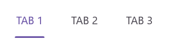
Scroll buttons on header
Scroll buttons are used to navigate through the items in the header of the Tab View by adjusting the IsScrollButtonEnabled property of SfTabView. This additionally indicates the presence of tabs beyond the currently visible area.
<tabView:SfTabView  IsScrollButtonEnabled="True">
    <tabView:SfTabItem/>
</tabView:SfTabView>
var tabView = new SfTabView();
tabView.IsScrollButtonEnabled = true;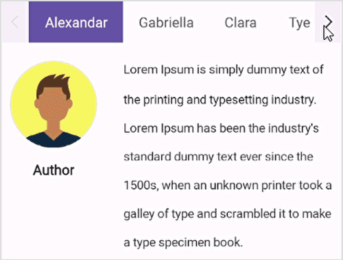
Scroll button customization
The ScrollButtonBackground and ScrollButtonColor property of SfTabView allows customization of the background and foreground color of the scroll button.
<tabView:SfTabView ScrollButtonBackground="Violet" ScrollButtonColor="Red">
</tabView:SfTabView>
StackLayout stackLayout = new StackLayout();
var tabView = new SfTabView();
tabView.ScrollButtonBackground = SolidColorBrush.Violet;
tabView.ScrollButtonColor = Colors.Red;
stackLayout.Children.Add(tabView);
this.Content = stackLayout;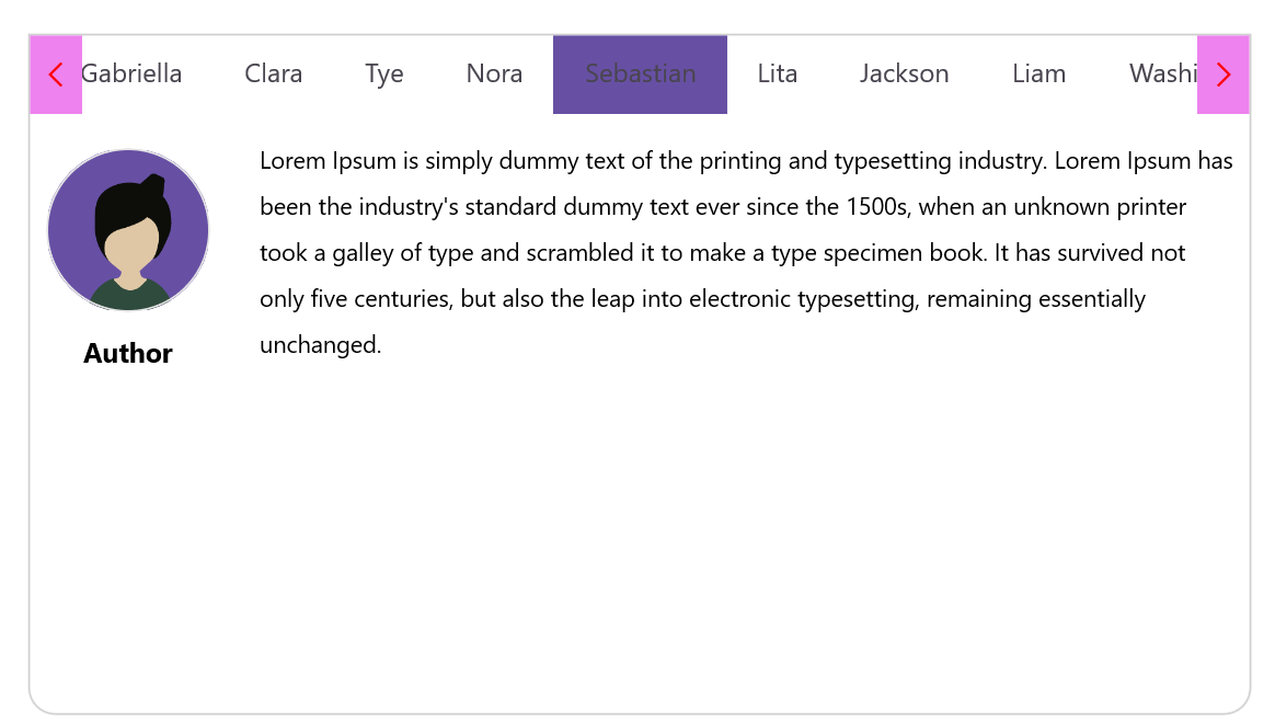
FontAutoScalingEnabled
The FontAutoScalingEnabled property automatically scales the tab header’s font size based on the operating system’s text size. The default value is false.
<tabView:SfTabView FontAutoScalingEnabled="True">
...
</tabView:SfTabView>
var tabView = new SfTabView();
tabView.FontAutoScalingEnabled = true;ContentTransitionDuration
You can customize the animation duration when changing the SelectedIndex of the Tab View by setting the ContentTransitionDuration property.
<tabView:SfTabView  ContentTransitionDuration ="1000">
    <tabView:SfTabItem/>
</tabView:SfTabView>
var tabView = new SfTabView();
tabView.ContentTransitionDuration = 1000;
ImageSize
You can customize the image size in the .NET MAUI Tab View control by setting the ImageSize property.
<tabView:SfTabView>
    <tabView:SfTabItem ImageSize="50"/>
</tabView:SfTabView>
StackLayout stackLayout = new StackLayout();
var tabView = new SfTabView();
var tabItems = new TabItemCollection
{
new SfTabItem()
{
ImageSize = 50,
}
};
tabView.Items = tabItems;
stackLayout.Children.Add(tabView);
this.Content = stackLayout;Disable ripple effect on item click
The EnableRippleAnimation property of the SfTabView allows you to enable or disable the ripple animation for tab headers. This animation provides visual feedback when a tab header is tapped. The default value of the EnableRippleAnimation property is true.
<!-- Define the SfTabView control with the ripple animation disabled -->
<tabView:SfTabView EnableRippleAnimation="False">
    <!-- Define tab items -->
</tabView:SfTabView>
// Create an instance of the SfTabView control
SfTabView tabView = new SfTabView();
// Disable the ripple animation
tabView.EnableRippleAnimation = false;How to
Disable hover effect on tab item
To disable the hover effect when the mouse pointer is over a TabItem header, set color value Transparent to the built-in key SfTabViewHoverBackground.
<ContentPage xmlns="http://schemas.microsoft.com/dotnet/2021/maui"
			 xmlns:x="http://schemas.microsoft.com/winfx/2009/xaml"
			 ... >
	<ContentPage.Resources>
		<Color x:Key="SfTabViewHoverBackground">Transparent</Color>
	</ContentPage.Resources>
	<ContentPage.Content>
		<tabView:SfTabView x:Name="tabView" EnableRippleAnimation="False">
			<!-- Define tab items -->
		</tabView:SfTabView>
	</ContentPage.Content>
</ContentPage>
Select tab items programmatically
To select the tab items programmatically, you can use the SelectedIndex property in SfTabView.
<tabView:SfTabView SelectedIndex="1">
     <tabView:SfTabItem />
     <tabView:SfTabItem />
     <tabView:SfTabItem />
</tabView:SfTabView>
SfTabView tabView = new SfTabView();
tabView.SelectedIndex = 1;