Customize the Tab Bar in .NET MAUI Tab View (SfTabView)
5 Jun 202623 minutes to read
Tab width options
The .NET MAUI Tab View provides two modes that determines how the width of the tab is calculated on the tab bar while it gets populated. The options are Default and SizeToContent. These can be achieved using the TabWidthMode property.
Fixed bar
The width of the tab is divided equally based on the available control width. This enables a fixed tab bar that will not allow tab scrolling, regardless of the number of tabs. This can be achieved by setting the TabWidthMode as Default.
NOTE
This mode is recommended when the tab count is not more than four. More tabs in this mode may appear with the text being trimmed.
<tabView:SfTabView TabWidthMode="Default">tabView.TabWidthMode = TabWidthMode.Default;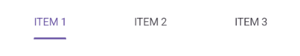
Based on the text size
The width of a tab is set to fit the text or image that it contains by setting the TabWidthMode as SizeToContent. Scroll is enabled in this mode to access the items outside the visible area.
<tabView:SfTabView TabWidthMode="SizeToContent">tabView.TabWidthMode = TabWidthMode.SizeToContent;
Customize the TabBarHeight
The height of the tab bar can be customized by setting the TabBarHeight property. The default height is 48.
NOTE
It is recommended to set the
TabBarHeightto 72 while displaying both the image and text withImagePositionas either top or bottom.
<tabView:SfTabView TabBarHeight="100">tabView.TabBarHeight = 100;NOTE
The
TabBarHeightproperty is obsolete — useTabBarSizeinstead. WhenTabBarPlacementisToporBottom,TabBarSizecontrols the tab bar’s height; whenTabBarPlacementisLeftorRight,TabBarSizecontrols the tab bar’s width.
Customize the TabBarSize
The size of the tab bar can be customized by setting the TabBarSize property. The default size is 48.
<tabView:SfTabView TabBarSize="100" TabBarPlacement="Left" >tabView.TabBarSize = 100;
tabView.TabBarPlacement = TabBarPlacement.LeftCustomize the tab header text alignment
The horizontal text alignment of the tab header can be customized by setting the HeaderHorizontalTextAlignment property. The default value is Center. This property accepts the following values:
- Start - The text will be placed at the starting position in the header tab.
- Center - The text will be placed at the center of the header tab.
- End - The text will be placed at the end of the header tab.
<tabView:SfTabView HeaderHorizontalTextAlignment="Center">tabView.HeaderHorizontalTextAlignment = TextAlignment.Center;
Customize the HeaderItemSpacing
The spacing between the tab items can be customized by setting the HeaderItemSpacing property. The default spacing is 36.
NOTE
HeaderItemSpacingis effective only when theTabWidthModeis set asSizeToContent.
<tabView:SfTabView HeaderItemSpacing="100" TabWidthMode="SizeToContent">tabView.HeaderItemSpacing = 100;
tabView.TabWidthMode = TabWidthMode.SizeToContent;
AnimationEasing
The animation of the tab item content and selection indicator can be customized by setting the AnimationEasing property. The default value is Easing.Linear.
<tabView:SfTabView AnimationEasing="SpringOut">tabView.AnimationEasing = Easing.SpringOut;TabBarPlacement options
The .NET MAUI Tab View provides four options for determining how the tab bar aligns relative to the tab content. The options are top, bottom, left and right. This can be achieved using the TabBarPlacement property.
Top
The tab bar will be placed above the content region of the Tab View control.
<tabView:SfTabView TabBarPlacement="Top"
                       TabBarHeight="60"
                       IndicatorWidthMode="Stretch">

    <tabView:SfTabView.Items>
        <tabView:SfTabItem Header="ITEM 1">
            <tabView:SfTabItem.Content>
                    <Label Text="Tab item content"
                           HorizontalOptions="Center"
                           VerticalOptions="Center" />
            </tabView:SfTabItem.Content>
        </tabView:SfTabItem>

        <tabView:SfTabItem Header="ITEM 2">
            <tabView:SfTabItem.Content>
                        <Label Text="Tab item content"
                               HorizontalOptions="Center"
                               VerticalOptions="Center" />
            </tabView:SfTabItem.Content>
        </tabView:SfTabItem>

        <tabView:SfTabItem Header="ITEM 3">
            <tabView:SfTabItem.Content>
                        <Label Text="Tab item content"
                               HorizontalOptions="Center"
                               VerticalOptions="Center" />
            </tabView:SfTabItem.Content>
        </tabView:SfTabItem>
    </tabView:SfTabView.Items>
</tabView:SfTabView>
var tabView = new SfTabView();
tabView.TabBarPlacement = TabBarPlacement.Top;
tabView.TabBarHeight = 60;
tabView.IndicatorWidthMode = IndicatorWidthMode.Stretch;
var item1 = new SfTabItem { Header = "ITEM 1" };
item1.Content = new Label
{
Text = "Tab item content",
HorizontalOptions = LayoutOptions.Center,
VerticalOptions = LayoutOptions.Center
};
tabView.Items.Add(item1);
var item2 = new SfTabItem { Header = "ITEM 2" };
item2.Content = new Label
{
Text = "Tab item content",
HorizontalOptions = LayoutOptions.Center,
VerticalOptions = LayoutOptions.Center
};
tabView.Items.Add(item2);
var item3 = new SfTabItem { Header = "ITEM 2" };
item3.Content = new Label
{
Text = "Tab item content",
HorizontalOptions = LayoutOptions.Center,
VerticalOptions = LayoutOptions.Center
};
tabView.Items.Add(item3);
this.Content = tabView;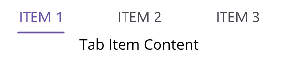
Bottom
The tab bar will be placed below the content region of the Tab View control.
<tabView:SfTabView TabBarPlacement="Bottom">var tabView = new SfTabView();
tabView.TabBarPlacement = TabBarPlacement.Bottom;
tabView.TabBarHeight = 60;
tabView.IndicatorWidthMode = IndicatorWidthMode.Stretch;
var item1 = new SfTabItem { Header = "ITEM 1" };
item1.Content = new Label
{
Text = "Tab item content",
HorizontalOptions = LayoutOptions.Center,
VerticalOptions = LayoutOptions.Center
};
tabView.Items.Add(item1);
var item2 = new SfTabItem { Header = "ITEM 2" };
item2.Content = new Label
{
Text = "Tab item content",
HorizontalOptions = LayoutOptions.Center,
VerticalOptions = LayoutOptions.Center
};
tabView.Items.Add(item2);
var item3 = new SfTabItem { Header = "ITEM 2" };
item3.Content = new Label
{
Text = "Tab item content",
HorizontalOptions = LayoutOptions.Center,
VerticalOptions = LayoutOptions.Center
};
tabView.Items.Add(item3);
this.Content = tabView;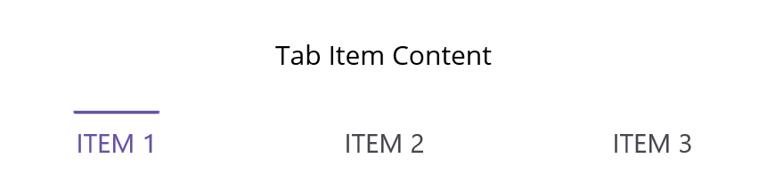
Left
The tab bar will be placed left to the content region of the Tab View control.
<tabView:SfTabView TabBarPlacement="Left"
                     TabBarWidth="60"
                     IndicatorWidthMode="Stretch">

    <tabView:SfTabView.Items>
        <tabView:SfTabItem Header="ITEM 1">
            <tabView:SfTabItem.Content>
                    <Label Text="Tab item content"
                           HorizontalOptions="Center"
                           VerticalOptions="Center" />
            </tabView:SfTabItem.Content>
        </tabView:SfTabItem>

        <tabView:SfTabItem Header="ITEM 2">
            <tabView:SfTabItem.Content>
                        <Label Text="Tab item content"
                               HorizontalOptions="Center"
                               VerticalOptions="Center" />
            </tabView:SfTabItem.Content>
        </tabView:SfTabItem>

        <tabView:SfTabItem Header="ITEM 3">
            <tabView:SfTabItem.Content>
                        <Label Text="Tab item content"
                               HorizontalOptions="Center"
                               VerticalOptions="Center" />
            </tabView:SfTabItem.Content>
        </tabView:SfTabItem>
    </tabView:SfTabView.Items>
</tabView:SfTabView>
var tabView = new SfTabView();
tabView.TabBarPlacement = TabBarPlacement.Left;
tabView.TabBarWidth = 60;
tabView.IndicatorWidthMode = IndicatorWidthMode.Stretch;
var item1 = new SfTabItem { Header = "ITEM 1" };
item1.Content = new Label
{
Text = "Tab item content",
HorizontalOptions = LayoutOptions.Center,
VerticalOptions = LayoutOptions.Center
};
tabView.Items.Add(item1);
var item2 = new SfTabItem { Header = "ITEM 2" };
item2.Content = new Label
{
Text = "Tab item content",
HorizontalOptions = LayoutOptions.Center,
VerticalOptions = LayoutOptions.Center
};
tabView.Items.Add(item2);
var item3 = new SfTabItem { Header = "ITEM 2" };
item3.Content = new Label
{
Text = "Tab item content",
HorizontalOptions = LayoutOptions.Center,
VerticalOptions = LayoutOptions.Center
};
tabView.Items.Add(item3);
this.Content = tabView;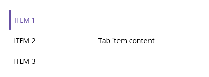
Right
The tab bar will be placed right to the content region of the Tab View control.
<tabView:SfTabView TabBarPlacement="Right"
                   TabBarWidth="60"
                   IndicatorWidthMode="Stretch">

    <tabView:SfTabView.Items>
        <tabView:SfTabItem Header="ITEM 1">
            <tabView:SfTabItem.Content>
                    <Label Text="Tab item content"
                           HorizontalOptions="Center"
                           VerticalOptions="Center" />
            </tabView:SfTabItem.Content>
        </tabView:SfTabItem>

        <tabView:SfTabItem Header="ITEM 2">
            <tabView:SfTabItem.Content>
                        <Label Text="Tab item content"
                               HorizontalOptions="Center"
                               VerticalOptions="Center" />
            </tabView:SfTabItem.Content>
        </tabView:SfTabItem>

        <tabView:SfTabItem Header="ITEM 3">
            <tabView:SfTabItem.Content>
                        <Label Text="Tab item content"
                               HorizontalOptions="Center"
                               VerticalOptions="Center" />
            </tabView:SfTabItem.Content>
        </tabView:SfTabItem>
    </tabView:SfTabView.Items>
</tabView:SfTabView>
var tabView = new SfTabView();
tabView.TabBarPlacement = TabBarPlacement.Right;
tabView.TabBarWidth = 60;
tabView.IndicatorWidthMode = IndicatorWidthMode.Stretch;
var item1 = new SfTabItem { Header = "ITEM 1" };
item1.Content = new Label
{
Text = "Tab item content",
HorizontalOptions = LayoutOptions.Center,
VerticalOptions = LayoutOptions.Center
};
tabView.Items.Add(item1);
var item2 = new SfTabItem { Header = "ITEM 2" };
item2.Content = new Label
{
Text = "Tab item content",
HorizontalOptions = LayoutOptions.Center,
VerticalOptions = LayoutOptions.Center
};
tabView.Items.Add(item2);
var item3 = new SfTabItem { Header = "ITEM 2" };
item3.Content = new Label
{
Text = "Tab item content",
HorizontalOptions = LayoutOptions.Center,
VerticalOptions = LayoutOptions.Center
};
tabView.Items.Add(item3);
this.Content = tabView;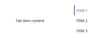
TabBarBackground customization
The tab bar background can be customized using the TabBarBackground property, which is of type Brush.
Solid color
A solid color can be achieved by assigning the SolidColorBrush to the TabBarBackground, which represents the color of the tab bar background.
<tabView:SfTabView TabBarBackground="LightBlue">tabView.TabBarBackground = Colors.LightBlue;
Gradient color
The background can be customized with a linear gradient and radial gradient as like below example.
<tabView:SfTabView>
        <tabView:SfTabView.TabBarBackground>
            <LinearGradientBrush EndPoint="0,1">
                <GradientStop Color="#009FFF" Offset="0.1" />
                <GradientStop Color="#ec2F4B Offset="1.0" />
            </LinearGradientBrush>
        </tabView:SfTabView.TabBarBackground>
</tabView:SfTabView>Microsoft.Maui.Controls.GradientStop gra1 = new Microsoft.Maui.Controls.GradientStop()
{
Color = Color.FromArgb("#009FFF"),
Offset = (float)0.1,
};
Microsoft.Maui.Controls.GradientStop gra2 = new Microsoft.Maui.Controls.GradientStop()
{
Color = Color.FromArgb("#ec2F4B"),
Offset = (float)1.0,
};
LinearGradientBrush graBrush = new LinearGradientBrush()
{
EndPoint = new Point(0, 1),
GradientStops = new GradientStopCollection() { gra1, gra2 }
};
SfTabView tabView = new SfTabView();
tabView.TabBarBackground = graBrush;
NOTE
View sample in GitHub.
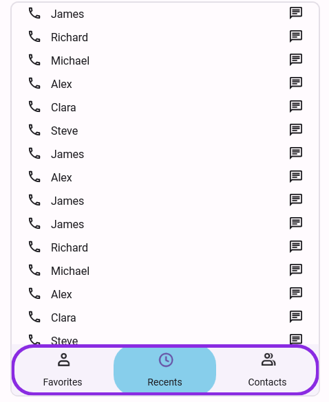
Tab bar border customization
You can customize the border of the tab header area in .NET MAUI Tab View using the following properties:
- TabBarBorderColor: Sets the border color.
- TabBarBorderThickness: Sets the border thickness.
- TabBarCornerRadius: Sets the corner radius of the tab bar’s border.
<tabView:SfTabView
    x:Name="tabView"
    TabBarPlacement="Bottom"
    TabBarBorderColor="#7C3AED"
    TabBarBorderThickness="2"
    TabBarCornerRadius="24">
</tabView:SfTabView>tabView.TabBarPlacement = TabBarPlacement.Bottom;
tabView.TabBarBorderColor = Color.FromArgb("#7C3AED");
tabView.TabBarBorderThickness = 2;
tabView.TabBarCornerRadius = new CornerRadius(24);