Customize the Selection Indicator in .NET MAUI Tab View (SfTabView)
4 Mar 202624 minutes to read
Placement options
The .NET MAUI Tab View provides five options for determining how the selection indicator aligns relative to the tab header item. These options are top, bottom, left, right and fill. This can be configured by setting the IndicatorPlacement property of SfTabView.
Top
The indicator will be placed at the top of the selected tab.
<tabView:SfTabView TabBarPlacement="Top"
                   IndicatorPlacement="Top"
                   TabBarWidth="60"
                   IndicatorWidthMode="Stretch">

    <tabView:SfTabView.Items>
        <tabView:SfTabItem Header="ITEM 1">
            <tabView:SfTabItem.Content>
                    <Label Text="Tab item content"
                           HorizontalOptions="Center"
                           VerticalOptions="Center" />
            </tabView:SfTabItem.Content>
        </tabView:SfTabItem>

        <tabView:SfTabItem Header="ITEM 2">
            <tabView:SfTabItem.Content>
                        <Label Text="Tab item content"
                               HorizontalOptions="Center"
                               VerticalOptions="Center" />
            </tabView:SfTabItem.Content>
        </tabView:SfTabItem>

        <tabView:SfTabItem Header="ITEM 3">
            <tabView:SfTabItem.Content>
                        <Label Text="Tab item content"
                               HorizontalOptions="Center"
                               VerticalOptions="Center" />
            </tabView:SfTabItem.Content>
        </tabView:SfTabItem>
    </tabView:SfTabView.Items>
</tabView:SfTabView>
var tabView = new SfTabView();
tabView.TabBarPlacement = TabBarPlacement.Top;
tabView.IndicatorPlacement = TabIndicatorPlacement.Top;
tabView.TabBarWidth = 60;
tabView.IndicatorWidthMode = IndicatorWidthMode.Stretch;
var item1 = new SfTabItem { Header = "ITEM 1" };
item1.Content = new Label
{
Text = "Tab item content",
HorizontalOptions = LayoutOptions.Center,
VerticalOptions = LayoutOptions.Center
};
tabView.Items.Add(item1);
var item2 = new SfTabItem { Header = "ITEM 2" };
item2.Content = new Label
{
Text = "Tab item content",
HorizontalOptions = LayoutOptions.Center,
VerticalOptions = LayoutOptions.Center
};
tabView.Items.Add(item2);
var item3 = new SfTabItem { Header = "ITEM 2" };
item3.Content = new Label
{
Text = "Tab item content",
HorizontalOptions = LayoutOptions.Center,
VerticalOptions = LayoutOptions.Center
};
tabView.Items.Add(item3);
this.Content = tabView;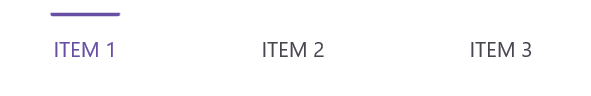
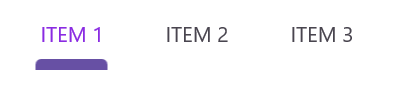
Bottom
The indicator will be placed at the bottom of the selected tab.
<tabView:SfTabView TabBarPlacement="Top"
                   IndicatorPlacement="Bottom"
                   TabBarWidth="60"
                   IndicatorWidthMode="Stretch">

    <tabView:SfTabView.Items>
        <tabView:SfTabItem Header="ITEM 1">
            <tabView:SfTabItem.Content>
                    <Label Text="Tab item content"
                           HorizontalOptions="Center"
                           VerticalOptions="Center" />
            </tabView:SfTabItem.Content>
        </tabView:SfTabItem>

        <tabView:SfTabItem Header="ITEM 2">
            <tabView:SfTabItem.Content>
                        <Label Text="Tab item content"
                               HorizontalOptions="Center"
                               VerticalOptions="Center" />
            </tabView:SfTabItem.Content>
        </tabView:SfTabItem>

        <tabView:SfTabItem Header="ITEM 3">
            <tabView:SfTabItem.Content>
                        <Label Text="Tab item content"
                               HorizontalOptions="Center"
                               VerticalOptions="Center" />
            </tabView:SfTabItem.Content>
        </tabView:SfTabItem>
    </tabView:SfTabView.Items>
</tabView:SfTabView>
var tabView = new SfTabView();
tabView.TabBarPlacement = TabBarPlacement.Top;
tabView.IndicatorPlacement = TabIndicatorPlacement.Bottom;
tabView.TabBarWidth = 60;
tabView.IndicatorWidthMode = IndicatorWidthMode.Stretch;
var item1 = new SfTabItem { Header = "ITEM 1" };
item1.Content = new Label
{
Text = "Tab item content",
HorizontalOptions = LayoutOptions.Center,
VerticalOptions = LayoutOptions.Center
};
tabView.Items.Add(item1);
var item2 = new SfTabItem { Header = "ITEM 2" };
item2.Content = new Label
{
Text = "Tab item content",
HorizontalOptions = LayoutOptions.Center,
VerticalOptions = LayoutOptions.Center
};
tabView.Items.Add(item2);
var item3 = new SfTabItem { Header = "ITEM 2" };
item3.Content = new Label
{
Text = "Tab item content",
HorizontalOptions = LayoutOptions.Center,
VerticalOptions = LayoutOptions.Center
};
tabView.Items.Add(item3);
this.Content = tabView;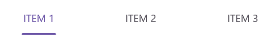
Left
The indicator will be placed at the left of the selected tab.
<tabView:SfTabView TabBarPlacement="Right"
                   IndicatorPlacement="Left"
                   TabBarWidth="60"
                   IndicatorWidthMode="Stretch">

    <tabView:SfTabView.Items>
        <tabView:SfTabItem Header="ITEM 1">
            <tabView:SfTabItem.Content>
                    <Label Text="Tab item content"
                           HorizontalOptions="Center"
                           VerticalOptions="Center" />
            </tabView:SfTabItem.Content>
        </tabView:SfTabItem>

        <tabView:SfTabItem Header="ITEM 2">
            <tabView:SfTabItem.Content>
                        <Label Text="Tab item content"
                               HorizontalOptions="Center"
                               VerticalOptions="Center" />
            </tabView:SfTabItem.Content>
        </tabView:SfTabItem>

        <tabView:SfTabItem Header="ITEM 3">
            <tabView:SfTabItem.Content>
                        <Label Text="Tab item content"
                               HorizontalOptions="Center"
                               VerticalOptions="Center" />
            </tabView:SfTabItem.Content>
        </tabView:SfTabItem>
    </tabView:SfTabView.Items>
</tabView:SfTabView>
var tabView = new SfTabView();
tabView.TabBarPlacement = TabBarPlacement.Right;
tabView.IndicatorPlacement = TabIndicatorPlacement.Left;
tabView.TabBarWidth = 60;
tabView.IndicatorWidthMode = IndicatorWidthMode.Stretch;
var item1 = new SfTabItem { Header = "ITEM 1" };
item1.Content = new Label
{
Text = "Tab item content",
HorizontalOptions = LayoutOptions.Center,
VerticalOptions = LayoutOptions.Center
};
tabView.Items.Add(item1);
var item2 = new SfTabItem { Header = "ITEM 2" };
item2.Content = new Label
{
Text = "Tab item content",
HorizontalOptions = LayoutOptions.Center,
VerticalOptions = LayoutOptions.Center
};
tabView.Items.Add(item2);
var item3 = new SfTabItem { Header = "ITEM 2" };
item3.Content = new Label
{
Text = "Tab item content",
HorizontalOptions = LayoutOptions.Center,
VerticalOptions = LayoutOptions.Center
};
tabView.Items.Add(item3);
this.Content = tabView;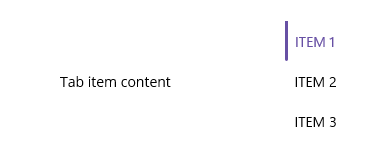
Right
The indicator will be placed at the right of the selected tab.
<tabView:SfTabView TabBarPlacement="Right"
                   IndicatorPlacement="Right"
                   TabBarWidth="60"
                   IndicatorWidthMode="Stretch">

    <tabView:SfTabView.Items>
        <tabView:SfTabItem Header="ITEM 1">
            <tabView:SfTabItem.Content>
                    <Label Text="Tab item content"
                           HorizontalOptions="Center"
                           VerticalOptions="Center" />
            </tabView:SfTabItem.Content>
        </tabView:SfTabItem>

        <tabView:SfTabItem Header="ITEM 2">
            <tabView:SfTabItem.Content>
                        <Label Text="Tab item content"
                               HorizontalOptions="Center"
                               VerticalOptions="Center" />
            </tabView:SfTabItem.Content>
        </tabView:SfTabItem>

        <tabView:SfTabItem Header="ITEM 3">
            <tabView:SfTabItem.Content>
                        <Label Text="Tab item content"
                               HorizontalOptions="Center"
                               VerticalOptions="Center" />
            </tabView:SfTabItem.Content>
        </tabView:SfTabItem>
    </tabView:SfTabView.Items>
</tabView:SfTabView>
var tabView = new SfTabView();
tabView.TabBarPlacement = TabBarPlacement.Right;
tabView.IndicatorPlacement = TabIndicatorPlacement.Right;
tabView.TabBarWidth = 60;
tabView.IndicatorWidthMode = IndicatorWidthMode.Stretch;
var item1 = new SfTabItem { Header = "ITEM 1" };
item1.Content = new Label
{
Text = "Tab item content",
HorizontalOptions = LayoutOptions.Center,
VerticalOptions = LayoutOptions.Center
};
tabView.Items.Add(item1);
var item2 = new SfTabItem { Header = "ITEM 2" };
item2.Content = new Label
{
Text = "Tab item content",
HorizontalOptions = LayoutOptions.Center,
VerticalOptions = LayoutOptions.Center
};
tabView.Items.Add(item2);
var item3 = new SfTabItem { Header = "ITEM 2" };
item3.Content = new Label
{
Text = "Tab item content",
HorizontalOptions = LayoutOptions.Center,
VerticalOptions = LayoutOptions.Center
};
tabView.Items.Add(item3);
this.Content = tabView;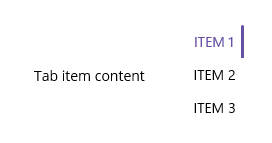
Fill
The indicator will fill the selected tab.
<tabView:SfTabView IndicatorPlacement="Fill">tabView.IndicatorPlacement = IndicatorPlacement.Fill;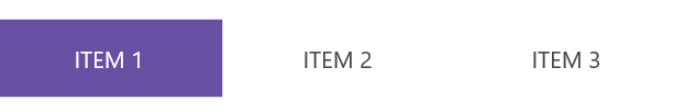
Limitations
- TabIndicatorPlacement behavior with VerticalTabBarPlacement: When using VerticalTabBarPlacement (i.e., the tab bar is positioned on the left or right side of the Tab View), the TabIndicatorPlacement property only supports Left and Right indicator placements. Setting the indicator placement to Top or Bottom will have no effect when the tab bar is placed vertically. Similarly, when using the default horizontal tab bar placement (i.e., the tab bar is positioned on the top or bottom), the TabIndicatorPlacement property only supports Top and Bottom indicator placements. Setting the indicator placement to Left or Right will have no effect when the tab bar is placed horizontally. Mixing incompatible indicator placements with tab bar placements may result in the indicator not being rendered or behaving unexpectedly.
Background customization
The background of the indicator can be customized using the IndicatorBackground property of SfTabView.
Solid color
The SolidColorBrush class defines the color property of IndicatorBackground, representing the selection indicator background’s color.
<tabView:SfTabView IndicatorBackground="LightBlue">tabView.TabBarBackground = Color.LightBlue;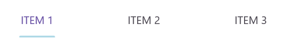
Gradient color
The background can be customized with a linear gradient and radial gradient as like below example.
<tabView:SfTabView>
        <tabView:SfTabView.IndicatorBackground>
            <LinearGradientBrush EndPoint="0,1">
                <GradientStop Color="#009FFF" Offset="0.1" />
                <GradientStop Color="#ec2F4B Offset="1.0" />
            </LinearGradientBrush>
        </tabView:SfTabView.IndicatorBackground>
</tabView:SfTabView>Microsoft.Maui.Controls.GradientStop gra1 = new Microsoft.Maui.Controls.GradientStop()
{
Color = Color.FromArgb("#009FFF"),
Offset = (float)0.1,
};
Microsoft.Maui.Controls.GradientStop gra2 = new Microsoft.Maui.Controls.GradientStop()
{
Color = Color.FromArgb("#ec2F4B"),
Offset = (float)1.0,
};
LinearGradientBrush graBrush = new LinearGradientBrush()
{
EndPoint = new Point(0, 1),
GradientStops = new GradientStopCollection() { gra1, gra2 }
};
SfTabView tabView = new SfTabView();
tabView.IndicatorBackground = graBrush;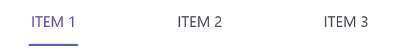
NOTE
View the complete sample on GitHub.
IndicatorWidthMode
The IndicatorWidthMode property allows customization of the width of the indicator. By default, the IndicatorWidthMode property is set to Fit, which adjusts the indicator width to fit the content of the header item. You can change the width size based on the header item by setting the IndicatorWidthMode property to Stretch.
<tabView:SfTabView IndicatorWidthMode="Fit">tabView.IndicatorWidthMode = IndicatorWidthMode.Fit;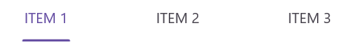
<tabView:SfTabView IndicatorWidthMode="Stretch">tabView.IndicatorWidthMode = IndicatorWidthMode.Stretch;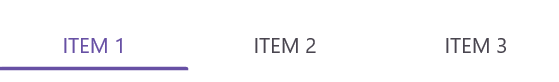
IndicatorCornerRadius
You can customize the corner radius of the selection indicator using the IndicatorCornerRadius property in the Tab View.
<tabView:SfTabView IndicatorCornerRadius ="5">tabView.IndicatorCornerRadius = 5;
IndicatorStrokeThickness
You can customize the stroke thickness of the selection indicator using the IndicatorStrokeThickness property in the Tab View.
<tabView:SfTabView IndicatorStrokeThickness ="7">
</tabView:SfTabView>tabView.IndicatorStrokeThickness = 7;