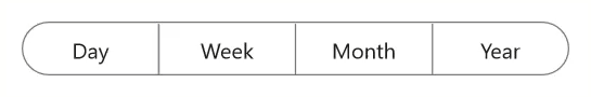
Selection in .NET MAUI Segmented Control (SfSegmentedControl)
16 Oct 202522 minutes to read
This section describes the features of the Segmented Control that help with item selection, customization of the selected item, and associated operations.
Programmatically set selected index
Programmatically set the default value for the selection to be placed. The selection is updated based on the given index value for the SelectedIndex.
<ContentPage
    xmlns:buttons="clr-namespace:Syncfusion.Maui.Buttons;assembly=Syncfusion.Maui.Buttons">
    <buttons:SfSegmentedControl x:Name="segmentedControl"
                                SelectedIndex="1">
    </buttons:SfSegmentedControl>
</ContentPage>
using Syncfusion.Maui.Buttons;
. . .
public partial class MainPage : ContentPage
{
public MainPage()
{
InitializeComponent();
SfSegmentedControl segmentedControl = new SfSegmentedControl();
segmentedControl.SelectedIndex = 1;
this.Content = segmentedControl;
}
}Selection indicator placements
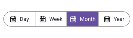
The Segmented control provides four types of selection indicator placement: Fill, border, top, and bottom border.
Fill
The selection indicator will fill the selected segment, if the SelectionIndicatorPlacement property of SelectionIndicatorSettings is set to Fill.
<ContentPage
    xmlns:buttons="clr-namespace:Syncfusion.Maui.Buttons;assembly=Syncfusion.Maui.Buttons">
    <buttons:SfSegmentedControl x:Name="segmentedControl">
        <buttons:SfSegmentedControl.SelectionIndicatorSettings>
            <buttons:SelectionIndicatorSettings
                SelectionIndicatorPlacement="Fill"/>
        </buttons:SfSegmentedControl.SelectionIndicatorSettings>
    </buttons:SfSegmentedControl>
</ContentPage>
using Syncfusion.Maui.Buttons;
. . .
public partial class MainPage : ContentPage
{
public MainPage()
{
InitializeComponent();
SfSegmentedControl segmentedControl = new SfSegmentedControl();
segmentedControl.SelectionIndicatorSettings = new SelectionIndicatorSettings()
{
SelectionIndicatorPlacement = SelectionIndicatorPlacement.Fill,
};
this.Content = segmentedControl;
}
}
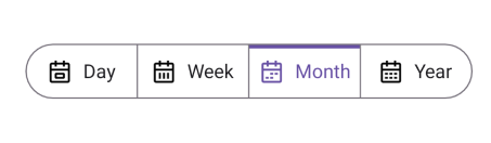
Border
The selection indicator will be highlighted with the border of the selected segment, if the SelectionIndicatorPlacement property of SelectionIndicatorSettings is set to Border.
<ContentPage
    xmlns:buttons="clr-namespace:Syncfusion.Maui.Buttons;assembly=Syncfusion.Maui.Buttons">
    <buttons:SfSegmentedControl x:Name="segmentedControl">
        <buttons:SfSegmentedControl.SelectionIndicatorSettings>
            <buttons:SelectionIndicatorSettings
                SelectionIndicatorPlacement="Border"/>
        </buttons:SfSegmentedControl.SelectionIndicatorSettings>
    </buttons:SfSegmentedControl>
</ContentPage>
using Syncfusion.Maui.Buttons;
. . .
public partial class MainPage : ContentPage
{
public MainPage()
{
InitializeComponent();
SfSegmentedControl segmentedControl = new SfSegmentedControl();
segmentedControl.SelectionIndicatorSettings = new SelectionIndicatorSettings()
{
SelectionIndicatorPlacement = SelectionIndicatorPlacement.Border,
};
this.Content = segmentedControl;
}
}
Top border
The selection indicator will be placed at the top of the selected segment, if the SelectionIndicatorPlacement property of SelectionIndicatorSettings is set to TopBorder.
<ContentPage
    xmlns:buttons="clr-namespace:Syncfusion.Maui.Buttons;assembly=Syncfusion.Maui.Buttons">
    <buttons:SfSegmentedControl x:Name="segmentedControl">
        <buttons:SfSegmentedControl.SelectionIndicatorSettings>
            <buttons:SelectionIndicatorSettings
                SelectionIndicatorPlacement="TopBorder"/>
        </buttons:SfSegmentedControl.SelectionIndicatorSettings>
    </buttons:SfSegmentedControl>
</ContentPage>
using Syncfusion.Maui.Buttons;
. . .
public partial class MainPage : ContentPage
{
public MainPage()
{
InitializeComponent();
SfSegmentedControl segmentedControl = new SfSegmentedControl();
segmentedControl.SelectionIndicatorSettings = new SelectionIndicatorSettings()
{
SelectionIndicatorPlacement = SelectionIndicatorPlacement.TopBorder,
};
this.Content = segmentedControl;
}
}
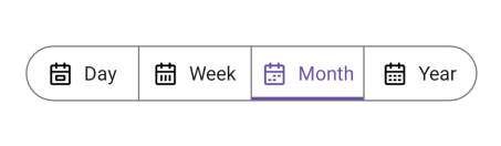
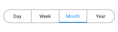
Bottom border
The selection indicator will be placed at the bottom of the selected segment, if the SelectionIndicatorPlacement property of SelectionIndicatorSettings is set to BottomBorder.
<ContentPage
    xmlns:buttons="clr-namespace:Syncfusion.Maui.Buttons;assembly=Syncfusion.Maui.Buttons">
    <buttons:SfSegmentedControl x:Name="segmentedControl">
        <buttons:SfSegmentedControl.SelectionIndicatorSettings>
            <buttons:SelectionIndicatorSettings
                SelectionIndicatorPlacement="BottomBorder"/>
        </buttons:SfSegmentedControl.SelectionIndicatorSettings>
    </buttons:SfSegmentedControl>
</ContentPage>
using Syncfusion.Maui.Buttons;
. . .
public partial class MainPage : ContentPage
{
public MainPage()
{
InitializeComponent();
SfSegmentedControl segmentedControl = new SfSegmentedControl();
segmentedControl.SelectionIndicatorSettings = new SelectionIndicatorSettings()
{
SelectionIndicatorPlacement = SelectionIndicatorPlacement.BottomBorder,
};
this.Content = segmentedControl;
}
}
Selection Mode
You can select the segment item by tapping the item in the Segmented Control. SfSegmentedControl provides two types of modes such as Single and SingleDeselect. The default SelectionMode is Single.
Single Selection
The Single selection can be performed in the Segmented Control by setting the SelectionMode property to Single. In this selection, you can select a single item at a time in the segmented control.
<ContentPage
        xmlns:segmentedControl="clr-namespace:Syncfusion.Maui.Buttons;assembly=Syncfusion.Maui.Buttons">
    <segmentedControl:SfSegmentedControl>
        <segmentedControl:SfSegmentedControl.SelectionIndicatorSettings>
            <segmentedControl:SelectionIndicatorSettings
                SelectionMode="Single"
                Background="Blue"/>
        </segmentedControl:SfSegmentedControl.SelectionIndicatorSettings>
    </segmentedControl:SfSegmentedControl>
</ContentPage>
using Syncfusion.Maui.Buttons;
. . .
public partial class MainPage : ContentPage
{
public MainPage()
{
InitializeComponent();
SfSegmentedControl segmentedControl = new SfSegmentedControl();
segmentedControl.SelectionMode = SegmentSelectionMode.Single;
this.Content = segmentedControl;
}
}Single Deselection
The Single Deselection can be performed in the Segmented Control by setting the SelectionMode property to SingleDeselect. In this mode, only one item can be selected at a time, and you can deselect the currently selected item by simply clicking on it again. This provides a quick way to clear the selection without needing additional actions.
<ContentPage
        xmlns:segmentedControl="clr-namespace:Syncfusion.Maui.Buttons;assembly=Syncfusion.Maui.Buttons">
    <segmentedControl:SfSegmentedControl>
        <segmentedControl:SfSegmentedControl.SelectionIndicatorSettings>
            <segmentedControl:SelectionIndicatorSettings
                SelectionMode="SingleDeselect"
                Background="Blue"/>
        </segmentedControl:SfSegmentedControl.SelectionIndicatorSettings>
    </segmentedControl:SfSegmentedControl>
</ContentPage>
using Syncfusion.Maui.Buttons;
. . .
public partial class MainPage : ContentPage
{
public MainPage()
{
InitializeComponent();
SfSegmentedControl segmentedControl = new SfSegmentedControl();
segmentedControl.SelectionMode = SegmentSelectionMode.SingleDeselect;
this.Content = segmentedControl;
}
}Customize selected segment
The selected segment of the Segmented control is customized using the SelectionIndicatorSettings property of SfSegmentedControl.
Customize selected segment background
You can customize the selected segment background of the segmented control and each segment item.
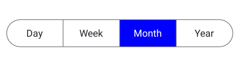
Customize selected segment background of segmented control
Customize the selected segment background using the Background property of SelectionIndicatorSettings.
<ContentPage
    xmlns:buttons="clr-namespace:Syncfusion.Maui.Buttons;assembly=Syncfusion.Maui.Buttons">
    <buttons:SfSegmentedControl x:Name="segmentedControl">
        <buttons:SfSegmentedControl.SelectionIndicatorSettings>
            <buttons:SelectionIndicatorSettings
                SelectionIndicatorPlacement="Fill"
                Background="Blue"/>
        </buttons:SfSegmentedControl.SelectionIndicatorSettings>
    </buttons:SfSegmentedControl>
</ContentPage>
using Syncfusion.Maui.Buttons;
. . .
public partial class MainPage : ContentPage
{
public MainPage()
{
InitializeComponent();
SfSegmentedControl segmentedControl = new SfSegmentedControl();
segmentedControl.SelectionIndicatorSettings = new SelectionIndicatorSettings()
{
SelectionIndicatorPlacement = SelectionIndicatorPlacement.Fill,
Background = Colors.Blue,
};
this.Content = segmentedControl;
}
}
NOTE
The
Backgroundproperty ofSelectionIndicatorSettingsis applicable only for SelectionIndicatorPlacement.Fill.
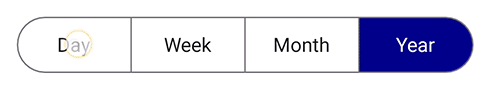
Customize selected segment background of each segment item
Customize the selected segment background of each segment item using the SelectedSegmentBackground property of SfSegmentItem.
using Syncfusion.Maui.Buttons;
. . .

public partial class MainPage : ContentPage
{
    public MainPage()
    {
        InitializeComponent();
        SfSegmentedControl segmentedControl = new SfSegmentedControl();
        List<SfSegmentItem> segmentItems = new List<SfSegmentItem>
            {
                new SfSegmentItem() {Text="Day", SelectedSegmentBackground = Colors.LightBlue},
                new SfSegmentItem() {Text="Week", SelectedSegmentBackground = Colors.Blue},
                new SfSegmentItem() {Text="Month", SelectedSegmentBackground = Colors.SkyBlue},
                new SfSegmentItem() {Text="Year", SelectedSegmentBackground = Colors.DarkBlue},
            };
        segmentedControl.ItemsSource = segmentItems;
        this.Content = segmentedControl;
    }
}
Customize selected segment text color
You can customize the selected segment text color of the segmented control and each segment item.
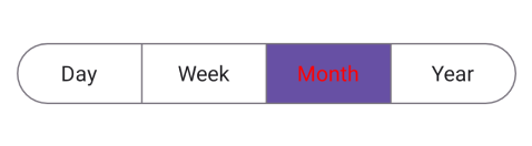
Customize selected segment text color of segmented control
Customize the selected segment text color using the TextColor property of SelectionIndicatorSettings.
<ContentPage
    xmlns:buttons="clr-namespace:Syncfusion.Maui.Buttons;assembly=Syncfusion.Maui.Buttons">
    <buttons:SfSegmentedControl x:Name="segmentedControl">
        <buttons:SfSegmentedControl.SelectionIndicatorSettings>
            <buttons:SelectionIndicatorSettings
                TextColor="Red"/>
        </buttons:SfSegmentedControl.SelectionIndicatorSettings>
    </buttons:SfSegmentedControl>
</ContentPage>
using Syncfusion.Maui.Buttons;
. . .
public partial class MainPage : ContentPage
{
public MainPage()
{
InitializeComponent();
SfSegmentedControl segmentedControl = new SfSegmentedControl();
segmentedControl.SelectionIndicatorSettings = new SelectionIndicatorSettings()
{
TextColor = Colors.Red,
};
this.Content = segmentedControl;
}
}
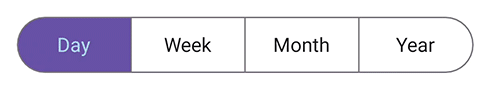
Customize selected segment text color of each segment item
Customize the selected segment text color of each segment item using the SelectedSegmentTextColor property of SfSegmentItem.
using Syncfusion.Maui.Buttons;
. . .

public partial class MainPage : ContentPage
{
    public MainPage()
    {
        InitializeComponent();
        SfSegmentedControl segmentedControl = new SfSegmentedControl();
        List<SfSegmentItem> segmentItems = new List<SfSegmentItem>
            {
                new SfSegmentItem() {Text="Day", SelectedSegmentTextColor = Colors.LightBlue},
                new SfSegmentItem() {Text="Week", SelectedSegmentTextColor = Colors.Blue},
                new SfSegmentItem() {Text="Month", SelectedSegmentTextColor = Colors.SkyBlue},
                new SfSegmentItem() {Text="Year", SelectedSegmentTextColor = Colors.DarkBlue},
            };
        segmentedControl.ItemsSource = segmentItems;
        this.Content = segmentedControl;
    }
}
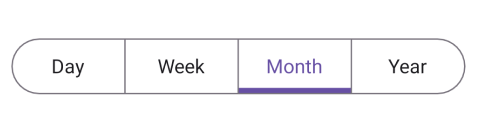
Customize selected segment border color
Customize the selected segment border color using the Stroke property of SelectionIndicatorSettings.
<ContentPage
    xmlns:buttons="clr-namespace:Syncfusion.Maui.Buttons;assembly=Syncfusion.Maui.Buttons">
    <buttons:SfSegmentedControl x:Name="segmentedControl">
        <buttons:SfSegmentedControl.SelectionIndicatorSettings>
            <buttons:SelectionIndicatorSettings
                SelectionIndicatorPlacement="BottomBorder"
                Stroke="DodgerBlue"/>
        </buttons:SfSegmentedControl.SelectionIndicatorSettings>
    </buttons:SfSegmentedControl>
</ContentPage>
using Syncfusion.Maui.Buttons;
. . .
public partial class MainPage : ContentPage
{
public MainPage()
{
InitializeComponent();
SfSegmentedControl segmentedControl = new SfSegmentedControl();
segmentedControl.SelectionIndicatorSettings = new SelectionIndicatorSettings()
{
SelectionIndicatorPlacement = SelectionIndicatorPlacement.BottomBorder,
Stroke = Colors.DodgerBlue,
};
this.Content = segmentedControl;
}
}
NOTE
The
Strokeproperty ofSelectionIndicatorSettingsis applicable only when the selection mode is set to SelectionIndicatorPlacement.Border, SelectionIndicatorPlacement.TopBorder, or SelectionIndicatorPlacement.BottomBorder.
Customize selected segment border thickness
Customize the selected segment border thickness using the StrokeThickness property of SelectionIndicatorSettings.
<ContentPage
    xmlns:buttons="clr-namespace:Syncfusion.Maui.Buttons;assembly=Syncfusion.Maui.Buttons">
    <buttons:SfSegmentedControl x:Name="segmentedControl">
        <buttons:SfSegmentedControl.SelectionIndicatorSettings>
            <buttons:SelectionIndicatorSettings
                SelectionIndicatorPlacement="BottomBorder"
                StrokeThickness="5"/>
        </buttons:SfSegmentedControl.SelectionIndicatorSettings>
    </buttons:SfSegmentedControl>
</ContentPage>
using Syncfusion.Maui.Buttons;
. . .
public partial class MainPage : ContentPage
{
public MainPage()
{
InitializeComponent();
SfSegmentedControl segmentedControl = new SfSegmentedControl();
segmentedControl.SelectionIndicatorSettings = new SelectionIndicatorSettings()
{
SelectionIndicatorPlacement = SelectionIndicatorPlacement.BottomBorder,
StrokeThickness = 5,
};
this.Content = segmentedControl;
}
}
Enable or Disable Ripple Animation
The SfSegmentedControl provides a ripple animation that visually highlights a segment when it is tapped. This effect applies to both default segment items and items defined using custom data templates. You can enable or disable this animation using the EnableRippleEffect property. Set EnableRippleEffect to true to display the ripple effect when a segment is selected. Set it to false to disable the ripple animation.
<ContentPage xmlns:buttons="clr-namespace:Syncfusion.Maui.Buttons;assembly=Syncfusion.Maui.Buttons">

<buttons:SfSegmentedControl x:Name="segmentedControl"
                           EnableRippleEffect="False">
    <buttons:SfSegmentedControl.ItemsSource>
        <x:Array Type="{x:Type x:String}">
                <x:String>Day</x:String>
                <x:String>Week</x:String>
                <x:String>Month</x:String>
                <x:String>Year</x:String>
        </x:Array>
    </buttons:SfSegmentedControl.ItemsSource>
</buttons:SfSegmentedControl>

</ContentPage>
using Syncfusion.Maui.Buttons;
. . .
public partial class MainPage : ContentPage
{
public MainPage()
{
InitializeComponent();
SfSegmentedControl segmentedControl = new SfSegmentedControl();
List<SfSegmentItem> itemList = new List<SfSegmentItem>
{
new SfSegmentItem() {Text = "Day"},
new SfSegmentItem() {Text = "Week"},
new SfSegmentItem() {Text = "Month"},
new SfSegmentItem() {Text = "Year"},
};
segmentedControl.ItemsSource = itemList;
segmentedControl.EnableRippleEffect = false;
this.Content = segmentedControl;
}
}