Appearance Customization of .NET MAUI SfSegmentedControl
16 Oct 202524 minutes to read
The .NET MAUI Segmented control allows you to customize the background, text color, selection style, and more.
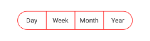
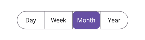
Customize the border color
You can use the Stroke property of SfSegmentedControl to customize the border color of the segmented control.
<ContentPage
    xmlns:buttons="clr-namespace:Syncfusion.Maui.Buttons;assembly=Syncfusion.Maui.Buttons">
    <buttons:SfSegmentedControl x:Name="segmentedControl"
                                Stroke="Red">
        <buttons:SfSegmentedControl.ItemsSource>
            <x:Array Type="{x:Type x:String}">
                <x:String>Day</x:String>
                <x:String>Week</x:String>
                <x:String>Month</x:String>
                <x:String>Year</x:String>
            </x:Array>
        </buttons:SfSegmentedControl.ItemsSource>
    </buttons:SfSegmentedControl>
</ContentPage>
using Syncfusion.Maui.Buttons;
. . .
public partial class MainPage : ContentPage
{
public MainPage()
{
InitializeComponent();
SfSegmentedControl segmentedControl = new SfSegmentedControl();
segmentedControl.Stroke = Colors.Red;
this.Content = segmentedControl;
}
}
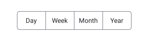
Customize the border thickness
You can use the StrokeThickness property of SfSegmentedControl to customize the border thickness of the segmented control.
<ContentPage
    xmlns:buttons="clr-namespace:Syncfusion.Maui.Buttons;assembly=Syncfusion.Maui.Buttons">
    <buttons:SfSegmentedControl x:Name="segmentedControl"
                                StrokeThickness="2">
        <buttons:SfSegmentedControl.ItemsSource>
            <x:Array Type="{x:Type x:String}">
                <x:String>Day</x:String>
                <x:String>Week</x:String>
                <x:String>Month</x:String>
                <x:String>Year</x:String>
            </x:Array>
        </buttons:SfSegmentedControl.ItemsSource>
    </buttons:SfSegmentedControl>
</ContentPage>
using Syncfusion.Maui.Buttons;
. . .
public partial class MainPage : ContentPage
{
public MainPage()
{
InitializeComponent();
SfSegmentedControl segmentedControl = new SfSegmentedControl();
segmentedControl.StrokeThickness = 2;
this.Content = segmentedControl;
}
}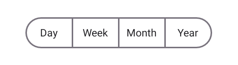
Customize the border corner radius
Use the CornerRadius property of SfSegmentedControl to customize the corner radius of the segmented control.
<ContentPage
    xmlns:buttons="clr-namespace:Syncfusion.Maui.Buttons;assembly=Syncfusion.Maui.Buttons">
    <buttons:SfSegmentedControl x:Name="segmentedControl"
                                CornerRadius="5">
        <buttons:SfSegmentedControl.ItemsSource>
            <x:Array Type="{x:Type x:String}">
                <x:String>Day</x:String>
                <x:String>Week</x:String>
                <x:String>Month</x:String>
                <x:String>Year</x:String>
            </x:Array>
        </buttons:SfSegmentedControl.ItemsSource>
    </buttons:SfSegmentedControl>
</ContentPage>
using Syncfusion.Maui.Buttons;
. . .
public partial class MainPage : ContentPage
{
public MainPage()
{
InitializeComponent();
SfSegmentedControl segmentedControl = new SfSegmentedControl();
segmentedControl.CornerRadius = 5;
this.Content = segmentedControl;
}
}
NOTE
The
CornerRadiusproperty will be applicable only for the first and last segment items. To set corner radius for all segments, useSegmentCornerRadius.
Customize the segment corner radius
Use the SegmentCornerRadius property of SfSegmentedControl to customize the segment corner radius of the segmented control.
<ContentPage
    xmlns:buttons="clr-namespace:Syncfusion.Maui.Buttons;assembly=Syncfusion.Maui.Buttons">
    <buttons:SfSegmentedControl x:Name="segmentedControl"
                                SegmentCornerRadius="5">
        <buttons:SfSegmentedControl.ItemsSource>
            <x:Array Type="{x:Type x:String}">
                <x:String>Day</x:String>
                <x:String>Week</x:String>
                <x:String>Month</x:String>
                <x:String>Year</x:String>
            </x:Array>
        </buttons:SfSegmentedControl.ItemsSource>
    </buttons:SfSegmentedControl>
</ContentPage>
using Syncfusion.Maui.Buttons;
. . .
public partial class MainPage : ContentPage
{
public MainPage()
{
InitializeComponent();
SfSegmentedControl segmentedControl = new SfSegmentedControl();
segmentedControl.SegmentCornerRadius = 5;
this.Content = segmentedControl;
}
}
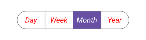
Customize the text style
You can customize the text style of the segmented control and each segment item.
Customize the text style of segmented Control
Use the TextStyle property of SfSegmentedControl to customize the text style of the segmented control.
<ContentPage
    xmlns:buttons="clr-namespace:Syncfusion.Maui.Buttons;assembly=Syncfusion.Maui.Buttons">
    <buttons:SfSegmentedControl x:Name="segmentedControl">
        <buttons:SfSegmentedControl.TextStyle>
            <buttons:SegmentTextStyle TextColor="Red" FontAttributes="Italic" FontSize="20"/>
        </buttons:SfSegmentedControl.TextStyle>
        <buttons:SfSegmentedControl.ItemsSource>
            <x:Array Type="{x:Type x:String}">
                <x:String>Day</x:String>
                <x:String>Week</x:String>
                <x:String>Month</x:String>
                <x:String>Year</x:String>
            </x:Array>
        </buttons:SfSegmentedControl.ItemsSource>
    </buttons:SfSegmentedControl>
</ContentPage>
using Syncfusion.Maui.Buttons;
. . .
public partial class MainPage : ContentPage
{
public MainPage()
{
InitializeComponent();
SfSegmentedControl segmentedControl = new SfSegmentedControl();
segmentedControl.TextStyle = new SegmentTextStyle()
{
TextColor = Colors.Red,
FontAttributes = FontAttributes.Italic,
FontSize = 20,
};
this.Content = segmentedControl;
}
}
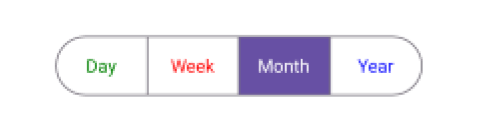
Customize the text style of each segment item
Customize the text style of each segment item using the TextStyle property of SfSegmentItem.
using Syncfusion.Maui.Buttons;
. . .

public partial class MainPage : ContentPage
{
    public MainPage()
    {
        InitializeComponent();
        SfSegmentedControl segmentedControl = new SfSegmentedControl();
        List<SfSegmentItem> segmentItems = new List<SfSegmentItem>
            {
                new SfSegmentItem() {Text="Day", TextStyle = new SegmentTextStyle(){TextColor = Colors.Green}},
                new SfSegmentItem() {Text="Week", TextStyle = new SegmentTextStyle(){TextColor = Colors.Red}},
                new SfSegmentItem() {Text="Month", TextStyle = new SegmentTextStyle(){TextColor = Colors.Yellow}},
                new SfSegmentItem() {Text="Year", TextStyle = new SegmentTextStyle(){TextColor = Colors.Blue}},
            };
        segmentedControl.ItemsSource = segmentItems;
        this.Content = segmentedControl;
    }
}
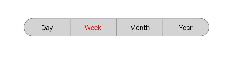
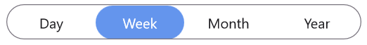
Customize the segment background
You can customize the segmented background of the segmented control and each segment item.
Customize the segment background of segmented control
Use the SegmentBackground property of SfSegmentedControl to customize the segmented background of the segmented control.
<ContentPage
    xmlns:buttons="clr-namespace:Syncfusion.Maui.Buttons;assembly=Syncfusion.Maui.Buttons">
    <buttons:SfSegmentedControl x:Name="segmentedControl"
                                SegmentBackground="LightGray">
        <buttons:SfSegmentedControl.ItemsSource>
            <x:Array Type="{x:Type x:String}">
                <x:String>Day</x:String>
                <x:String>Week</x:String>
                <x:String>Month</x:String>
                <x:String>Year</x:String>
            </x:Array>
        </buttons:SfSegmentedControl.ItemsSource>
    </buttons:SfSegmentedControl>
</ContentPage>
using Syncfusion.Maui.Buttons;
. . .
public partial class MainPage : ContentPage
{
public MainPage()
{
InitializeComponent();
SfSegmentedControl segmentedControl = new SfSegmentedControl();
segmentedControl.SegmentBackground = Colors.LightGray;
this.Content = segmentedControl;
}
}
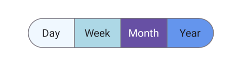
Customize the segment background of each segment item
Customize the background of each segment item using the Background property of SfSegmentItem.
using Syncfusion.Maui.Buttons;
. . .

public partial class MainPage : ContentPage
{
    public MainPage()
    {
        InitializeComponent();
        SfSegmentedControl segmentedControl = new SfSegmentedControl();
        List<SfSegmentItem> segmentItems = new List<SfSegmentItem>
            {
                new SfSegmentItem() {Text="Day", Background = Colors.LightBlue},
                new SfSegmentItem() {Text="Week", Background = Colors.LightBlue},
                new SfSegmentItem() {Text="Month", Background = Colors.LightBlue},
                new SfSegmentItem() {Text="Year", Background = Colors.LightBlue},
            };
        segmentedControl.ItemsSource = segmentItems;
        this.Content = segmentedControl;
    }
}
Separator Visibility Change to Show or Hide Separator
The ShowSeparator property is used to control the visibility of the separator line that appears between the segments in the SfSegmentedControl. By default, the separator is visible, and setting this property to false hides the separator line.
<ContentPage xmlns:buttons="clr-namespace:Syncfusion.Maui.Buttons;assembly=Syncfusion.Maui.Buttons">
    <buttons:SfSegmentedControl x:Name="segmentedControl" ShowSeparator="False">
        <buttons:SfSegmentedControl.ItemsSource>
            <x:Array Type="{x:Type x:String}">
                <x:String>Day</x:String>
                <x:String>Week</x:String>
                <x:String>Month</x:String>
                <x:String>Year</x:String>
            </x:Array>
        </buttons:SfSegmentedControl.ItemsSource>
    </buttons:SfSegmentedControl>
</ContentPage>
using Syncfusion.Maui.Buttons;
. . .
public partial class MainPage : ContentPage
{
public MainPage()
{
InitializeComponent();
SfSegmentedControl segmentedControl = new SfSegmentedControl();
List<SfSegmentItem> itemList = new List<SfSegmentItem>
{
new SfSegmentItem() {Text = "Day"},
new SfSegmentItem() {Text = "Week"},
new SfSegmentItem() {Text = "Month"},
new SfSegmentItem() {Text = "Year"},
};
segmentedControl.ItemsSource = itemList;
segmentedControl.ShowSeparator = false;
this.Content = segmentedControl;
}
}
Customize segment items appearance using DataTemplate
Use the SegmentTemplate property of SfSegmentedControl to create custom segmented control. The following example code shows how to create a custom segmented control using a data template.
<ContentPage
    xmlns:buttons="clr-namespace:Syncfusion.Maui.Buttons;assembly=Syncfusion.Maui.Buttons">
    <buttons:SfSegmentedControl x:Name="segmentedControl">
        <buttons:SfSegmentedControl.ItemsSource>
            <x:Array Type="{x:Type x:String}">
                <x:String>Day</x:String>
                <x:String>Week</x:String>
                <x:String>Month</x:String>
                <x:String>Year</x:String>
            </x:Array>
        </buttons:SfSegmentedControl.ItemsSource>
        <buttons:SfSegmentedControl.SegmentTemplate>
            <DataTemplate>
                <Grid Background="LightGray">
                    <Label Text="{Binding Text}"
                           TextColor="Red"
                           Margin="6"/>
                </Grid>
            </DataTemplate>
        </buttons:SfSegmentedControl.SegmentTemplate>
    </buttons:SfSegmentedControl>
</ContentPage>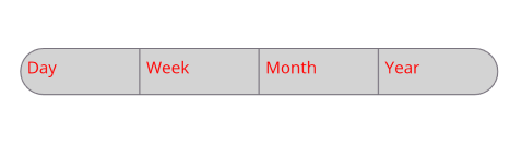
Customize selected segment item appearance using DataTemplate
Use the IsSelected property of SfSegmentItem to customize the selected segment item appearance. The following example code shows how to create a custom segmented control using a data template.
<ContentPage
    xmlns:buttons="clr-namespace:Syncfusion.Maui.Buttons;assembly=Syncfusion.Maui.Buttons">
    <ContentPage.Resources>
        <ResourceDictionary>
            <local:TextColorConverter x:Key="TextColorConverter" />
        </ResourceDictionary>
    </ContentPage.Resources>
    <StackLayout Spacing="20" VerticalOptions="Center">
        <buttons:SfSegmentedControl x:Name="segmentedControl">
            <buttons:SfSegmentedControl.ItemsSource>
                <x:Array Type="{x:Type x:String}">
                    <x:String>Day</x:String>
                    <x:String>Week</x:String>
                    <x:String>Month</x:String>
                    <x:String>Year</x:String>
                </x:Array>
            </buttons:SfSegmentedControl.ItemsSource>
            <buttons:SfSegmentedControl.SegmentTemplate>
                <DataTemplate>
                    <Grid BackgroundColor="LightCyan">
                        <Label Text="{Binding Text}"
                               TextColor="{Binding IsSelected, Converter={StaticResource TextColorConverter}}"
                               FontAttributes="Bold"
                               Margin="6"/>
                    </Grid>
                </DataTemplate>
            </buttons:SfSegmentedControl.SegmentTemplate>
        </buttons:SfSegmentedControl>
    </StackLayout>
</ContentPage>
using Syncfusion.Maui.Buttons;
. . .
public partial class MainPage : ContentPage
{
public MainPage()
{
InitializeComponent();
SfSegmentedControl segmentedControl = new SfSegmentedControl();
List<SfSegmentItem> segmentItems = new List<SfSegmentItem>
{
new SfSegmentItem() {Text="Day", Background = Colors.LightBlue},
new SfSegmentItem() {Text="Week", Background = Colors.LightBlue},
new SfSegmentItem() {Text="Month", Background = Colors.LightBlue},
new SfSegmentItem() {Text="Year", Background = Colors.LightBlue},
};
segmentedControl.ItemsSource = segmentItems;
this.Content = segmentedControl;
}
}public class TextColorConverter : IValueConverter
{
public object Convert(object value, Type targetType, object parameter, CultureInfo culture)
{
if (value is bool isSelected)
{
return isSelected ? Colors.Green : Colors.Red;
}
return Colors.Black;
}
public object ConvertBack(object value, Type targetType, object parameter, CultureInfo culture)
{
}
}NOTE
- The BindingContext of the SegmentTemplate is the SfSegmentItem.