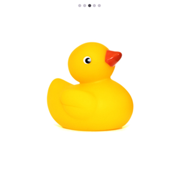
Navigation Modes in .NET MAUI Rotator
18 Nov 201813 minutes to read
Overview
The .NET MAUI Rotator control uses two related properties to configure the navigation strip that lets users move between items:
-
NavigationStripMode- controls the appearance of the navigation bar (for example,DotsorThumbnail). -
NavigationStripPosition- controls where the navigation bar is placed relative to the slider area (for example,Bottom,Top,Left, orRight).
Prerequisites
Before using the SfRotator, ensure the following NuGet package is installed in your .NET MAUI project:
Syncfusion.Maui.Rotator
For step-by-step setup, refer to the Getting Started documentation.
Properties Reference
| Property | Type | Default | Description |
|---|---|---|---|
NavigationStripMode |
NavigationStripMode |
Dots |
The appearance of the navigation bar. Supported values are Dots and Thumbnail. |
NavigationStripPosition |
NavigationStripPosition |
Bottom |
The placement of the navigation bar relative to the slider area. Supported values are Bottom, Top, Left, and Right. |
Navigation Strip Mode
The NavigationStripMode property specifies the appearance of the navigation bar items. The image data can be selected using either the Thumbnail or the Dots mode.
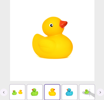
Thumbnail
When the strip mode is Thumbnail, each slider item is loaded as a thumbnail preview. When a thumbnail item is clicked, the slider switches to the corresponding image.
<rotator:SfRotator x:Name="rotator"
                    ItemsSource="{Binding ImageCollection}"
                    SelectedIndex="2"
                    NavigationDirection="Horizontal"
                    NavigationStripMode="Thumbnail"
                    BackgroundColor="#ececec">
    <rotator:SfRotator.ItemTemplate>
        <DataTemplate>
            <Image Source="{Binding Image}" />
        </DataTemplate>
    </rotator:SfRotator.ItemTemplate>
</rotator:SfRotator>
RotatorViewModel rotatorViewModel = new RotatorViewModel();
SfRotator rotator = new SfRotator()
{
SelectedIndex = 2,
NavigationDirection = NavigationDirection.Horizontal,
NavigationStripMode = NavigationStripMode.Thumbnail,
BackgroundColor = Color.FromArgb("#ececec"),
ItemsSource = rotatorViewModel.ImageCollection,
ItemTemplate = new DataTemplate(() =>
{
var image = new Image();
image.SetBinding(Image.SourceProperty, "Image");
return image;
}),
};// Model
public class RotatorModel
{
public RotatorModel(string imageString)
{
Image = imageString;
}
private string _image;
public string Image
{
get { return _image; }
set { _image = value; }
}
}
// ViewModel
public class RotatorViewModel
{
public RotatorViewModel()
{
imageCollection = new List<RotatorModel>
{
new RotatorModel("image1.png"),
new RotatorModel("image2.png"),
new RotatorModel("image3.png"),
new RotatorModel("image4.png"),
new RotatorModel("image5.png")
};
}
private List<RotatorModel> imageCollection;
public List<RotatorModel> ImageCollection
{
get { return imageCollection; }
set { imageCollection = value; }
}
}
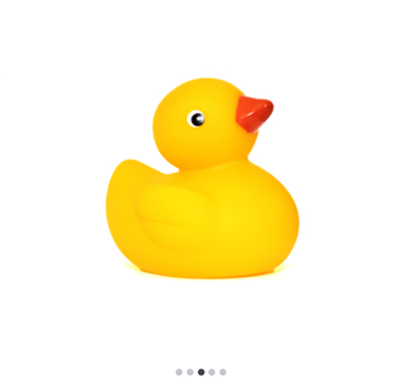
Dots
When the strip mode is Dots, each slider item is represented by a small dot. When a dot is clicked, the slider switches to the corresponding image.
<rotator:SfRotator x:Name="rotator"
                    ItemsSource="{Binding ImageCollection}"
                    SelectedIndex="2"
                    NavigationDirection="Horizontal"
                    NavigationStripMode="Dots"
                    BackgroundColor="#ececec">
    <rotator:SfRotator.ItemTemplate>
        <DataTemplate>
            <Image Source="{Binding Image}" />
        </DataTemplate>
    </rotator:SfRotator.ItemTemplate>
</rotator:SfRotator>
RotatorViewModel rotatorViewModel = new RotatorViewModel();
SfRotator rotator = new SfRotator()
{
SelectedIndex = 2,
NavigationDirection = NavigationDirection.Horizontal,
NavigationStripMode = NavigationStripMode.Dots,
BackgroundColor = Color.FromArgb("#ececec"),
EnableAutoPlay = true,
NavigationStripPosition = NavigationStripPosition.Bottom,
ItemsSource = rotatorViewModel.ImageCollection,
ItemTemplate = new DataTemplate(() =>
{
var image = new Image();
image.SetBinding(Image.SourceProperty, "Image");
return image;
}),
};// Model
public class RotatorModel
{
public RotatorModel(string imageString)
{
Image = imageString;
}
private string _image;
public string Image
{
get { return _image; }
set { _image = value; }
}
}
// ViewModel
public class RotatorViewModel
{
public RotatorViewModel()
{
imageCollection = new List<RotatorModel>
{
new RotatorModel("image1.png"),
new RotatorModel("image2.png"),
new RotatorModel("image3.png"),
new RotatorModel("image4.png"),
new RotatorModel("image5.png")
};
}
private List<RotatorModel> imageCollection;
public List<RotatorModel> ImageCollection
{
get { return imageCollection; }
set { imageCollection = value; }
}
}
Navigation Strip Position
The NavigationStripPosition property specifies the placement of the navigation bar (thumbnails or dots) relative to the slider area.
The NavigationStripPosition enum exposes four values:
-
Bottom- Places the navigation bar at the bottom of the slider. -
Top- Places the navigation bar at the top of the slider. -
Left- Places the navigation bar to the left of the slider. -
Right- Places the navigation bar to the right of the slider.
The following example sets the position to Top.
<rotator:SfRotator x:Name="rotator"
                   ItemsSource="{Binding ImageCollection}"
                   SelectedIndex="2"
                   NavigationDirection="Horizontal"
                   NavigationStripMode="Dots"
                   NavigationStripPosition="Top"
                   BackgroundColor="#ececec">
    <rotator:SfRotator.ItemTemplate>
        <DataTemplate>
            <Image Source="{Binding Image}" />
        </DataTemplate>
    </rotator:SfRotator.ItemTemplate>
</rotator:SfRotator>
RotatorViewModel rotatorViewModel = new RotatorViewModel();
SfRotator rotator = new SfRotator()
{
SelectedIndex = 2,
NavigationDirection = NavigationDirection.Horizontal,
NavigationStripMode = NavigationStripMode.Dots,
NavigationStripPosition = NavigationStripPosition.Top,
BackgroundColor = Color.FromArgb("#ececec"),
ItemsSource = rotatorViewModel.ImageCollection,
ItemTemplate = new DataTemplate(() =>
{
var image = new Image();
image.SetBinding(Image.SourceProperty, "Image");
return image;
}),
};// Model
public class RotatorModel
{
public RotatorModel(string imageString)
{
Image = imageString;
}
private string _image;
public string Image
{
get { return _image; }
set { _image = value; }
}
}
// ViewModel
public class RotatorViewModel
{
public RotatorViewModel()
{
imageCollection = new List<RotatorModel>
{
new RotatorModel("image1.png"),
new RotatorModel("image2.png"),
new RotatorModel("image3.png"),
new RotatorModel("image4.png"),
new RotatorModel("image5.png")
};
}
private List<RotatorModel> imageCollection;
public List<RotatorModel> ImageCollection
{
get { return imageCollection; }
set { imageCollection = value; }
}
}