Navigation Customization in .NET MAUI Rotator (SfRotator)
8 Jun 202614 minutes to read
The Rotator control supports customizing dots, thumbnails and navigation buttons.
Dots Customization
In Dot Customization we can customize the dots’ stroke, selected and unselected dots’ color.
DotsStroke Color
The DotsStroke property is used to customize the color of the dots stroke in the SfRotator.
<syncfusion:SfRotator x:Name="rotator"
            ItemsSource="{Binding ImageCollection}"
            SelectedIndex="2"
            BackgroundColor="#ececec"
            NavigationStripPosition="Bottom"
            DotsStroke="Aqua"
            WidthRequest="550"
HeightRequest="550">rotator.DotsStroke = Colors.Aqua;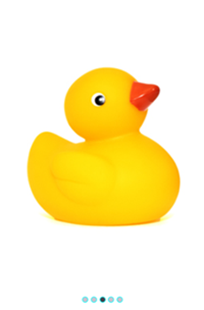
Selected Dot Color
The SelectedDotColor property is used to customize the color of selected dot in the SfRotator.
<syncfusion:SfRotator x:Name="rotator"
            ItemsSource="{Binding ImageCollection}"
            SelectedIndex="2"
            BackgroundColor="#ececec"
            NavigationStripPosition="Bottom"
            DotsStroke="Aqua"
            SelectedDotColor="Blue"
            WidthRequest="550"
HeightRequest="550">rotator.DotsStroke = Color.Aqua;
rotator.SelectedDotColor = Color.Blue;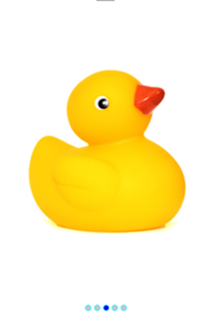
Unselected Dot Color
The UnselectedDotColor property is used to customize the color of unselected dots in the SfRotator.
<syncfusion:SfRotator x:Name="rotator"
            ItemsSource="{Binding ImageCollection}"
            SelectedIndex="2"
            BackgroundColor="#ececec"
            NavigationStripPosition="Bottom"
            DotsStroke="Aqua"
            SelectedDotColor="Blue"
            UnselectedDotColor="Gray"
            WidthRequest="550"
HeightRequest="550">rotator.DotsStroke = Color.Aqua;
rotator.SelectedDotColor = Color.Blue;
rotator.UnselectedDotColor = Color.Gray;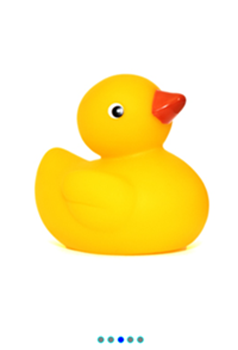
Thumbnails Customization
In Thumbnail Customization we can customize the selected and unselected thumbnail’s stroke.
Selected Thumbnail Stroke
The SelectedThumbnailStroke property is used to customize the color of the selected thumbnail stroke in the SfRotator.
<syncfusion:SfRotator x:Name="rotator"
            ItemsSource="{Binding ImageCollection}"
            SelectedIndex="2"
            BackgroundColor="#ececec"
            NavigationStripPosition="Bottom"
            NavigationStripMode="Thumbnail"
            SelectedThumbnailStroke="Green"
            WidthRequest="550"
HeightRequest="550">rotator.NavigationStripMode = NavigationStripMode.Thumbnail;
rotator.SelectedThumbnailStroke = Colors.Green;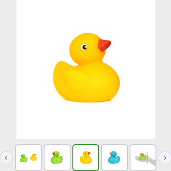
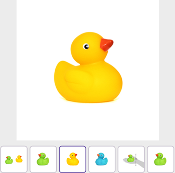
UnSelected Thumbnail Stroke
The UnSelectedThumbnailStroke property is used to customize the color of the unselected thumbnails stroke in the SfRotator.
<syncfusion:SfRotator x:Name="rotator"
            ItemsSource="{Binding ImageCollection}"
            SelectedIndex="2"
            BackgroundColor="#ececec"
            NavigationStripPosition="Bottom"
            NavigationStripMode="Thumbnail"
            SelectedThumbnailStroke="Green"
            UnselectedThumbnailStroke="Red"
            WidthRequest="550"
HeightRequest="550">rotator.NavigationStripMode = NavigationStripMode.Thumbnail;
rotator.SelectedThumbnailStroke = Colors.Green;
rotator.UnSelectedThumbnailStroke = Colors.Red;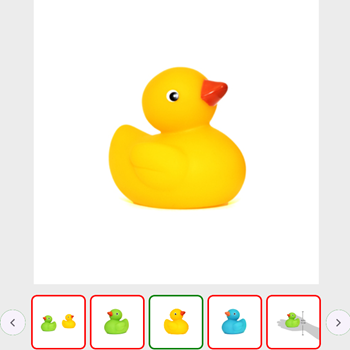
Customizing Position
The placement position of navigation strip items such as Thumbnail or Dots can be customized in SfRotator. This can be specified using NavigationStripMode property.
<?xml version="1.0" encoding="utf-8" ?>
<ContentPage xmlns="http://schemas.microsoft.com/dotnet/2021/maui"
            xmlns:x="http://schemas.microsoft.com/winfx/2009/xaml"
            xmlns:syncfusion="clr-namespace:Syncfusion.Maui.Rotator;assembly=Syncfusion.Maui.Rotator"
            xmlns:local="clr-namespace:Rotator"
            x:Class="Rotator.Rotator">
    <ContentPage.BindingContext>
        <local:RotatorViewModel/>
    </ContentPage.BindingContext>
    <ContentPage.Content>
        <syncfusion:SfRotator x:Name="rotator"
                        NavigationDelay="2000"
                        ItemsSource="{Binding ImageCollection}"
                        SelectedIndex="2"
                        NavigationDirection="Horizontal"
                        NavigationStripMode="Dots"
                        BackgroundColor="#ececec"
                        NavigationStripPosition="Top"
                        WidthRequest="550"
                        HeightRequest="550">
            <syncfusion:SfRotator.ItemTemplate>
                <DataTemplate>
                    <Image  Source="{Binding Image}"/>
                </DataTemplate>
            </syncfusion:SfRotator.ItemTemplate>
        </syncfusion:SfRotator>
    </ContentPage.Content>
</ContentPage>
using Syncfusion.Maui.Core.Rotator;
using Syncfusion.Maui.Rotator;
namespace Rotator
{
public partial class Rotator : ContentPage
{
public Rotator()
{
InitializeComponent ();
SfRotator rotator = new SfRotator();
var ImageCollection = new List<RotatorModel> {
new RotatorModel ("image1.png"),
new RotatorModel ("image2.png"),
new RotatorModel ("image3.png"),
new RotatorModel ("image4.png"),
new RotatorModel ("image5.png")
};
var itemTemplate = new DataTemplate(() =>
{
var grid = new Grid();
var nameLabel = new Image();
nameLabel.SetBinding(Image.SourceProperty, "Image");
grid.Children.Add(nameLabel);
return grid;
});
rotator.ItemTemplate = itemTemplate;
rotator.NavigationStripMode = NavigationStripMode.Dots;
rotator.NavigationStripPosition = NavigationStripPosition.Top;
rotator.WidthRequest=550;
rotator.HeightRequest=550;
rotator.ItemsSource = ImageCollection;
this.Content = rotator;
}
}
public class RotatorModel
{
public RotatorModel(string imageString)
{
Image = imageString;
}
private String _image;
public String Image
{
get { return _image; }
set { _image = value; }
}
}
}
Navigation Button Customization
In Navigation Button Customization we can customize the navigation button’s icon and Background color.
Navigation Button Icon Color
The NavigationButtonIconColor property is used to customize the color of the navigation buttons icon in the SfRotator.
<syncfusion:SfRotator x:Name="rotator"
            ItemsSource="{Binding ImageCollection}"
            SelectedIndex="2"
            BackgroundColor="#ececec"
            NavigationStripMode="Thumbnail"
            NavigationButtonIconColor="Blue"
            WidthRequest="550"
HeightRequest="550">rotator.NavigationStripMode = NavigationStripMode.Thumbnail;
rotator.NavigationButtonIconColor = Colors.Blue;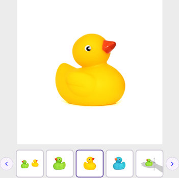
Navigation Button Background Color
The NavigationButtonBackgroundColor property is used to customize the color of the navigation buttons background in the SfRotator.
<syncfusion:SfRotator x:Name="rotator"
            ItemsSource="{Binding ImageCollection}"
            SelectedIndex="2"
            BackgroundColor="#ececec"
            NavigationStripMode="Thumbnail"
            NavigationButtonBackgroundColor="Pink"
            NavigationButtonIconColor="Blue"
            WidthRequest="550"
HeightRequest="550">rotator.NavigationStripMode = NavigationStripMode.Thumbnail;
rotator.NavigationButtonBackgroundColor = Colors.Pink;
rotator.NavigationButtonIconColor = Colors.Blue;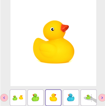
Navigation Visibility
We can show or hide Navigation Button using ShowNavigationButton property.
<syncfusion:SfRotator x:Name="rotator"
            ItemsSource="{Binding ImageCollection}"
            SelectedIndex="2"
            BackgroundColor="#ececec"
            NavigationStripMode="Thumbnail"
            ShowNavigationButton="False"
            WidthRequest="550"
HeightRequest="550">rotator.NavigationStripMode = NavigationStripMode.Thumbnail;
rotator.ShowNavigationButton = false;