Populating Data in .NET MAUI Rotator
18 Nov 20188 minutes to read
The .NET MAUI Rotator control can be populated with items in two ways:
-
Through Binding - bind a collection (such as
IList,List<T>, orObservableCollection<T>) to theItemsSourceproperty and supply a shared layout viaItemTemplate. -
Through Rotator Item - create a list of
SfRotatorItemobjects when each item needs a different view, an image, or arbitrary content via theItemContentproperty.
Use Through Binding when all items share a common layout. Use Through Rotator Item when you need per-item customization, mixed content, or quick image-only items.
Prerequisites
Before using the SfRotator, ensure the following NuGet package is installed in your .NET MAUI project:
Syncfusion.Maui.Rotator
For step-by-step setup, refer to the Getting Started documentation.
Properties Reference
| Property | Type | Default | Description |
|---|---|---|---|
ItemsSource |
IList |
null |
The collection of items to display. Supports List<T>, ObservableCollection<T>, and arrays. Use ObservableCollection<T> for automatic UI updates when the collection changes. |
ItemTemplate |
DataTemplate |
null |
The shared template applied to every item. The template binds to each item’s properties. |
SfRotatorItem.Image |
string |
null |
The image file name (resolved from the Resources/Images folder) for image-only items. |
SfRotatorItem.ItemContent |
View |
null |
The arbitrary view shown for the item. Takes precedence over Image when both are set. |
Through Binding
This section explains how to set the ItemsSource and apply a custom template to the data.
Create a Model with Data
The Rotator items can be populated with a collection of image data. Assign a collection to the ItemsSource property. Collections include arrays, List<T>, and ObservableCollection<T>. For example, you may want to create a RotatorModel with an Image property as follows.
// Model Class for Rotator.
public class RotatorModel
{
    public RotatorModel(string imageString)
    {
        Image = imageString;
    }
    public string Image { get; set; }
}
Create and populate the Rotator collection as follows.
// ViewModel class for Rotator.

public class RotatorViewModel
{
    public RotatorViewModel()
    {
        ImageCollection = new List<RotatorModel>
        {
            new RotatorModel("image1.png"),
            new RotatorModel("image2.png"),
            new RotatorModel("image3.png"),
            new RotatorModel("image4.png"),
            new RotatorModel("image5.png")
        };
    }
    public List<RotatorModel> ImageCollection { get; set; }
}
Binding the Data with Custom Template
The Rotator provides support to add a custom view as Rotator items by designing a view inside its ItemTemplate. This template will be applied to all its items, and its data will be bound.
<rotator:SfRotator x:Name="rotator"
                   ItemsSource="{Binding ImageCollection}"
                   SelectedIndex="2"
                   NavigationDirection="Horizontal"
                   NavigationStripMode="Dots"
                   BackgroundColor="#ececec">
    <rotator:SfRotator.ItemTemplate>
        <DataTemplate>
            <Image Source="{Binding Image}" />
        </DataTemplate>
    </rotator:SfRotator.ItemTemplate>
</rotator:SfRotator>
<rotator:SfRotator.BindingContext>
    <local:RotatorViewModel />
</rotator:SfRotator.BindingContext>
RotatorViewModel rotatorViewModel = new RotatorViewModel();
SfRotator rotator = new SfRotator()
{
SelectedIndex = 2,
BackgroundColor = Color.FromArgb("#ececec"),
NavigationStripMode = NavigationStripMode.Dots,
NavigationDirection = NavigationDirection.Horizontal,
ItemsSource = rotatorViewModel.ImageCollection,
ItemTemplate = new DataTemplate(() =>
{
var image = new Image();
image.SetBinding(Image.SourceProperty, "Image");
return image;
}),
};Through Rotator Item
The ItemTemplate provides a common template with different data, whereas if different views for every item are needed, they can be provided using the ItemContent property in the SfRotatorItem class.
Using ItemContent
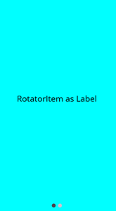
Use SfRotatorItem.ItemContent when each item must display a different view, such as a label, an image, or any custom layout.
List<SfRotatorItem> rotatorItem = new List<SfRotatorItem>();

// Rotator Item as Label
rotatorItem.Add(new SfRotatorItem()
{
    ItemContent = new Label()
    {
        Text = "RotatorItem as Label",
        BackgroundColor = Colors.Aqua,
        FontSize = 20,
        VerticalTextAlignment = TextAlignment.Center,
        HorizontalTextAlignment = TextAlignment.Center,
        VerticalOptions = LayoutOptions.Center
    }
});

// Rotator Item as Image
rotatorItem.Add(new SfRotatorItem()
{
    ItemContent = new Image()
    {
        Source = ImageSource.FromFile("image1.png"),
        Aspect = Aspect.AspectFit,
        VerticalOptions = LayoutOptions.Center,
        HeightRequest = 400,
        WidthRequest = 400
    }
});

SfRotator rotator = new SfRotator()
{
    ItemsSource = rotatorItem
};
Using the Image Property
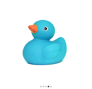
The SfRotatorItem class also provides an Image property for quickly displaying image-only items. When both Image and ItemContent are set, ItemContent takes precedence.
SfRotator rotator = new SfRotator()
{
    ItemsSource = new List<SfRotatorItem>()
    {
        new SfRotatorItem() { Image = "image1.png" },
        new SfRotatorItem() { Image = "image2.png" },
        new SfRotatorItem() { Image = "image3.png" },
        new SfRotatorItem() { Image = "image4.png" },
        new SfRotatorItem() { Image = "image5.png" }
    }
};

StackLayout stackLayout = new StackLayout()
{
    HeightRequest = 300,
    Children =
    {
        rotator
    }
};
Similarly, every item can be created and customized when a different Rotator item view is needed.