Getting Started with .NET MAUI Range Slider
29 Jun 20265 minutes to read
This section explains the steps required to add the RangeSlider control and its elements such as track, ticks, labels and tooltip. This section covers only basic features needed to know to get started with Syncfusion® Range Slider.
To quickly get started with the .NET MAUI Range Slider, watch this video.
Prerequisites
Before proceeding, ensure the following are set up:
- Install .NET 9 SDK or later.
- Set up a .NET MAUI environment with Visual Studio 2022 v17.12 or later.
Step 1: Create a new .NET MAUI project
- Go to File > New > Project and choose the .NET MAUI App template.
- Name the project and choose a location. Then, click Next.
- Select the .NET framework version and click Create.
Step 2: Install the Syncfusion® MAUI Sliders NuGet package
- In Solution Explorer, right-click the project and choose Manage NuGet Packages.
- Search for Syncfusion.Maui.Sliders and install the latest version.
- Ensure the necessary dependencies are installed correctly, and the project is restored.
Prerequisites
Before proceeding, ensure the following are set up:
- Install .NET 9 SDK or later.
- Set up a .NET MAUI environment with Visual Studio Code.
- Ensure that the .NET MAUI workloads are installed and configured as described here.
Step 1: Create a new .NET MAUI project
- Open the Command Palette by pressing Ctrl+Shift+P and type .NET:New Project and press Enter.
- Choose the .NET MAUI App template.
- Select the project location, type the project name and press Enter.
- Then choose Create project
Step 2: Install the Syncfusion® MAUI Sliders NuGet package
- Press Ctrl + ` (backtick) to open the integrated terminal in Visual Studio Code.
- Ensure you’re in the project root directory where your .csproj file is located.
- Run the command
dotnet add package Syncfusion.Maui.Slidersto install the Syncfusion® .NET MAUI Sliders package. - To ensure all dependencies are installed, run
dotnet restore.
Prerequisites
Before proceeding, ensure the following are set up:
- Install .NET 9 SDK or later.
- Set up a .NET MAUI environment with JetBrains Rider 2024.3 or later.
- Make sure the MAUI workloads are installed and configured as described here.
Step 1: Create a new .NET MAUI project
- Go to File > New Solution, Select .NET (C#) and choose the .NET MAUI App template.
- Enter the Project Name, Solution Name, and Location.
- Select the .NET framework version and click Create.
Step 2: Install the Syncfusion® MAUI Sliders NuGet package
- In Solution Explorer, right-click the project and choose Manage NuGet Packages.
- Search for Syncfusion.Maui.Sliders and install the latest version.
- Ensure the necessary dependencies are installed correctly, and the project is restored. If not, Open the Terminal in Rider and manually run:
dotnet restore
Step 3: Register Syncfusion handler
Make sure to add the namespace.
using Syncfusion.Maui.Core.Hosting;Register the Syncfusion core handler in your CreateMauiApp method of MauiProgram.cs file to use Syncfusion controls.
builder.ConfigureSyncfusionCore();Step 4: Import Range Slider namespace
Add the following namespace in your XAML or C#.
xmlns:rangeSlider="clr-namespace:Syncfusion.Maui.Sliders;assembly=Syncfusion.Maui.Sliders"using Syncfusion.Maui.Sliders;Step 5: Add the RangeSlider component
Configure the RangeSlider component that allows you to select a range of values within specified limits, providing a flexible and interactive input experience. The ShowLabels property enables the labels which renders on given interval.
<sliders:SfRangeSlider Minimum="0"
                       Maximum="10"
                       RangeStart="2"
                       RangeEnd="8"
                       Interval="2"
                       ShowLabels="True"
                       ShowTicks="True"
                       MinorTicksPerInterval="1" />
SfRangeSlider rangeSlider = new SfRangeSlider();
rangeSlider.Minimum = 0;
rangeSlider.Maximum = 10;
rangeSlider.RangeStart = 2;
rangeSlider.RangeEnd = 8;
rangeSlider.ShowLabels = true;
rangeSlider.Interval = 2;
rangeSlider.ShowTicks = true;
rangeSlider.Interval = 2;
rangeSlider.MinorTicksPerInterval = 1;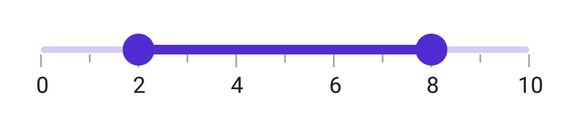
You can download the Range Slider Getting Started sample from GitHub.
NOTE
You can refer to our .NET MAUI Range Slider feature tour page for its groundbreaking feature representations. You can also explore our .NET MAUI Range Slider Example that shows you how to render the Range Slider in .NET MAUI.