Column in .NET MAUI Kanban Board (SfKanban)
12 Sep 202524 minutes to read
Customizing Column Size
By default, columns are sized smartly to arrange the default elements of the cards with better readability. However, you can define the minimum and maximum width for the columns in SfKanban using MinimumColumnWidth and MaximumColumnWidth properties respectively.
<kanban:SfKanban x:Name="kanban" MinimumColumnWidth ="300" MaximumColumnWidth ="340"/>this.kanban.MinimumColumnWidth = 300;
this.kanban.MaximumColumnWidth = 340;You can also define the exact column width using ColumnWidth property of SfKanban.
<kanban:SfKanban x:Name="kanban" ColumnWidth ="250"/>this.kanban.ColumnWidth = 250;Categorizing Columns
To categorize columns based on a specific property, you must explicitly define the property path using the ColumnMappingPath property. However, only the properties of KanbanModel can be assigned to ColumnMappingPath. By default, SfKanban will categorize the items using the Category property of KanbanModel.
<kanban:SfKanban x:Name="kanban" ColumnMappingPath="ID"/>this.kanban.ColumnMappingPath = "ID";Category for a column
You can assign a specific category to a column by setting the Categories property of the KanbanColumn. This will display cards with the specified category under the corresponding column. For example, to map the In Progress category to the In Progress column
<kanban:KanbanColumn x:Name="progressColumn" Categories="In Progress" />this.progressColumn.Categories = new List<object>() { "In Progress" };Headers
Header shows the category Title, Items count, Min and Max informations of a column. The UI of the header can be replaced entirely using HeaderTemplate property of SfKanban. The following code snippet and screenshot illustrates this.
<kanban:SfKanban.HeaderTemplate >
    <DataTemplate>
        <StackLayout WidthRequest="300" HeightRequest="40" BackgroundColor="Silver">
            <Label Margin="10" Text="{Binding Title}" TextColor="Purple" HorizontalOptions="Start" />
        </StackLayout>
    </DataTemplate>
</kanban:SfKanban.HeaderTemplate>
var headerTemplate = new DataTemplate(() =>
{
StackLayout root = new StackLayout()
{
WidthRequest = 300,
HeightRequest = 40,
BackgroundColor = Color.Silver
};
Label label = new Label();
label.Margin = new Thickness(10);
label.SetBinding(Label.TextProperty, new Binding("Title") );
label.TextColor = Color.Purple;
label.HorizontalOptions = LayoutOptions.Start;
root.Children.Add(label);
return root;
});
kanban.HeaderTemplate = headerTemplate;Expand/Collapse Column
Columns can be expanded/collapsed by tapping the toggle button which is placed at top right corner of the Kanban header. IsExpanded property of KanbanColumn is used to programmatically expand/collapse the Kanban column. The following code example describes the above behavior.
<kanban:SfKanban.Columns>
    <kanban:KanbanColumn x:Name="column1" Title="To Do" IsExpanded="false" />
    <kanban:KanbanColumn x:Name="column2" Title="In Progress" IsExpanded="false" />
</kanban:SfKanban.Columns>
KanbanColumn column1 = new KanbanColumn();
column1.IsExpanded = false;
KanbanColumn column2 = new KanbanColumn();
column2.IsExpanded = false;
kanban.Columns.Add(column1);
kanban.Columns.Add(column2);Enable/Disable Drag & Drop
You can enable and disable the drag and drop operation of the cards for particular column using AllowDrag and AllowDrop properties of KanbanColumn.
The following code is used to disable the drag operation from progress column.
<kanban:SfKanban.Columns>
    <kanban:KanbanColumn AllowDrag="false"/>
</kanban:SfKanban.Columns>
KanbanColumn progressColumn = new KanbanColumn();
progressColumn.AllowDrag = false;The following code is used to disable the drop operation of the cards into the progress column.
<kanban:SfKanban.Columns>
    <kanban:KanbanColumn AllowDrop="false"/>
</kanban:SfKanban.Columns>
KanbanColumn progressColumn = new KanbanColumn();
progressColumn.AllowDrop = false;Items Count
ItemsCount property is used to get the total cards count in each column.
int count = todoColumn.ItemsCount;Work In-Progress Limit
MinimumLimit and MaximumLimit properties are used to define the minimum and maximum number of items in a column. If the actual items count is exceeded or lesser than the specified limits, the error bars are used to indicate this violation. Following properties of ErrorBarSettings are used to customize the appearance of error bar.
-
Fill, of type
Brush, used to change the default color of the error bar. -
MaxValidationFill, of type
Brush, used to change the maximum validation color of the error bar. -
MinValidationFill, of type
Brush, used to change the minimum validation color of the error bar. -
Height,of type
double, used to change the height of the error bar.
<kanban:KanbanColumn x:Name="todoColumn" Title="To Do" MinimumLimit="2" MaximumLimit="1"/>todoColumn.MinimumLimit = 2;
todoColumn.MaximumLimit = 1;<kanban:KanbanColumn x:Name="todoColumn" Title="To Do" MinimumLimit="3" MaximumLimit="5">
<kanban:KanbanColumn.ErrorBarSettings>
<kanban:KanbanErrorBarSettings Fill="Green" MinValidationFill="Orange" MaxValidationFill="Red" Height="4"/>
</kanban:KanbanColumn.ErrorBarSettings>
</kanban:KanbanColumn>KanbanColumn todoColumn = new KanbanColumn();
todoColumn.Title = "To Do";
todoColumn.MaximumLimit = 5;
todoColumn.MinimumLimit = 3;
KanbanErrorBarSettings kanbanErrorBarSettings = new KanbanErrorBarSettings()
{
Fill = Colors.Green,
MaxValidationFill = Colors.Red,
MinValidationFill = Colors.Orange,
Height = 4,
};
todoColumn.ErrorBarSettings = kanbanErrorBarSettings;
kanban.Columns.Add(todoColumn);Customize column appearance
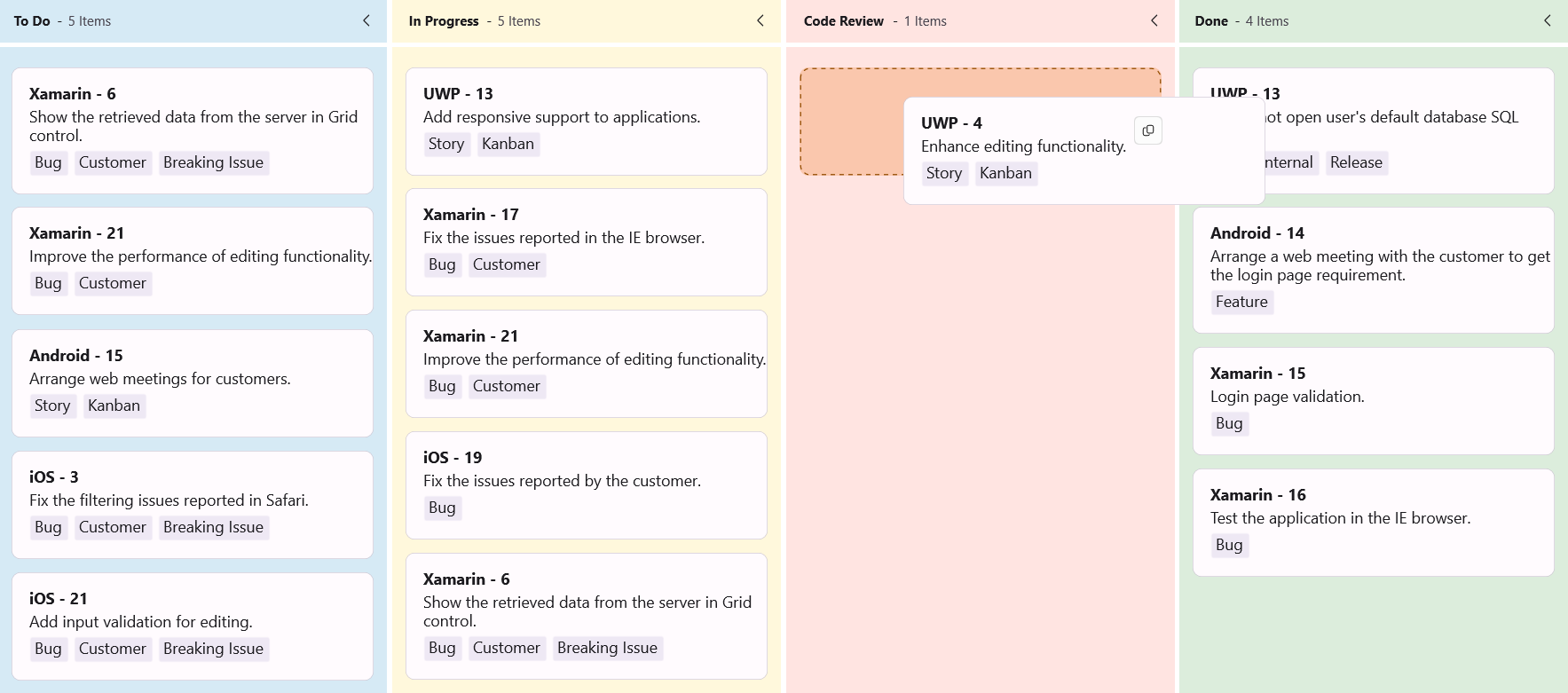
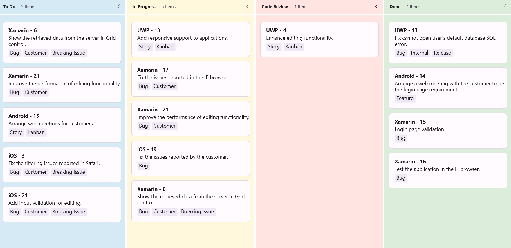
The .NET MAUI Kanban control provides flexible options to customize the appearance of each column. You can modify the column background, placeholder style, and the UI shown when no cards are present.
Customize the column background
To change the background color of a column, use the Background property of the KanbanColumn class. This allows you to visually differentiate columns based on their status.
<kanban:SfKanban x:Name="kanban"
                 AutoGenerateColumns="False"
                 ItemsSource="{Binding Cards}">
    <kanban:SfKanban.BindingContext>
        <local:KanbanViewModel />
    </kanban:SfKanban.BindingContext>
    <kanban:KanbanColumn Title="To Do"
                         Categories="Open,Postponed"
                         Background="#D6EAF5"/>
    <kanban:KanbanColumn Title="In Progress"
                         Categories="In Progress"
                         Background="#FFF8DC"/>
    <kanban:KanbanColumn Title="Code Review"
                         Categories="Code Review"
                         Background="#FFE4E1"/>
    <kanban:KanbanColumn Title="Done"
                         Categories="Closed"
                         Background="#DCEDDC"/>
</kanban:SfKanban>
SfKanban kanban = new SfKanban();
KanbanViewModel viewModel = new KanbanViewModel();
kanban.AutoGenerateColumns = false;
kanban.Columns.Add(new KanbanColumn
{
Title = "To Do",
Categories = new List<object> { "Open", "Postponed" },
Background = Color.FromArgb("#D6EAF5")
});
kanban.Columns.Add(new KanbanColumn
{
Title = "In Progress",
Categories = new List<object> { "In Progress" },
Background = Color.FromArgb("#FFF8DC")
});
kanban.Columns.Add(new KanbanColumn
{
Title = "Code Review",
Categories = new List<object> { "Code Review" },
Background = Color.FromArgb("#FFE4E1")
});
kanban.Columns.Add(new KanbanColumn
{
Title = "Done",
Categories = new List<object> { "Closed" },
Background = Color.FromArgb("#DCEDDC")
});
kanban.ItemsSource = viewModel.Cards;
this.Content = kanban;public class KanbanViewModel
{
public KanbanViewModel()
{
this.Cards = this.GetCardDetails();
}
public ObservableCollection<KanbanModel> Cards { get; set; }
private ObservableCollection<KanbanModel> GetCardDetails()
{
var cardsDetails = new ObservableCollection<KanbanModel>();
cardsDetails.Add(new KanbanModel()
{
ID = 6,
Title = "Xamarin - 6",
Category = "Open",
Description = "Show the retrieved data from the server in Grid control.",
IndicatorFill = Colors.Red,
Tags = new List<string> { "Bug", "Customer", "Breaking Issue" }
});
cardsDetails.Add(new KanbanModel()
{
ID = 21,
Title = "Xamarin - 21",
Category = "Open",
Description = "Improve the performance of editing functionality.",
IndicatorFill = Colors.Purple,
Tags = new List<string> { "Bug", "Customer" }
});
cardsDetails.Add(new KanbanModel()
{
ID = 3,
Title = "iOS - 3",
Category = "Postponed",
Description = "Fix the filtering issues reported in Safari.",
IndicatorFill = Colors.Red,
Tags = new List<string> { "Bug", "Customer", "Breaking Issue" }
});
cardsDetails.Add(new KanbanModel()
{
ID = 11,
Title = "iOS - 21",
Category = "Postponed",
Description = "Add input validation for editing.",
IndicatorFill = Colors.Red,
Tags = new List<string> { "Bug", "Customer", "Breaking Issue" }
});
cardsDetails.Add(new KanbanModel()
{
ID = 15,
Title = "Android - 15",
Category = "Open",
Description = "Arrange web meetings for customers.",
IndicatorFill = Colors.Red,
Tags = new List<string> { "Story", "Kanban" }
});
cardsDetails.Add(new KanbanModel()
{
ID = 4,
Title = "UWP - 4",
Category = "Code Review",
Description = "Enhance editing functionality.",
IndicatorFill = Colors.Brown,
Tags = new List<string> { "Story", "Kanban" }
});
cardsDetails.Add(new KanbanModel()
{
ID = 13,
Title = "UWP - 13",
Category = "In Progress",
Description = "Add responsive support to applications.",
IndicatorFill = Colors.Brown,
Tags = new List<string> { "Story", "Kanban" }
});
cardsDetails.Add(new KanbanModel()
{
ID = 17,
Title = "Xamarin - 17",
Category = "In Progress",
Description = "Fix the issues reported in the IE browser.",
IndicatorFill = Colors.Brown,
Tags = new List<string> { "Bug", "Customer" }
});
cardsDetails.Add(new KanbanModel()
{
ID = 21,
Title = "Xamarin - 21",
Category = "In Progress",
Description = "Improve the performance of editing functionality.",
IndicatorFill = Colors.Purple,
Tags = new List<string> { "Bug", "Customer" }
});
cardsDetails.Add(new KanbanModel()
{
ID = 19,
Title = "iOS - 19",
Category = "In Progress",
Description = "Fix the issues reported by the customer.",
IndicatorFill = Colors.Purple,
Tags = new List<string> { "Bug" }
});
cardsDetails.Add(new KanbanModel()
{
ID = 6,
Title = "Xamarin - 6",
Category = "In Progress",
Description = "Show the retrieved data from the server in Grid control.",
IndicatorFill = Colors.Red,
Tags = new List<string> { "Bug", "Customer", "Breaking Issue" }
});
cardsDetails.Add(new KanbanModel()
{
ID = 13,
Title = "UWP - 13",
Category = "Closed",
Description = "Fix cannot open user's default database SQL error.",
IndicatorFill = Colors.Purple,
Tags = new List<string> { "Bug", "Internal", "Release" }
});
cardsDetails.Add(new KanbanModel()
{
ID = 14,
Title = "Android - 14",
Category = "Closed",
Description = "Arrange a web meeting with the customer to get the login page requirement.",
IndicatorFill = Colors.Red,
Tags = new List<string> { "Feature" }
});
cardsDetails.Add(new KanbanModel()
{
ID = 15,
Title = "Xamarin - 15",
Category = "Closed",
Description = "Login page validation.",
IndicatorFill = Colors.Red,
Tags = new List<string> { "Bug" }
});
cardsDetails.Add(new KanbanModel()
{
ID = 16,
Title = "Xamarin - 16",
Category = "Closed",
Description = "Test the application in the IE browser.",
IndicatorFill = Colors.Purple,
Tags = new List<string> { "Bug" }
});
return cardsDetails;
}
}
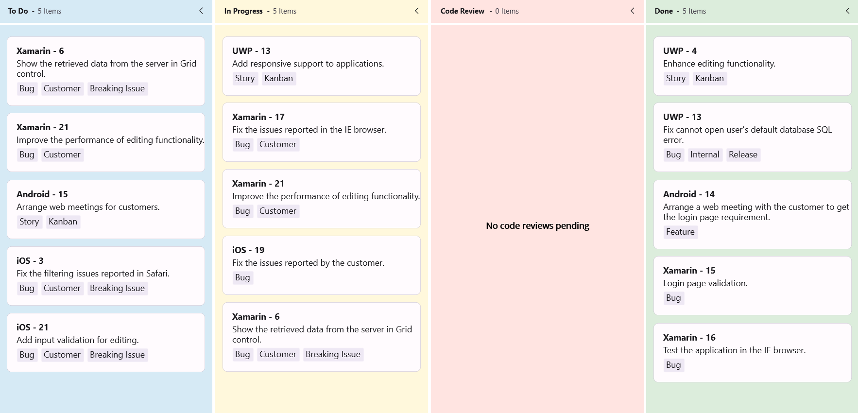
Customize no card appearance using DataTemplate
The .NET MAUI Kanban control allows you to define a custom UI for columns that have no cards using the NoCardTemplate property of the KanbanColumn. This feature helps you display meaningful messages or visuals when a column is empty, improving the user experience.
The following example shows how to define a custom no card template using a DataTemplate.
<kanban:SfKanban x:Name="kanban"
                 AutoGenerateColumns="False"
                 ItemsSource="{Binding Cards}">
    <kanban:SfKanban.BindingContext>
        <local:KanbanViewModel />
    </kanban:SfKanban.BindingContext>
    <kanban:KanbanColumn Title="To Do"
                         Categories="Open,Postponed"
                         Background="#D6EAF5"/>
    <kanban:KanbanColumn Title="In Progress"
                         Categories="In Progress"
                         Background="#FFF8DC"/>
    <kanban:KanbanColumn Title="Code Review"
                         Categories="Code Review"
                         Background="#FFE4E1">
        <kanban:KanbanColumn.NoCardTemplate>
            <DataTemplate>
                <VerticalStackLayout VerticalOptions="Center">
                    <Label Text="No code reviews pending"
                           Margin="0,8,0,0"
                           HorizontalOptions="Center"
                           VerticalOptions="Center"
                           FontSize="14"
                           FontAttributes="Bold"
                           TextColor="#000000" />
                </VerticalStackLayout>
            </DataTemplate>
        </kanban:KanbanColumn.NoCardTemplate>
    </kanban:KanbanColumn>
    <kanban:KanbanColumn Title="Done"
                         Categories="Closed"
                         Background="#DCEDDC"/>
</kanban:SfKanban>
SfKanban kanban = new SfKanban();
KanbanViewModel viewModel = new KanbanViewModel();
kanban.AutoGenerateColumns = false;
kanban.Columns.Add(new KanbanColumn
{
Title = "To Do",
Categories = new List<object> { "Open", "Postponed" },
Background = Color.FromArgb("#D6EAF5")
});
kanban.Columns.Add(new KanbanColumn
{
Title = "In Progress",
Categories = new List<object> { "In Progress" },
Background = Color.FromArgb("#FFF8DC")
});
kanban.Columns.Add(new KanbanColumn
{
Title = "Code Review",
Categories = new List<object> { "Code Review" },
Background = Color.FromArgb("#FFE4E1"),
NoCardTemplate = new DataTemplate(() =>
{
return new VerticalStackLayout
{
VerticalOptions = LayoutOptions.Center,
Children =
{
new Label
{
Text = "No code reviews pending",
Margin = new Thickness(0, 8, 0, 0),
HorizontalOptions = LayoutOptions.Center,
VerticalOptions = LayoutOptions.Center,
FontSize = 14,
FontAttributes = FontAttributes.Bold,
TextColor = Colors.Black
}
}
};
})
});
kanban.Columns.Add(new KanbanColumn
{
Title = "Done",
Categories = new List<object> { "Closed" },
Background = Color.FromArgb("#DCEDDC")
});
kanban.ItemsSource = viewModel.Cards;
this.Content = kanban;public class KanbanViewModel
{
public KanbanViewModel()
{
this.Cards = this.GetCardDetails();
}
public ObservableCollection<KanbanModel> Cards { get; set; }
private ObservableCollection<KanbanModel> GetCardDetails()
{
var cardsDetails = new ObservableCollection<KanbanModel>();
cardsDetails.Add(new KanbanModel()
{
ID = 6,
Title = "Xamarin - 6",
Category = "Open",
Description = "Show the retrieved data from the server in Grid control.",
IndicatorFill = Colors.Red,
Tags = new List<string> { "Bug", "Customer", "Breaking Issue" }
});
cardsDetails.Add(new KanbanModel()
{
ID = 21,
Title = "Xamarin - 21",
Category = "Open",
Description = "Improve the performance of editing functionality.",
IndicatorFill = Colors.Purple,
Tags = new List<string> { "Bug", "Customer" }
});
cardsDetails.Add(new KanbanModel()
{
ID = 3,
Title = "iOS - 3",
Category = "Postponed",
Description = "Fix the filtering issues reported in Safari.",
IndicatorFill = Colors.Red,
Tags = new List<string> { "Bug", "Customer", "Breaking Issue" }
});
cardsDetails.Add(new KanbanModel()
{
ID = 11,
Title = "iOS - 21",
Category = "Postponed",
Description = "Add input validation for editing.",
IndicatorFill = Colors.Red,
Tags = new List<string> { "Bug", "Customer", "Breaking Issue" }
});
cardsDetails.Add(new KanbanModel()
{
ID = 15,
Title = "Android - 15",
Category = "Open",
Description = "Arrange web meetings for customers.",
IndicatorFill = Colors.Red,
Tags = new List<string> { "Story", "Kanban" }
});
cardsDetails.Add(new KanbanModel()
{
ID = 4,
Title = "UWP - 4",
Category = "Code Review",
Description = "Enhance editing functionality.",
IndicatorFill = Colors.Brown,
Tags = new List<string> { "Story", "Kanban" }
});
cardsDetails.Add(new KanbanModel()
{
ID = 13,
Title = "UWP - 13",
Category = "In Progress",
Description = "Add responsive support to applications.",
IndicatorFill = Colors.Brown,
Tags = new List<string> { "Story", "Kanban" }
});
cardsDetails.Add(new KanbanModel()
{
ID = 17,
Title = "Xamarin - 17",
Category = "In Progress",
Description = "Fix the issues reported in the IE browser.",
IndicatorFill = Colors.Brown,
Tags = new List<string> { "Bug", "Customer" }
});
cardsDetails.Add(new KanbanModel()
{
ID = 21,
Title = "Xamarin - 21",
Category = "In Progress",
Description = "Improve the performance of editing functionality.",
IndicatorFill = Colors.Purple,
Tags = new List<string> { "Bug", "Customer" }
});
cardsDetails.Add(new KanbanModel()
{
ID = 19,
Title = "iOS - 19",
Category = "In Progress",
Description = "Fix the issues reported by the customer.",
IndicatorFill = Colors.Purple,
Tags = new List<string> { "Bug" }
});
cardsDetails.Add(new KanbanModel()
{
ID = 6,
Title = "Xamarin - 6",
Category = "In Progress",
Description = "Show the retrieved data from the server in Grid control.",
IndicatorFill = Colors.Red,
Tags = new List<string> { "Bug", "Customer", "Breaking Issue" }
});
cardsDetails.Add(new KanbanModel()
{
ID = 13,
Title = "UWP - 13",
Category = "Closed",
Description = "Fix cannot open user's default database SQL error.",
IndicatorFill = Colors.Purple,
Tags = new List<string> { "Bug", "Internal", "Release" }
});
cardsDetails.Add(new KanbanModel()
{
ID = 14,
Title = "Android - 14",
Category = "Closed",
Description = "Arrange a web meeting with the customer to get the login page requirement.",
IndicatorFill = Colors.Red,
Tags = new List<string> { "Feature" }
});
cardsDetails.Add(new KanbanModel()
{
ID = 15,
Title = "Xamarin - 15",
Category = "Closed",
Description = "Login page validation.",
IndicatorFill = Colors.Red,
Tags = new List<string> { "Bug" }
});
cardsDetails.Add(new KanbanModel()
{
ID = 16,
Title = "Xamarin - 16",
Category = "Closed",
Description = "Test the application in the IE browser.",
IndicatorFill = Colors.Purple,
Tags = new List<string> { "Bug" }
});
return cardsDetails;
}
}
Customize the placeholder style
The .NET MAUI Kanban control supports styling the placeholder area, where cards can be dropped during drag-and-drop operations using the PlaceholderStyle property of the KanbanColumn. This customization enhances visual clarity and improves the user experience during interactions.
<kanban:SfKanban x:Name="kanban"
                 AutoGenerateColumns="False"
                 ItemsSource="{Binding Cards}">
    <kanban:SfKanban.Resources>
        <kanban:KanbanPlaceholderStyle x:Key="PlaceholderStyle"
                                       Background="#FAC7AD"
                                       SelectionIndicatorBackground="#FAC7AD"
                                       SelectionIndicatorStroke="#914C00">
            <kanban:KanbanPlaceholderStyle.SelectionIndicatorTextStyle>
                <kanban:KanbanTextStyle TextColor="#914C00" />
            </kanban:KanbanPlaceholderStyle.SelectionIndicatorTextStyle>
        </kanban:KanbanPlaceholderStyle>
    </kanban:SfKanban.Resources>
    <kanban:SfKanban.BindingContext>
        <local:KanbanViewModel />
    </kanban:SfKanban.BindingContext>
    <kanban:KanbanColumn Title="To Do"
                         Categories="Open,Postponed"
                         Background="#D6EAF5"
                         PlaceholderStyle="{StaticResource PlaceholderStyle}"/>
    <kanban:KanbanColumn Title="In Progress"
                         Categories="In Progress"
                         Background="#FFF8DC"
                         PlaceholderStyle="{StaticResource PlaceholderStyle}"/>
    <kanban:KanbanColumn Title="Code Review"
                         Categories="Code Review"
                         Background="#FFE4E1"
                         PlaceholderStyle="{StaticResource PlaceholderStyle}"/>
    <kanban:KanbanColumn Title="Done"
                         Categories="Closed"
                         Background="#DCEDDC"
                         PlaceholderStyle="{StaticResource PlaceholderStyle}"/>
</kanban:SfKanban>
SfKanban kanban = new SfKanban();
KanbanViewModel viewModel = new KanbanViewModel();
kanban.AutoGenerateColumns = false;
KanbanPlaceholderStyle placeholderStyle = new KanbanPlaceholderStyle
{
Background = Color.FromArgb("#FAC7AD"),
SelectionIndicatorBackground = Color.FromArgb("#FAC7AD"),
SelectionIndicatorStroke = Color.FromArgb("#914C00"),
SelectionIndicatorTextStyle = new KanbanTextStyle
{
TextColor = Color.FromArgb("#914C00")
}
};
kanban.Columns.Add(new KanbanColumn
{
Title = "To Do",
Categories = new List<object> { "Open", "Postponed" },
Background = Color.FromArgb("#D6EAF5"),
PlaceholderStyle = placeholderStyle
});
kanban.Columns.Add(new KanbanColumn
{
Title = "In Progress",
Categories = new List<object> { "In Progress" },
Background = Color.FromArgb("#FFF8DC"),
PlaceholderStyle = placeholderStyle
});
kanban.Columns.Add(new KanbanColumn
{
Title = "Code Review",
Categories = new List<object> { "Code Review" },
Background = Color.FromArgb("#FFE4E1"),
PlaceholderStyle = placeholderStyle
});
kanban.Columns.Add(new KanbanColumn
{
Title = "Done",
Categories = new List<object> { "Closed" },
Background = Color.FromArgb("#DCEDDC"),
PlaceholderStyle = placeholderStyle
});
kanban.ItemsSource = viewModel.Cards;
this.Content = kanban;public class KanbanViewModel
{
public ObservableCollection<KanbanModel> Cards { get; set; }
public KanbanViewModel()
{
Cards = new ObservableCollection<KanbanModel>();
Cards.Add(new KanbanModel()
{
ID = 1,
Title = "iOS - 1002",
Category = "Open",
Description = "Analyze customer requirements",
IndicatorFill = Colors.Red,
Tags = new List<string> { "Incident", "Customer" }
});
Cards.Add(new KanbanModel()
{
ID = 6,
Title = "Xamarin - 4576",
Category = "Open",
Description = "Show the retrieved data from the server in grid control",
IndicatorFill = Colors.Green,
Tags = new List<string> { "Story", "Customer" }
});
Cards.Add(new KanbanModel()
{
ID = 13,
Title = "UWP - 13",
Category = "In Progress",
Description = "Add responsive support to application",
IndicatorFill = Colors.Brown,
Tags = new List<string> { "Story", "Customer" }
});
Cards.Add(new KanbanModel()
{
ID = 2543,
Title = "IOS- 11",
Category = "Code Review",
Description = "Check login page validation",
IndicatorFill = Colors.Brown,
Tags = new List<string> { "Story", "Customer" }
});
Cards.Add(new KanbanModel()
{
ID = 123,
Title = "UWP-21",
Category = "Done",
Description = "Check login page validation",
IndicatorFill = Colors.Brown,
Tags = new List<string> { "Story", "Customer" }
});
}
}