Cards in .NET MAUI Kanban Board (SfKanban)
21 Jul 202623 minutes to read
The default elements of a card can be customized using the following properties of KanbanModel.
-
Title(string) - Sets the title of a card. -
ImageURL(string) - Sets the image URL of a card. The image is displayed on the right side of the default card template. -
Category(object) - Sets the category of a card. Cards are added to the corresponding column based on the category. -
Description(string) - Sets the description text of a card. -
IndicatorFill- Used to specify the indicator color of a card. -
Tags(List<string>) - Specifies the tags of a card. Tags are displayed at the bottom of the default card template. -
ID(object) - Sets the unique identifier of a card.
NOTE
- The image URL can be set in two ways: using an assembly reference or a local file path. For assembly references, store the image in the
Resources/Imagesfolder with theMauiImagebuild action.- When a custom data model is assigned to the
ItemsSourceproperty of theSfKanbancontrol, each card’sBindingContextis set to an instance of that model. Therefore, bindings within theCardTemplatemust directly reference the properties defined in the custom model.- The default card UI is not applicable when using a custom data model. To render the card content correctly, you must define a custom
DataTemplateusing theCardTemplateproperty.
new KanbanModel()
{
    ID = 1,
    Title = "iOS - 1002",
    ImageURL = "Image1.png",
    Category = "Open",
    Description = "Analyze customer requirements",
    IndicatorFill = Colors.Red;
    Tags = new List<string> { "Incident", "Customer" }
}
Template
You can replace the entire card template with your own design using the CardTemplate property of SfKanban. Inside the template, the BindingContext is the card model. The following code snippet and screenshot illustrate this.
<ContentPage xmlns="http://schemas.microsoft.com/dotnet/2021/maui"
             xmlns:x="http://schemas.microsoft.com/winfx/2009/xaml"
             xmlns:kanban="clr-namespace:Syncfusion.Maui.Kanban;assembly=Syncfusion.Maui.Kanban"
             x:Class="YourAppNamespace.MainPage">
    <kanban:SfKanban x:Name="kanban">
        <kanban:SfKanban.CardTemplate>
            <DataTemplate>
                <StackLayout WidthRequest="250" Orientation="Vertical" BackgroundColor="Gray" Padding="10,10,10,10">

                    <StackLayout Orientation="Horizontal">

                        <Label Text="{Binding Title}"
                               TextColor="Silver"
                               HorizontalOptions="StartAndExpand" />
                    </StackLayout>

                    <StackLayout Orientation="Horizontal">

                        <Label Text="{Binding Description}"
                               WidthRequest="150"
                               FontSize="14"
                               TextColor="Silver"
                               LineBreakMode="WordWrap" />
                        <Image Source="{Binding ImageURL}"
                               HeightRequest="50"
                               WidthRequest="50" />
                    </StackLayout>

                </StackLayout>
            </DataTemplate>
        </kanban:SfKanban.CardTemplate>
    </kanban:SfKanban>
</ContentPage>
var cardTemplate = new DataTemplate(() =>
{
StackLayout root = new StackLayout()
{
WidthRequest = 250,
Orientation = StackOrientation.Vertical,
Padding = new Thickness(10),
BackgroundColor = Colors.Gray
};
HorizontalStackLayout titleLayout = new HorizontalStackLayout();
Label title = new Label()
{
TextColor = Colors.Silver,
HorizontalOptions = LayoutOptions.Start
};
title.SetBinding(Label.TextProperty, new Binding("Title"));
titleLayout.Children.Add(title);
StackLayout contentLayout = new StackLayout()
{
Orientation = StackOrientation.Horizontal
};
Label desc = new Label()
{
WidthRequest = 150,
FontSize = 14,
TextColor = Colors.Silver,
LineBreakMode = LineBreakMode.WordWrap
};
desc.SetBinding(Label.TextProperty, new Binding("Description"));
Image image = new Image()
{
HeightRequest = 50,
WidthRequest = 50
};
image.SetBinding(Image.SourceProperty, new Binding("ImageURL"));
contentLayout.Children.Add(desc);
contentLayout.Children.Add(image);
root.Children.Add(titleLayout);
root.Children.Add(contentLayout);
return root;
});
kanban.CardTemplate = cardTemplate;Creating a custom model
For example, to render tasks with custom properties:
You can also map a custom data model to the Kanban control. The following steps demonstrate how to render tasks using the .NET MAUI Kanban control with corresponding custom data properties.
- Create the data model: Create a data model class in a new file as shown in the example below.
- Create the view model: Create a view model class to populate values for the properties of the model class.
-
Bind the item source: Set the
ItemsSourceproperty ofSfKanbanto the view model collection. Map the followingSfKanbanproperties to the corresponding properties inItemsSourcewhen initializing the control:-
ColumnMappingPath- specifies the name of the property in the data object that is used to generate columns whenAutoGenerateColumnsis set totrue.
-
-
Defining columns in the Kanban Board: The
Columnsin the Kanban board are mapped based on the values of a specified property (e.g., “Status”) from your custom data model. TheColumnMappingPathspecifies the name of the property within the data object that is used to generate columns in the Kanban control whenAutoGenerateColumnsis set totrue.
Alternatively, you can manually define columns by setting AutoGenerateColumns to false and adding instances of KanbanColumn to the Columns collection of SfKanban. The Kanban control generates the columns based on the property specified in ColumnMappingPath and renders the corresponding cards accordingly.
The following example demonstrates this:
<ContentPage xmlns="http://schemas.microsoft.com/dotnet/2021/maui"
             xmlns:x="http://schemas.microsoft.com/winfx/2009/xaml"
             xmlns:kanban="clr-namespace:Syncfusion.Maui.Kanban;assembly=Syncfusion.Maui.Kanban"
             xmlns:local="clr-namespace:YourAppNamespace;assembly=YourAppName"
             x:Class="YourAppNamespace.MainPage">
    <ContentPage.BindingContext>
        <local:KanbanViewModel />
    </ContentPage.BindingContext>
    <kanban:SfKanban x:Name="kanban"
                     ItemsSource="{Binding TaskDetails}"
                     ColumnMappingPath="Status">
        <kanban:SfKanban.CardTemplate>
            <DataTemplate>
                <Border Stroke="Black"
                        StrokeThickness="1"
                        Background="#F3CFCE">
                    <VerticalStackLayout Margin="10">
                        <Label Text="{Binding Title}"
                               HorizontalTextAlignment="Center"
                               FontAttributes="Bold"
                               FontSize="14" />
                        <Label Text="{Binding Description}"
                               HorizontalTextAlignment="Center"
                               FontSize="12"
                               LineBreakMode="WordWrap"
                               Margin="5" />
                    </VerticalStackLayout>
                </Border>
            </DataTemplate>
        </kanban:SfKanban.CardTemplate>
    </kanban:SfKanban>
</ContentPage>
SfKanban kanban = new SfKanban();
KanbanViewModel viewModel = new KanbanViewModel();
kanban.ColumnMappingPath = "Status";
kanban.CardTemplate = new DataTemplate(() =>
{
var titleLabel = new Label
{
HorizontalTextAlignment = TextAlignment.Center,
FontAttributes = FontAttributes.Bold,
FontSize = 14
};
titleLabel.SetBinding(Label.TextProperty, "Title");
var descriptionLabel = new Label
{
HorizontalTextAlignment = TextAlignment.Center,
FontSize = 12,
LineBreakMode = LineBreakMode.WordWrap,
Margin = new Thickness(5)
};
descriptionLabel.SetBinding(Label.TextProperty, "Description");
var stackLayout = new VerticalStackLayout
{
Margin = new Thickness(10),
Children = { titleLabel, descriptionLabel }
};
var border = new Border
{
Stroke = Colors.Black,
StrokeThickness = 1,
Background = Color.FromArgb("#F3CFCE"),
Content = stackLayout
};
return border;
});
kanban.ItemsSource = viewModel.TaskDetails;
this.Content = kanban;public class TaskDetails
{
public string Title { get; set; }
public string Description { get; set; }
public object Status { get; set; }
}using System.Collections.ObjectModel;
public class KanbanViewModel
{
public ObservableCollection<TaskDetails> TaskDetails { get; set; }
public KanbanViewModel()
{
this.TaskDetails = this.GetTaskDetails();
}
private ObservableCollection<TaskDetails> GetTaskDetails()
{
var taskDetails = new ObservableCollection<TaskDetails>();
TaskDetails taskDetail = new TaskDetails();
taskDetail.Title = "UWP Issue";
taskDetail.Description = "Sorting is not working properly in DateTimeAxis";
taskDetail.Status = "Postponed";
taskDetails.Add(taskDetail);
taskDetail = new TaskDetails();
taskDetail.Title = "WPF Issue";
taskDetail.Description = "Crosshair label template not visible in UWP";
taskDetail.Status = "Open";
taskDetails.Add(taskDetail);
taskDetail = new TaskDetails();
taskDetail.Title = "WinUI Issue";
taskDetail.Description = "AxisLabel cropped when rotating the axis label";
taskDetail.Status = "In Progress";
taskDetails.Add(taskDetail);
taskDetail = new TaskDetails();
taskDetail.Title = "UWP Issue";
taskDetail.Description = "Crosshair label template not visible in UWP";
taskDetails.Add(taskDetail);
taskDetail = new TaskDetails();
taskDetail.Title = "Kanban Feature";
taskDetail.Description = "Provide drag and drop support";
taskDetail.Status = "In Progress";
taskDetails.Add(taskDetail);
taskDetail = new TaskDetails();
taskDetail.Title = "WF Issue";
taskDetail.Description = "HorizontalAlignment for tooltip is not working";
taskDetail.Status = "In Progress";
taskDetails.Add(taskDetail);
taskDetail = new TaskDetails();
taskDetail.Title = "WPF Issue";
taskDetail.Description = "In minimized state, first and last segments have incorrect spacing";
taskDetail.Status = "Code Review";
taskDetails.Add(taskDetail);
taskDetail = new TaskDetails();
taskDetail.Title = "WPF Issue";
taskDetail.Description = "In minimized state, first and last segments have incorrect spacing";
taskDetail.Status = "Code Review";
taskDetails.Add(taskDetail);
taskDetail = new TaskDetails();
taskDetail.Title = "New Feature";
taskDetail.Description = "Dragging events support for Kanban";
taskDetail.Status = "Closed";
taskDetails.Add(taskDetail);
return taskDetails;
}
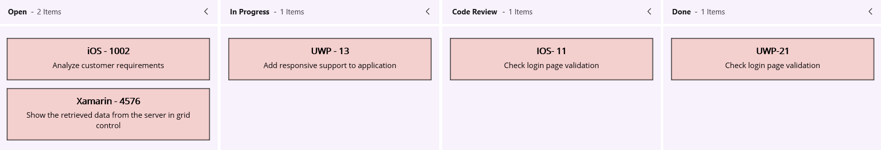
}The following screenshot illustrates the result of the above code.
NOTE
When using a custom data model, the default card UI is not applicable. You must define a custom
DataTemplateusing theCardTemplateproperty to render the card content appropriately.
Data template selector
You can customize the appearance of each card with different templates based on specific constraints using DataTemplateSelector.
Create a data template selector
Create a custom class by deriving from DataTemplateSelector, and override the OnSelectTemplate method to return the DataTemplate for that item. At runtime, SfKanban invokes the OnSelectTemplate method for each item, passing the data object as a parameter.
public class KanbanTemplateSelector : DataTemplateSelector
{
    private readonly DataTemplate menuTemplate;
    private readonly DataTemplate orderTemplate;
    private readonly DataTemplate readyToServeTemplate;
    private readonly DataTemplate deliveryTemplate;

    public KanbanTemplateSelector()
    {
        menuTemplate = new DataTemplate(typeof(MenuTemplate));
        orderTemplate = new DataTemplate(typeof(OrderTemplate));
        readyToServeTemplate = new DataTemplate(typeof(ReadyToServeTemplate));
        deliveryTemplate = new DataTemplate(typeof(DeliveryTemplate));
    }

    protected override DataTemplate OnSelectTemplate(object item, BindableObject container)
    {
        var data = item as CustomKanbanModel;
        if (data == null)
            return null;

        string category = data.Category?.ToString();

        return category.Equals("Menu") ? menuTemplate :
        category.Equals("Dining") || category.Equals("Delivery") ? orderTemplate :
        category.Equals("Ready to Serve") ? readyToServeTemplate : deliveryTemplate;
    }
}
Applying the data template selector
Assign the custom DataTemplateSelector to the CardTemplate of SfKanban in either XAML or C#.
<ContentPage xmlns="http://schemas.microsoft.com/dotnet/2021/maui"
            xmlns:x="http://schemas.microsoft.com/winfx/2009/xaml"
            x:Class="SimpleSample.MainPage"
            xmlns:kanban="clr-namespace:Syncfusion.Maui.Kanban;assembly=Syncfusion.Maui.Kanban"
            xmlns:local="clr-namespace:SimpleSample;assembly=SimpleSample">

    <ContentPage.Resources>
        <ResourceDictionary>
        <local:KanbanTemplateSelector x:Key="kanbanTemplateSelector" />
        </ResourceDictionary>
    </ContentPage.Resources>

    <ContentPage.BindingContext>
        <local:KanbanCustomViewModel />
    </ContentPage.BindingContext>

    <kanban:SfKanban x:Name="kanban" HorizontalOptions="FillAndExpand"
                    VerticalOptions="FillAndExpand" ItemsSource="{Binding Cards}"
                    CardTemplate="{StaticResource kanbanTemplateSelector}" >

    ...

    </kanban:SfKanban>

</ContentPage>
SfKanban kanban = new SfKanban();
KanbanViewModel viewModel = new KanbanViewModel();
kanban.ItemsSource = viewModel.Cards;
kanban.CardTemplate = new KanbanTemplateSelector();
this.Content = kanban;NOTE
When using a custom data model, the default card UI is not applicable. To render the card content, you must define a custom
DataTemplateusing theCardTemplateproperty. For theDataTemplateSelectorexample above, define theMenuTemplate,OrderTemplate,ReadyToServeTemplate,DeliveryTemplate, andCustomKanbanModelclasses in your project.