Working with AI AssistView in .NET MAUI AI AssistView (SfAIAssistView)
30 Jun 202624 minutes to read
Stop responding
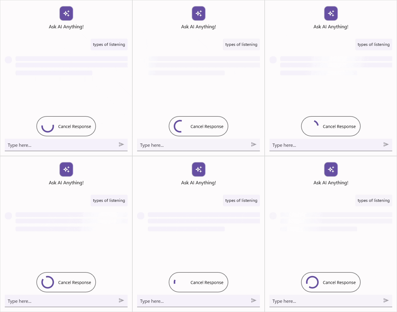
The SfAIAssistView control provides Stop Responding feature that allows you to cancel an ongoing AI response by clicking the Stop Responding view. This feature ensures that users can stop if a response is no longer needed.
By default, the Stop Responding button is displayed, to disable this set the EnableStopResponding property to false.
<syncfusion:SfAIAssistView x:Name="sfAIAssistView"
                           EnableStopResponding="False"/>
SfAIAssistView sfAIAssistView;
public MainPage()
{
    InitializeComponent();
    this.sfAIAssistView = new SfAIAssistView();
    this.sfAIAssistView.EnableStopResponding = false;
    this.Content = sfAIAssistView;
}
Event and Command
The SfAIAssistView control includes a built-in event called StopResponding and a command named StopRespondingCommand. These are triggered when the Stop Responding button is clicked.
To cancel the response using the StopRespondingCommand or StopResponding event, you can include logic to stop the ongoing response as shown below.
StopResponding Event
<syncfusion:SfAIAssistView x:Name="sfAIAssistView"
StopResponding="OnStopResponding" />sfAIAssistView.StopResponding += OnStopResponding;
private void OnStopResponding(object sender, EventArgs e)
{
// Handle the Stop Responding action
}StopResponding Command
<syncfusion:SfAIAssistView x:Name="sfAIAssistView"
                           StopRespondingCommand="{Binding StopRespondingCommand}" />
public class ViewModel : INotifyPropertyChanged
{
public ICommand StopRespondingCommand { get; set; }
public ViewModel()
{
AssistViewRequestCommand = new Command(ExecuteRequestCommand);
StopRespondingCommand = new Command(ExecuteStopResponding);
}
private void ExecuteStopResponding()
{
// logic to handle the Stop Responding action
this.CancelResponse = true;
AssistItem responseItem = new AssistItem() { Text = "You canceled the response" };
responseItem.ShowAssistItemFooter = false;
this.AssistItems.Add(responseItem);
}
private void ExecuteRequestCommand()
{
this.GetResult();
}
private void GetResult()
{
if (!CancelResponse)
{
// generating the response if it has not been canceled.
}
}
}
NOTE
StopResponding UI customization
The SfAIAssistView control allows you to fully customize the Stop Responding view appearance by using the StopRespondingTemplate property. This property lets you define a custom layout and style for the StopResponding UI.
<ContentPage.Resources>
    <ResourceDictionary>
        <DataTemplate x:Key="stopRespondingTemplate">
            <Grid>
                ...
            </Grid>
        </DataTemplate>
    </ResourceDictionary>
</ContentPage.Resources>
<ContentPage.Content>
      <syncfusion:SfAIAssistView x:Name="sfAIAssistView"
                                 StopRespondingTemplate="{StaticResource stopRespondingTemplate}">
      </syncfusion:SfSfAIAssistView>
</ContentPage.Content>
using Syncfusion.Maui.AIAssistView;
public partial class MainPage : ContentPage
{
SfAIAssistView sfAIAssistView;
public MainPage()
{
InitializeComponent();
sfAIAssistView = new SfAIAssistView();
sfAIAssistView.StopRespondingTemplate = CreateStopRespondingViewTemplate();
this.Content = sfAIAssistView;
}
private DataTemplate CreateStopRespondingViewTemplate()
{
return new DataTemplate(() =>
{
...
});
}
}
Control template
The ControlTemplate in AI AssistView allows you to define and reuse the visual structure of a control. This flexible structure enables to fully customize the appearance and behavior of the AI AssistView. By using ControlTemplate with the AI AssistView, you can create a highly customized and interactive interface, as demonstrated below.
<ContentPage.Content>
    ...
    <local:CustomAssistView x:Name="sfAIAssistView"
                            AssistItems="{Binding AssistMessages}">
        <local:CustomAssistView.ControlTemplate>
                <ControlTemplate>
                    <ContentView>
                        <ContentView.Content>
                            <Grid>
                                <ContentView IsVisible="{Binding IsActiveChatView}" Content="{TemplateBinding AssistChatView}" BindingContext="{TemplateBinding BindingContext}" />
                                <local:ComposeView  IsVisible="{Binding IsActiveComposeView}" BindingContext="{TemplateBinding BindingContext}"/>
                             </Grid>
                        </ContentView.Content>
                    </ContentView>
                </ControlTemplate>
        </local:CustomAssistView.ControlTemplate>
    </local:CustomAssistView>
            ...
</ContentPage.Content>
Custom chat view
The CreateAssistChat method allows for the customization of the chat view functionality within the AI AssistView control. By overriding this method, can create their own custom implementation of the chat view, allowing for greater control over the appearance and behavior of chat interactions. It provides the flexibility to modify how chat messages are displayed, how user interactions are handled. Here’s how to override the CreateAssistChat method to return a custom instance of AssistViewChat.
public class CustomAIAssiststView : SfAIAssistView
{
    public CustomAIAssiststView() { }

    protected override AssistViewChat CreateAssistChat()
    {
        // Returning custom implementation of AssistViewChat
        return new CustomAssistViewChat(this);
    }
}
The CustomAssistViewChat class inherits from AssistViewChat and can be used to further customize the chat view, here the input view is removed by setting ShowMessageInputView to false as shown below.
public class CustomAssistViewChat : AssistViewChat
{
    public CustomAssistViewChat(SfAIAssistView assistView) : base(assistView)
    {
        //Customize the AssistViewChat
        this.ShowMessageInputView = false;
    }
}
NOTE
Edit option for request item
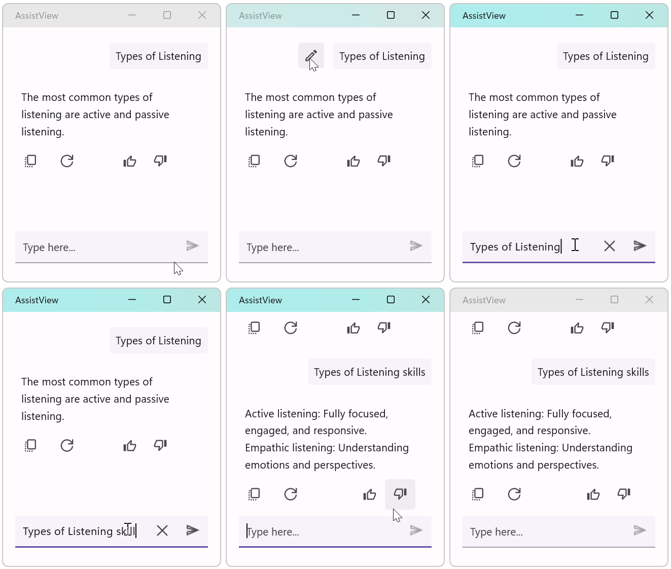
The SfAIAssistView allows you to edit a previously sent request. This feature lets users review and refine the prompt and resubmit from the editor to get more accurate responses. Each request shows an Edit icon; when tapped, the request text is placed in the editor (InputView) to redefine.
NOTE
Interaction: On desktop (Windows, macOS), hover over a request to reveal the Edit icon. On mobile (Android, iOS), tap the request to show the Edit option.
Request Context menu
The SfAIAssistView control supports customizable Request context menu for both request. Use the following properties to configure context menus and their templates:
-
RequestContextMenu:
ObservableCollection<AssistContextMenuItem>— collection of menu items shown for request items. -
RequestContextMenuItemTemplate:
DataTemplate— template for individual menu items. -
RequestContextMenuPanelTemplate:
DataTemplate— template for the popup panel that contains the menu items.
Assist context menu items are represented by AssistContextMenuItem (inherits from ActionButton) and expose the familiar Text, Icon, Command, and CommandParameter properties. When the menu is opened for a specific assist item, the control sets the AssistItem property on each AssistContextMenuItem so commands can access the target IAssistItem.
- When a menu item is tapped the control executes the
Commandon theAssistContextMenuItem(if present). IfCommandParameterisnull, the control passes theAssistContextMenuIteminstance as the parameter (so you can access theAssistItemproperty). - The context menu is shown when the More Options icon is tapped for an item. The ContextMenuOpening event is raised before the popup appears so you can modify or cancel it.
<syncfusion:SfAIAssistView x:Name="sfAIAssistView">
    <syncfusion:SfAIAssistView.RequestContextMenu>
        <syncfusion:AssistContextMenuItem Text="Retry" Command="{Binding RetryCommand}" />
    </syncfusion:SfAIAssistView.RequestContextMenu>
</syncfusion:SfAIAssistView>
SfAIAssistView sfAIAssistView = new SfAIAssistView();
GettingStartedViewModel viewModel = new GettingStartedViewModel();
var requestMenu = new ObservableCollection<AssistContextMenuItem>
{
new AssistContextMenuItem
{
Text = "Copy",
Command = viewModel.RetryCommand,
}
};
sfAIAssistView.RequestContextMenu = requestMenu;
Customizing the context menu item template
The RequestContextMenuItemTemplate property allows you to customize the appearance and interaction of individual context menu items. You can define a custom layout, bind UI elements such as icons and text, and pass the associated AssistItem as a CommandParameter for handling item-specific actions.
<syncfusion:SfAIAssistView.RequestContextMenuItemTemplate>
    <DataTemplate>
        <Grid Padding="8">
            <Grid.ColumnDefinitions>
                <ColumnDefinition Width="Auto" />
                <ColumnDefinition Width="*" />
            </Grid.ColumnDefinitions>
            <Image Source="{Binding Icon}" HeightRequest="20" WidthRequest="20" />
            <Label Grid.Column="1" Text="{Binding Text}" />
            <!-- Make the AssistItem available to the command as parameter -->
            <Grid.GestureRecognizers>
                <TapGestureRecognizer Command="{Binding Command}" CommandParameter="{Binding AssistItem}" />
            </Grid.GestureRecognizers>
        </Grid>
    </DataTemplate>
</syncfusion:SfAIAssistView.RequestContextMenuItemTemplate>
Customizing the context menu panel template
The RequestContextMenuPanelTemplate property enables you to customize the overall layout and styling of the context menu popup. This allows you to control how menu items are arranged and presented, including styling, spacing, and container appearance.
<syncfusion:SfAIAssistView.RequestContextMenuPanelTemplate>
    <DataTemplate>
        ...
    </DataTemplate>
</syncfusion:SfAIAssistView.RequestContextMenuPanelTemplate>
Response Context menu
The SfAIAssistView control supports customizable Response context menu for both response. Use the following properties to configure Response context menu and its template:
-
ResponseContextMenu:
IList<AssistContextMenuItem>— collection of menu items shown for response items. -
ResponseContextMenuItemTemplate:
DataTemplate— template for individual menu items. -
ResponseContextMenuPanelTemplate:
DataTemplate— template for the popup panel that contains the menu items.
Assist context menu items are represented by AssistContextMenuItem (inherits from ActionButton) and expose the familiar Text, Icon, Command, and CommandParameter properties. When the menu is opened for a specific assist item, the control sets the AssistItem property on each AssistContextMenuItem so commands can access the target IAssistItem.
- When a menu item is tapped the control executes the
Commandon theAssistContextMenuItem(if present). IfCommandParameterisnull, the control passes theAssistContextMenuIteminstance as the parameter (so you can access theAssistItemproperty). - The context menu is shown when the More Options icon is tapped for an item. The ContextMenuOpening event is raised before the popup appears so you can modify or cancel it.
<syncfusion:SfAIAssistView x:Name="sfAIAssistView">
    <syncfusion:SfAIAssistView.ResponseContextMenu>
        <syncfusion:AssistContextMenuItem Text="Share" Command="{Binding ShareCommand}" />
        <syncfusion:AssistContextMenuItem Text="Regenerate" Command="{Binding RegenerateCommand}" />
    </syncfusion:SfAIAssistView.ResponseContextMenu>
</syncfusion:SfAIAssistView>
SfAIAssistView sfAIAssistView = new SfAIAssistView();
GettingStartedViewModel viewModel = new GettingStartedViewModel()
var responseMenu = new ObservableCollection<AssistContextMenuItem>
{
new AssistContextMenuItem
{
Text = "Share",
Command = viewModel.ShareCommand
},
new AssistContextMenuItem
{
Text = "Regenerate",
Command = viewModel.RegenerateCommand
}
};
sfAIAssistView.ResponseContextMenu = responseMenu;NOTE
The customization of ResponseContextMenuItemTemplate and ResponseContextMenuPanelTemplate follows the same approach as the
RequestContextMenutemplates. Refer to the Request Context Menu template customization section for implementation details, as described there.
ContextMenuOpening Event
The ContextMenuOpening event is triggered before the context menu is displayed. The ContextMenuOpeningEventArgs provide the following details:
- ContextMenuItems : Represents the collection of menu items that will be displayed. You can modify this list (add or remove items) dynamically before the menu appears.
-
Cancel: Indicates whether the context menu opening should be canceled. Set this property to true to prevent the menu from being shown.
<syncfusion:SfAIAssistView x:Name="sfAIAssistView"
                           ContextMenuOpening="OnContextMenuOpening">
</syncfusion:SfAIAssistView>
private void OnContextMenuOpening(object sender, ContextMenuOpeningEventArgs e)
{
// Allows customizing or canceling the context menu before it is displayed
}Editor
EditorView template
The SfAIAssistView control allows you to fully customize the editor’s appearance by using the EditorViewTemplate property. This property lets you define a custom layout and style for the editor.
<ContentPage.Resources>
    <ResourceDictionary>
        <DataTemplate x:Key="editorViewTemplate">
            <Grid>
                <Editor x:Name="editor" Placeholder="Type Message...">
                     ...
            </Grid>
        </DataTemplate>
    </ResourceDictionary>
</ContentPage.Resources>
<ContentPage.Content>
      <syncfusion:SfAIAssistView x:Name="sfAIAssistView"
                                 EditorViewTemplate="{StaticResource editorViewTemplate}">
      </syncfusion:SfSfAIAssistView>
</ContentPage.Content>
using Syncfusion.Maui.AIAssistView;
public partial class MainPage : ContentPage
{
SfAIAssistView sfAIAssistView;
public MainPage()
{
InitializeComponent();
sfAIAssistView = new SfAIAssistView();
sfAIAssistView.EditorViewTemplate = CreateEditorViewTemplate();
this.Content = sfAIAssistView;
}
private DataTemplate CreateEditorViewTemplate()
{
return new DataTemplate(() =>
{
var grid = new Grid { };
var editor = new Editor
{
Placeholder = "Type Message...",
};
.......
grid.Children.Add(editor);
return grid;
});
}
}
Editor customization
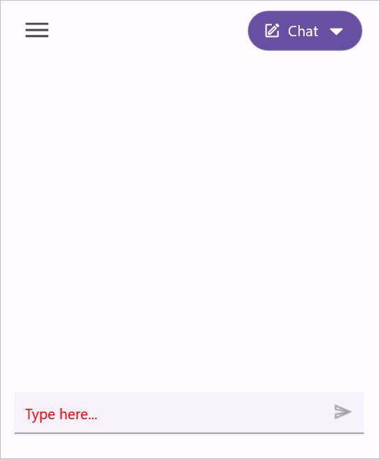
The SfAIAssistView allows users to customize the editor’s visual surface by accessing the RequestEditor only in the code behind C#.
using Syncfusion.Maui.AIAssistView;

public partial class MainPage : ContentPage
{
    public MainPage()
    {
            InitializeComponent();
            sfAIAssistView = new SfAIAssistView();
            sfAIAssistView.RequestEditor.PlaceholderColor = Colors.Red;
    }
}
Accessing the editor in AssistView
The SfAIAssistView allows you to access the editor by using RequestEditorView, which helps you to customize the editor’s visual elements and overall appearance wherever it is used.
Attachment Preview in EditorView
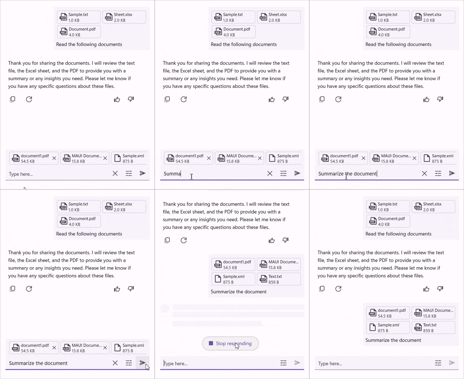
The SfAIAssistView allows you to add files and images as attachments in the editor using Attachments property. This feature lets you show the preview for attachments added in the editor. Attachments are added as AssistAttachment which has the following members:
- FileName : Displays the name of the file.
- FileSize : Displays the size of the file.
- FilePath : Displays the local path of the file.
- FileExtension : Displays the type of the file using the extension.
- FileContent : Displays the content of the file.
- FilePreviewIcon : Displays the preview icon for the file.
<ContentPage.Content>
      <syncfusion:SfAIAssistView x:Name = "sfAIAssistView"
                                 Attachments = "{Binding Attachments}">
      </syncfusion:SfSfAIAssistView>
</ContentPage.Content>
using Syncfusion.Maui.AIAssistView;
internal class ViewModel : INotifyPropertyChanged
{
private ObservableCollection<IAttachment>? attachments;
public ViewModel()
{
Attachments = new ObservableCollection<IAttachment>();
UploadCommand = new Command(async () => await UploadFilesAsync());
}
public ObservableCollection<IAttachment>? Attachments
{
get => attachments;
set
{
if (attachments != value)
{
attachments = value;
}
}
}
public ICommand UploadCommand { get; }
private async Task UploadFilesAsync()
{
var results = await FilePicker.Default.PickMultipleAsync();
if (results == null) return;
foreach (var file in results)
{
Stream stream = await file.OpenReadAsync();
long size;
if (stream.CanSeek)
{
size = stream.Length;
}
else
{
using var ms = new MemoryStream();
await stream.CopyToAsync(ms);
size = ms.Length;
stream.Dispose();
stream = new MemoryStream(ms.ToArray());
}
Attachments?.Add(new AssistAttachment
{
FileName = file.FileName,
FileSize = size,
FilePath = file.FullPath ?? string.Empty,
FileExtension = Path.GetExtension(file.FileName) ?? string.Empty,
FileContent = stream,
});
}
}
}
Max Attachment Count
The SfAIAssistView control allows you to control the number of attachments using the MaxAttachmentCount property. This feature allows us to restrict the number of attachments that can be added to the Attachments. The default value is 10.
<ContentPage.Content>
      <syncfusion:SfAIAssistView x:Name = "sfAIAssistView"
                                 Attachments = "{Binding Attachments}"
                                 MaxAttachmentCount = 8>
      </syncfusion:SfSfAIAssistView>
</ContentPage.Content>
using Syncfusion.Maui.AIAssistView;
public partial class MainPage : ContentPage
{
SfAIAssistView sfAIAssistView;
public MainPage()
{
InitializeComponent();
sfAIAssistView = new SfAIAssistView();
sfAIAssistView.Attachment = viewModel.Attachments;
sfAIAssistView.MaxAttachmentCount = 8;
this.Content = sfAIAssistView;
}
}Attachment Item Template
The SfAIAssistView control allows you to customize the preview for the attachments by using the AttachmentItemTemplate property. This property lets you define a custom layout for the attachment preview UI.
<ContentPage.Resources>
    <ResourceDictionary>
        <DataTemplate x:Key = "attachmentItemTemplate">
            <Grid>
                ...
            </Grid>
        </DataTemplate>
    </ResourceDictionary>
</ContentPage.Resources>
<ContentPage.Content>
      <syncfusion:SfAIAssistView x:Name = "sfAIAssistView"
                                 Attachments = "{Binding Attachments}"
                                 AttachmentItemTemplate = "{StaticResource attachmentItemTemplate}">
      </syncfusion:SfSfAIAssistView>
</ContentPage.Content>
using Syncfusion.Maui.AIAssistView;
public partial class MainPage : ContentPage
{
SfAIAssistView sfAIAssistView;
public MainPage()
{
InitializeComponent();
sfAIAssistView = new SfAIAssistView();
SfAIAssistView.Attachments = viewModel.Attachments;
sfAIAssistView.AttachmentItemTemplate = CreateAttachmentItemTemplate();
this.Content = sfAIAssistView;
}
private DataTemplate CreateAttachmentItemTemplate()
{
return new DataTemplate(() =>
{
...
});
}
}Action buttons in the editor
The SfAIAssistView can display a quick action icon inside the editor. To enable the action button, set the ShowActionButtons property to true.
<syncfusion:SfAIAssistView x:Name="sfAIAssistView"
                           ShowActionButtons="True" />
using Syncfusion.Maui.AIAssistView;

public partial class MainPage : ContentPage
{
    SfAIAssistView sfAIAssistView;
    public MainPage()
    {
        InitializeComponent();
        this.sfAIAssistView = new SfAIAssistView();
        this.sfAIAssistView.ShowActionButtons = true;
        this.Content = sfAIAssistView;
    }
}
Displaying action buttons
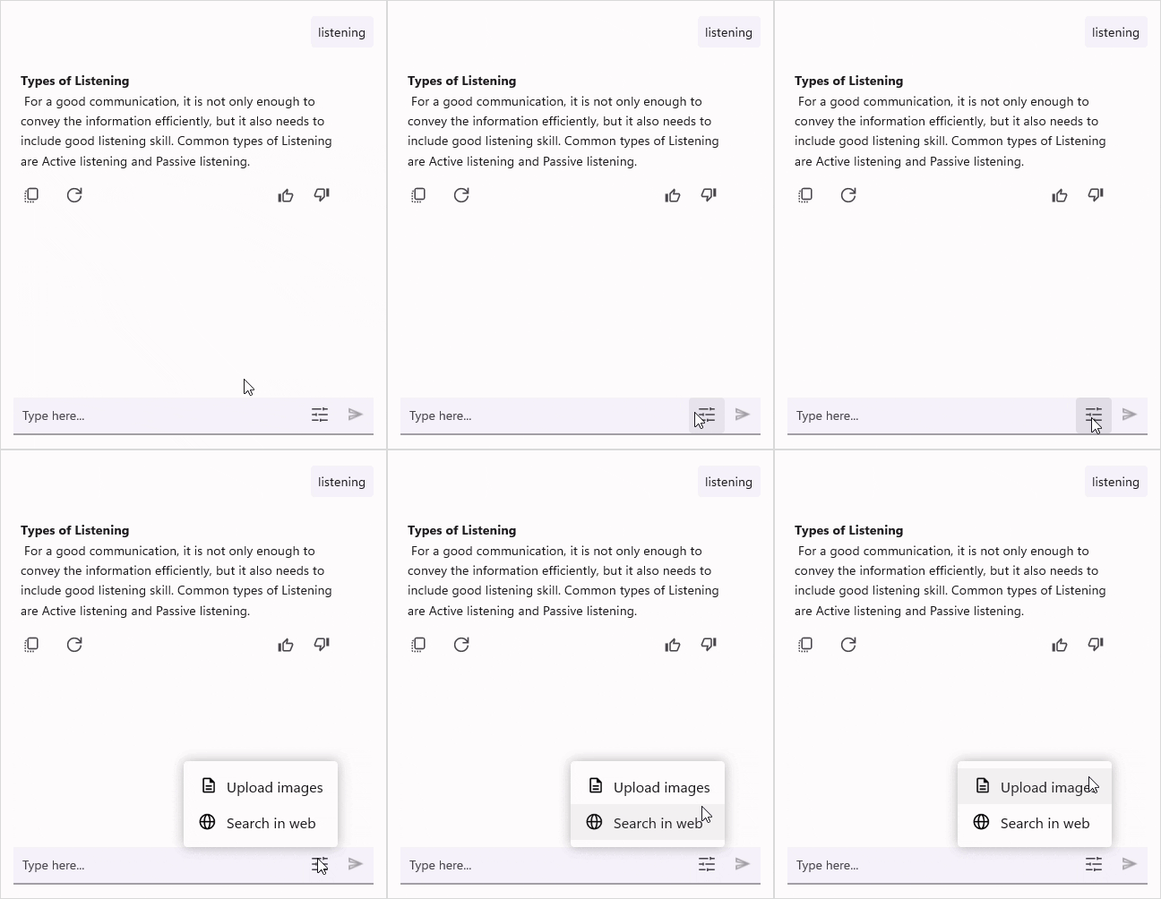
Bind the ActionButtons collection with one or more ActionButton items to populate the popup. The ActionButton provides the properties. When the ActionButton icon is tapped, an action popup appears with the list of configured ActionButton.
- Text: Displays the text for the action button.
- Icon: Displays an icon for the action button.
- Command: Executes a command when the action button is tapped.
- CommandParameter: Passes a parameter to the command when executed.
<syncfusion:SfAIAssistView x:Name="sfAIAssistView"
                           ShowActionButtons="True"
                           AssistItems="{Binding AssistItems}">
    <syncfusion:SfAIAssistView.ActionButtons>
        <syncfusion:ActionButton BindingContext="{x:Reference viewModel}" Text="Upload images" Icon="image.png" Command="{Binding UploadCommand}" />
        <syncfusion:ActionButton BindingContext="{x:Reference viewModel}" Text="Search in web" Icon="web.png" Command="{Binding SearchCommand}" />
    </syncfusion:SfAIAssistView.ActionButtons>
</syncfusion:SfAIAssistView>
using Syncfusion.Maui.AIAssistView;
public partial class MainPage : ContentPage
{
SfAIAssistView sfAIAssistView;
ViewModel viewModel;
public MainPage()
{
InitializeComponent();
this.viewModel = new ViewModel();
this.BindingContext = this.viewModel;
this.sfAIAssistView = new SfAIAssistView();
this.sfAIAssistView.ShowActionButtons = true,
this.sfAIAssistView.AssistItems = this.viewModel.AssistItems,
this.sfAIAssistView.ActionButtons = new ObservableCollection<ActionButton>
{
new ActionButton
{
BindingContext = this.viewModel,
Text = "Upload images",
Icon = ImageSource.FromFile("image.png"),
Command = this.viewModel.UploadCommand
},
new ActionButton
{
BindingContext = this.viewModel,
Text = "Search in web",
Icon = ImageSource.FromFile("web.png"),
Command = this.viewModel.SearchCommand
},
};
this.Content = sfAIAssistView;
}
}
Action button customization
The editor action button and its popup are customizable beyond the ActionButtons collection:
-
ActionButtonIcon: Set a custom
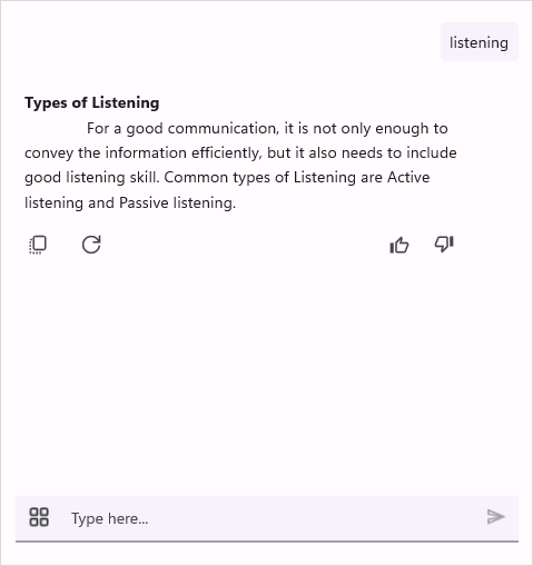
ImageSourcefor the quick action icon shown inside the editor (the icon that opens the action popup). - ActionButtonPosition: Controls where the action icon appears in the input view. Use ActionButtonPosition.Start or ActionButtonPosition.End to place the icon at the leading or trailing edge.
<syncfusion:SfAIAssistView
    ShowActionButtons="True"
    ActionButtonIcon="dotmenu.png"
    ActionButtonPosition="Start">
    <syncfusion:SfAIAssistView.ActionButtons>
        <syncfusion:ActionButton BindingContext="{x:Reference viewModel}" Text="Attach" Icon="attach.png" Command="{Binding AttachCommand}" />
        <syncfusion:ActionButton BindingContext="{x:Reference viewModel}" Text="Format" Icon="format.png" Command="{Binding FormatCommand}" />
    </syncfusion:SfAIAssistView.ActionButtons>
</syncfusion:SfAIAssistView>
public partial class MainPage : ContentPage
{
SfAIAssistView sfAIAssistView;
ViewModel viewModel;
public MainPage()
{
InitializeComponent();
this.viewModel = new ViewModel();
this.BindingContext = this.viewModel;
this.sfAIAssistView = new SfAIAssistView();
this.sfAIAssistView.ShowActionButtons = true,
this.sfAIAssistView.ActionButtonIcon = trueImageSource.FromFile("dotmenu.png"),
this.sfAIAssistView.ActionButtonPosition = ActionButtonPosition.Start; // or ActionButtonPosition.End,
this.sfAIAssistView.AssistItems = this.viewModel.AssistItems,
this.sfAIAssistView.ActionButtons = new ObservableCollection<ActionButton>
{
new ActionButton
{
BindingContext = this.viewModel;
Text = "Attach",
Icon = ImageSource.FromFile ("attach.png"),
Command = viewModel.AttachCommand
},
new ActionButton
{
BindingContext = this.viewModel;
Text = "Search in web",
Icon = ImageSource.FromFile ("format.png"),
Command = this.viewModel.FormatCommand
},
};
this.Content = sfAIAssistView;
}
}
Request button customization
Request button icon
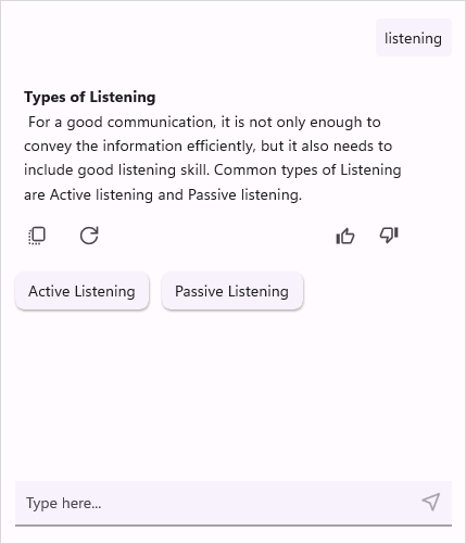
The SfAIAssistView control allows you to customize the request button icon by setting an ImageSource to the RequestButtonIcon property.
<syncfusion:SfAIAssistView x:Name="sfAIAssistView"
AssistItems="{Binding AssistItems}">
<syncfusion:SfAIAssistView.RequestButtonIcon>
<FontImageSource Glyph=""
FontFamily="MauiSampleFontIcon"
Color="Black" />
</syncfusion:SfAIAssistView.RequestButtonIcon>
</syncfusion:SfAIAssistView>using Syncfusion.Maui.AIAssistView;
public partial class MainPage : ContentPage
{
SfAIAssistView sfAIAssistView;
public MainPage()
{
InitializeComponent();
sfAIAssistView = new SfAIAssistView();
sfAIAssistView.RequestButtonIcon = new FontImageSource
{
Glyph = "\ue809;",
FontFamily = "MauiMaterialAssets",
Color = Colors.Green
};
this.Content = sfAIAssistView;
}
}
Request button template
The SfAIAssistView control allows you to fully customize the request button’s appearance using the RequestButtonTemplate property. This property lets you define a custom layout and style for the send button.
<ContentPage.Resources>
<ResourceDictionary>
<!-- Define the RequestButtonTemplate as a static resource -->
<DataTemplate x:Key="RequestButtonTemplate">
<Grid>
<Label x:Name="label"
Text=""
FontFamily="MauiMaterialAssets"
FontSize="24"
HorizontalOptions="Center"
VerticalOptions="Center" />
</Grid>
</DataTemplate>
</ResourceDictionary>
</ContentPage.Resources>
<ContentPage.Content>
<StackLayout>
<syncfusion:SfAIAssistView x:Name="assist"
AssistItems="{Binding AssistItems}"
Request="assist_Request"
RequestButtonTemplate="{StaticResource RequestButtonTemplate}" />
</StackLayout>
</ContentPage.Content>using Syncfusion.Maui.AIAssistView;
public partial class MainPage : ContentPage
{
SfAIAssistView sfAIAssistView;
public MainPage()
{
InitializeComponent();
sfAIAssistView = new SfAIAssistView();
sfAIAssistView.RequestButtonTemplate = RequestButtonTemplate();
this.Content = sfAIAssistView;
}
private DataTemplate RequestButtonTemplate()
{
return new DataTemplate(() =>
{
var grid = new Grid();
var label = new Label
{
Text = "", // Unicode for the icon
FontFamily = "MauiMaterialAssets",
FontSize = 24,
HorizontalOptions = LayoutOptions.Center,
VerticalOptions = LayoutOptions.Center
};
grid.Children.Add(label);
return grid;
});
}
}
NOTE
The InputText is used to gets or sets the text of the editor in the
SfAIAssistView.
Show ResponseLoader View
By Default, the response loader view will be enabled, and the default shimmer view will be displayed when the request is added. To disable it, set the ShowResponseLoader property to false.
<ContentPage.BindingContext>
    <local:GettingStartedViewModel/>
</ContentPage.BindingContext>

<ContentPage.Content>
    <syncfusion:SfAIAssistView x:Name="sfAIAssistView"
                               AssistItems="{Binding AssistItems}"
                               ShowResponseLoader="False"/>
</ContentPage.Content>
public partial class MainPage : ContentPage
{
SfAIAssistView sfAIAssistView;
public MainPage()
{
InitializeComponent();
this.sfAIAssistView = new SfAIAssistView();
GettingStartedViewModel viewModel = new GettingStartedViewModel();
this.sfAIAssistView.AssistItems = viewModel.AssistItems;
this.sfAIAssistView.ShowResponseLoader = false;
this.Content = sfAIAssistView;
}
}Template customization
The SfAIAssistView facilitates the customization of both request and response item templates according to specific requirements. This feature enhances flexibility and provides a higher degree of control over the display of items.
By utilizing the template selector, distinct templates can be assigned to all AssistItem or to a particular item, allowing for the independent customization of both request and response items. This capability is particularly beneficial when custom item types require different visual representations, offering precise control over the layout and presentation within the assist view.
Request item template
A template can be used to present the data in a way that makes sense for the application by using different controls. SfAIAssistView allows customizing the appearance of the Request view by setting the RequestItemTemplate property.
Data model
public class FileAssistItem : AssistItem, INotifyPropertyChanged
{
    private string fileName;

    private string fileType;

    public string FileName
    {
        get
        {
            return fileName;
        }
        set
        {
            fileName = value;
            OnPropertyChanged("FileName");
        }
    }
    public string FileType
    {
        get
        {
            return fileType;
        }
        set
        {
            fileType = value;
            OnPropertyChanged("FileType");
        }
    }

    public event PropertyChangedEventHandler PropertyChanged;

    public void OnPropertyChanged(string name)
    {
        if (this.PropertyChanged != null)
            this.PropertyChanged(this, new PropertyChangedEventArgs(name));
    }
}
View model
public class GettingStartedViewModel : INotifyPropertyChanged
{
    private ObservableCollection<IAssistItem> assistItems;


    public GettingStartedViewModel()
    {
        this.assistItems = new ObservableCollection<IAssistItem>();
        this.GenerateAssistItems();
    }

    /// <summary>
    /// Gets or sets the collection of AssistItem of a conversation.
    /// </summary>
    public ObservableCollection<IAssistItem> AssistItems
    {
        get
        {
            return this.assistItems;
        }

        set
        {
            this.assistItems = value;
        }
    }

    private async void GenerateAssistItems()
    {


        FileAssistItem FileItem = new FileAssistItem()
        {
            FileName = ".NET MAUI",
            FileType = "Document",
            IsRequested = true
        };

        this.AssistItems.Add(FileItem);


        await Task.Delay(1000).ConfigureAwait(true);

        AssistItem responseItem2 = new AssistItem()
        {
            Text = "you've uploaded a file containing information about .NET MAUI.If you have any specific questions or would like to dive deeper into any part of the file, feel free to let me know!",
            IsRequested = false
        };

        this.AssistItems.Add(responseItem2);
    }
}
Data template selector
Create a custom class that inherits from RequestItemTemplateSelector, and override the OnSelectTemplate method to return the DataTemplate for that item. At runtime, the SfAIAssistView invokes the OnSelectTemplate method for each item and passes the data object as parameter.
public class CustomRequestTemplateSelector : RequestItemTemplateSelector
{
    private readonly DataTemplate? requestcustomtemplate;

    public CustomRequestTemplateSelector()
    {
        this.requestcustomtemplate = new DataTemplate(typeof(FileTemplate));
    }


    protected override DataTemplate? OnSelectTemplate(object item, BindableObject container)
    {
        var assistitem = item as IAssistItem;

        if (assistitem == null)
        {
            return null;
        }

        // Returns the custom data template for the file item.
        if (item.GetType() == typeof(FileAssistItem))
        {
            return requestcustomtemplate;
        }

        // Returns the inbuilt data templates for the other request AssistItems.
        else
        {
            return base.OnSelectTemplate(item, container);
        }
    }
}
Applying the data template selector
<ContentPage.BindingContext>
    <local:GettingStartedViewModel/>
</ContentPage.BindingContext>

<ContentPage.Resources>
    <local:CustomRequestTemplateSelector x:Key="requestSelector"/>
</ContentPage.Resources>

<ContentPage.Content>
    <syncfusion:SfAIAssistView x:Name="sfAIAssistView"
                            AssistItems="{Binding AssistItems}"
                            RequestItemTemplate="{StaticResource requestSelector}"/>
</ContentPage.Content>
public partial class MainPage : ContentPage
{
SfAIAssistView sfAIAssistView;
public MainPage()
{
InitializeComponent();
this.sfAIAssistView = new SfAIAssistView();
GettingStartedViewModel viewModel = new GettingStartedViewModel();
this.sfAIAssistView.AssistItems = viewModel.AssistItems;
this.sfAIAssistView.RequestItemTemplate = new CustomRequestTemplateSelector();
this.Content = sfAIAssistView;
}
}
Response item template
A template can be used to present the data in a way that makes sense for the application by using different controls. SfAIAssistView allows customizing the appearance of the Response view by setting the ResponseItemTemplate property.
View model
public class GettingStartedViewModel : INotifyPropertyChanged
{
    /// <summary>
    /// Collection of assistItem in a conversation.
    /// </summary>
    private ObservableCollection<IAssistItem> assistItems;

    public GettingStartedViewModel()
    {
        this.assistItems = new ObservableCollection<IAssistItem>();
        this.GenerateAssistItems();
    }

    /// <summary>
    /// Gets or sets the collection of AssistItem of a conversation.
    /// </summary>
    public ObservableCollection<IAssistItem> AssistItems
    {
        get
        {
            return this.assistItems;
        }

        set
        {
            this.assistItems = value;
        }
    }

    private async void GenerateAssistItems()
    {
        AssistItem requestItem = new AssistItem()
        {
            Text = "Hi, I think I caught a cold.",
            IsRequested = true
        };

        // Add the request item to the collection
        this.AssistItems.Add(requestItem);


        await Task.Delay(1000).ConfigureAwait(true);

        AssistItem responseItem = new AssistItem()
        {
            Text = "Do you want me to schedule a consultation with a doctor?",
            IsRequested = false,
        };

        // Add the response item to the collection
        this.AssistItems.Add(responseItem);

        // Adding a request item
        AssistItem requestItem1 = new AssistItem()
        {
            Text = "Yes, Consultation with Dr.Harry tomorrow",
            IsRequested = true
        };

        // Add the request item to the collection
        this.AssistItems.Add(requestItem1);

        await Task.Delay(1000).ConfigureAwait(true);

        DatePickerItem datepickerItem = new DatePickerItem()
        {
            Text = "Choose a date for Consultation",
            IsRequested = false,
            SelectedDate = DateTime.Today,
        };

        // Add the response item to the collection
        this.AssistItems.Add(datepickerItem);
        // Generating response item
    }
}
Data template selector
Create a custom class that inherits from ResponseItemTemplateSelector, and override the OnSelectTemplate method to return the DataTemplate for that item. At runtime, the SfAIAssistView invokes the OnSelectTemplate method for each item and passes the data object as parameter.
public class CustomResponseTemplateSelector : ResponseItemTemplateSelector
{
    private readonly DataTemplate? reponsecustomtemplate;

    public CustomResponseTemplateSelector()
    {
        this.reponsecustomtemplate = new DataTemplate(typeof(TimePickerTemplate));
    }


    protected override DataTemplate? OnSelectTemplate(object item, BindableObject container)
    {
        var assistitem = item as IAssistItem;

        if (assistitem == null)
        {
            return null;
        }

        // Returns the custom data template for the DatePickerItem item.
        if (item.GetType() == typeof(DatePickerItem))
        {
            return reponsecustomtemplate;
        }

        // Returns the inbuilt data templates for the other request AssistItems.
        else
        {
            return base.OnSelectTemplate(item, container);
        }
    }
}
Applying the data template selector
<ContentPage.BindingContext>
    <local:GettingStartedViewModel/>
</ContentPage.BindingContext>

<ContentPage.Resources>
    <local:CustomResponseTemplateSelector x:Key="responseSelector"/>
</ContentPage.Resources>

<ContentPage.Content>
    <syncfusion:SfAIAssistView x:Name="sfAIAssistView"
                                AssistItems="{Binding AssistItems}"
                                ResponseItemTemplate="{StaticResource responseSelector}"/>
</ContentPage.Content>
public partial class MainPage : ContentPage
{
SfAIAssistView sfAIAssistView;
public MainPage()
{
InitializeComponent();
this.sfAIAssistView = new SfAIAssistView();
GettingStartedViewModel viewModel = new GettingStartedViewModel();
this.sfAIAssistView.AssistItems = viewModel.AssistItems;
this.sfAIAssistView.ResponseItemTemplate = new CustomResponseTemplateSelector();
this.Content = sfAIAssistView;
}
}
Text selection
The SfAIAssistView allows for selecting specific phrases or the entire response or request text. It enables the platform specific selection functionalities.
By default, text selection is disabled. To enable it, set the AllowTextSelection property to true.
<syncfusion:SfAIAssistView x:Name="sfAIAssistView"
                           AllowTextSelection="True"/>
using Syncfusion.Maui.AIAssistView;

public partial class MainPage : ContentPage
{
    SfAIAssistView sfAIAssistView;
    public MainPage()
    {
            InitializeComponent();
            sfAIAssistView = new SfAIAssistView();
            sfAIAssistView.AllowTextSelection = true;
            this.Content = sfAIAssistView;
    }
}
Scroll to bottom button
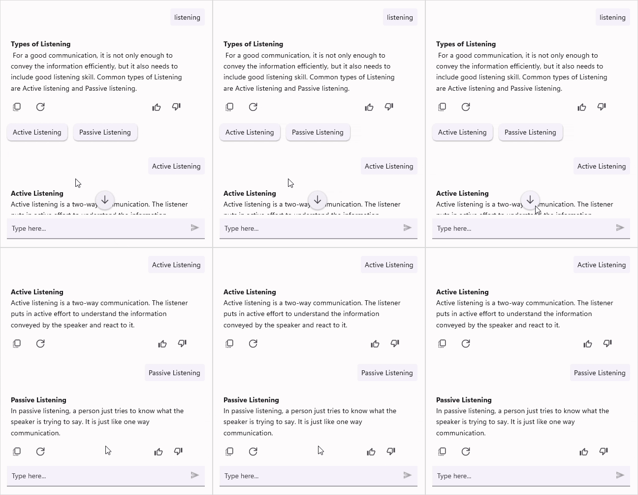
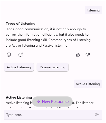
The SfAIAssistView control provides an option to display a scroll-to-bottom button that helps users quickly navigate back to the latest responses when they have scrolled up in the AI conversation. To enable this, set the ShowScrollToBottomButton property to true.
<syncfusion:SfAIAssistView x:Name="sfAIAssistView"
                           AssistItems="{Binding AssistItems}"
                           ShowScrollToBottomButton="True" />
using Syncfusion.Maui.AIAssistView;

public partial class MainPage : ContentPage
{
    SfAIAssistView sfAIAssistView;
    public MainPage()
    {
        InitializeComponent();
        this.sfAIAssistView = new SfAIAssistView();
        this.sfAIAssistView.ShowScrollToBottomButton = true;
        this.Content = sfAIAssistView;
    }
}
Scroll to bottom button customization
The SfAIAssistView control allows you to fully customize the scroll-to-bottom button appearance by using the ScrollToBottomButtonTemplate property. This property lets you define a custom layout and style.
<ContentPage.Resources>
    <ResourceDictionary>
        <DataTemplate x:Key="scrollToBottomButtonTemplate">
            <Border Padding="10"
                BackgroundColor="#6C4EC2"
                StrokeThickness="0"
                StrokeShape="RoundRectangle 25"
                HorizontalOptions="Center"
                VerticalOptions="End">
                    <HorizontalStackLayout Spacing="6"
                                    HorizontalOptions="Center"
                                    VerticalOptions="Center">
                        <Image Source="down.png"
                        WidthRequest="16"
                        HeightRequest="16"
                        VerticalOptions="Center" />
                        <Label Text="New Response"
                        FontSize="14"
                        TextColor="White"
                        VerticalOptions="Center" />
                    </HorizontalStackLayout>
            </Border>
        </DataTemplate>
    </ResourceDictionary>
</ContentPage.Resources>

<syncfusion:SfAIAssistView x:Name="sfAIAssistView"
                           AssistItems="{Binding AssistItems}"
                           ShowScrollToBottomButton="True"
                           ScrollToBottomButtonTemplate="{StaticResource scrollToBottomButtonTemplate}" />
using Syncfusion.Maui.AIAssistView;
public partial class MainPage : ContentPage
{
SfAIAssistView sfAIAssistView;
public MainPage()
{
InitializeComponent();
this.sfAIAssistView = new SfAIAssistView();
this.sfAIAssistView.ShowScrollToBottomButton = true;
this.sfAIAssistView.ScrollToBottomButtonTemplate = this.CreateScrollToBottomButtonTemplate();
this.Content = this.sfAIAssistView;
}
private DataTemplate CreateScrollToBottomButtonTemplate()
{
return new DataTemplate(() =>
{
var border = new Border
{
Padding = new Thickness(10),
BackgroundColor = Color.FromArgb("#6C4EC2"),
StrokeThickness = 0,
StrokeShape = new RoundRectangle
{
CornerRadius = new CornerRadius(25)
},
HorizontalOptions = LayoutOptions.Center,
VerticalOptions = LayoutOptions.End
};
var layout = new HorizontalStackLayout
{
Spacing = 6,
HorizontalOptions = LayoutOptions.Center,
VerticalOptions = LayoutOptions.Center
};
var image = new Image
{
Source = "down.png",
WidthRequest = 16,
HeightRequest = 16,
VerticalOptions = LayoutOptions.Center
};
var label = new Label
{
Text = "New Response",
FontSize = 14,
TextColor = Colors.White,
VerticalOptions = LayoutOptions.Center
};
layout.Children.Add(image);
layout.Children.Add(label);
border.Content = layout;
return border;
});
}
}
Auto scroll control to bottom when new message is added
By default, the SfAIAssistView control automatically scrolls to the bottom of the conversation to display newly added messages. If you want to prevent this behavior and retain the current scroll position, you can disable auto‑scrolling by setting the CanAutoScrollToBottom property to false.
<syncfusion:SfAIAssistView x:Name="sfAIAssistView"
                           AssistItems="{Binding AssistItems}"
                           CanAutoScrollToBottom="False" />
AutoScroll Behavior Configuration
The SfAIAssistView control provides the AutoScrollBehavior property, which determines how the view updates its scroll position when new messages or responses are added. This property is of type AssistViewScrollBehavior, and its default value is ScrollToLastResponse.
The AutoScrollBehavior property supports the following scrolling modes:
-
ScrollToLastResponse: Automatically scrolls the view to display the most recent AI response. -
ScrollToLastRequest: Scrolls the view to display the latest user request instead of the response.
By configuring AutoScrollBehavior, you can control which part of the conversation remains visible when new content is appended. For more advanced scenarios, you can combine this property with CanAutoScrollToBottom and handle the Scrolled event to fine-tune scrolling behavior based on user interaction or application logic.
<syncfusion:SfAIAssistView x:Name="sfAIAssistView"
                           AutoScrollBehavior="ScrollToLastRequest" />
SfAIAssistView sfAIAssistView = new SfAIAssistView();
    sfAIAssistView.AutoScrollBehavior = AssistViewScrollBehavior.ScrollToLastRequest;
Scrolled Event
The SfAIAssistView control comes with a built-in Scrolled event that will be fired whenever the conversation view is scrolled. This event allows developers to track the current scroll position and determine whether the user has reached the top or bottom of the conversation list through the ScrolledEventArgs.
You can handle this event to control the auto-scroll behavior of the AssistView. For example, if the user manually scrolls up and is no longer at the bottom of the conversation, auto-scrolling can be disabled to prevent newly added messages from interrupting the user’s reading position.
<syncfusion:SfAIAssistView x:Name="sfAIAssistView"
Scrolled="sfAIAssistView_Scrolled" />sfAIAssistView.Scrolled += sfAIAssistView_Scrolled;
private void sfAIAssistView_Scrolled(object sender, Syncfusion.Maui.AIAssistView.ScrolledEventArgs e)
{
// Handle the Scrolled event.
}Enable time break in view
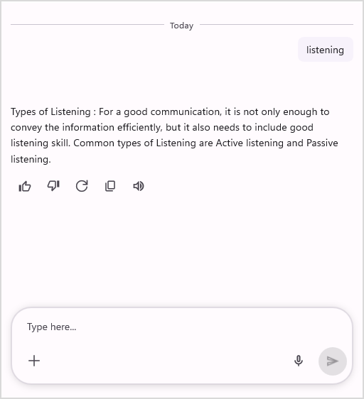
The SfAIAssistView control allows for organizing the AssistItems by their creation date and time, enabling users to identify request and responses chronologically. Set the ShowTimeBreak property to true to display the time break view.
<syncfusion:SfAIAssistView x:Name="sfAIAssistView"
                           ShowTimeBreak="True" />
using Syncfusion.Maui.AIAssistView;

public partial class MainPage : ContentPage
{
    SfAIAssistView sfAIAssistView;
    public MainPage()
    {
        InitializeComponent();
        this.sfAIAssistView = new SfAIAssistView();
        this.sfAIAssistView.ShowTimeBreak = true;
        this.Content = this.sfAIAssistView;
    }
}
Time break customization
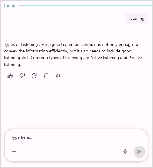
The SfAIAssistView control allows you to fully customize the time break appearance using the TimeBreakTemplate property. This property lets you define a custom layout and style for the time break UI.
<ContentPage.Resources>
        <ResourceDictionary>
            <DataTemplate x:Key="timeBreakTemplate">
                ...
            </DataTemplate>
        </ResourceDictionary>
</ContentPage.Resources>

<syncfusion:SfAIAssistView x:Name="sfAIAssistView"
                           ShowTimeBreak="True"
                           TimeBreakTemplate="{StaticResource timeBreakTemplate}" />
using Syncfusion.Maui.AIAssistView;

public partial class MainPage : ContentPage
{
    SfAIAssistView sfAIAssistView;
    public MainPage()
    {
        InitializeComponent();
        this.sfAIAssistView = new SfAIAssistView();
        this.sfAIAssistView.ShowScrollToBottomButton = true;
        this.sfAIAssistView.TimeBreakTemplate = this.CreateTimeBreakTemplate();
        this.Content = this.sfAIAssistView;
    }

    private DataTemplate CreateTimeBreakTemplate()
    {
        return new DataTemplate(() =>
        {
            ...
        });
    }
}
Show Toast notification in view
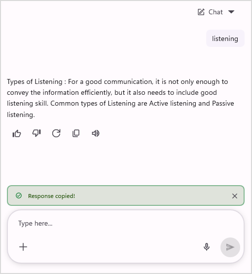
The SfAIAssistView control supports displaying toast notifications. These notifications appear as pop-up windows providing information during user interactions with the SfAIAssistView.
Toast notification types
The SfAIAssistView supports the following types of toast notifications:
-
None: Displays the default toast notification. -
Success: Indicates that an operation has been completed successfully. -
Warning: Highlights a cautionary message or a potential issue that requires user attention. -
Error: Notifies the user of a failure or an issue that has occurred during execution.
Restrict toast notification in view
By default, toast notifications appear in the view. To prevent them from showing, use the ToastOpening event.
<syncfusion:SfAIAssistView x:Name="sfAIAssistView"
                           ToastOpening="assistView_ToastOpening" />
sfAIAssistView.ToastOpening += assistView_ToastOpening;

private void assistView_ToastOpening(object sender, Syncfusion.Maui.AIAssistView.ToastNotificationEventArgs e)
{
   e.Cancel = true;
}
Editor expansion button in view
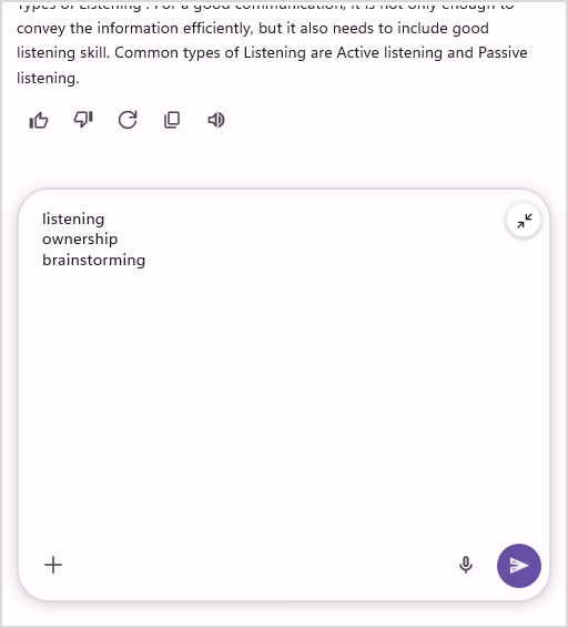
The SfAIAssistView control allows for expanding the editor view based on its MaximumHeightRequest property. To enable editor expansion, set the AllowEditorExpansion property to true.
<syncfusion:SfAIAssistView x:Name="sfAIAssistView"
                           AllowEditorExpansion="True" />
using Syncfusion.Maui.AIAssistView;

public partial class MainPage : ContentPage
{
    SfAIAssistView sfAIAssistView;
    public MainPage()
    {
        InitializeComponent();
        this.sfAIAssistView = new SfAIAssistView();
        this.sfAIAssistView.RequestEditor.MaximumHeightRequest = 300;
        this.sfAIAssistView.AllowEditorExpansion = true;
        this.Content = this.sfAIAssistView;
    }
}
NOTE
The editor expansion button is only visible when the content reaches the third line of the editor.
Voice input support in SfAIAssistView
The SfAIAssistView control provides built-in voice input support through a microphone button in the editor. By default, the microphone view is visible. To hide it, set the EnableVoiceInput property to false.
Permission required for voice input
For using voice input support, you need to grant permission for audio.
Android platform
Provide audio permission within the AndroidManifest.xml file:
<uses-permission android:name="android.permission.RECORD_AUDIO" />iOS and macOS platform
Add the NSMicrophoneUsageDescription and NSSpeechRecognitionUsageDescription permissions to your Info.plist file:
<key>NSSpeechRecognitionUsageDescription</key>
<string>Recognize speech</string>
<key>NSMicrophoneUsageDescription</key>
<string>Use microphone to listen to your voice input</string>
Windows platform
Provide the Microphone capability for the application in the Package.appxmanifest file.
<DeviceCapability Name="microphone"/>Configure Speech Recognition
Confirm that the following are enabled in your WinUI app:
- Online speech recognition: (Settings -> Privacy -> Privacy & Security) is enabled.
- Microphone: (Settings -> Privacy & Security -> Microphone) has the necessary permissions for the app.
<syncfusion:SfAIAssistView x:Name="sfAIAssistView"
                           EnableVoiceInput="False" />
using Syncfusion.Maui.AIAssistView;

public partial class MainPage : ContentPage
{
    SfAIAssistView sfAIAssistView;
    public MainPage()
    {
        InitializeComponent();
        this.sfAIAssistView = new SfAIAssistView();
        this.sfAIAssistView.EnableVoiceInput = false;
        this.Content = this.sfAIAssistView;
    }
}
Text-to-speech support in SfAIAssistView
The SfAIAssistView control provides built-in text-to-speech support for each response. This allows users to play, pause, and stop the text-to-speech functionality.
Disclaimer text
The SfAIAssistView control supports displaying a note or suggestion text below the editor. To display this text, assign a value to the DisclaimerText property.
<syncfusion:SfAIAssistView x:Name="sfAIAssistView"
                           DisclaimerText="AI outputs may be inaccurate or inconsistent." />
SfAIAssistView sfAIAssistView;
public MainPage()
{
    InitializeComponent();
    this.sfAIAssistView = new SfAIAssistView();
    this.sfAIAssistView.DisclaimerText = "AI outputs may be inaccurate or inconsistent.";
    this.Content = sfAIAssistView;
}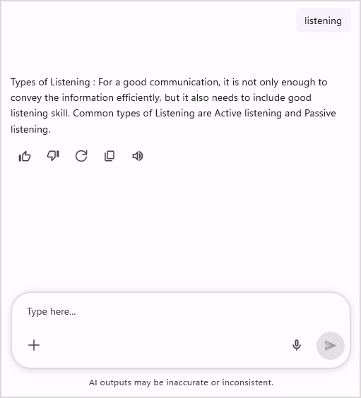
Image preview support in SfAIAssistView
The SfAIAssistView control provides built-in image preview support. When an image is associated with an AssistImageItem or an AssistAttachmentItem, tapping the image displays it in a preview view.
This behavior is enabled by default and does not require additional configuration.