How to Apply Styles in .NET MAUI SfAIAssistView?
7 Jul 202624 minutes to read
You can style the elements of the SfAIAssistView control by creating resource dictionaries and assigning values to the in-built keys assigned for each individual element.
AI AssistView background
To set a solid color as the background for SfAIAssistView, assign a color to the SfAssistView.Background property. However, if you want the solid color to be applied to the control, also set the background as transparent, as shown in the below code sample.
<ContentPage.Resources>
        <syncTheme:SyncfusionThemeDictionary>
            <syncTheme:SyncfusionThemeDictionary.  MergedDictionaries>
                <ResourceDictionary>
                    <x:String x:Key="SfAIAssistViewTheme">CustomTheme</x:String>
                    <Color x:Key="SfAIAssistViewBackground">transparent</Color>
                </ResourceDictionary>
            </syncTheme:SyncfusionThemeDictionary.MergedDictionaries>
        </syncTheme:SyncfusionThemeDictionary>
    </ContentPage.Resources>

    <syncfusion:SfAIAssistView x:Name="sfAIAssistView"
                               Background="#94b6ec" />
SfAIAssistView sfAIAssistView = new SfAIAssistView ();
    sfAIAssistView.Background = Color.FromHex("#94b6ec");
Set background image
To set an image as the background for the SfAIAssistView, set the SfAIAssistView.Background to Colors.Transparent and place the image below the SfAIAssistView control.
<ContentPage.Resources>
        <syncTheme:SyncfusionThemeDictionary>
            <syncTheme:SyncfusionThemeDictionary.MergedDictionaries>
            <ResourceDictionary>
                <x:String x:Key="SfAIAssistViewTheme">CustomTheme</x:String>
                <Color x:Key="SfAIAssistViewBackground">transparent</Color>
            </ResourceDictionary>
        </syncTheme:SyncfusionThemeDictionary.MergedDictionaries>
        </syncTheme:SyncfusionThemeDictionary>
    </ContentPage.Resources>

    <Grid>
        <Image Source="backgroundimage.jpg" Aspect="AspectFill" />
        <syncfusion:SfAIAssistView x:Name="sfAIAssistView"
                                           Background="Transparent" />
    </Grid>
Grid grid = new Grid();
SfAIAssistView sfAIAssistView = new SfAIAssistView();
Image image = new Image();
image.Source = "backgroundimage.jpg";
image.Aspect = Aspect.AspectFill;
grid.Children.Add(image);
sfAIAssistView.Background = Colors.Transparent;
grid.Children.Add(sfAIAssistView);Set gradient background
To apply a gradient view as a background to the AI AssistView, set the SfAIAssistView.Background property to the desired gradient colors.
<ContentPage.Resources>
        <syncTheme:SyncfusionThemeDictionary>
            <syncTheme:SyncfusionThemeDictionary.MergedDictionaries>
                <ResourceDictionary>
                    <x:String x:Key="SfAIAssistViewTheme">CustomTheme</x:String>
                    <Color x:Key="SfAIAssistViewBackground">transparent</Color>
                </ResourceDictionary>
            </syncTheme:SyncfusionThemeDictionary.MergedDictionaries>
          </syncTheme:SyncfusionThemeDictionary>
    </ContentPage.Resources>

    <syncfusion:SfAIAssistView x:Name="sfAIAssistView">
        <syncfusion:SfAIAssistView.Background>
            <LinearGradientBrush>
                <GradientStop Color="SkyBlue" Offset="0.0" />
                <GradientStop Color="LightCyan" Offset="0.25" />
                <GradientStop Color="SteelBlue" Offset="0.5" />
                <GradientStop Color="LightSkyBlue" Offset="0.75" />
                <GradientStop Color="LightGray" Offset="1.0" />
            </LinearGradientBrush>
        </syncfusion:SfAIAssistView.Background>
    </syncfusion:SfAIAssistView>
SfAIAssistView sfAIAssistView = new SfAIAssistView();
LinearGradientBrush linearGradientBrush = new LinearGradientBrush();
linearGradientBrush.GradientStops.Add(new GradientStop(Colors.SkyBlue, 0.0f));
linearGradientBrush.GradientStops.Add(new GradientStop(Colors.LightCyan, 0.25f));
linearGradientBrush.GradientStops.Add(new GradientStop(Colors.SteelBlue, 0.5f));
linearGradientBrush.GradientStops.Add(new GradientStop(Colors.LightSkyBlue, 0.75f));
linearGradientBrush.GradientStops.Add(new GradientStop(Colors.LightGray, 1.0f));
sfAIAssistView.Background = linearGradientBrush;Request item styling
To apply styles to the elements of a request item, set values to the in-built keys of the request item in the resource dictionary.
| Key | Description |
|---|---|
| SfAIAssistViewRequestItemTextColor | Text color of the request item. |
| SfAIAssistViewRequestItemAuthorTextColor | Text color of the author’s name in the request item. |
| SfAIAssistViewRequestItemBackground | Background color of the request item. |
| SfAIAssistViewRequestItemFontFamily | Font family of the request item. |
| SfAIAssistViewRequestItemFontAttributes | Font attributes of the request item. |
| SfAIAssistViewRequestItemFontSize | Font size of the request item. |
| SfAIAssistViewRequestItemAuthorFontFamily | Font family of the author’s name in request item. |
| SfAIAssistViewRequestItemAuthorFontAttributes | Font attributes of the author’s name in request item. |
| SfAIAssistViewRequestItemAuthorFontSize | Font size of the author’s name in request item. |
<ContentPage.Resources>
        <syncTheme:SyncfusionThemeDictionary>
             <syncTheme:SyncfusionThemeDictionary.MergedDictionaries>
                <ResourceDictionary>
                    <x:String x:Key="SfAIAssistViewTheme">CustomTheme</x:String>
                    <Color x:Key="SfAIAssistViewRequestItemTextColor">Gray</Color>
                    <Color x:Key="SfAIAssistViewRequestItemAuthorTextColor">Gray</Color>
                    <Color x:Key="SfAIAssistViewRequestItemBackground">#eee479</Color>
                    <x:String x:Key="SfAIAssistViewRequestItemFontFamily">Roboto-Medium</x:String>
                    <FontAttributes x:Key="SfAIAssistViewRequestItemFontAttributes">Italic</FontAttributes>
                    <x:Double x:Key="SfAIAssistViewRequestItemFontSize">16</x:Double>
                    <x:String x:Key="SfAIAssistViewRequestItemAuthorFontFamily">Roboto-Medium</x:String>
                    <FontAttributes x:Key="SfAIAssistViewRequestItemAuthorFontAttributes">Italic</FontAttributes>
                    <x:Double x:Key="SfAIAssistViewRequestItemAuthorFontSize">16</x:Double>
                </ResourceDictionary>
            </syncTheme:SyncfusionThemeDictionary.MergedDictionaries>
        </syncTheme:SyncfusionThemeDictionary>
    </ContentPage.Resources>
ResourceDictionary dictionary = new ResourceDictionary();
dictionary.Add("SfAIAssistViewTheme", "CustomTheme");
dictionary.Add("SfAIAssistViewRequestItemTextColor", Colors.Gray);
dictionary.Add("SfAIAssistViewRequestItemAuthorTextColor", Colors.Gray);
dictionary.Add("SfAIAssistViewRequestItemBackground", Color.FromHex("#eee479"));
dictionary.Add("SfAIAssistViewRequestItemFontFamily", "Roboto-Medium");
dictionary.Add("SfAIAssistViewRequestItemFontAttributes", FontAttributes.Italic);
dictionary.Add("SfAIAssistViewRequestItemFontSize", 16);
dictionary.Add("SfAIAssistViewRequestItemAuthorFontFamily", "Roboto-Medium");
dictionary.Add("SfAIAssistViewRequestItemAuthorFontAttributes", FontAttributes.Italic);
dictionary.Add("SfAIAssistViewRequestItemAuthorFontSize", 16);
this.Resources.Add(dictionary);Response item styling
To apply styles to the elements of a response item, set values to the in-built keys of the response item in the resource dictionary.
| Key | Description |
|---|---|
| SfAIAssistViewResponseItemTextColor | Text color of response item. |
| SfAIAssistViewResponseItemAuthorTextColor | Text color of the author’s name in response item. |
| SfAIAssistViewResponseItemBackground | Background color of the response item. |
| SfAIAssistViewResponseItemFontFamily | Font family of the response item. |
| SfAIAssistViewResponseItemFontAttributes | Font attributes of the response item. |
| SfAIAssistViewResponseItemFontSize | Font size of the response. |
| SfAIAssistViewResponseItemAuthorFontFamily | Font family of the author’s name in response item. |
| SfAIAssistViewResponseItemAuthorFontAttributes | Font attributes of the author’s name in response item. |
| SfAIAssistViewResponseItemAuthorFontSize | Font size of the author’s name in response item |
<ContentPage.Resources>
        <syncTheme:SyncfusionThemeDictionary>
            <syncTheme:SyncfusionThemeDictionary.MergedDictionaries>
                <ResourceDictionary>
                    <x:String x:Key="SfAIAssistViewTheme">CustomTheme</x:String>
                    <Color x:Key="SfAIAssistViewResponseItemTextColor">Gray</Color>
                    <Color x:Key="SfAIAssistViewResponseItemBackground">#eee479</Color>
                    <Color x:Key="SfAIAssistViewResponseItemAuthorTextColor">Gray</Color>
                    <x:String x:Key="SfAIAssistViewResponseItemFontFamily">Roboto-Medium</x:String>
                    <FontAttributes x:Key="SfAIAssistViewResponseItemFontAttributes">Italic</FontAttributes>
                    <x:Double x:Key="SfAIAssistViewResponseItemFontSize">16</x:Double>
                    <x:String x:Key="SfAIAssistViewResponseItemAuthorFontFamily">Roboto-Medium</x:String>
                    <FontAttributes x:Key="SfAIAssistViewResponseItemAuthorFontAttributes">Italic</FontAttributes>
                    <x:Double x:Key="SfAIAssistViewResponseItemAuthorFontSize">16</x:Double>
                </ResourceDictionary>
            </syncTheme:SyncfusionThemeDictionary.MergedDictionaries>
        </syncTheme:SyncfusionThemeDictionary>
    </ContentPage.Resources>
ResourceDictionary dictionary = new ResourceDictionary();
dictionary.Add("SfAIAssistViewTheme", "CustomTheme");
dictionary.Add("SfAIAssistViewResponseItemTextColor", Colors.Gray);
dictionary.Add("SfAIAssistViewResponseItemAuthorTextColor", Colors.Gray);
dictionary.Add("SfAIAssistViewResponseItemBackground", Color.FromHex("#eee479"));
dictionary.Add("SfAIAssistViewResponseItemFontFamily", "Roboto-Medium");
dictionary.Add("SfAIAssistViewResponseItemFontAttributes", FontAttributes.Italic);
dictionary.Add("SfAIAssistViewResponseItemFontSize", 16);
dictionary.Add("SfAIAssistViewResponseItemAuthorFontFamily", "Roboto-Medium");
dictionary.Add("SfAIAssistViewResponseItemAuthorFontAttributes", FontAttributes.Italic);
dictionary.Add("SfAIAssistViewResponseItemAuthorFontSize", 16);
this.Resources.Add(dictionary);Hyperlink item styling
To apply styles to the elements of a hyperlink item, set values to the in-built keys of the hyperlink item in the resource dictionary.
| Key | Description |
|---|---|
| SfAIAssistViewRequestHyperlinkColor | Text color of the URL in a hyperlink item. |
| SfAIAssistViewResponseHyperlinkColor | Text color of the URL in an outgoing hyperlink item. |
| SfAIAssistViewHyperlinkDescriptionTextColor | Text color of the URL's meta description in a hyperlink item. |
| SfAIAssistViewHyperlinkDescriptionBackground | Background color of the URL description area in a hyperlink item. |
| SfAIAssistViewHyperlinkMetaTitleTextColor | Text color of the URL's meta title in a hyperlink item. |
<ContentPage.Resources>
        <syncTheme:SyncfusionThemeDictionary>
             <syncTheme:SyncfusionThemeDictionary.MergedDictionaries>
                <ResourceDictionary>
                    <Color x:Key="SfAIAssistViewRequestHyperlinkColor">#94b6ec</Color>
                    <Color x:Key="SfAIAssistViewHyperlinkMetaTitleTextColor">#f29d0a</Color>
                    <Color x:Key="SfAIAssistViewHyperlinkDescriptionTextColor">Black</Color>
                    <Color x:Key="SfAIAssistViewHyperlinkDescriptionBackground">#dde9cc</Color>
                </ResourceDictionary>
             </syncTheme:SyncfusionThemeDictionary.MergedDictionaries>
        </syncTheme:SyncfusionThemeDictionary>
    </ContentPage.Resources>
ResourceDictionary dictionary = new ResourceDictionary();
dictionary.Add("SfAIAssistViewTheme", "CustomTheme");
dictionary.Add("SfAIAssistViewRequestHyperlinkColor", Color.FromHex("#94b6ec"));
dictionary.Add("SfAIAssistViewHyperlinkMetaTitleTextColor", Color.FromHex("#f29d0a"));
dictionary.Add("SfAIAssistViewHyperlinkDescriptionTextColor", Colors.Black);
dictionary.Add("SfAIAssistViewHyperlinkDescriptionBackground", Color.FromHex("#dde9cc"));
this.Resources.Add(dictionary);Card item styling
To apply styles to the elements of a card item, set values to the in-built keys of the card item in the resource dictionary.
| Key | Description |
|---|---|
| SfAIAssistViewCardBackground | Background color of the card item. |
| SfAIAssistViewCardStroke | Border color of the card item. |
| SfAIAssistViewCardTitleTextColor | Title text color of the card item. |
| SfAIAssistViewCardTitleFontFamily | Font family of the card title. |
| SfAIAssistViewCardTitleFontSize | Font size of the card title. |
| SfAIAssistViewCardTitleFontAttributes | Font attributes of the card title. |
| SfAIAssistViewCardSubtitleTextColor | Text color of the card subtitle. |
| SfAIAssistViewCardSubtitleFontFamily | Font family of the card subtitle. |
| SfAIAssistViewCardSubtitleFontSize | Font size of the card subtitle. |
| SfAIAssistViewCardSubtitleFontAttributes | Font attributes of the card title. |
| SfAIAssistViewCardDescriptionTextColor | Text color of the card description. |
| SfAIAssistViewCardDescriptionFontFamily | Font family of the card description. |
| SfAIAssistViewCardDescriptionFontSize | Font size of the card description. |
| SfAIAssistViewCardDescriptionFontAttributes | Font attributes of the card description. |
| SfAIAssistViewCardButtonBackground | Background color of the card button. |
| SfAIAssistViewCardButtonStroke | Border color of the card button. |
| SfAIAssistViewCardButtonTextColor | Text color of the card button. |
| SfAIAssistViewCardButtonFontFamily | Font family of the card button. |
| SfAIAssistViewCardButtonFontSize | Font size of the card button. |
| SfAIAssistViewCardButtonFontAttributes | Font attributes of the card description. |
<ContentPage.Resources>
        <syncTheme:SyncfusionThemeDictionary>
            <syncTheme:SyncfusionThemeDictionary.MergedDictionaries>
                <ResourceDictionary>
                    <Color x:Key="SfAIAssistViewCardBackground">#94b6ec</Color>
                    <Color x:Key="SfAIAssistViewCardStroke">#f29d0a</Color>
                    <Color x:Key="SfAIAssistViewCardTitleTextColor">Black</Color>
                    <x:String x:Key="SfAIAssistViewCardTitleFontFamily">Roboto-Medium</x:String>
                    <x:Double x:Key="SfAIAssistViewCardTitleFontSize">16</x:Double>
                    <FontAttributes x:Key="SfAIAssistViewCardTitleFontAttributes">Bold</FontAttributes>
                    <Color x:Key="SfAIAssistViewCardSubtitleTextColor">#dde9cc</Color>
                    <x:String x:Key="SfAIAssistViewCardSubtitleFontFamily">Roboto-Medium</x:String>
                    <x:Double x:Key="SfAIAssistViewCardSubtitleFontSize">12</x:Double>
                    <FontAttributes x:Key="SfAIAssistViewCardSubtitleFontAttributes">Italic</FontAttributes>
                    <Color x:Key="SfAIAssistViewCardDescriptionTextColor">#dde9cc</Color>
                    <x:String x:Key="SfAIAssistViewCardDescriptionFontFamily">Roboto-Medium</x:String>
                    <x:Double x:Key="SfAIAssistViewCardDescriptionFontSize">12</x:Double>
                    <FontAttributes x:Key="SfAIAssistViewCardDescriptionFontAttributes">Italic</FontAttributes>
                    <Color x:Key="SfAIAssistViewCardButtonBackground">#94b6ec</Color>
                    <Color x:Key="SfAIAssistViewCardButtonStroke">#f29d0a</Color>
                    <Color x:Key="SfAIAssistViewCardButtonTextColor">Gray</Color>
                    <x:String x:Key="SfAIAssistViewCardButtonFontFamily">Roboto-Medium</x:String>
                    <x:Double x:Key="SfAIAssistViewCardButtonFontSize">16</x:Double>
                    <FontAttributes x:Key="SfAIAssistViewCardButtonFontAttributes">Bold</FontAttributes>
                </ResourceDictionary>
            </syncTheme:SyncfusionThemeDictionary.MergedDictionaries>
        </syncTheme:SyncfusionThemeDictionary>
    </ContentPage.Resources>
ResourceDictionary dictionary = new ResourceDictionary();
dictionary.Add("SfAIAssistViewTheme", "CustomTheme");
dictionary.Add("SfAIAssistViewCardBackground", Color.FromHex("#94b6ec"));
dictionary.Add("SfAIAssistViewCardStroke", Color.FromHex("#f29d0a"));
dictionary.Add("SfAIAssistViewCardTitleTextColor", Colors.Black);
dictionary.Add("SfAIAssistViewCardTitleFontFamily", "Roboto-Medium");
dictionary.Add("SfAIAssistViewCardTitleFontSize", 16.0);
dictionary.Add("SfAIAssistViewCardTitleFontAttributes", FontAttributes.Bold);
dictionary.Add("SfAIAssistViewCardSubtitleTextColor", Color.FromHex("#dde9cc"));
dictionary.Add("SfAIAssistViewCardSubtitleFontFamily", "Roboto-Medium");
dictionary.Add("SfAIAssistViewCardSubtitleFontSize", 12.0);
dictionary.Add("SfAIAssistViewCardSubtitleFontAttributes", FontAttributes.Italic);
dictionary.Add("SfAIAssistViewCardDescriptionTextColor", Color.FromHex("#dde9cc"));
dictionary.Add("SfAIAssistViewCardDescriptionFontFamily", "Roboto-Medium");
dictionary.Add("SfAIAssistViewCardDescriptionFontSize", 12.0);
dictionary.Add("SfAIAssistViewCardDescriptionFontAttributes", FontAttributes.Italic);
dictionary.Add("SfAIAssistViewCardButtonBackground", Color.FromHex("#94b6ec"));
dictionary.Add("SfAIAssistViewCardButtonStroke", Color.FromHex("#f29d0a"));
dictionary.Add("SfAIAssistViewCardButtonTextColor", Colors.Gray);
dictionary.Add("SfAIAssistViewCardButtonFontFamily", "Roboto-Medium");
dictionary.Add("SfAIAssistViewCardButtonFontSize", 16.0);
dictionary.Add("SfAIAssistViewCardButtonFontAttributes", FontAttributes.Bold);
this.Resources.Add(dictionary);Item input view styling
To apply styles to the elements of the input view, set values to the in-built keys of the input view in the resource dictionary.
| Key | Description |
|---|---|
| SfAIAssistViewInputViewBackground | Item input view background color. |
<ContentPage.Resources>
        <syncTheme:SyncfusionThemeDictionary>
            <syncTheme:SyncfusionThemeDictionary.MergedDictionaries>
                <ResourceDictionary>
                    <x:String x:Key="SfAIAssistViewTheme">CustomTheme</x:String>
                    <Color x:Key="SfAIAssistViewInputViewBackground">#94b6ec</Color>
                </ResourceDictionary>
            </syncTheme:SyncfusionThemeDictionary.MergedDictionaries>
        </syncTheme:SyncfusionThemeDictionary>
    </ContentPage.Resources>
ResourceDictionary dictionary = new ResourceDictionary();
dictionary.Add("SfAIAssistViewTheme", "CustomTheme");
dictionary.Add("SfAIAssistViewInputViewBackground", Colors.SkyBlue);
this.Resources.Add(dictionary);Editor styling
To apply styles to the elements of the editor view, set values to the in-built keys of the editor view in the resource dictionary.
| Key | Description |
|---|---|
| SfAIAssistViewEditorTextColor | Color of the text in the editor. |
| SfAIAssistViewEditorPlaceholderTextColor | Color of the placeholder text in the editor. |
| SfAIAssistViewEditorStroke | Color of the border in the editor. |
| SfAIAssistViewEditorBackground | Background color of the editor. |
| SfAIAssistViewEditorFontFamily | Font family of the text in the editor. |
| SfAIAssistViewEditorFontAttributes | Font attributes of the text in the editor. |
| SfAIAssistViewEditorFontSize | Font size of the text in the editor. |
<ContentPage.Resources>
        <syncTheme:SyncfusionThemeDictionary>
            <syncTheme:SyncfusionThemeDictionary.MergedDictionaries>
                <ResourceDictionary>
                    <x:String x:Key="SfAIAssistViewTheme">CustomTheme</x:String>
                    <Color x:Key="SfAIAssistViewEditorPlaceholderTextColor">Blue</Color>
                    <Color x:Key="SfAIAssistViewEditorTextColor">Black</Color>
                    <Color x:Key="SfAIAssistViewEditorBackground">LightGreen</Color>
                    <Color x:Key="SfAIAssistViewEditorStroke">Black</Color>
                    <x:String x:Key="SfAIAssistViewEditorFontFamily">Roboto-Medium</x:String>
                    <FontAttributes x:Key="SfAIAssistViewEditorFontAttributes">Bold</FontAttributes>
                    <x:Double x:Key="SfAIAssistViewEditorFontSize">16</x:Double>
                </ResourceDictionary>
            </syncTheme:SyncfusionThemeDictionary.MergedDictionaries>
        </syncTheme:SyncfusionThemeDictionary>
    </ContentPage.Resources>
ResourceDictionary dictionary = new ResourceDictionary();
dictionary.Add("SfAIAssistViewTheme", "CustomTheme");
dictionary.Add("SfAIAssistViewEditorPlaceholderTextColor", Colors.Blue);
dictionary.Add("SfAIAssistViewEditorBackground", Colors.LightGreen);
dictionary.Add("SfAIAssistViewEditorTextColor", Colors.Black);
dictionary.Add("SfAIAssistViewEditorStroke", Colors.Black);
dictionary.Add("SfAIAssistViewEditorFontFamily", "Roboto-Medium");
dictionary.Add("SfAIAssistViewEditorFontAttributes", FontAttributes.Italic);
dictionary.Add("SfAIAssistViewEditorFontSize", 16);
this.Resources.Add(dictionary);Suggestions styling
To apply styles to the elements of the suggestion view, set values to the in-built keys of the suggestion view in the resource dictionary.
| Key | Description |
|---|---|
| SfAIAssistViewSuggestionItemTextColor | Text color of an item in the list of suggestions. |
| SfAIAssistViewSuggestionItemBackground | Background color of an item in the list of suggestions. |
| SfAIAssistViewSuggestionBackground | Background color of the suggestions list view. |
| SfAIAssistViewSuggestionItemFontFamily | Font family of an item in the list of suggestions. |
| SfAIAssistViewSuggestionItemFontAttributes | Font attributes of an item in the list of suggestions. |
| SfAIAssistViewSuggestionItemFontSize | Font size of an item in the list of suggestions. |
<ContentPage.Resources>
        <syncTheme:SyncfusionThemeDictionary>
            <syncTheme:SyncfusionThemeDictionary.MergedDictionaries>
                <ResourceDictionary>
                    <x:String x:Key="SfAIAssistViewTheme">CustomTheme</x:String>
                    <Color x:Key="SfAIAssistViewSuggestionItemTextColor">Blue</Color>
                    <Color x:Key="SfAIAssistViewSuggestionItemBackground">#d9d9d9</Color>
                    <Color x:Key="SfAIAssistViewSuggestionBackground">Violet</Color>
                    <x:String x:Key="SfAIAssistViewSuggestionItemFontFamily">Roboto-Medium</x:String>
                    <FontAttributes x:Key="SfAIAssistViewSuggestionItemFontAttributes">Bold</FontAttributes>
                    <x:Double x:Key="SfAIAssistViewSuggestionItemFontSize">16</x:Double>
                </ResourceDictionary>
            </syncTheme:SyncfusionThemeDictionary.MergedDictionaries>
        </syncTheme:SyncfusionThemeDictionary>
    </ContentPage.Resources>
ResourceDictionary dictionary = new ResourceDictionary();
dictionary.Add("SfAIAssistViewTheme", "CustomTheme");
dictionary.Add("SfAIAssistViewSuggestionItemTextColor", Colors.Blue);
dictionary.Add("SfAIAssistViewSuggestionBackground", Colors.Violet);
dictionary.Add("SfAIAssistViewSuggestionItemBackground", Color.FromHex("#d9d9d9"));
dictionary.Add("SfAIAssistViewSuggestionItemFontFamily", "Roboto-Medium");
dictionary.Add("SfAIAssistViewSuggestionItemFontAttributes", FontAttributes.Italic);
dictionary.Add("SfAIAssistViewSuggestionItemFontSize", 16);
this.Resources.Add(dictionary);Action view styling
To apply styles to the elements of the action view, set values to the in-built keys of the action view in the resource dictionary.
| Key | Description |
|---|---|
| SfAIAssistViewNormalActionViewColor | Background color of the action view. |
| SfAIAssistViewHoverActionViewColor | Background color of action view in hover state. |
| SfAIAssistViewPressedActionViewColor | Background color when the action view is pressed. |
| SfAIAssistViewNormalActionViewIconColor | Icon color of the copy,retry,like, dislike icons. |
| SfAIAssistViewSelectedLikeIconColor | Color of the like icon. |
| SfAIAssistViewSelectedDisLikeIconColor | Color of the dislike icon. |
<ContentPage.Resources>
        <syncTheme:SyncfusionThemeDictionary>
            <syncTheme:SyncfusionThemeDictionary.MergedDictionaries>
                <ResourceDictionary>
                    <x:String x:Key="SfAIAssistViewTheme">CustomTheme</x:String>
                    <Color x:Key="SfAIAssistViewNormalActionViewColor">Blue</Color>
                    <Color x:Key="SfAIAssistViewHoverActionViewColor">LightGray</Color>
                    <Color x:Key="SfAIAssistViewPressedActionViewColor">DarkGray</Color>
                    <Color x:Key="SfAIAssistViewNormalActionViewIconColor">Black</Color>
                    <Color x:Key="SfAIAssistViewSelectedLikeIconColor">Green</Color>
                    <Color x:Key="SfAIAssistViewSelectedDisLikeIconColor">Red</Color>
                </ResourceDictionary>
            </syncTheme:SyncfusionThemeDictionary.MergedDictionaries>
        </syncTheme:SyncfusionThemeDictionary>
    </ContentPage.Resources>
ResourceDictionary dictionary = new ResourceDictionary();
dictionary.Add("SfAIAssistViewTheme", "CustomTheme");
dictionary.Add("SfAIAssistViewNormalActionViewColor", Colors.Blue);
dictionary.Add("SfAIAssistViewHoverActionViewColor", Colors.LightGray);
dictionary.Add("SfAIAssistViewPressedActionViewColor", Colors.DarkGray);
dictionary.Add("SfAIAssistViewNormalActionViewIconColor", Colors.Black);
dictionary.Add("SfAIAssistViewSelectedLikeIconColor", Colors.Green);
dictionary.Add("SfAIAssistViewSelectedDisLikeIconColor", Colors.Red);
this.Resources.Add(dictionary);Send button styling
To style the send item button based on its state, set values to the in-built keys of the send button in the resource dictionary.
| Key | Description |
|---|---|
| SfAIAssistViewDisabledSendButtonIconColor | Color of the send button when it is in Disabled state. |
| SfAIAssistViewDisabledSendButtonColor | Disabled background color of the send button. |
<ContentPage.Resources>
        <syncTheme:SyncfusionThemeDictionary>
             <syncTheme:SyncfusionThemeDictionary.MergedDictionaries>
                <ResourceDictionary>
                    <x:String x:Key="SfAIAssistViewTheme">CustomTheme</x:String>
                    <Color x:Key="SfAIAssistViewDisabledSendButtonIconColor">Purple</Color>
                    <Color x:Key="SfAIAssistViewDisabledSendButtonColor">LightGreen</Color>
                </ResourceDictionary>
            </syncTheme:SyncfusionThemeDictionary.MergedDictionaries>
        </syncTheme:SyncfusionThemeDictionary>
    </ContentPage.Resources>
ResourceDictionary dictionary = new ResourceDictionary();
dictionary.Add("SfAIAssistViewTheme", "CustomTheme");
dictionary.Add("SfAIAssistViewDisabledSendButtonIconColor", Colors.Purple);
dictionary.Add("SfAIAssistViewDisabledSendButtonColor", Colors.LightGreen);
this.Resources.Add(dictionary);Stop responding view styling
To style the stop responding view based on its appearance, set values to the in-built keys in the resource dictionary.
| Key | Description |
|---|---|
| SfAIAssistViewStopRespondingBackground | Background color of the stop responding view. |
| SfAIAssistViewStopRespondingIconColor | Icon color for the stop responding view. |
| SfAIAssistViewStopRespondingTextColor | Text color for the stop responding view. |
| SfAIAssistViewStopRespondingFontFamily | Font family used for the stop responding text. |
| SfAIAssistViewStopRespondingFontSize | Font size of the stop responding text. |
| SfAIAssistViewStopRespondingFontAttributes | Font attributes used for the stop responding text. |
| SfAIAssistViewStopRespondingStroke | Stroke color for the stop responding view. |
| SfAIAssistViewStopRespondingStrokeThickness | Stroke thickness for the stop responding view. |
<ContentPage.Resources>
        <syncTheme:SyncfusionThemeDictionary>
            <syncTheme:SyncfusionThemeDictionary.MergedDictionaries>
                <ResourceDictionary>
                    <x:String x:Key="SfAIAssistViewTheme">CustomTheme</x:String>
                    <Color x:Key="SfAIAssistViewStopRespondingIconColor">Red</Color>
                    <Color x:Key="SfAIAssistViewStopRespondingTextColor">DarkBlue</Color>
                    <x:String x:Key="SfAIAssistViewStopRespondingFontFamily">Segoe UI</x:String>
                    <x:Double x:Key="SfAIAssistViewStopRespondingFontSize">14</x:Double>
                    <x:String x:Key="SfAIAssistViewStopRespondingFontAttributes">Italic</x:String>
                    <SolidColorBrush x:Key="SfAIAssistViewStopRespondingStroke">Violet</SolidColorBrush>
                    <x:Double x:Key="SfAIAssistViewStopRespondingStrokeThickness">2</x:Double>
                </ResourceDictionary>
            </syncTheme:SyncfusionThemeDictionary.MergedDictionaries>
        </syncTheme:SyncfusionThemeDictionary>
    </ContentPage.Resources>
ResourceDictionary dictionary = new ResourceDictionary();
dictionary.Add("SfAIAssistViewTheme", "CustomTheme");
dictionary.Add("SfAIAssistViewStopRespondingIconColor", Colors.Red);
dictionary.Add("SfAIAssistViewStopRespondingTextColor", Colors.DarkBlue);
dictionary.Add("SfAIAssistViewStopRespondingFontFamily", "Segoe UI");
dictionary.Add("SfAIAssistViewStopRespondingFontSize", 14.0);
dictionary.Add("SfAIAssistViewStopRespondingFontAttributes", FontAttributes.Italic);
dictionary.Add("SfAIAssistViewStopRespondingStroke", new SolidColorBrush(Colors.Violet));
dictionary.Add("SfAIAssistViewStopRespondingStrokeThickness", 2.0);
this.Resources.Add(dictionary);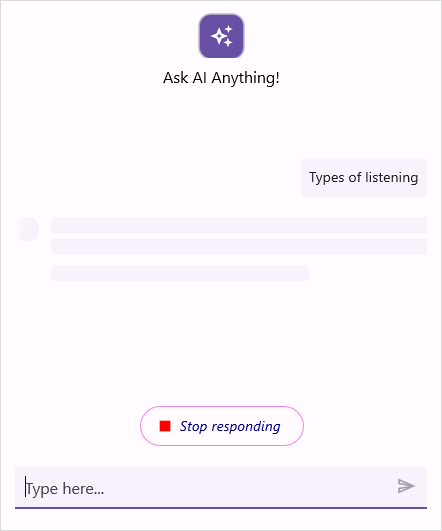
Text selection styling
To modify the highlight color of selected text, you need to update the value associated with the built-in key SfAIAssistViewSelectionTextHighLightColor in the resource dictionary.
| Key | Description |
|---|---|
| SfAIAssistViewSelectionTextHighLightColor | Color to highlight the selected text. |
<ContentPage.Resources>
         <core:SyncfusionThemeDictionary>
            <core:SyncfusionThemeDictionary.MergedDictionaries>
                 <ResourceDictionary>
                     <x:String x:Key="SfAIAssistViewTheme">CustomTheme</x:String>
                     <Color x:Key="SfAIAssistViewSelectionTextHighLightColor">Orange</Color>
                </ResourceDictionary>
            </core:SyncfusionThemeDictionary.MergedDictionaries>
        </core:SyncfusionThemeDictionary>
    </ContentPage.Resources>
ResourceDictionary dictionary = new ResourceDictionary();
dictionary.Add("SfAIAssistViewTheme", "CustomTheme");
dictionary.Add("SfAIAssistViewSelectionTextHighLightColor", Colors.Orange);
this.Resources.Add(dictionary);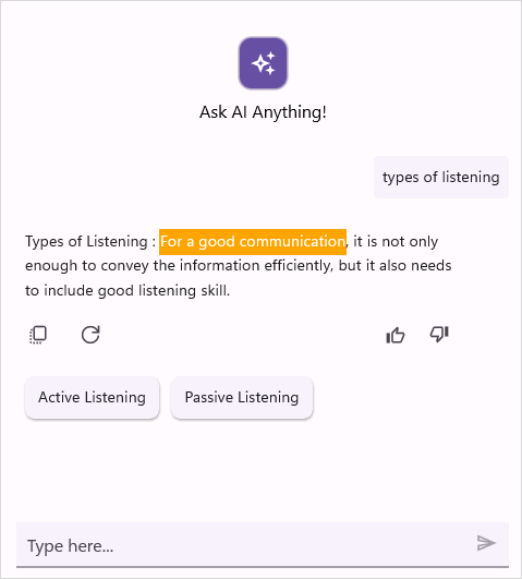
Common suggestions styling
To style the common suggestion view based on its appearance, set values to the in-built keys in the resource dictionary.
| Key | Description |
|---|---|
| SfAIAssistViewHeaderSuggestionBackground | Background color of the common suggestions view. |
| SfAIAssistViewHeaderSuggestionItemStroke | Stroke color for the common suggestion item. |
| SfAIAssistViewHeaderSuggestionItemStrokeThickness | Stroke thickness for the common suggestion item. |
| SfAIAssistViewHeaderSuggestionItemBackground | Background color of an item in the common suggestions. |
| SfAIAssistViewHeaderSuggestionItemTextColor | Text color of an item in the common suggestions. |
| SfAIAssistViewHeaderSuggestionItemFontSize | Font size of an item in the common suggestions. |
| SfAIAssistViewHeaderSuggestionItemFontFamily | Font family of an item in the common suggestions. |
| SfAIAssistViewHeaderSuggestionItemFontAttribute | Font attributes of an item in the common suggestions. |
<ContentPage.Resources>
        <syncTheme:SyncfusionThemeDictionary>
            <syncTheme:SyncfusionThemeDictionary.MergedDictionaries>
                <ResourceDictionary>
                     <x:String x:Key="SfAIAssistViewTheme">CustomTheme</x:String>
	   	             <Color x:Key="SfAIAssistViewHeaderSuggestionBackground">LightSkyBlue</Color>
		             <Color x:Key="SfAIAssistViewHeaderSuggestionItemStroke">BlueViolet</Color>
		             <x:Double x:Key="SfAIAssistViewHeaderSuggestionItemStrokeThickness">2</x:Double>
	                <Color x:Key="SfAIAssistViewHeaderSuggestionItemBackground">White</Color>
		            <Color x:Key="SfAIAssistViewHeaderSuggestionItemTextColor">Blue</Color>
		            <x:Double x:Key="SfAIAssistViewHeaderSuggestionItemFontSize">16</x:Double>
		            <FontAttributes x:Key="SfAIAssistViewHeaderSuggestionItemFontAttribute">Italic</FontAttributes>
		            <x:String x:Key="SfAIAssistViewEditorFontFamily">Roboto-Medium</x:String>
                </ResourceDictionary>
            </syncTheme:SyncfusionThemeDictionary.MergedDictionaries>
        </syncTheme:SyncfusionThemeDictionary>
    </ContentPage.Resources>
ResourceDictionary dictionary = new ResourceDictionary();
dictionary.Add("SfAIAssistViewTheme", "CustomTheme");
dictionary.Add("SfAIAssistViewHeaderSuggestionBackground", Colors.LightSkyBlue);
dictionary.Add("SfAIAssistViewHeaderSuggestionItemStroke", Colors.BlueViolet);
dictionary.Add("SfAIAssistViewHeaderSuggestionItemStrokeThickness", 2.0);
dictionary.Add("SfAIAssistViewHeaderSuggestionItemTextColor", Colors.Blue);
dictionary.Add("SfAIAssistViewHeaderSuggestionItemFontSize", 16.0);
dictionary.Add("SfAIAssistViewHeaderSuggestionItemFontAttribute", FontAttributes.Italic);
dictionary.Add("SfAIAssistViewEditorFontFamily", "Roboto-Medium");
dictionary.Add("SfAIAssistViewHeaderSuggestionItemBackground", Colors.White);
this.Resources.Add(dictionary);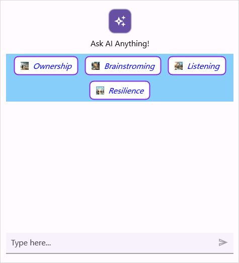
Scroll to bottom button style
To style the scroll to bottom button view based on its appearance, set values to the in-built keys in the resource dictionary.
| Key | Description |
|---|---|
| SfAIAssistViewScrollToBottomButtonBackground | Background color of the scroll to bottom button view. |
| SfAIAssistViewScrollToBottomButtonIconColor | Color of the scroll to bottom button. |
<ContentPage.Resources>
        <core:SyncfusionThemeDictionary>
            <core:SyncfusionThemeDictionary.MergedDictionaries>
                <ResourceDictionary>
                    <x:String x:Key="SfAIAssistViewTheme">CustomTheme</x:String>
                    <Color x:Key="SfAIAssistViewScrollToBottomButtonBackground">Orange</Color>
                    <Color x:Key="SfAIAssistViewScrollToBottomButtonIconColor">White</Color>
                </ResourceDictionary>
            </core:SyncfusionThemeDictionary.MergedDictionaries>
        </core:SyncfusionThemeDictionary>
    </ContentPage.Resources>
ResourceDictionary dictionary = new ResourceDictionary();
dictionary.Add("SfAIAssistViewTheme", "CustomTheme");
dictionary.Add("SfAIAssistViewScrollToBottomButtonBackground", Colors.Orange);
dictionary.Add("SfAIAssistViewScrollToBottomButtonIconColor", Colors.White);
this.Resources.Add(dictionary);Action button style
To style the action button view based on its appearance, set values to the in-built keys in the resource dictionary.
| Key | Description |
|---|---|
| SfAIAssistViewActionButtonBackground | Background color of the action button. |
| SfAIAssistViewActionButtonIconColor | Color of the action button. |
| SfAIAssistViewActionButtonViewTextColor | Text color of an item in the action button. |
| SfAIAssistViewActionButtonsPopupBackground | Background color of the action buttons view. |
<ContentPage.Resources>
        <core:SyncfusionThemeDictionary>
            <core:SyncfusionThemeDictionary.MergedDictionaries>
                <ResourceDictionary>
                    <x:String x:Key="SfAIAssistViewTheme">CustomTheme</x:String>
                    <Color x:Key="SfAIAssistViewActionButtonBackground">Orange</Color>
                    <Color x:Key="SfAIAssistViewActionButtonIconColor">White</Color>
                    <Color x:Key="SfAIAssistViewActionButtonViewTextColor">Black</Color>
                    <Color x:Key="SfAIAssistViewActionButtonsPopupBackground">LightGray</Color>
                </ResourceDictionary>
            </core:SyncfusionThemeDictionary.MergedDictionaries>
        </core:SyncfusionThemeDictionary>
    </ContentPage.Resources>
ResourceDictionary dictionary = new ResourceDictionary();
dictionary.Add("SfAIAssistViewTheme", "CustomTheme");
dictionary.Add("SfAIAssistViewActionButtonBackground", Colors.Orange);
dictionary.Add("SfAIAssistViewActionButtonIconColor", Colors.White);
dictionary.Add("SfAIAssistViewActionButtonViewTextColor", Colors.Black);
dictionary.Add("SfAIAssistViewActionButtonsPopupBackground", Colors.LightGray);
this.Resources.Add(dictionary);Response suggestion header text style
To style the response suggestion header text view based on its appearance, set values to the in-built keys in the resource dictionary.
| Key | Description |
|---|---|
| SfAIAssistViewSuggestionHeaderTextColor | Text color of response suggestion header text. |
| SfAIAssistViewSuggestionHeaderFontSize | Font size of response suggestion header text. |
| SfAIAssistViewSuggestionHeaderFontFamily | Font family of response suggestion header text. |
| SfAIAssistViewSuggestionHeaderFontAttributes | Font attributes of response suggestion header text. |
<ContentPage.Resources>
        <syncTheme:SyncfusionThemeDictionary>
            <syncTheme:SyncfusionThemeDictionary.MergedDictionaries>
                <ResourceDictionary>
                    <x:String x:Key="SfAIAssistViewTheme">CustomTheme</x:String>
                    <Color x:Key="SfAIAssistViewSuggestionHeaderTextColor">DarkBlue</Color>
                    <x:Double x:Key="SfAIAssistViewSuggestionHeaderFontSize">14</x:Double>
                    <x:String x:Key="SfAIAssistViewSuggestionHeaderFontFamily">Roboto-Medium</x:String>
                    <FontAttributes x:Key="SfAIAssistViewSuggestionHeaderFontAttributes">Bold</FontAttributes>
                </ResourceDictionary>
            </syncTheme:SyncfusionThemeDictionary.MergedDictionaries>
        </syncTheme:SyncfusionThemeDictionary>
    </ContentPage.Resources>
ResourceDictionary dictionary = new ResourceDictionary();
dictionary.Add("SfAIAssistViewTheme", "CustomTheme");
dictionary.Add("SfAIAssistViewSuggestionHeaderTextColor", Colors.DarkBlue);
dictionary.Add("SfAIAssistViewSuggestionHeaderFontSize", 14);
dictionary.Add("SfAIAssistViewSuggestionHeaderFontFamily", "Roboto-Medium");
dictionary.Add("SfAIAssistViewSuggestionHeaderFontAttributes", FontAttributes.Bold);
this.Resources.Add(dictionary);AutoComplete suggestion item styling
To style the autocomplete suggestion overlay view based on its appearance, set values to the in-built keys in the resource dictionary.
| Key | Description |
|---|---|
| SfAIAssistViewAutoCompleteSuggestionBackground | Background color of the autocomplete suggestion overlay. |
| SfAIAssistViewAutoCompleteSuggestionItemBackground | Background color of an item in the autocomplete suggestion overlay. |
| SfAIAssistViewAutoCompleteSuggestionItemTextColor | Text color of an item in the autocomplete suggestion overlay. |
| SfAIAssistViewAutoCompleteSuggestionItemFontFamily | Font family of an item in the autocomplete suggestion overlay. |
| SfAIAssistViewAutoCompleteSuggestionItemFontSize | Font size of an item in the autocomplete suggestion overlay. |
| SfAIAssistViewAutoCompleteSuggestionItemFontAttributes | Font attributes of an item in the autocomplete suggestion overlay. |
<ContentPage.Resources>
        <syncTheme:SyncfusionThemeDictionary>
            <syncTheme:SyncfusionThemeDictionary.MergedDictionaries>
                <ResourceDictionary>
                    <x:String x:Key="SfAIAssistViewTheme">CustomTheme</x:String>
                    <Color x:Key="SfAIAssistViewAutoCompleteSuggestionBackground">Orange</Color>
                    <Color x:Key="SfAIAssistViewAutoCompleteSuggestionItemBackground">LightSkyBlue</Color>
                    <Color x:Key="SfAIAssistViewAutoCompleteSuggestionItemTextColor">Green</Color>
                    <x:String x:Key="SfAIAssistViewAutoCompleteSuggestionItemFontFamily">OpenSansSemibold</x:String>
                    <x:Double x:Key="SfAIAssistViewAutoCompleteSuggestionItemFontSize">20</x:Double>
                    <FontAttributes x:Key="SfAIAssistViewAutoCompleteSuggestionItemFontAttributes">Bold</FontAttributes>
                </ResourceDictionary>
            </syncTheme:SyncfusionThemeDictionary.MergedDictionaries>
        </syncTheme:SyncfusionThemeDictionary>
    </ContentPage.Resources>
ResourceDictionary dictionary = new ResourceDictionary();
dictionary.Add("SfAIAssistViewTheme", "CustomTheme");
dictionary.Add("SfAIAssistViewAutoCompleteSuggestionBackground", Colors.Orange);
dictionary.Add("SfAIAssistViewAutoCompleteSuggestionItemBackground", Colors.LightSkyBlue);
dictionary.Add("SfAIAssistViewAutoCompleteSuggestionItemTextColor", Colors.Green);
dictionary.Add("SfAIAssistViewAutoCompleteSuggestionItemFontFamily", "OpenSansSemibold");
dictionary.Add("SfAIAssistViewAutoCompleteSuggestionItemFontSize", 20.0);
dictionary.Add("SfAIAssistViewAutoCompleteSuggestionItemFontAttributes", FontAttributes.Bold);
this.Resources.Add(dictionary);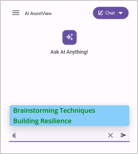
Time break styling
To style the time break view based on its appearance, set values to the built-in keys in the resource dictionary.
| Key | Description |
|---|---|
| SfAIAssistViewTimeBreakLabelTextColor | Text color of the time break label. |
| SfAIAssistViewTimeBreakLabelFontSize | Font size of the time break label. |
| SfAIAssistViewTimeBreakLabelFontFamily | Font family of the time break label. |
| SfAIAssistViewTimeBreakLabelFontAttributes | Font attributes of the time break label. |
| SfAIAssistViewTimeBreakSeparatorHeightRequest | Height of the time break separator line. |
| SfAIAssistViewTimeBreakSeparatorBackground | Background color of the time break separator line. |
<ContentPage.Resources>
    <syncTheme:SyncfusionThemeDictionary>
        <syncTheme:SyncfusionThemeDictionary.MergedDictionaries>
            <ResourceDictionary>
                <x:String x:Key="SfAIAssistViewTheme">CustomTheme</x:String>
                <Color x:Key="SfAIAssistViewTimeBreakLabelTextColor">Blue</Color>
                <x:Double x:Key="SfAIAssistViewTimeBreakLabelFontSize">15</x:Double>
                <x:String x:Key="SfAIAssistViewTimeBreakLabelFontFamily">OpenSansSemibold</x:String>
                <FontAttributes x:Key="SfAIAssistViewTimeBreakLabelFontAttributes">Bold</FontAttributes>
                <x:Double x:Key="SfAIAssistViewTimeBreakSeparatorHeightRequest">4</x:Double>
                <Color x:Key="SfAIAssistViewTimeBreakSeparatorBackground">LightSkyBlue</Color>
            </ResourceDictionary>
        </syncTheme:SyncfusionThemeDictionary.MergedDictionaries>
    </syncTheme:SyncfusionThemeDictionary>
</ContentPage.Resources>
ResourceDictionary dictionary = new ResourceDictionary();
dictionary.Add("SfAIAssistViewTheme", "CustomTheme");
dictionary.Add("SfAIAssistViewTimeBreakLabelTextColor", Colors.Blue);
dictionary.Add("SfAIAssistViewTimeBreakLabelFontSize", 15.0);
dictionary.Add("SfAIAssistViewTimeBreakLabelFontFamily", "OpenSansSemibold");
dictionary.Add("SfAIAssistViewAutoCompleteSuggestionItemFontSize", 20.0);
dictionary.Add("SfAIAssistViewTimeBreakLabelFontAttributes", FontAttributes.Bold);
dictionary.Add("SfAIAssistViewTimeBreakSeparatorHeightRequest", 4.0);
dictionary.Add("SfAIAssistViewTimeBreakSeparatorBackground", Colors.LightSkyBlue);
this.Resources.Add(dictionary);Editor expansion button styling
To style the editor expansion button view based on its appearance, set values to the built-in keys in the resource dictionary.
| Key | Description |
|---|---|
| SfAIAssistViewExpandViewBackground | Background color of the editor expansion button. |
| SfAIAssistViewExpandViewStroke | Stroke color of the editor expansion button. |
| SfAIAssistViewExpandIconColor | Icon color of the editor expansion button. |
<ContentPage.Resources>
    <syncTheme:SyncfusionThemeDictionary>
        <syncTheme:SyncfusionThemeDictionary.MergedDictionaries>
            <ResourceDictionary>
                <x:String x:Key="SfAIAssistViewTheme">CustomTheme</x:String>
                <Color x:Key="SfAIAssistViewExpandViewBackground">Blue</Color>
                <Color x:Key="SfAIAssistViewExpandViewStroke">Orange</Color>
                <Color x:Key="SfAIAssistViewExpandIconColor">Red</Color>
            </ResourceDictionary>
        </syncTheme:SyncfusionThemeDictionary.MergedDictionaries>
    </syncTheme:SyncfusionThemeDictionary>
</ContentPage.Resources>
ResourceDictionary dictionary = new ResourceDictionary();
dictionary.Add("SfAIAssistViewTheme", "CustomTheme");
dictionary.Add("SfAIAssistViewExpandViewBackground", Colors.Blue);
dictionary.Add("SfAIAssistViewExpandViewStroke", Colors.Orange);
dictionary.Add("SfAIAssistViewExpandIconColor", Colors.Red);
this.Resources.Add(dictionary);Voice input styling
To style the voice input view based on its appearance, set values to the built-in keys in the resource dictionary.
| Key | Description |
|---|---|
| SfAIAssistViewMicViewNormalBackground | Background color of the microphone view in normal state. |
| SfAIAssistViewMicViewHoverBackground | Background color of the microphone view in hover state. |
| SfAIAssistViewMicViewPressedBackground | Background color of the microphone view in pressed state. |
| SfAIAssistViewMicViewStroke | Stroke color of the microphone view. |
| SfAIAssistViewMicViewStrokeThickness | Stroke thickness of the microphone view. |
| SfAIAssistViewMicButtonDefaultIconColor | Default icon color of the microphone button. |
| SfAIAssistViewMicButtonPressedIconColor | Icon color of the microphone button when pressed. |
<ContentPage.Resources>
    <syncTheme:SyncfusionThemeDictionary>
        <syncTheme:SyncfusionThemeDictionary.MergedDictionaries>
            <ResourceDictionary>
                <x:String x:Key="SfAIAssistViewTheme">CustomTheme</x:String>
                <Color x:Key="SfAIAssistViewMicViewNormalBackground">Blue</Color>
                <Color x:Key="SfAIAssistViewMicViewHoverBackground">LightBlue</Color>
                <Color x:Key="SfAIAssistViewMicViewPressedBackground">Violet</Color>
                <Color x:Key="SfAIAssistViewMicViewStroke">Red</Color>
                <x:Double x:Key="SfAIAssistViewMicViewStrokeThickness">3</x:Double>
                <Color x:Key="SfAIAssistViewMicButtonDefaultIconColor">Orange</Color>
                <Color x:Key="SfAIAssistViewMicButtonPressedIconColor">Green</Color>
            </ResourceDictionary>
        </syncTheme:SyncfusionThemeDictionary.MergedDictionaries>
    </syncTheme:SyncfusionThemeDictionary>
</ContentPage.Resources>
ResourceDictionary dictionary = new ResourceDictionary();
dictionary.Add("SfAIAssistViewTheme", "CustomTheme");
dictionary.Add("SfAIAssistViewMicViewNormalBackground", Colors.Blue);
dictionary.Add("SfAIAssistViewMicViewHoverBackground", Colors.LightBlue);
dictionary.Add("SfAIAssistViewMicViewPressedBackground", Colors.Violet);
dictionary.Add("SfAIAssistViewMicViewStroke", Colors.Red);
dictionary.Add("SfAIAssistViewMicViewStrokeThickness", 3.0);
dictionary.Add("SfAIAssistViewMicButtonDefaultIconColor", Colors.Orange);
dictionary.Add("SfAIAssistViewMicButtonPressedIconColor", Colors.Green);
this.Resources.Add(dictionary);