Interaction and Animation
10 Jan 20185 minutes to read
-
Linear Gauge control contains Interaction feature. You can use this interaction feature to change the pointer values manually either by clicking or dragging the pointer over the Gauge. It dynamically changes the value of pointer when dragged. To Enable/Disable the user interaction you can use the
readOnlyBoolean property. The user interaction option is enabled when you set readOnly property as false. By default it holds the true value. -
Linear Gauge contains another attractive concept called Animation. The animation option enables the movement of the pointer from the minimum value to the current value. You can use animation option to change the pointer value dynamically. You can enable/ disable it using
enableAnimationproperty. To enable animation set enableAnimation to “true”. -
By default it holds the true value. You can control the speed of the pointer during animating using
animationSpeed. It is a numerical value that holds the time in milliseconds. That is when setting value is 1000, it is considered as 1 second.
<div id="LinearGauge1"></div>$(function () {
// For Linear Gauge rendering
$("#LinearGauge1").ejLinearGauge({
//For enable Animation
enableAnimation: true,
//For enable Animation speed
animationSpeed: 1000,
//For enable interaction
readOnly: false,
value: 78,
//For Adding scale collection
scales: [{
border: { color: "transparent", width: 0 },
showBarPointers: true,
//For Adding bar pointer collection
barPointers: [{ width: 5, backgroundColor: "Grey" }],
//For Adding marker pointer collection
markerPointers: [{
width: 10, length: 10, backgroundColor: "Grey", distanceFromScale: -12
}],
//For Adding ticks collection
ticks: [{
type: "majorinterval", width: 2,
color: "#8c8c8c", distanceFromScale: { x: 7, y: 0 }
},
{
type: "minorinterval", width: 1, height: 6,
color: "#8c8c8c", distanceFromScale: { x: 7, y: 0 }
}]
}]
});
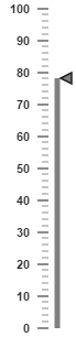
});Execute the above code to render the following output.
Enable Marker Pointer Animation
Specifies the animate state for marker pointer, you can set enableMarkerPointer property as true
<div id="LinearGauge1"></div>

<script>
        $("#LinearGauge1").ejLinearGauge({ enableMarkerPointerAnimation: true, value:50});
</script>
Tooltip
10 Jan 20185 minutes to read
Tooltip has three attributes in it. The first two attributes such as showLabelTooltip and showCustomLabelTooltip are for enabling the Tooltip for label as well as custom label in default appearance.
ShowLabelTooltip is to enable the Tooltip for labels and showCustomLabelTooltip is for enabling the Tooltip option for customLabels.
<div id="LinearGauge1"></div>

<script>
        $("#LinearGauge1").ejLinearGauge({ tooltip:{showCustomLabelTooltip: true,showLabelTooltip: true}});
</script>
Tooltip Template
In Tooltip option, you can customize the Tooltip window by adding the tooltip template on that page with the help of API templateID. Refer to the following code example to know more about Tooltip template.
<div id="LinearGauge1"></div>

<script>
        $("#LinearGauge1").ejLinearGauge({  tooltip:{showLabelTooltip: true, templateID: true}});
</script>