Indicators
11 Jan 201824 minutes to read
Indicators simply indicates the current status of the pointer. Indicators are in several formats such as in shape format, textual format and image format.
Setting Dimension
-
You can enable indicators by setting
showIndicatorsto ‘true’ in scale collection. Theheightandwidthproperty for the indicators are used to specify the area allocated to the indicator for the width and height respectively. -
You can use the position collection to
positionthe indicators along X and Y axis.xspecifies horizontal position in indicators whereasyspecifies vertical position in indicators. Indicators are of several types such as, dimensions like circle, rectangle, rounded rectangle,textand image. By using thetypeproperty it can be applied. For image type imageUrl property is used.
<div id="LinearGauge1"></div>$(function () {
// For Linear Gauge rendering
$("#LinearGauge1").ejLinearGauge({
enableAnimation: false,
//Adding frame object
frame: { backgroundImageUrl: "../images/gauge/Gauge_linear_light.png" },
value: 78,
//Adding scale collection
scales: [{
width: 0,
border: { color: "transparent", width: 0 },
minimum: 0,
maximum: 300,
minorIntervalValue: 5,
majorIntervalValue: 30,
showBarPointers: false,
showIndicators: true,
//Adding marker pointer collection
markerPointers: [{
width: 10, length: 10,
backgroundColor: "Grey", distanceFromScale: 12
}],
//Adding ticks collection
ticks: [{
type: "majorinterval", width: 2,
color: "#8c8c8c", distanceFromScale: { x: 7, y: 0 }
},
{
type: "minorinterval", width: 1, height: 6,
color: "#8c8c8c", distanceFromScale: { x: 7, y: 0 }
}],
//Adding indicator collection
indicators: [{
height: 10,
width: 10,
type: "circle",
position: { x: 50, y: 100 }
}]
}]
});
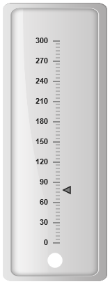
});Execute the above code to render the following output.
State Ranges
State ranges are used to specify the indicator behavior in the certain region. startValue and endValue are used to set the range bound for the pointer. Whenever the pointer crosses the specified region, the indicator attributes are applied for the ranges.
To specify the textColor in bar indicators state ranges by using the property textColor.
<div id="LinearGauge1"></div>$(function () {
$("#LinearGauge1").ejLinearGauge({
enableAnimation: false, readOnly: false,
//Adding frame object
frame: { backgroundImageUrl: "../images/gauge/Gauge_linear_light.png" },
value: 78,
//Adding scale object
scales: [{
width: 0,
border: { color: "transparent", width: 0 },
minimum: 0,
maximum: 300,
minorIntervalValue: 5,
majorIntervalValue: 30,
showRanges: true,
showBarPointers: false,
showIndicators: true,
//Adding marker pointer collection
markerPointers: [{
width: 10, length: 10, backgroundColor: "Grey",
distanceFromScale: 12
}],
//Adding tick collection
ticks: [{
type: "majorinterval", width: 2,
color: "#8c8c8c", distanceFromScale: { x: 7, y: 0 }
},
{
type: "minorinterval", width: 1, height: 6,
color: "#8c8c8c", distanceFromScale: { x: 7, y: 0 }
}],
//Adding range collection
ranges: [
{
startWidth: 5, endWidth: 5, startValue: 0, endValue: 200,
backgroundColor: "#94C361", border: {
color: "#94C361", width: 1
}
},
{
startWidth: 5, endWidth: 5, startValue: 200, endValue: 250,
backgroundColor: "#F9CF67", border: {
color: "#F9CF67", width: 1
}
},
{
startWidth: 5, endWidth: 5, startValue: 250, endValue: 300,
backgroundColor: "#F89B83", border: {
color: "#F89B83", width: 1
}
}
],
//Adding indicator collection
indicators: [
{
height: 10, width: 10, type: "circle", position: { x: 50, y: 100 },
//Adding State ranges collection
stateRanges: [
{
backgroundColor: "#02A258", endValue: 200,
startValue: 0, borderColor: "#02A258"
},
{
backgroundColor: "Grey", endValue: 300,
startValue: 200, borderColor: "Grey"
}
]
}]
}]
});
});Execute the above code to render the following output.
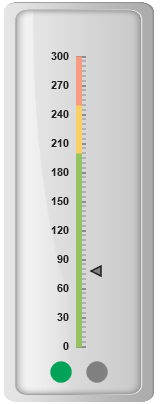
Linear Gauge with indicator state ranges
Color and Appearance
The backgroundColor and borderColor sets the appearance behavior for the indicators. You can apply this only if it lies within the state ranges. Otherwise default behavior will be applied.
The indicator border is modified with the border object. It contains two border property namely color and width which are used to customize the border color of the indicator and border width of the indicator pointer.
<div id="LinearGauge1"></div>$(function () {
// For Linear Gauge rendering
$("#LinearGauge1").ejLinearGauge({
enableAnimation: false,
//Adding frame object
frame: { backgroundImageUrl: "../images/gauge/Gauge_linear_light.png" },
value: 78,
//Adding scale object
scales: [{
width: 0,
border: { color: "transparent", width: 0 },
minimum: 0,
maximum: 300,
minorIntervalValue: 5,
majorIntervalValue: 30,
showBarPointers: false,
showIndicators: true,
//Adding marker pointer collection
markerPointers: [{
width: 10, length: 10,
backgroundColor: "Grey", distanceFromScale: 12
}],
//Adding ticks collection
ticks: [{
type: "majorinterval", width: 2,
color: "#8c8c8c", distanceFromScale: { x: 7, y: 0 }
},
{
type: "minorinterval", width: 1, height: 6,
color: "#8c8c8c", distanceFromScale: { x: 7, y: 0 }
}],
//Adding indicator collection
indicators: [{
height: 10, width: 10, type: "circle", position: { x: 50, y: 100 },
stateRanges: [{
backgroundColor: "#91B64E", endValue: 300,
startValue: 0, borderColor: "#91B64E"
}]
}]
}]
});
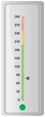
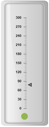
});Execute the above code to render the following output.
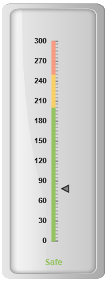
Font options
The basic font options available for the textual type indicators in the Linear Gauge such as Size, font style and font family are achieved by the properties size, fontStyle and fontFamily.You can adjust the opacity of the label with the property opacity and the value of opacity lies between 0 and 1.
To specifies the textLocation in bar indicators along X and Y axis. x specifies horizontal text location in indicators whereas y specifies vertical text location in indicators.
<div id="LinearGauge1"></div>$(function () {
// For Linear Gauge rendering
$("#LinearGauge1").ejLinearGauge({
enableAnimation: false, readOnly: false,
//Adding frame object
frame: { backgroundImageUrl: "../images/gauge/Gauge_linear_light.png" },
value: 78,
//Adding scale collection
scales: [{
width: 0,
border: { color: "transparent", width: 0 },
minimum: 0,
maximum: 300,
minorIntervalValue: 5,
majorIntervalValue: 30,
showRanges: true,
showBarPointers: false,
showIndicators: true,
//Adding marker pointer collection
markerPointers: [{
width: 10, length: 10,
backgroundColor: "Grey", distanceFromScale: 12
}],
//Adding tick collection
ticks: [{
type: "majorinterval", width: 2,
color: "#8c8c8c", distanceFromScale: { x: 7, y: 0 }
},
{
type: "minorinterval", width: 1, height: 6,
color: "#8c8c8c", distanceFromScale: { x: 7, y: 0 }
}],
//Adding range collection
ranges: [
{
startWidth: 5, endWidth: 5, startValue: 0, endValue: 200,
backgroundColor: "#94C361", border: {
color: "#94C361", width: 1
}
},
{
startWidth: 5, endWidth: 5, startValue: 200, endValue: 250,
backgroundColor: "#F9CF67", border: {
color: "#F9CF67", width: 1
}
},
{
startWidth: 5, endWidth: 5, startValue: 250, endValue: 300,
backgroundColor: "#F89B83", border: {
color: "#F89B83", width: 1
}
}
],
//Adding indicator collection
indicators: [
{
type: "text", textLocation: { x: 50, y: 100 },
//Adding font option
font: { size: "12px", fontFamily: "Arial", fontType: "Bold" },
//Adding state ranges collection
stateRanges: [{
startValue: 0, endValue: 200,
text: "Safe", textColor: "#94C361"
},
{
startValue: 200, endValue: 250,
text: "Caution", textColor: "#F9CF67"
},
{
startValue: 250, endValue: 300,
text: "Danger", textColor: "#F89B83"
}
]
}]
}]
});
});Execute the above code to render the following output.
Multiple Indicator
You can set multiple indicators in a single Linear Gauge by adding an array of indicator objects. Refer the following code example for multiple indicator functionality.
<div id="LinearGauge1"></div>$(function () {
// For Linear Gauge rendering
$("#LinearGauge1").ejLinearGauge({
enableAnimation: false, readOnly: false,
//Adding frame object
frame: { backgroundImageUrl: "../images/gauge/Gauge_linear_light.png" },
value: 78,
//Adding scale collection
scales: [{
width: 0,
border: { color: "transparent", width: 0 },
minimum: 0,
maximum: 300,
minorIntervalValue: 5,
majorIntervalValue: 30,
showRanges: true,
showBarPointers: false,
showIndicators: true,
//Adding marker pointer collection
markerPointers: [{
width: 10, length: 10, backgroundColor: "Grey",
distanceFromScale: 12
}],
//Adding ticks collection
ticks: [{
type: "majorinterval", width: 2,
color: "#8c8c8c", distanceFromScale: { x: 7, y: 0 }
},
{
type: "minorinterval", width: 1, height: 6,
color: "#8c8c8c", distanceFromScale: { x: 7, y: 0 }
}],
//Adding ranges collection
ranges: [
{
startWidth: 5, endWidth: 5, startValue: 0, endValue: 200,
backgroundColor: "#94C361", border: {
color: "#94C361", width: 1
}
},
{
startWidth: 5, endWidth: 5, startValue: 200, endValue: 250,
backgroundColor: "#F9CF67", border: {
color: "#F9CF67", width: 1
}
},
{
startWidth: 5, endWidth: 5, startValue: 250, endValue: 300,
backgroundColor: "#F89B83", border: {
color: "#F89B83", width: 1
}
}
],
//Adding indicator collection
indicators: [
//Adding indicator 1
{
height: 10, width: 10, type: "circle", position: { x: 30, y: 100 },
//Adding state ranges collection
stateRanges: [{
backgroundColor: "#02A258", endValue: 200,
startValue: 0, borderColor: "#02A258"
},
{
backgroundColor: "Grey", endValue: 300,
startValue: 200, borderColor: "Grey"
}]
},
//Adding indicator 2
{
height: 10, width: 10, type: "circle", position: { x: 70, y: 100 },
stateRanges: [{
backgroundColor: "Grey", endValue: 200,
startValue: 0, borderColor: "Grey"
},
{
backgroundColor: "Red", endValue: 300,
startValue: 200, borderColor: "Red"
}]
}]
}]
});
});Execute the above code to render the following output.