How can I help you?
Columns in JavaScript Gantt
The column displays the information from a bounded data source and it will be editable to update the task details through TreeGrid.
Column edit types
Gantt supports the following types of column editors,
- String
- Date
- Datetime
- Numeric
- Maskedit
- Currency
- Dropdown
Get column collection
In Gantt it is possible to get all the defined columns into a variable using getColumns public method.
we can customize these columns at load. The following code snippet explains this.
$("#GanttContainer").ejGantt({
        //...
        load: function (args) {
            var columns = this.getColumns();
        }
 });
Format column
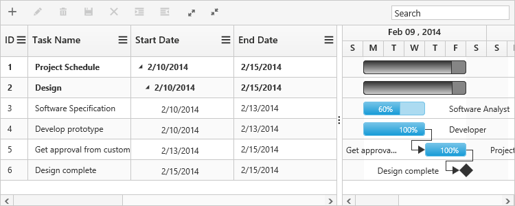
It is possible to format a column using load event. The following code examples show how to format the ‘progress’ column with percentage value.
$("#GanttContainer").ejGantt({
        //...
        load: function (args) {
            var columns = this.getColumns();
            columns[5]["format"] = "{0:p0}";
        }
 });
Note: For more numeric format strings, please refer to this link.
For more date format strings, please refer to this link.
Column Resizing
You can change the width of the column to show the entire text of the column by resizing the column. In Gantt column resizing can be enabled by setting allowColumnResize property as true. The following code example shows you how to enable the column resize feature in Gantt.
$("#GanttContainer").ejGantt({
    //...
    allowColumnResize: true
});
Column Template
Column template is used to customize the column’s look and feel, based on requirement.
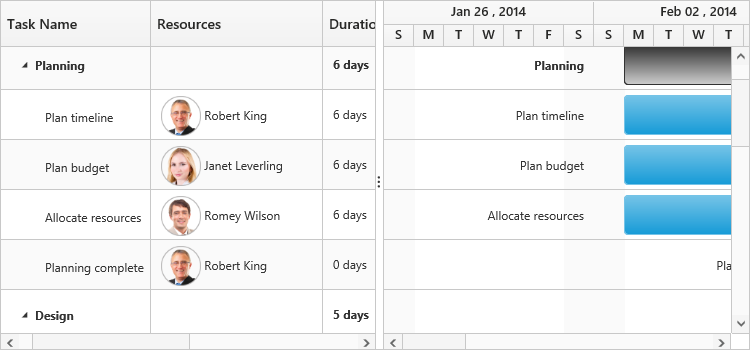
The following code example shows you how to display a column with resource images.
<script type="text/x-jsrender" id="columnTemplate">

    {{if #data['resourceNames']}}

    <div style="display:inline-block;position:relative;left:10px;top:1px">

        <img src="images/Gantt/{{:#data['resourceNames']}}.png" height="40px" />

    </div>

    <div style='display:inline-block;width:100%;position:relative;left:10px;top:2px'>}}</div>

    {{/if}}
</script>

var columnTemplateData = [{
    taskID: 1,
    taskName: "Project Schedule",
    startDate: "02/03/2014",
    endDate: "03/07/2014",
    subtasks: [{
        taskID: 2,
        taskName: "Planning",
        startDate: "02/03/2014",
        endDate: "02/07/2014",
        subtasks: [{
                taskID: 3,
                taskName: "Plan timeline",
                startDate: "02/03/2014",
                endDate: "02/07/2014",
                duration: 6,
                progress: "60",
                resourceId: [1]
            },
            //...
        ]
    }, ]
}];
$(function() {

    $("#Gantt").ejGantt({

        //…

        scheduleEndDate: "03/016/2014",

        //Resources mapping

        resourceInfoMapping: "resourceId",

        resourceNameMapping: "resourceName",

        resourceIdMapping: "resourceId",

        resources: columnTemplateResource,

        allowGanttChartEditing: false,

        load: function(args) {

            var Gantt = $("#Gantt").ejGantt("instance");

            var columns = Gantt.getColumns();

            columns[2].visible = columns[3].visible = false;

            columns[4].isTemplateColumn = true;

            columns[4].templateID = "columnTemplate";

            columns[4].width = "172";

        },

    });

});
The following screenshot displays the customized column in Gantt control.
Column menu
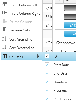
Show column chooser
Gantt supports enabling and disabling the visibility of the columns dynamically with the showColumnChooser property. The visibility of the custom columns can also be toggled with this property. Column chooser option is rendered as a sub menu item within the column menu in the Gantt columns.
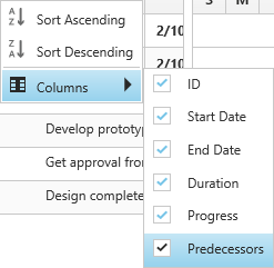
The column menu is enabled with the showColumnChooser property, where the default value for this property is false.
The column menu provides the following options:
- Sort Ascending
- Sort Descending
- Columns
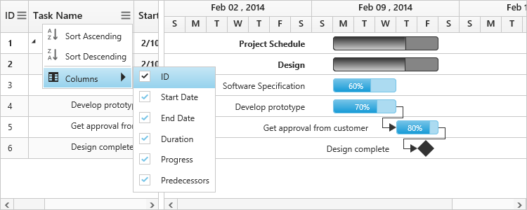
Sort Ascending and Sort Descending options can be enabled or disabled with the allowSorting property. Single level sorting can be performed with these options. To perform multilevel sorting, the allowMultiSorting property should be enabled. You can also disable the visibility of a particular column in the column collection manually by setting the visible property to false.
$("#Gantt").ejGantt({
        // ...
        showColumnChooser: true,
        allowSorting: true,
        allowMultiSorting: true,
        // ...
});
The following screenshot displays the column chooser in the Gantt control.
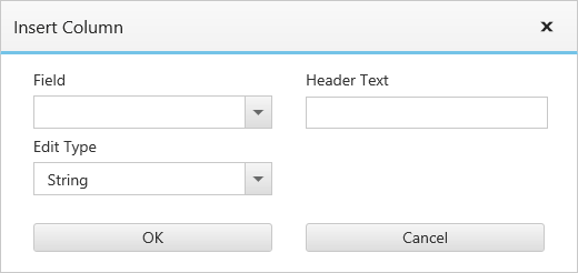
Show column options
You can customize the column with some more options with the showColumnOptions property. Use this property to insert a new column, delete a column and to update the header text of the column.
The column options can be enabled or disabled with the showColumnOptions property, where the default value for this property is false.
The column options provide the following options:
- Insert column left
- Insert column right
- Delete column
- Rename column
Inserting column provides the dialog to enter the details for the column.
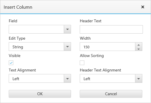
These fields can be customized with the columnDialogFields property. The following code sample shows you how to customize these fields.
$("#Gantt").ejGantt({
        // ...
        showColumnChooser: true,
        showColumnOptions: true,
        columnDialogFields: ["field", "headerText", "editType"],
        // ...
});
Change visibility of the columns dynamically
Gantt columns visibility can be changed dynamically by using showColumn and hideColumn methods. The below code example shows how to change the visibility of the column in Gantt dynamically.
$("#Gantt").ejGantt({
        // ...
});

$("#hide_column").click(function() {
    var ganttObj = $("#Gantt").ejGantt("instance");
    var column = ganttObj.getColumns()[0];
    ganttObj.hideColumn(column.headerText);
});

$("#show_column").click(function() {
    var ganttObj = $("#Gantt").ejGantt("instance");
    var column = ganttObj.getColumns()[0];
    ganttObj.showColumn(column.headerText);
});
Change tree/expander column
Tree/Expander column is a column in Gantt which has icons to expand/collapse the parent records. We can define the tree column index in Gantt by using treeColumnIndex property, default value of this property was 0. The following code example shows how to use this property.
$("#Gantt").ejGantt({
        // ...
        treeColumnIndex: 2,
});
The below screenshot shows the output of above code example.