- How to configure flat table data into Choropleth Map?
- How to configure SSAS data to Choropleth map?
- How to format Choropleth Map?
Contact Support
Choropleth Map
Choropleth Map allows you to showcase quantitative values encoded through color scale.
How to configure flat table data into Choropleth Map?
To plot a Choropleth Map, a minimum requirement of 1 value and 1 shape is needed. This holds one additional block Calculations in Data Pane. Dropping a dimension will display each region split by each of its item.
The following procedure illustrates data configuration of Choropleth Map.
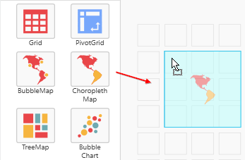
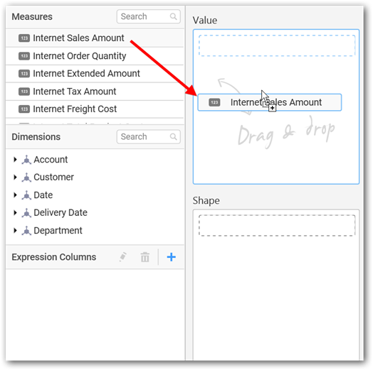
Drag and drop Choropleth Map control icon from the Tool box into design panel. You can find control in Toolbox by search.
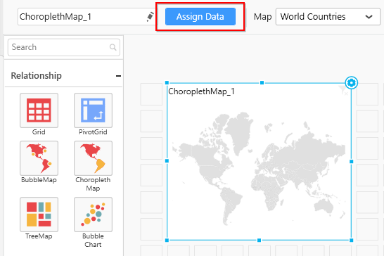
After control added in design panel, click Assign Data button at Design Tools Pane to open the Data configuration pane.
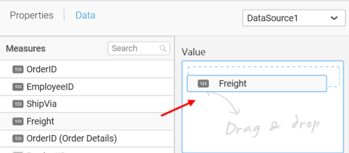
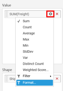
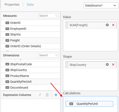
Bind column through drag and drop element from Measures section to Value.
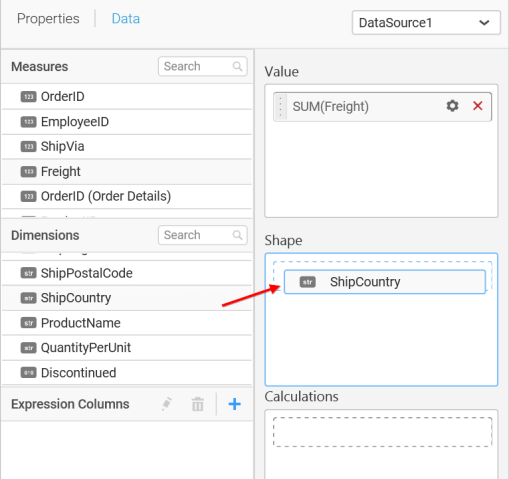
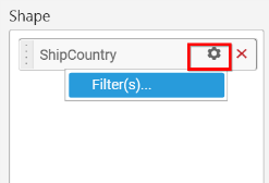
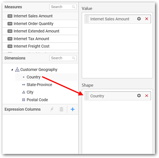
Drag and Drop the elements from sections to Shape.
You can use the aggregation function to change the Value of the column.
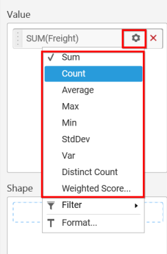
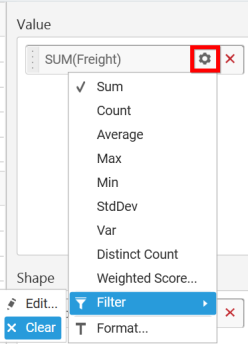
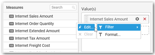
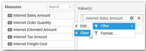
You can use the Filter option to enable filters by selecting the Edit option.
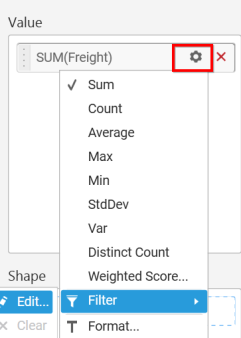
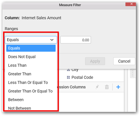
Measure Filter window will be shown.
You can clear the filter by selecting the Clear option.
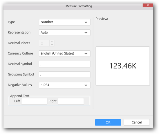
You can format the values by selecting the Format option.
Measure Formatting window will be shown.
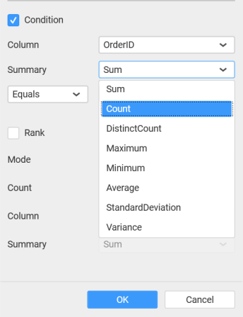
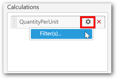
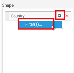
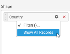
You can use the filters by selecting the Filter(s)… option to rank to the elements.
You can select the specific country to filter the element and CheckAll is used either to check all the data or to select the specific data. Include and Exclude is used to include and exclude the elements by selecting the radio button and click the Apply button.
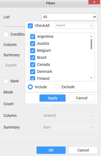
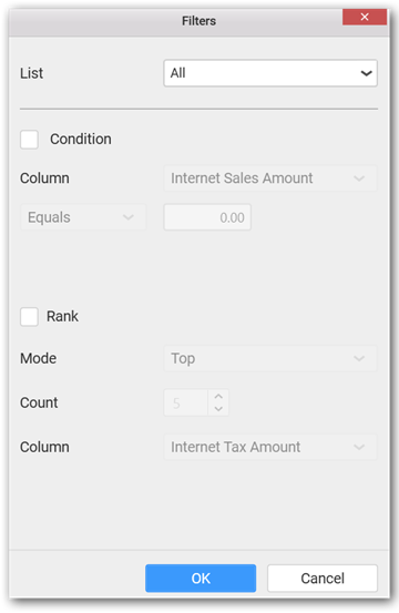
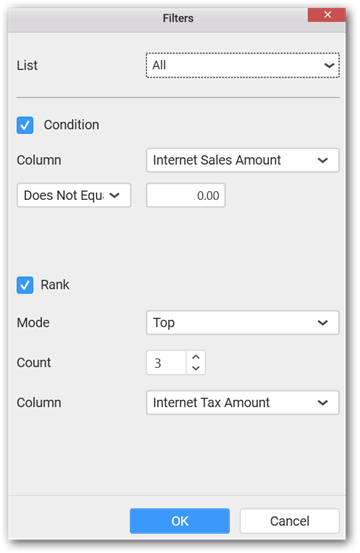
You can select the Condition option to change the Column elements and Summary type by selecting the required column name and summary type.

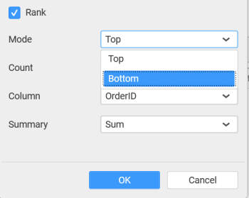
You can select the Rank option to enable filters and select the Mode either top or bottom.
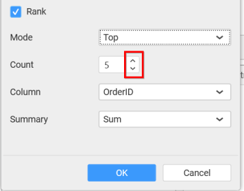
You can change the Count value to filter the top elements and change the column and summary type as required and click OK button.
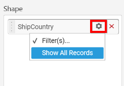
You can clear the filters by selecting the Show All Records options.
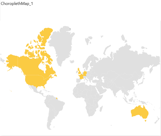
You can set colors to countries.
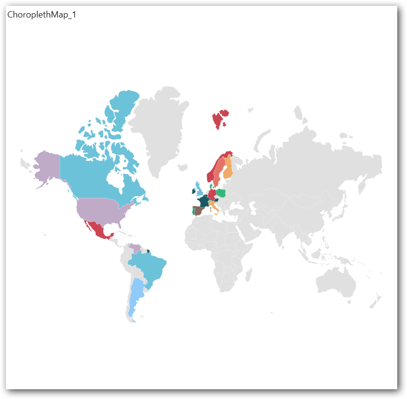
In the above screenshot, colors are applied to countries based on calculations. The default color palette is used to set the colors.
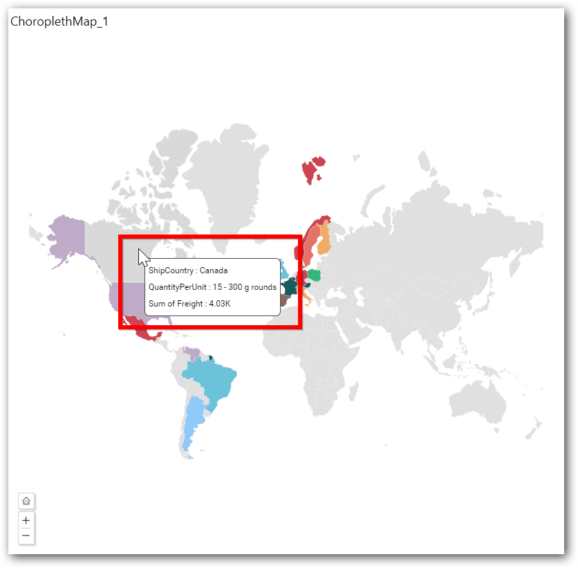
On hovering the mouse over a country, the tooltip will display its details of measure, shape, and calculations.
To achieve this, follow the given steps:
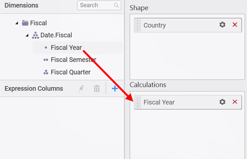
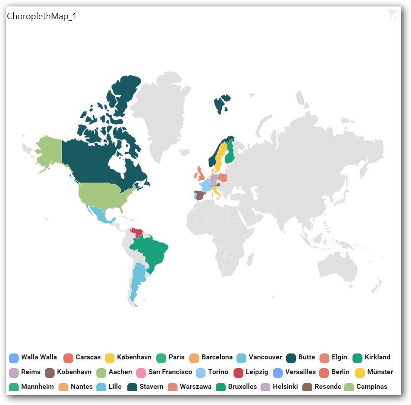
Drag and drop the elements from dimensions section to Calculations.
Here is an illustration,
You have settings options similar to Column(s).
How to configure SSAS data to Choropleth map?
To plot a Choropleth Map, a minimum requirement of 1 value and 1 shape is needed. This holds one additional block Calculations in Data Pane. Dropping a dimension will display each region split by each of its item.
Following steps illustrates configuration of SSAS data to Choropleth Map.
Drag and drop Choropleth Map control icon from the Tool box into design panel. You can find control in Toolbox by search.
After control added in design panel, click Assign Data button at Design Tools Pane to open the Data configuration pane.
Drag and drop a column under Measures category into Value.
Drag and drop a dimension level or hierarchy column under Dimensions category into Shape.
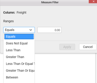
Define the filter criteria to match through choosing Edit option in Filter menu item.
The Measure filter dialog will be shown where you can choose the filter condition and apply the condition value.
Select Clear option to clear the defined filter.
Select Format option to define the display format to the values in the column through Measure Formatting window.
Define filter criteria through Filter(s)… menu item in the Settings drop down menu.
Select Filter(s)… to launch the Filters window.
Define the filter Condition and Rank and Click OK.
To show all records again click on Show All Records.
Drag and drop a dimension level or hierarchy column under Dimensions category into Calculations.
Here is an illustration,
How to format Choropleth Map?
You can format the Choropleth Map for better illustration of the view that you require, through the settings available in Properties pane.
General Settings

Heading
This allows you to set title for this Choropleth Map widget.
SubHeading
This allows you to set sub-title for this Choropleth Map widget.
Description
This allows you to set description for this Choropleth Map widget, whose visibility will be denoted by i icon, hovering which will display this description in tooltip.
Basic Settings
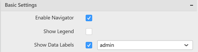
Enable Navigator
You can enable/ disable the map navigator in Choropleth Map.
Show Legend
You can toggle the visibility of legend in Choropleth Map.
Show Data Labels
You can enable or disable the data labels in map widget by using Show Data Labels property. After enabling this property, a dropdown menu is enabled for choosing the shape properties (i.e. name, admin, iso_3166, etc.) which is going to be displayed as data label.
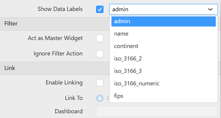
The properties displayed in the DropDownList are changed based on selected shapes.
Filter Settings
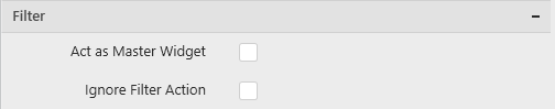
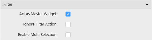
Act as Master Widget
This allows you to define this Choropleth Map widget as a master widget such that its filter action can be made to listen by other widgets in the dashboard.
Ignore Filter Actions
This allows you to define this Choropleth Map widget to ignore responding to the filter actions applied on other widgets in dashboard.
Enable Multi Selection
Enable Multi Selection is displayed only when you enable the Act as Master Widget option. This allows you to select multiple shapes in the Choropleth Map widget.
Link Settings
You can enable linking and configure to navigate either to a published dashboard URL or to a general URL with or without parameters. For more details, refer Linking.
Container Appearance
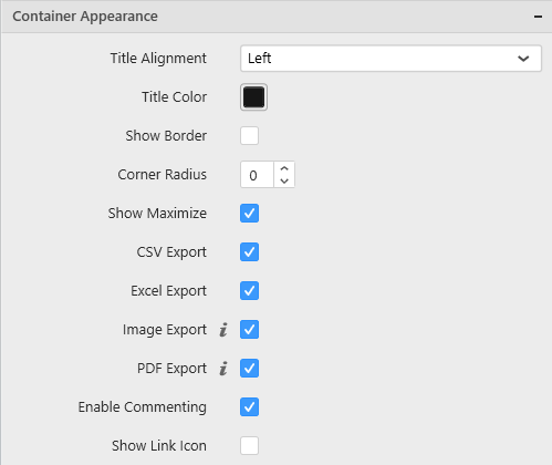
Title Alignment
This allows you to handle the alignment of widget title to either left, center or right.
Title Color
This allows you to apply text color to the widget title.
Show Border
This allows you to toggle the visibility of border surrounding the widget.
Corner Radius
This allows you to apply the specified radius to the widget corners. Value can be between 0 and 10.
Show Maximize
This allows you to enable/disable the maximized mode of this Choropleth Map widget. The visibility of the maximize icon in widget header will be defined based on this setting. Clicking this icon in viewer will show the maximized view of the Choropleth Map widget.
CSV Export
This allows you to enable/disable the CSV export option for this Choropleth Map widget. Enabling this allows you to export the summarized data of the widget view to CSV format.
Excel Export
This allows you to enable/disable the Excel export option for this Choropleth Map widget. Enabling this allows you to export the summarized data of the widget view to XLSX format.
Image Export
This allows you to enable/disable the image export option for this Choropleth Map widget. Enabling this allows you to export the view of the widget to image format (*.JPG) in viewer.
Enable Comment
This allows you to enable/disable comment for dashboard widget. For more details refer here
Map Settings
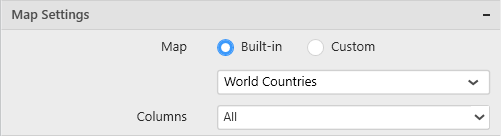
Built-in
You can choose from the available 14 map shape files shipped along with dashboard designer for visualizing map data.
Custom
This option allows you to load any map shape files (i.e. .json files) into Map widget. For loading custom map files, you need to choose Custom option from Map settings. After enabling this option, browse icon is enabled for loading custom shape file.
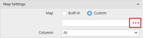
Using browse icon, we can browse and load the required shape file in Map.

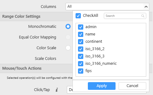
Columns
You can choose multiple column fields from the list of field names supported by the loaded map shape that can be mapped with the data source connected. By default all column fields have been selected and you can select/unselect from columns drop down menu.
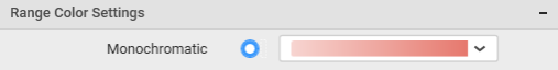
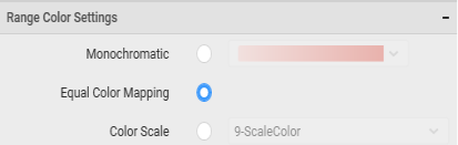
Range Color Settings

Monochromatic
You can configure a single color palette whose saturation differs based on the value density.
Here is an illustration,
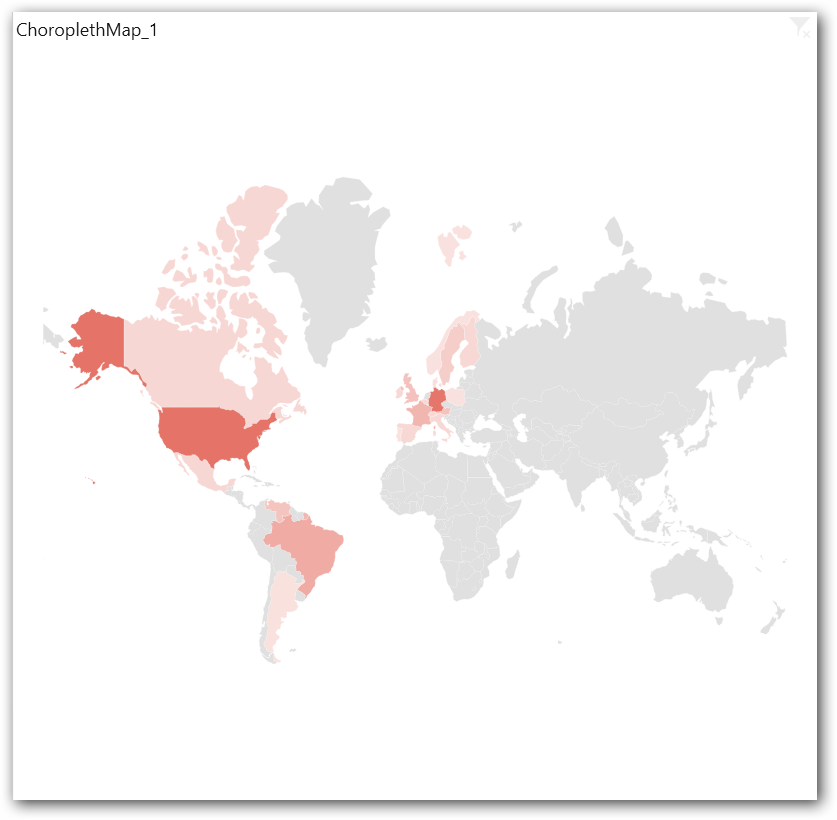
Equal Color Mapping
This option will be available only when you add any element to Calculations block in Data pane. Switching to any other range color scheme option, will remove the added column from Calculations block.
Here is an illustration,
Color Scale
You can choose the number of scales the color need to be split into (3, 5, 7, or 9). Based on the selected color scale, the color palette will be displayed.
Scale Colors
You can customize the colors in the selected color scale.