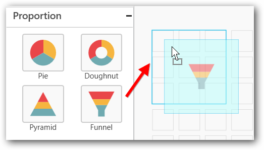
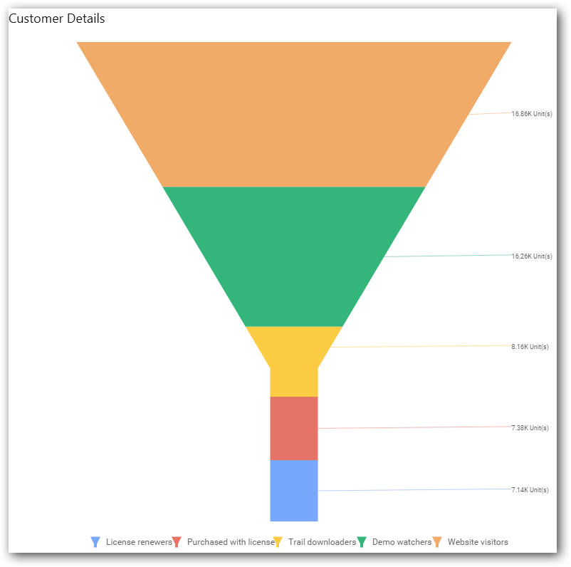
Funnel Chart
Funnel Chart shows values across multiple stages in a process by highlighting different stages with different colors. It allows you make proportional comparison among values showcased in progressively decreasing manner.
How to configure the flat table data to Funnel Chart
Funnel Chart needs a minimum of one value element and one column element to showcase. The measure or expression field that you want to analyze can be dropped into the Value(s) block. The dimension that you want to categorize the measure can be dropped into the Column block. To categorize the measure based on a series, drop the respective dimension into the Row block.
To configure data into the Funnel Chart, follow these steps:
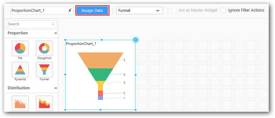
- Drag and drop the Funnel Chart into canvas and resize it to your required size.
-
Connect to the data source.
-
Focus the Funnel Chart and click Assign Data.
The data pane will be opened with available Measures and Dimensions from the data source.
You can add the required data from Measures and Dimensions into the required field. You can create any mathematical, Boolean, or any expressions using columns, rows, or vaules in the Expression Columns using the Expression Designer.
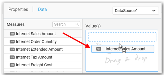
Adding value(s)
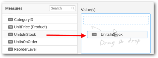
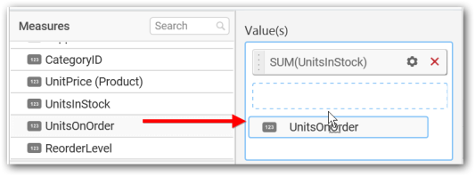
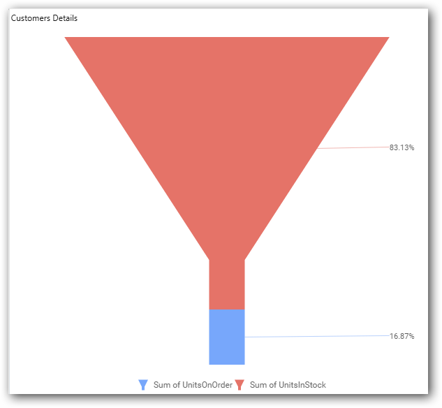
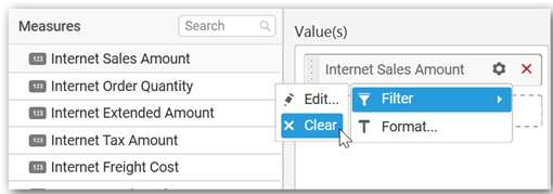
Add the Measures fields into Value(s) section by dragging and dropping the required measure fields.
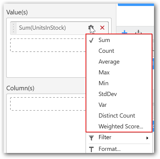
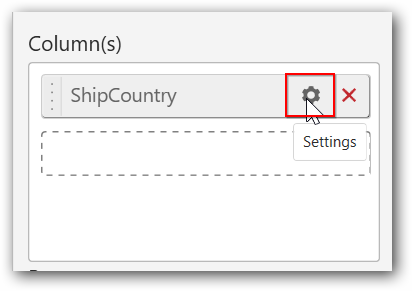
You can change the properties of the required field by using the settings option.

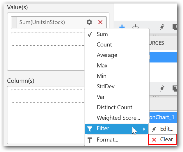
Select the required summary type from the available summary types shown in the settings.
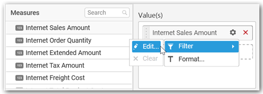
You can filter the data to be displayed in the Funnel Chart by using the filter. It is used to filter the values in numbers by setting the filter range as greater than, less than, etc.
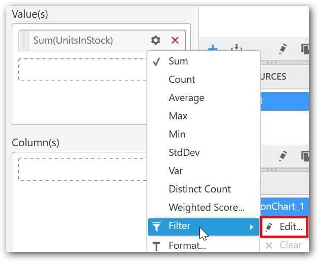
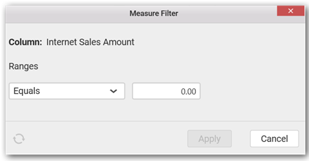
When you click Edit, the Measure Filter option will appear.
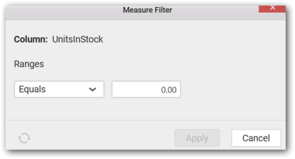
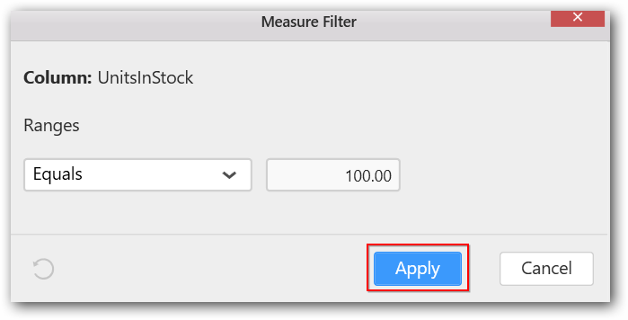
You can select the condition to be applied in the shown list box and set the value in text box, and then click Apply.
You have an option to clear the applied filter. Click Clear to remove the filters.
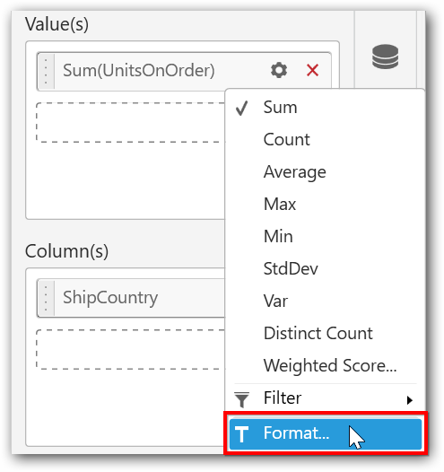
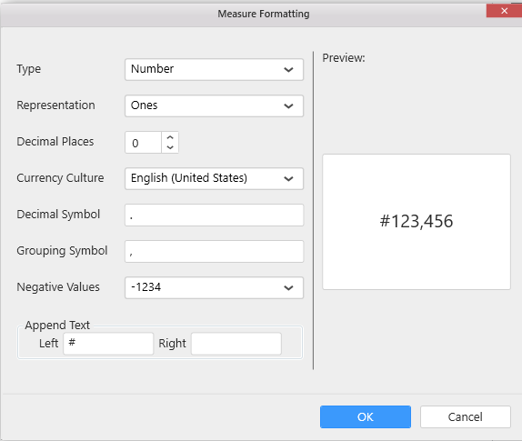
You can format the data to be displayed in the Funnel Chart by using the Format option.
The Measure Formatting option will be shown as follows. Select the required format and click OK.
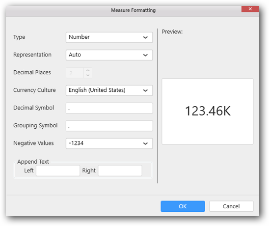
Enter the text to be displayed in the left side of the value in the Append Text as follows and click OK to proceed. Similary, you can provide the required text in the right side of the value.
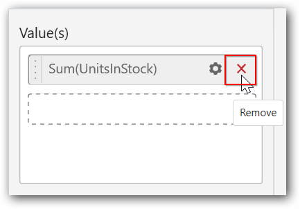
To remove the added value fields, click the x button.
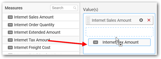
You can add multiple Measures into Value(s) field.
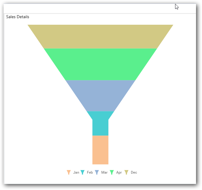
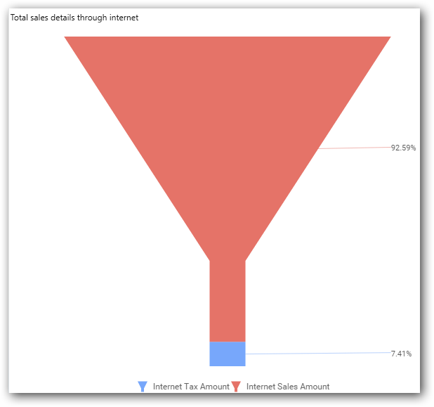
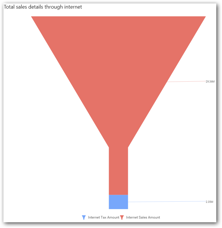
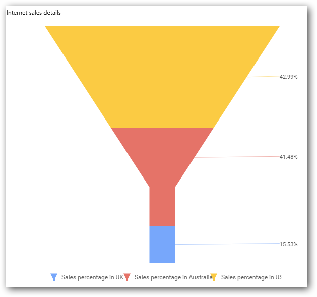
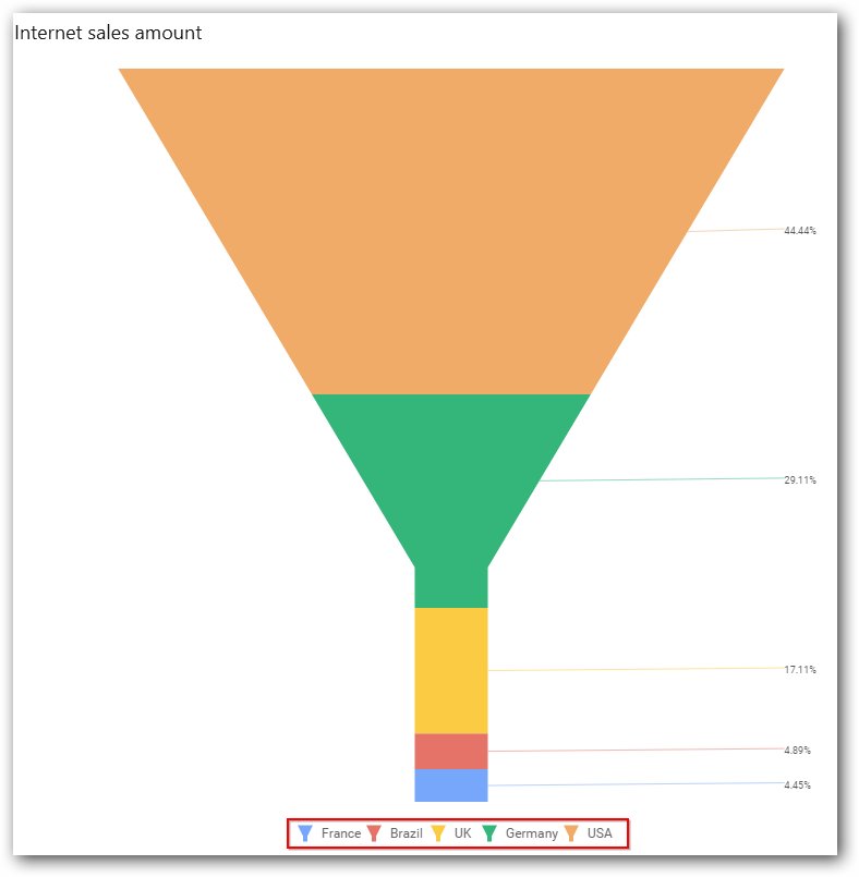
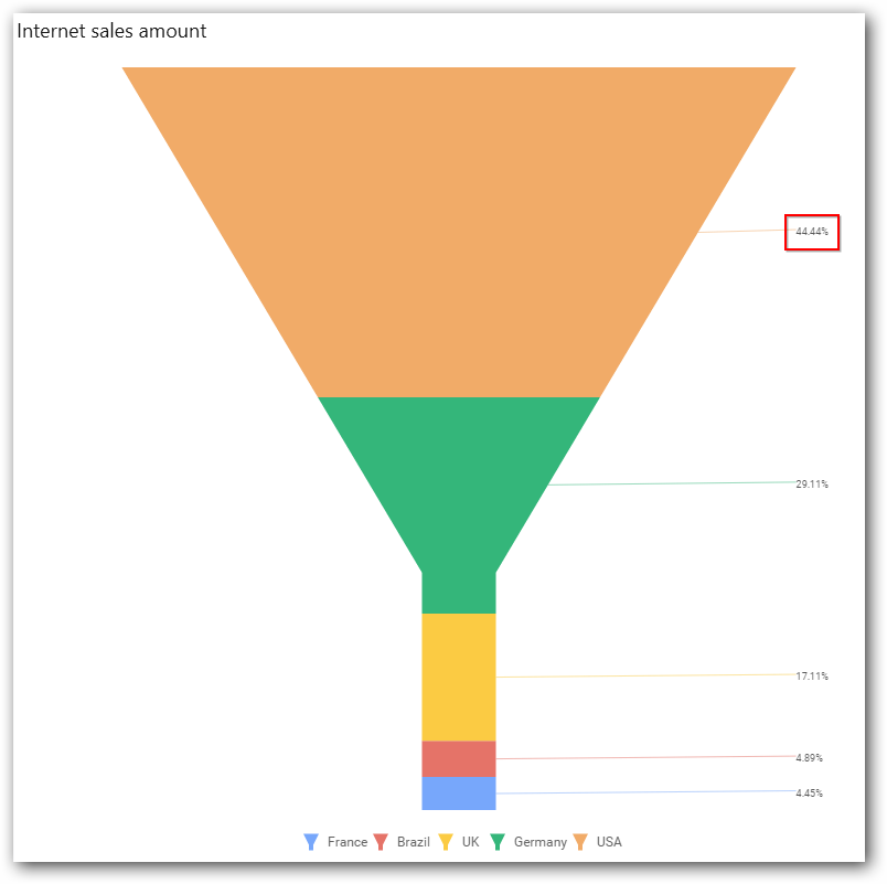
The chart will be rendered as follows.
You can also drag the Dimensions and Expression Columns into Value(s).
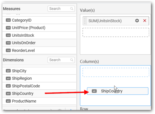
Adding column(s)
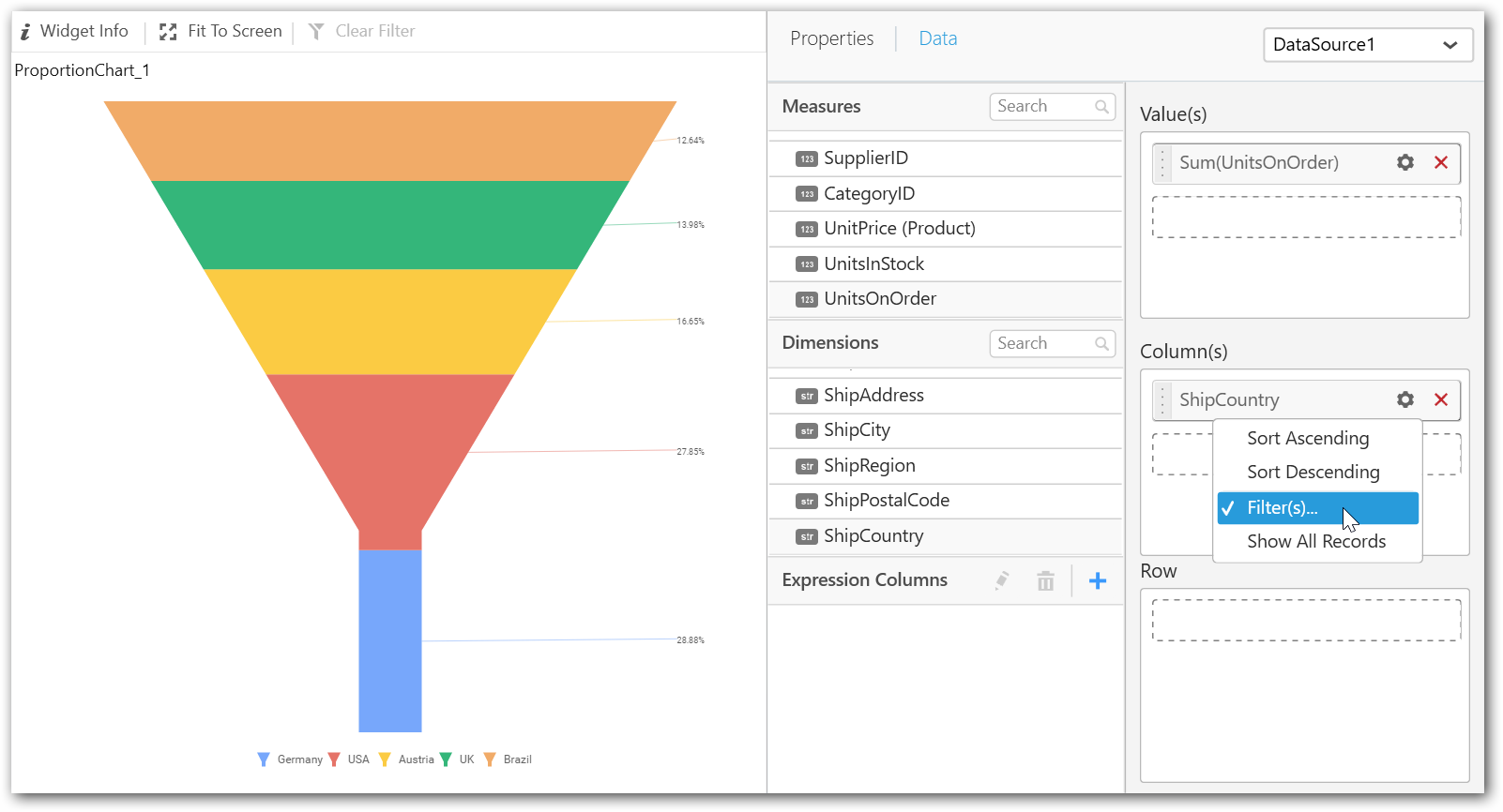
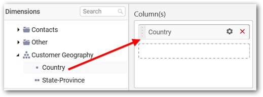
Drag and drop the Dimensions into Column(s).
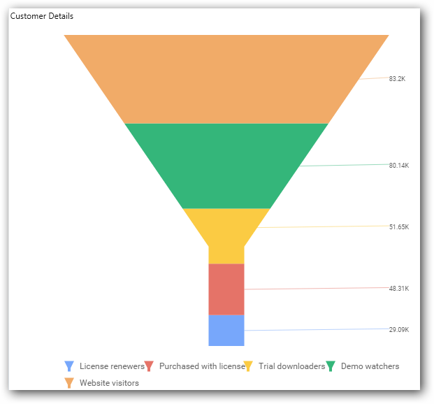
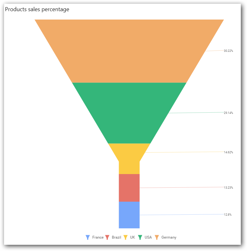
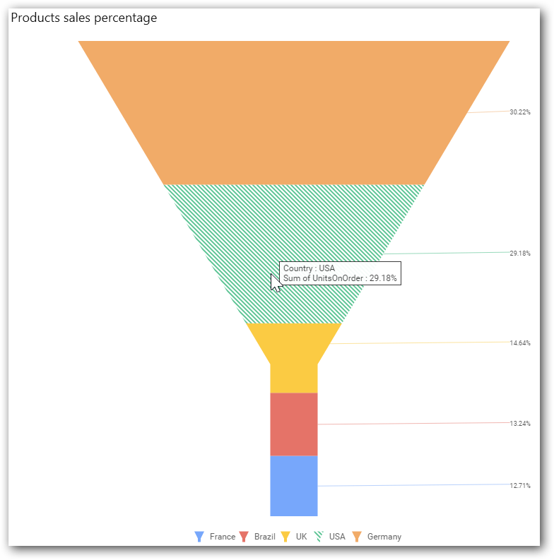
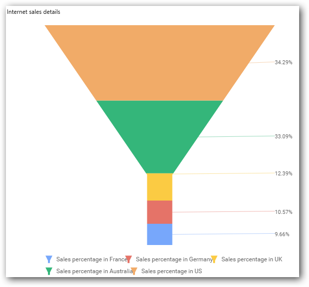
The Funnel Chart will be rendered as follows.
You can add more than one value into the Column(s) field.
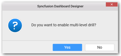
The following message will open.
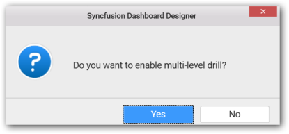
You can enable this option to get the further details about the selected chart region. To enable drill down, click Yes.
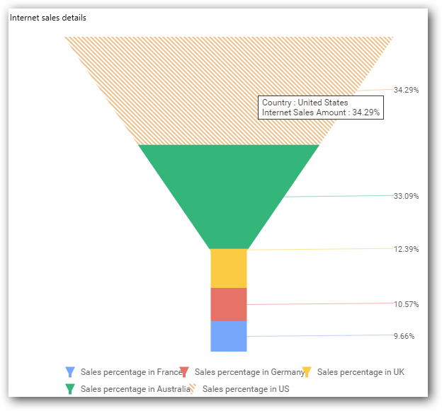
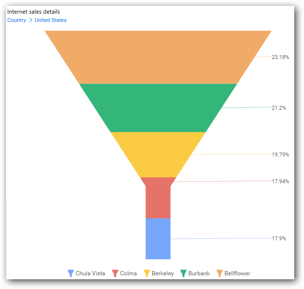
The drilled view of the selected chart region.
To continue without drill down, click NO.
The old column value will be replaced by a new column value.
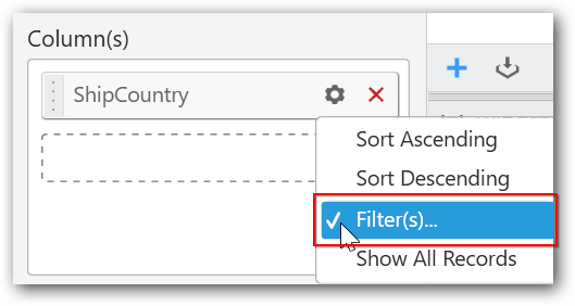
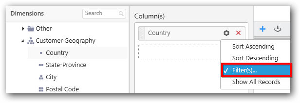
You can change the properties of the required field by using the Settings option.
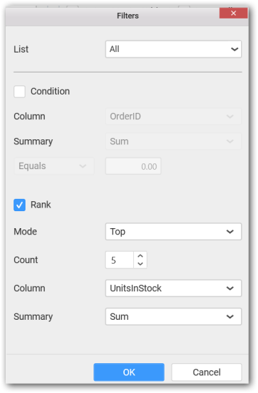
You can apply filters by selecting the filter option in the settings. This filter option is used to filter the strings like top 5 records and bottom 5 records.
NOTE
By default, the filter will be set for top 5 records.
The filters option will open.
Select the required Conditions and Rank, and then click OK.
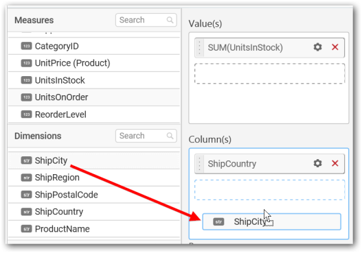
Similarly, you can add the Measures and Expression Columns into the Column field.
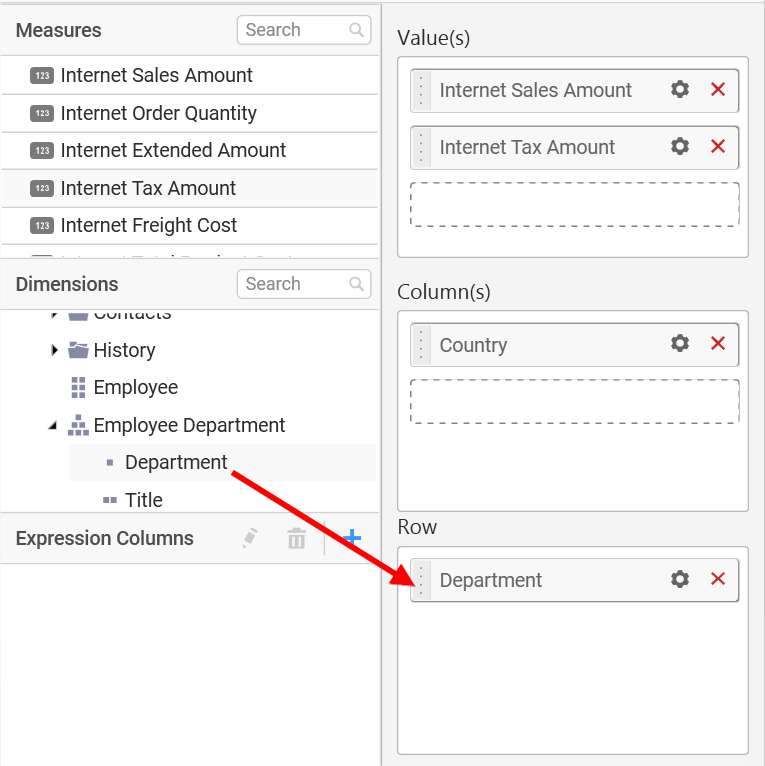
Adding row
You can drag and drop the Measure or Dimension into the Row field.
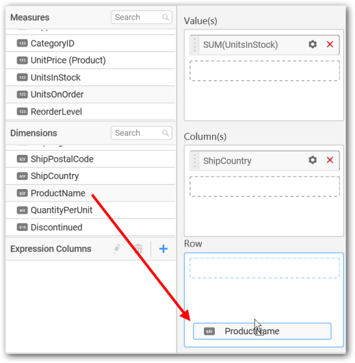
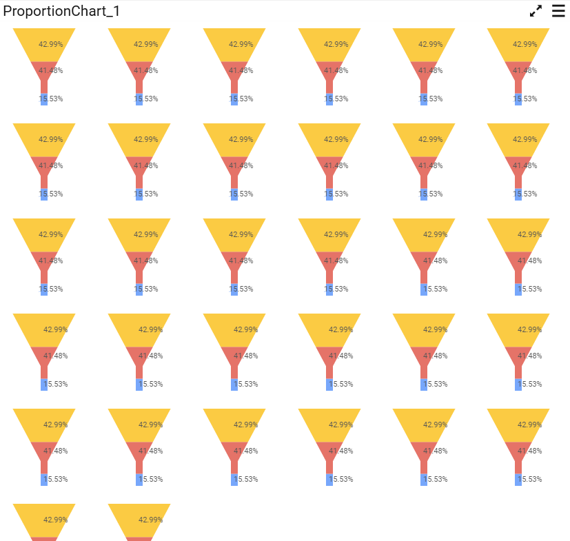
This will render the Funnel Chart in series.
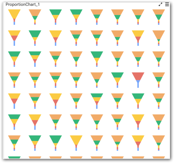
Scroll to see all charts.
How to configure the SSAS data to Funnel Chart
Funnel Chart needs a minimum of one value element and one column element to showcase. The measure or expression field that you want to analyze can be dropped into the Value(s) block. The dimension that you want to categorize the measure can be dropped into the Column block. To categorize the measure based on a series, drop the respective dimension into the Row block.
The following steps illustrate the configuration of SSAS data to Funnel chart.
Drag and drop the Funnel chart into the canvas and resize it to your required size.
Select the dropped widget and click Assign Data in the toolbar.
A data pane will be opened with available Measures and Dimensions.
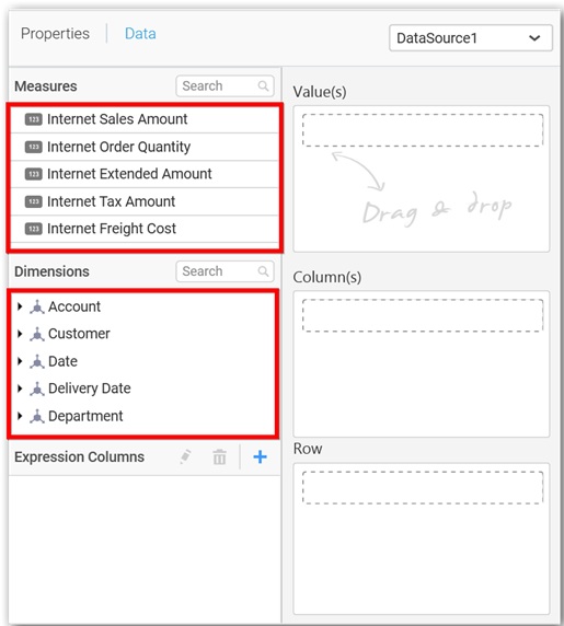
Assigning value(s)
Drag and drop a column under Measures category into Value(s).
You can also add more than one column to the Value(s).
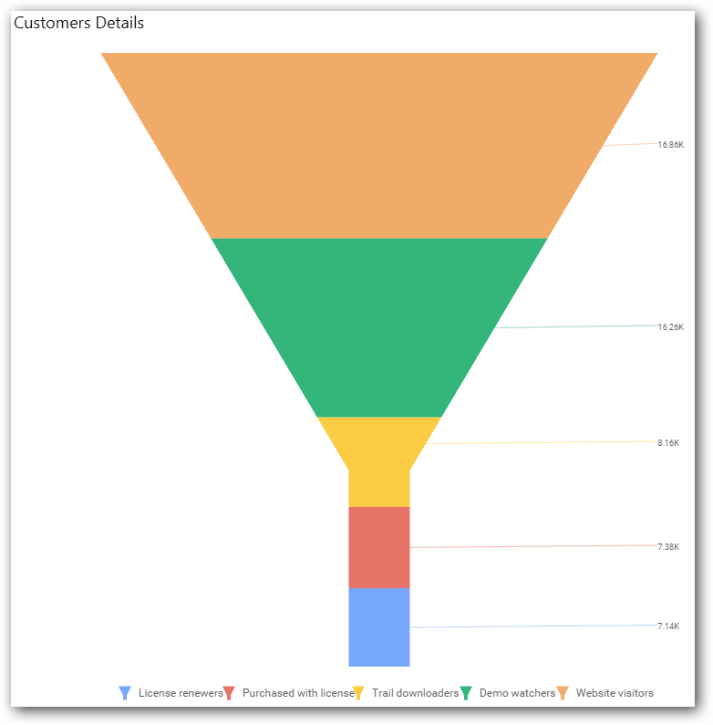
Now, the chart will be rendered as follows.
Define the filter criteria to match by choosing Edit in the Filter menu item.
The Measure Filter dialog will be shown, where you can choose the filter condition and apply the condition value.
Select Clear to clear the defined filter.
Select Format to define the display format to values in the column through the Measure Formatting window.
Choose the options that you need and click OK.
Now, the chart will be rendered as follows.
Assigning column(s)
Add a dimension level or hierarchy into Column(s) section by dragging it.
You may also add more than one column into Column(s) section. The following message will be prompted to enable drilling across the multilevels.
Select Yes to enable the drill option in the chart. Select No to replace the existing column with this one in the Column(s) section.
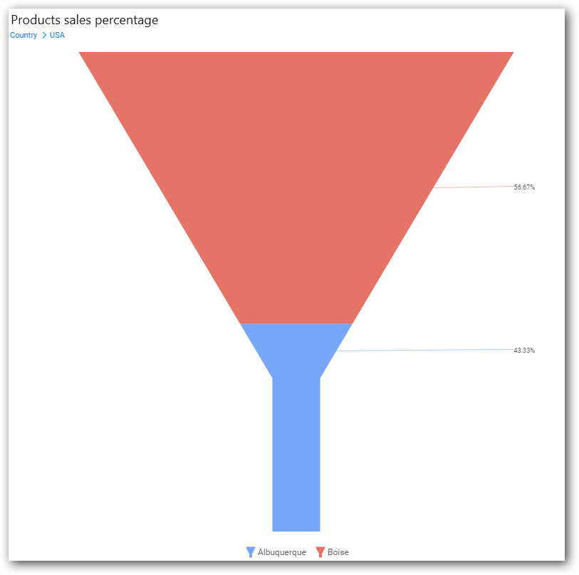
Click the respective data value marker in the chart to drill into its inner level.
The drilled view of the chart is as follows.
Define the filter criteria using the Filter(s)… menu item in the Settings drop-down menu.
Select Filter(s)… to launch the Filters window.
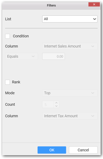
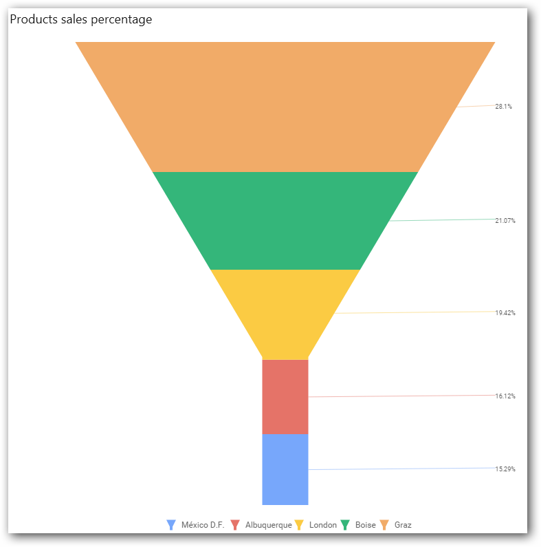
Define the filter condition and Rank and click OK.
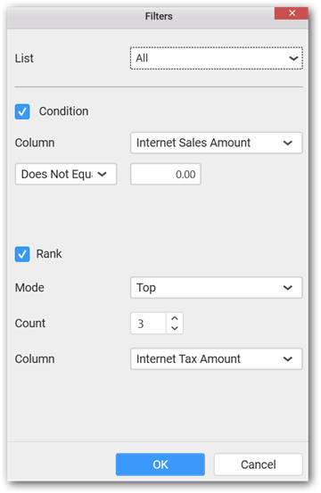
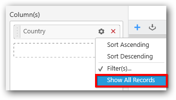
Now, the chart will be rendered as follows.
To show all records again, click Show All Records.
Assigning row
You can add a dimension level or hierarchy to the Row section for series rendering of the chart.
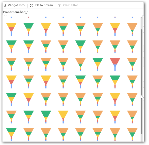
The chart will be rendered in series as shown in the image.
Scroll down to see all charts.
How to format a Funnel Chart
You can format a Funnel Chart for better illustration of the view by using the settings available in the Properties pane.
To configure data into the Funnel Chart, follow the steps:
-
Drag and drop the Funnel Chart into the canvas and resize it to your required size.
-
Configure data into the Funnel Chart.
-
Focus the Funnel Chart and click the Widget Settings icon.
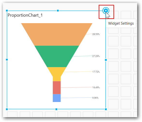
The property window will be opened as follows.
You can see the list of properties available for the widget with default value.
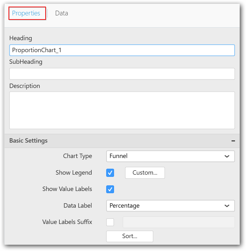
General settings
Header
Allows you to set a title for the Funnel Chart widget.
SubHeading
Allows you to set a subtitle for the Funnel Chart widget.
Description
Allows you to set a description for the Funnel Chart widget, whose visibility will be denoted by i icon, hovering which displays the description in tooltip.
Basic settings
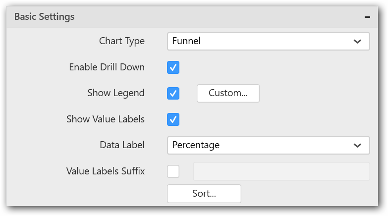
Chart type
Allows you switch the widget view from the current chart type to another chart type.
Enable drill down
Allows you add more than one dimension element to the Column block in the Data Pane of Widget View. It forms an hierarchy, and each of its level can be navigated by clicking the respective series drawn. In its disabled state, adding more than one element will replace the existing one.
Initial view
Drilled view
Show legend
Allows you toggle the visibility of legend in the chart and change the legend text position (selecting through combo box).
Enabling the Custom Legend Text option allows you define a custom text (through the text area) to display for each legend series (selecting through the combo box) in the chart.
Show value labels
Allows you toggle the visibility of value labels.
Data label
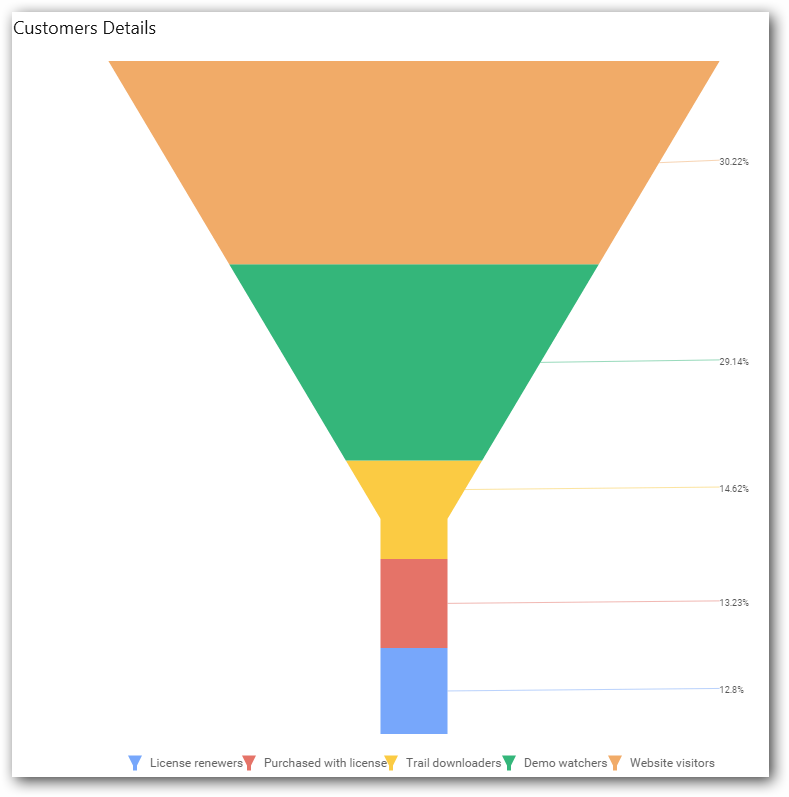
Allows you define the display format either as value or percentage.
Value
Percentage
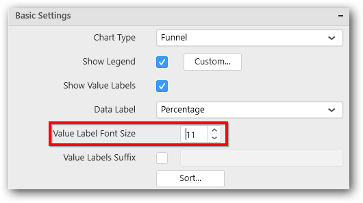
Value label font size
Allows you define the font size for the value labels to display the text. Text will collapse, if it exceeds the size of the bar. The default font size for the value label is 9 pixels.
Value labels suffix
Allows you to set suffix to the value labels.
Sort order
Allows you define the sort order for each added measure column.
Filter settings
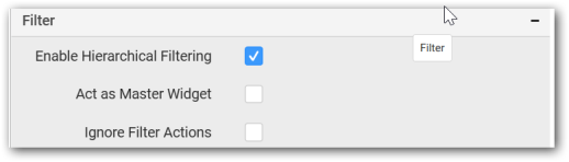
Hierarchical filtering
Allows you define the behavior of top n filtering which can be flat or hierarchical.
Act as master widget
Allows you define the Funnel Chart widget as a master widget such that its filter action can be made to listen by other widgets in the dashboard.
Ignore filter actions
Allows you define the Funnel Chart widget to ignore responding to the filter actions applied on other widgets in the dashboard.
Link settings
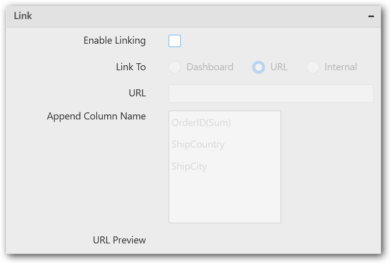
Configure the linking to URL or dashboard with the widget through its settings. For more details, refer to Linking.
Container appearance
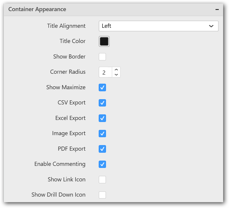
Title alignment
Allows you handle the alignment of widget title to either left, center, or right.
Title color
Allows you apply the text color to the widget title.
Show border
Allows you toggle the visibility of border surrounding the widget.
Corner radius
Allows you to apply the specified radius to widget corners. Value can be between 0 and 10.
Show maximize
Allows you enable or disable the maximized mode of the Funnel Chart widget. The visibility of the maximize icon in the widget header will be defined based on this setting in viewer.
CSV export
Allows you enable or disable the CSV export option for the Funnel Chart widget. Enabling this allows you to export the summarized data of the widget view to CSV format in viewer.
Excel export
Allows you enable or disable the Excel export option for the Funnel Chart widget. Enabling this allows you to export the summarized data of the widget view to XLSX format in viewer.
Image export
Allows you enable or disable the image export option for the Funnel Chart widget. Enabling this allows you to export the view of the widget to image format (*.JPG) in viewer.
Enable comment
Allows you enable or disable the comment for dashboard widget. For more details refer to here
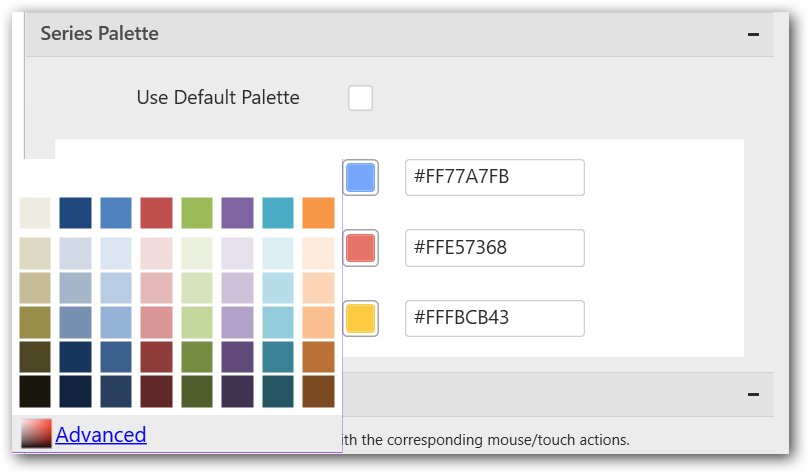
Series palette
Allows you customize the chart series color through the Series Palette section.
Use Default Palette
Allows you toggle the series color between the default palette and custom palette. By default, the property is toggled on and the default palette will be applied to proportion series segments.
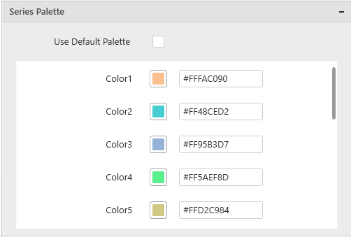
By toggle off the Use Default Palette, you can customize the proportion series segments’ colors. This section shows a palette of colors. By clicking the colored square, the color picker will be opened. You can choose a color. And, you can change the series color by changing the corresponding hexadecimal value in the right side.