- How to configure flat table data to Line Chart?
- How to configure the SSAS data to Line Chart?
- How to format Line Chart?
Contact Support
Line Chart
Line Chart allows you to showcase trends for analysis over a time period with data points connecting using straight lines.
How to configure flat table data to Line Chart?
Line Chart need a minimum of 1 value element and 1 column element to showcase. The measure or expression field that you would like to analyze can be dropped into Value(s) block. The dimension that you would like to categorize the measure, can be dropped onto Column block. If you would like to categorize based on a series, then the respective dimension can be dropped onto Row block in addition.
Follow the steps to configure data to Line chart
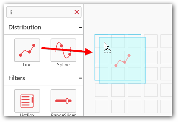
Drag and drop the control to canvas and resize it to your required size.
Connect to the data source.
Focus on the line widget and click on Assign Data.
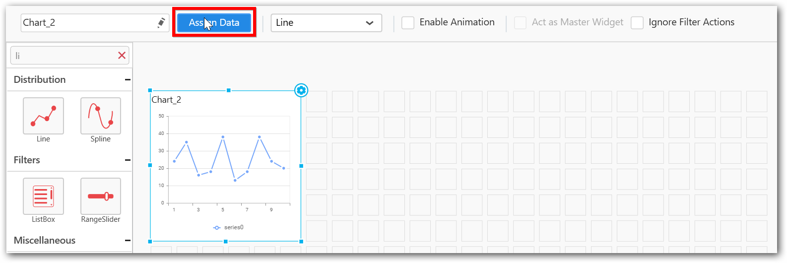
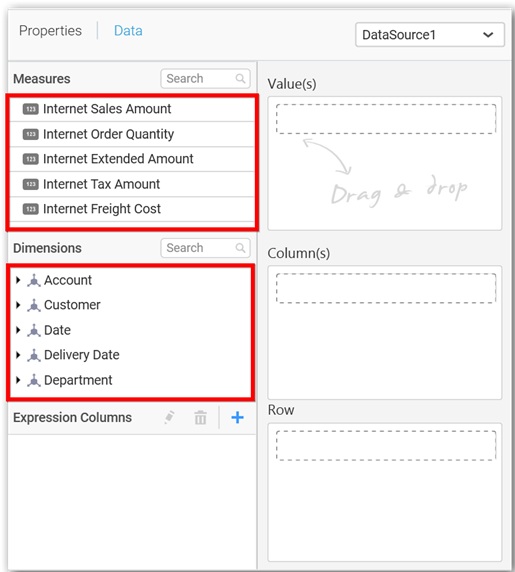
The data pane will be opened with available Measures and Dimensions from the connected data source.
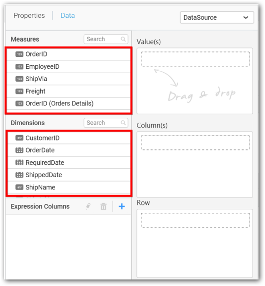
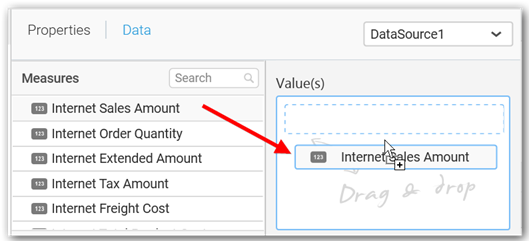
Assigning Value(s)
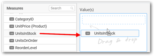
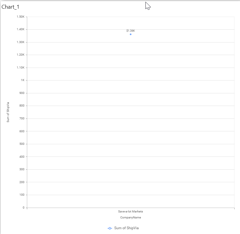
Drag and drop the Measure into Value.
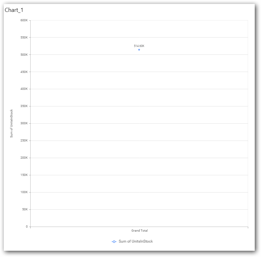
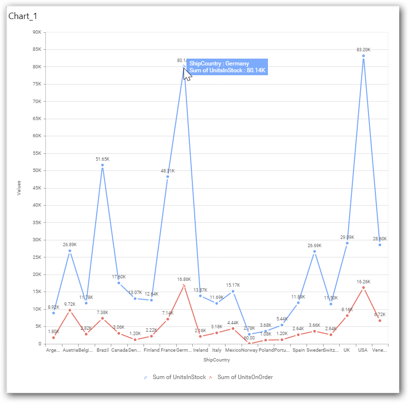
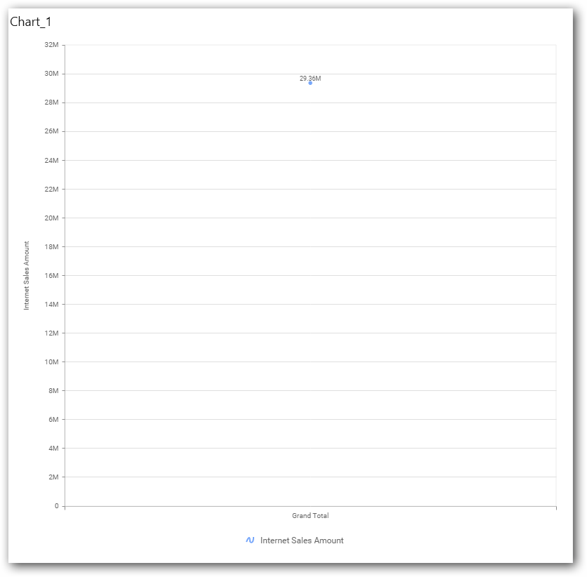
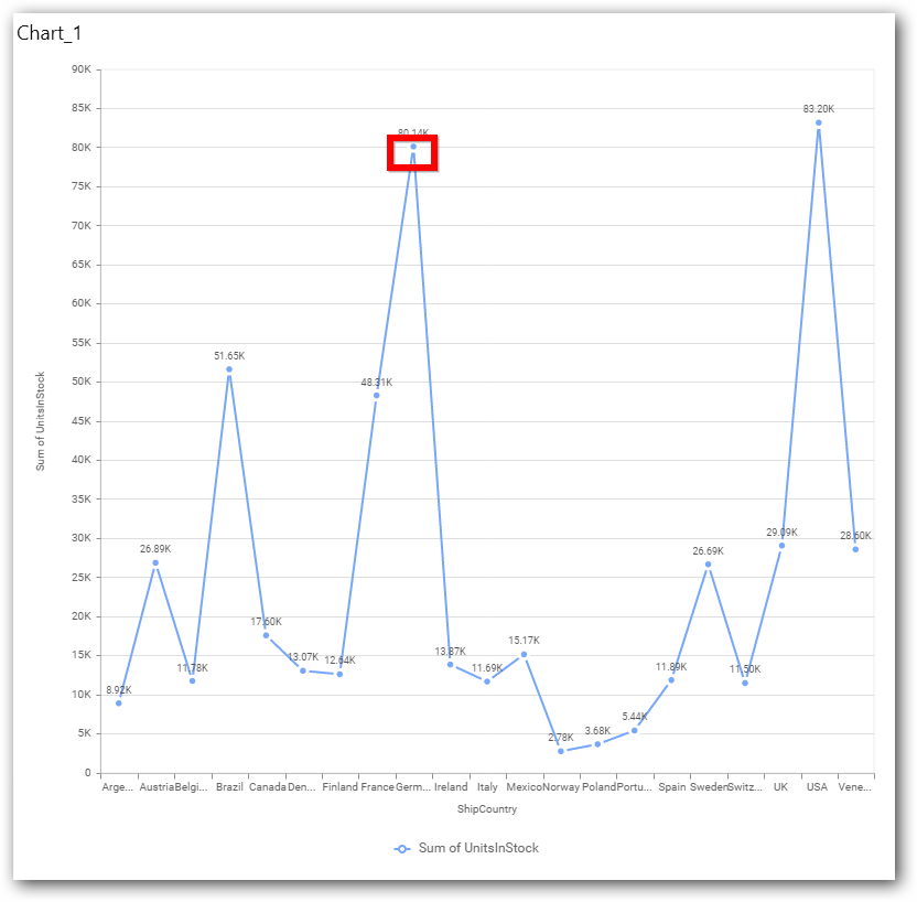
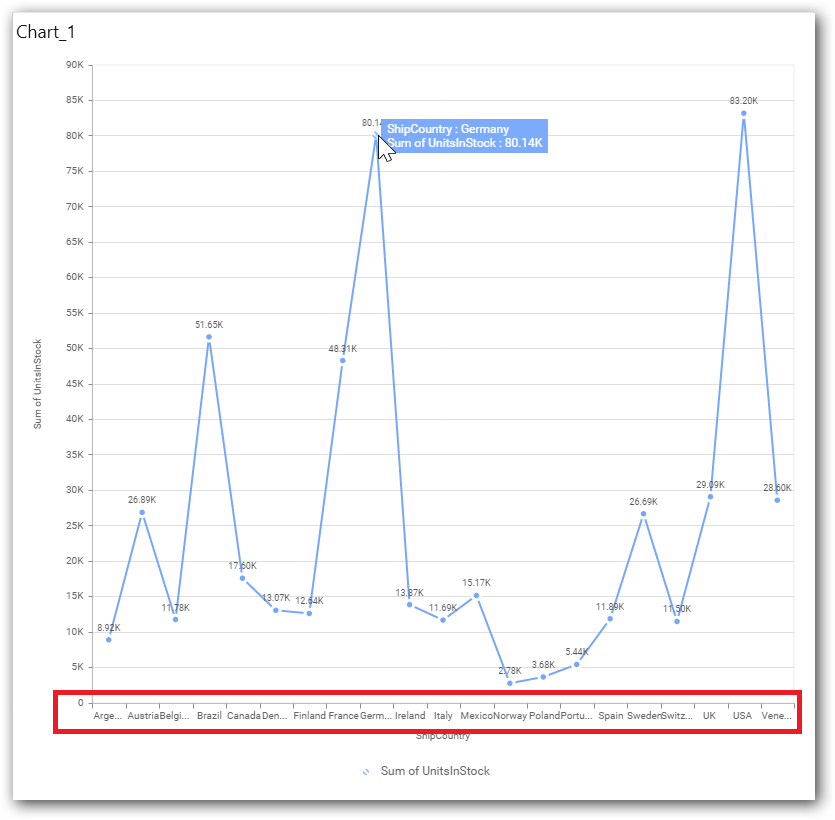
Now the chart will be rendered like this.
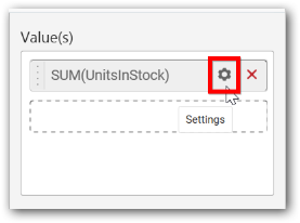
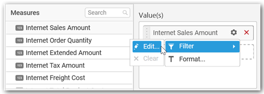
You can change the summary type of the value by clicking on Settings option.
Select the required summary type from list.
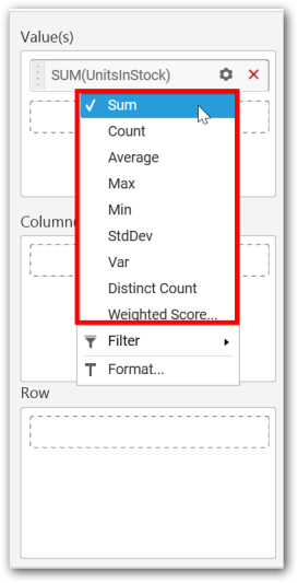
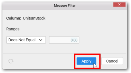
You can select what data to be displayed by choosing filter option.
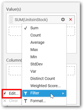
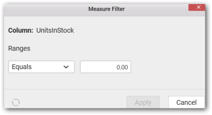
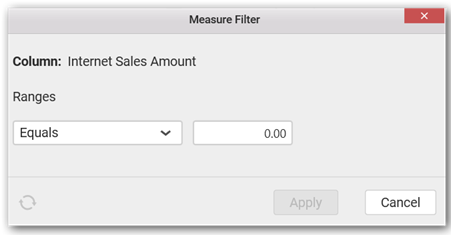
The Measure Filter option will be shown and you can choose the filter condition and apply the condition value.
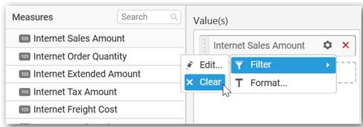
You can Clear the filter.
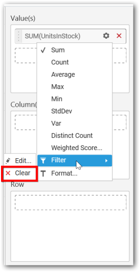
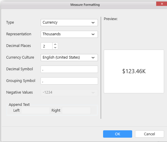
You can Format the value.
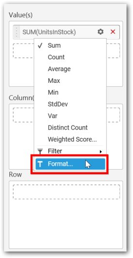
The format options will be shown.
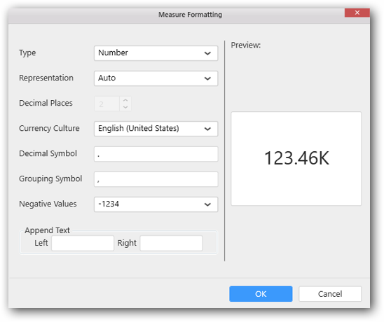
Choose the options you need and click OK.
Now the Chart will be rendered like this.
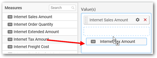
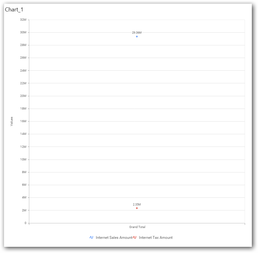
You can add more number of values by drag and drop the Measures into Value field.
You can also add Dimensions and Columns to Value(s).
Assigning Column(s)
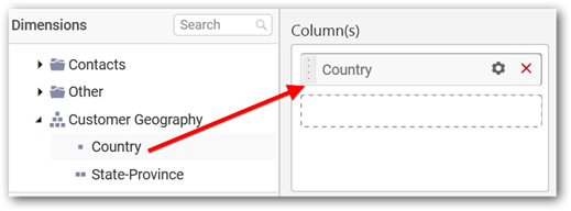
You can add the Dimension into Column(s) field by drag and drop.
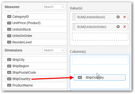

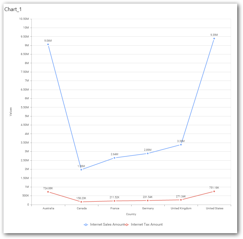
You have option to add more than one Column Value
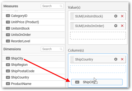
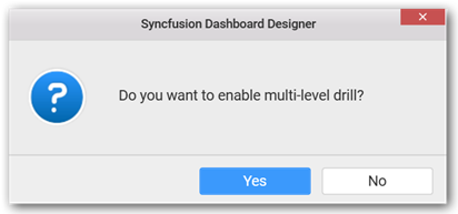
The following alert message will be shown.
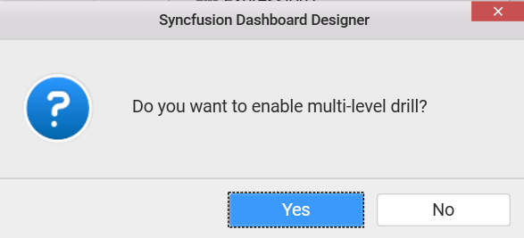
- If you choose
YesDrill down option will be enabled.
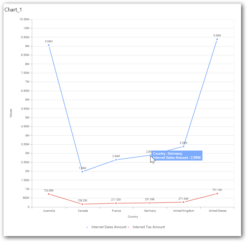
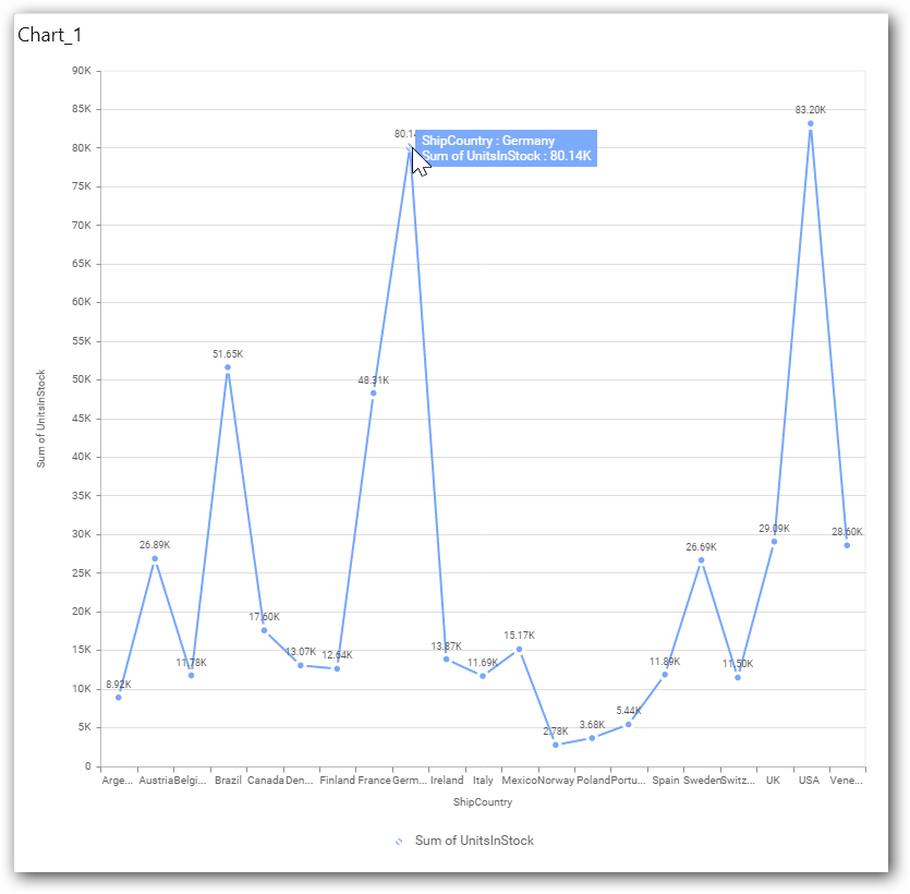
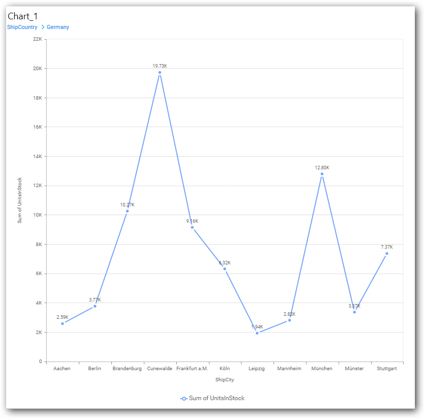
You can drill down the chart by clicking on the chart.
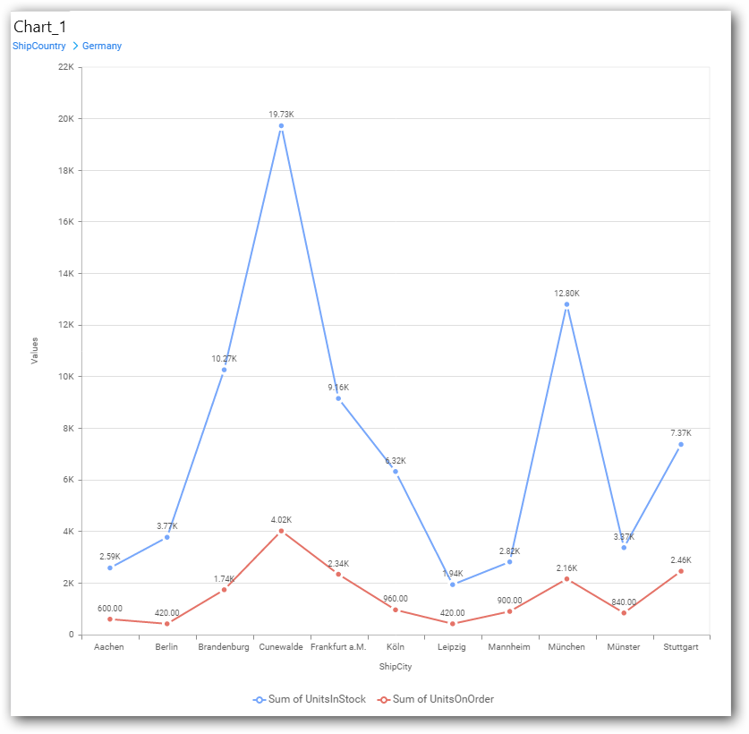
The drilled view of the chart is follows.
- If you click
Nothe newDimensionvalue will replace old value.
You can also add Measures and Expression columns into Column(s) field.
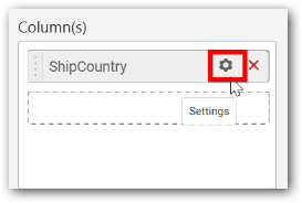
You have options to change the Settings.
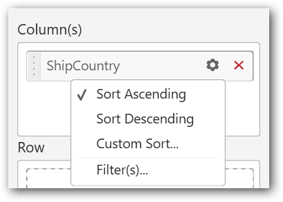
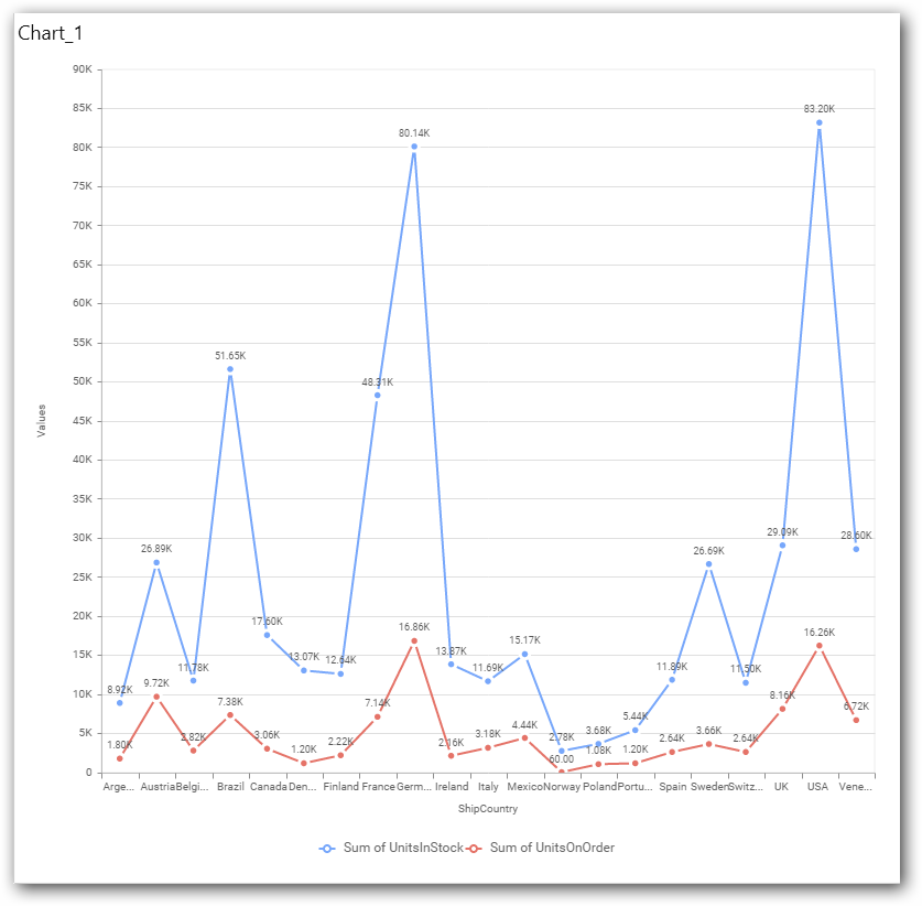
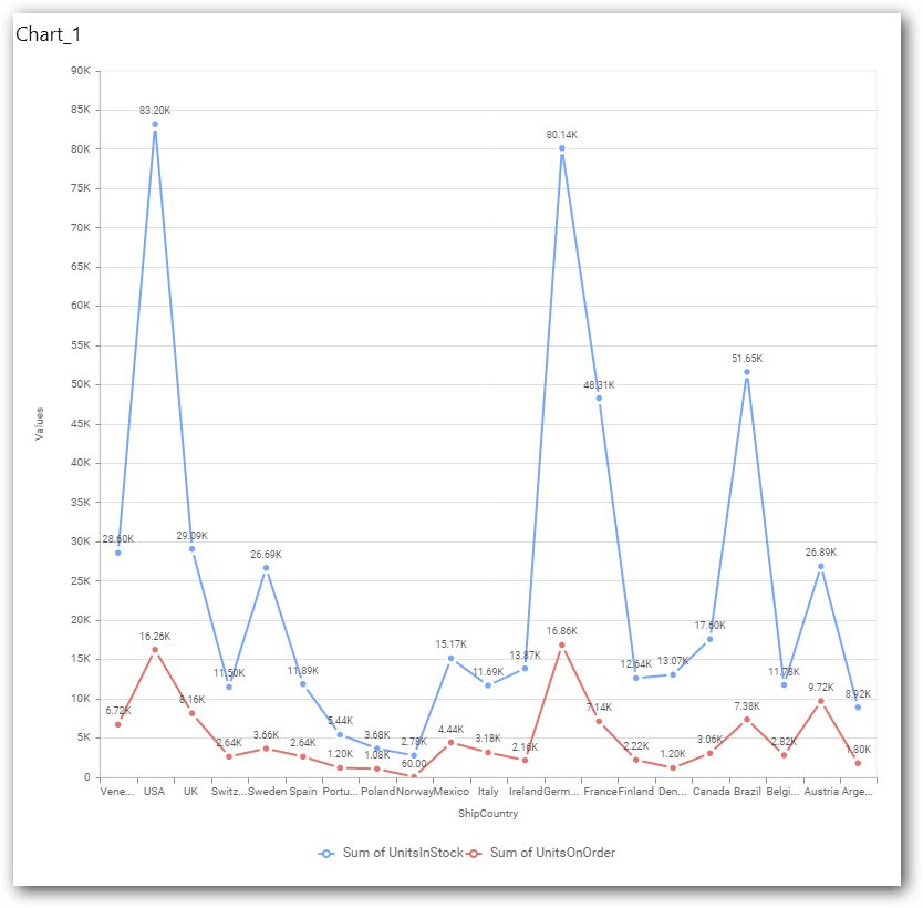
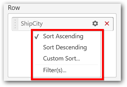
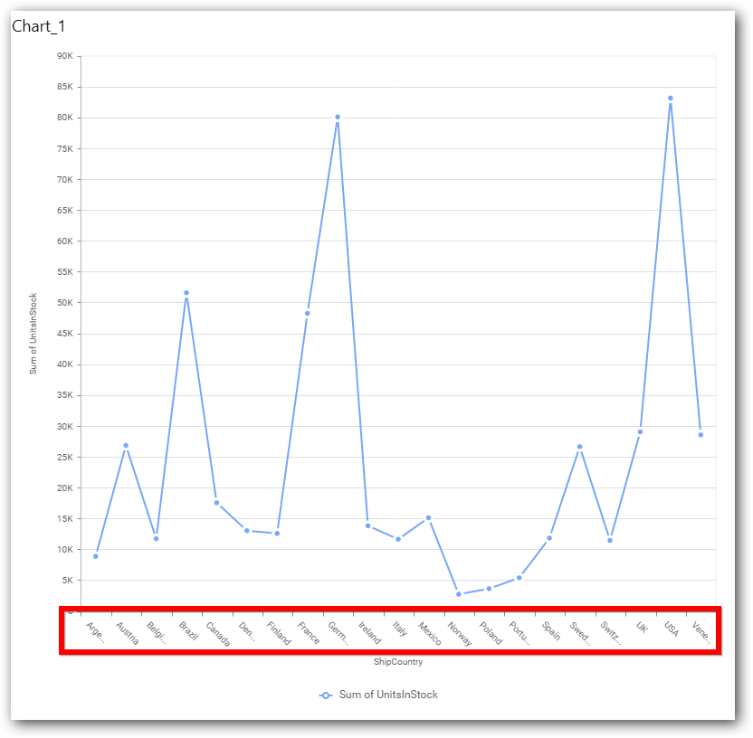
You can sort the chart either in Ascending or Descending series.
Ascending Order:
Descending order:
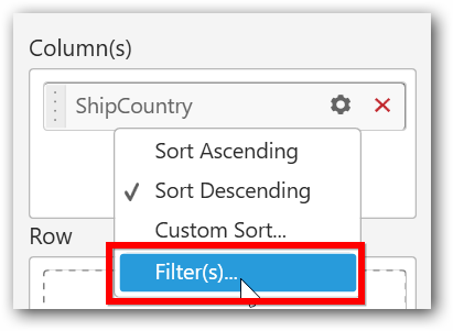
You can apply a Filter.
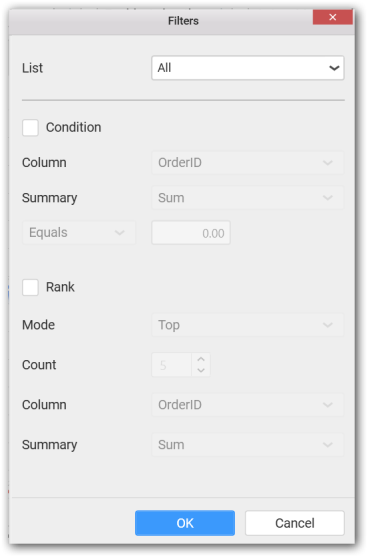
Select the Conditions and Rank you need.
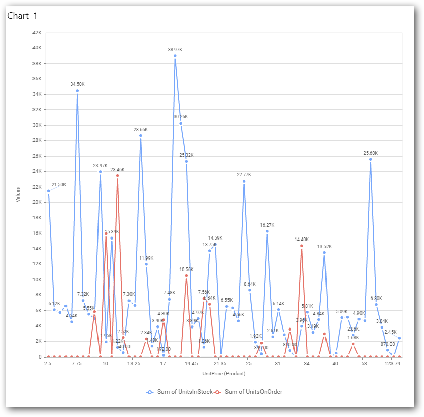
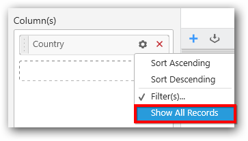
Now the chart will be rendered like this.
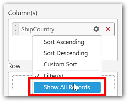
To show all records again click on Show All Records.
You can add the Measures into Column(s).
The following alert message will shown.
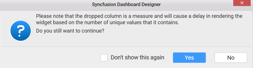
To continue click Yes, otherwise click No.
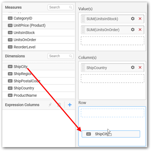
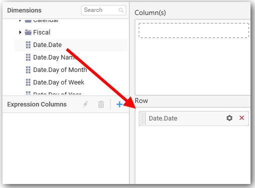
Assigning Row
You can add Dimension into the Row field for series chart.
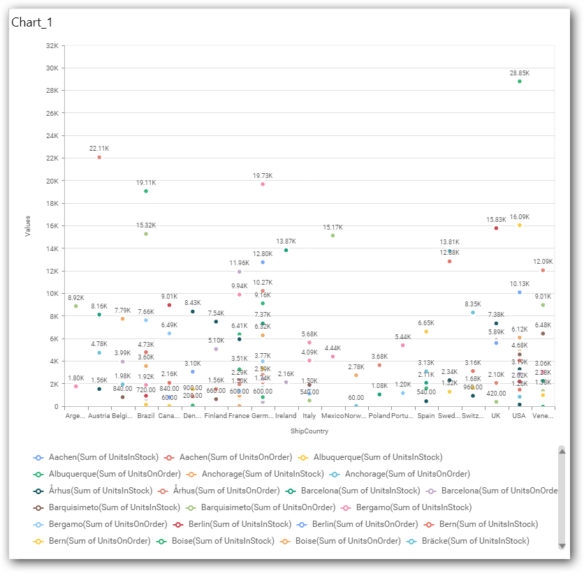
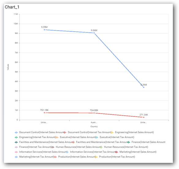
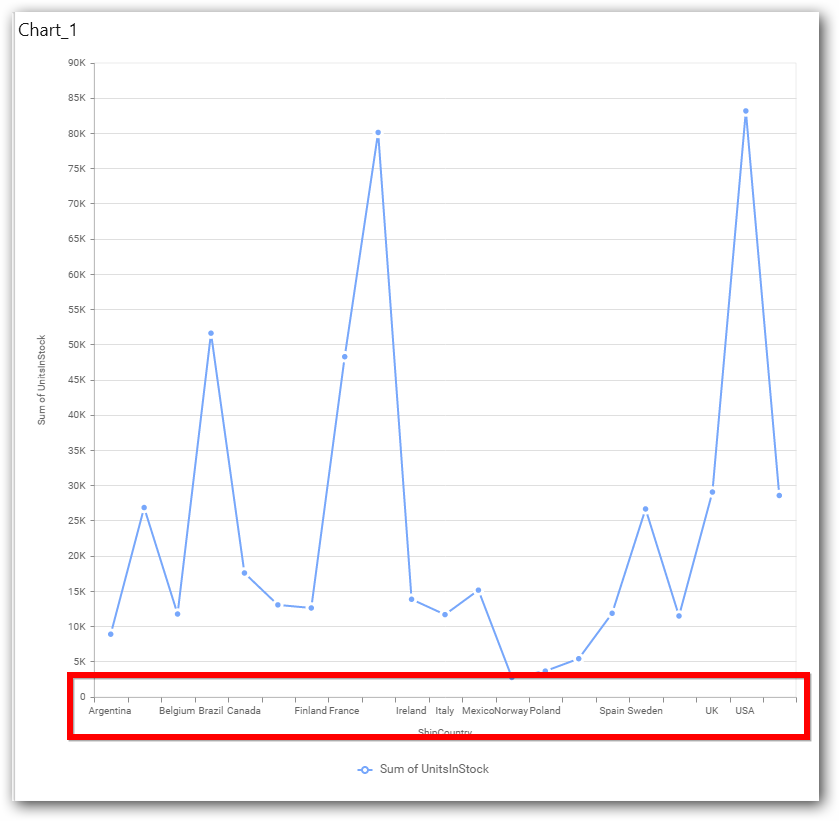
The chart will be rendered in series as shown in the image.
You have settings options similar to Column(s).
How to configure the SSAS data to Line Chart?
Line Chart need a minimum of 1 value element and 1 column element to showcase. The measure or expression field that you would like to analyze can be dropped into Value(s) block. The dimension that you would like to categorize the measure, can be dropped onto Column block. If you would like to categorize based on a series, then the respective dimension can be dropped onto Row block in addition.
Following steps illustrates configuration of SSAS data to Line chart.
Drag and drop the Line chart to canvas and resize it to your required size.
Select the dropped widget using mouse.
Click the Assign Data button in the toolbar.
A Data pane will be opened with available Measures and Dimensions
Assigning Value(s)
Drag and drop a column under Measures category into Value(s) section.
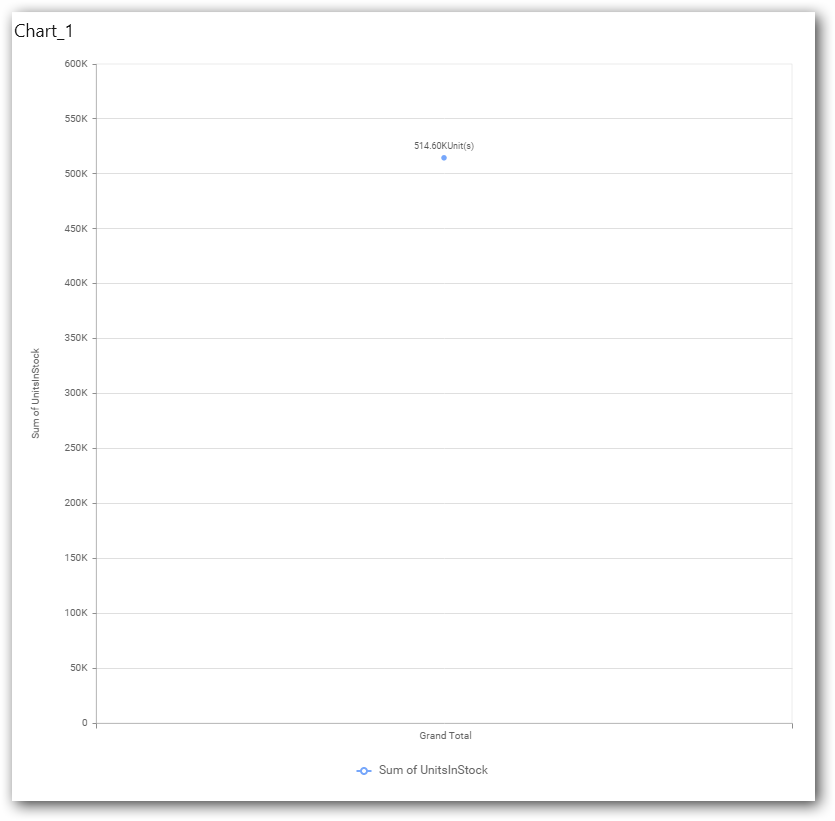
Now the chart will be rendered like this.
Define the filter criteria to match through choosing Edit option in Filter menu item.
The Measure filter dialog will be shown where you can choose the filter condition and apply the condition value.
Select Clear option to clear the defined filter.
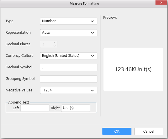
Select Format option to define the display format to the values in the column through Measure Formatting window.
Choose the options you need and click OK.
Now the Chart will be rendered like this.
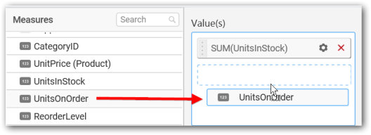
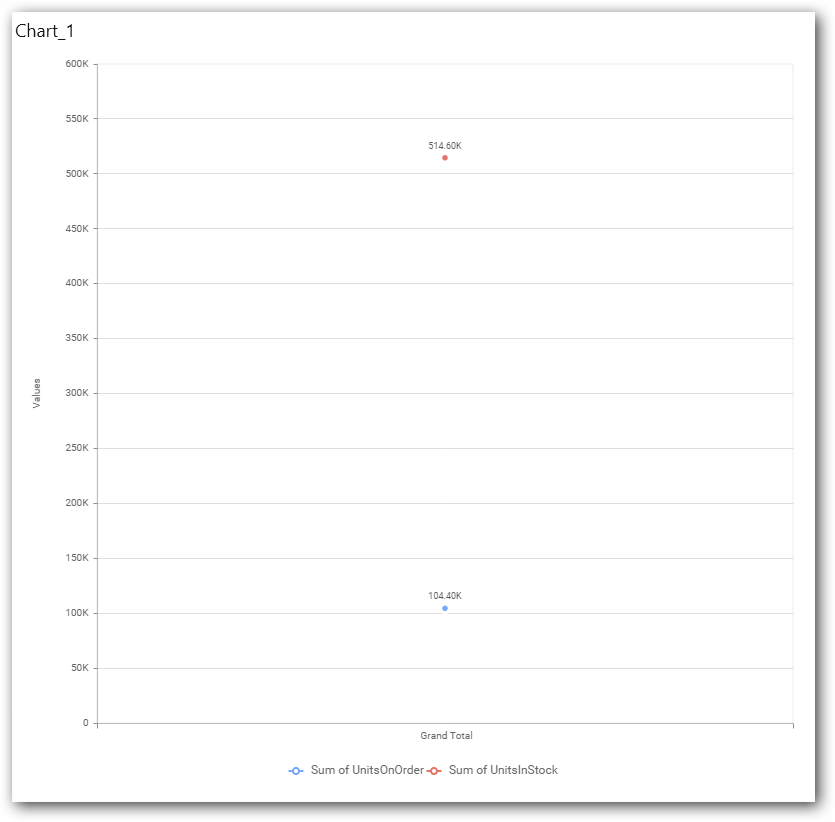
You can add more number values by drag drop the Measures into Value(s) field.
Assigning Column(s)
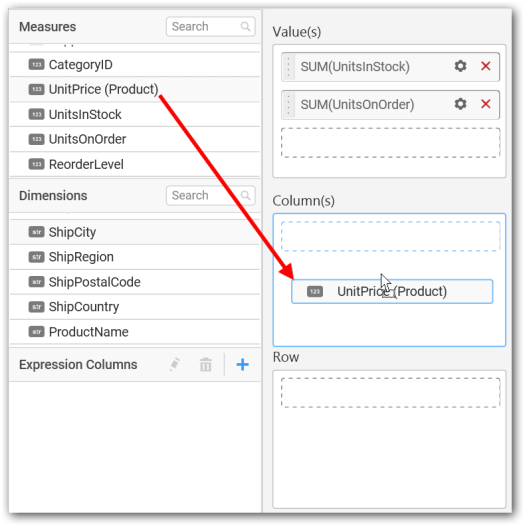
Add a dimension level or hierarchy into Column(s) section through drag and drop.
You may also add more than one column into Column(s) section. In that case, you will be prompted with a message like below, asking for confirmation to enable drilling across the levels.
Select Yes to enable drill option in chart. Select No to replace the existing column with this one in the Column(s) section.
Click the respective data value marker in chart to drill into its inner level.
The drilled view of the chart is follows.
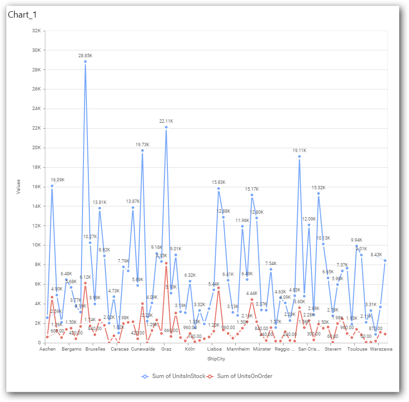
Through the breadcrumb at top, you may navigate to the outer or middle levels from your current inner level
Define filter criteria through Filter(s)… menu item in the Settings drop down menu.
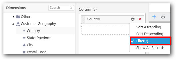
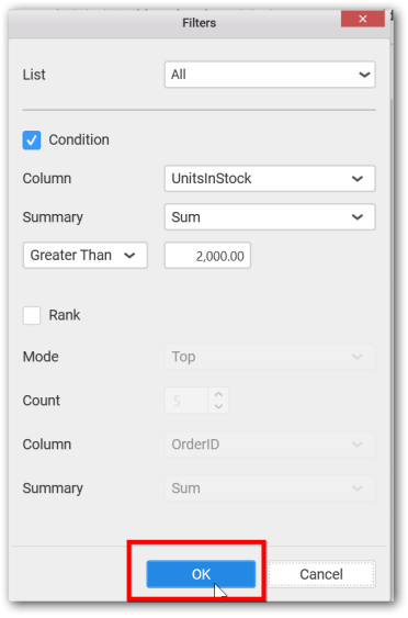
Select Filter(s)… to launch the Filters window.
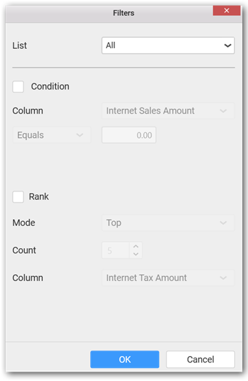
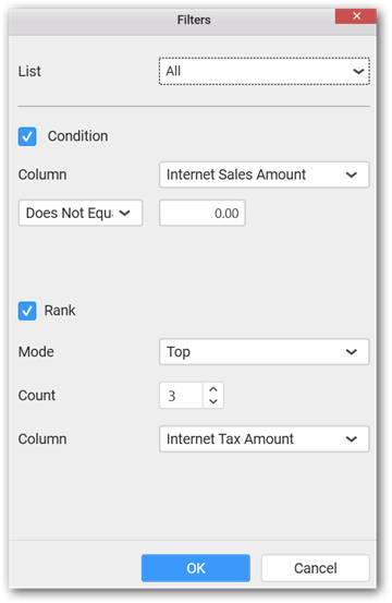
Define the filter Condition and Rank and Click OK.
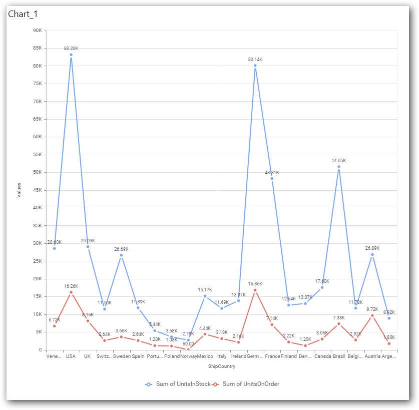
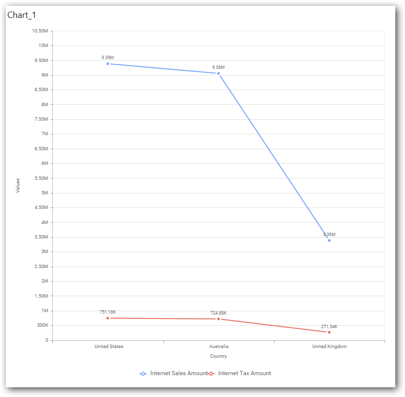
Now the chart will be rendered like this
To show all records again click on Show All Records.
Assigning Row
You can add a dimension level or hierarchy to Row section for series rendering of chart
The chart will be rendered in series as shown in the image below.
How to format Line Chart?
You can format the Line chart for better illustration of the view that you require, through the settings available in Properties pane.
To configure data into line chart follow the steps
-
Drag and drop the line chart into canvas and resize it to your required size.
-
Configure the data into line chart.
-
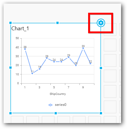
Focus on the line chart and Click on Widget Settings.
The property window will be opened
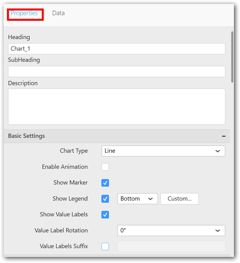
General Settings
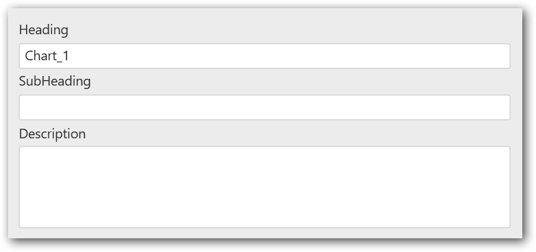
Header
This allows you to set title for this line chart widget.
SubHeading
This allows you to set sub-title for this line chart widget.
Description
This allows you to set description for this line chart widget, whose visibility will be denoted by i icon, hovering which will display this description in tooltip.
Basic Settings
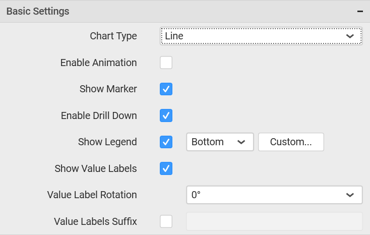
Chart Type
This allows you to switch the widget view from current chart type to another chart type. To selecting chart type through combo box.
Enable Animation
This allow to enable option the rendering of series in animated mode.
Show Data Marker
This allows you to toggle the visibility of marker from label to adorn each data point in chart series.
Enable Drill Down
This allows you to add more than one dimension element to the Column block in Data Pane of Widget View such that, those form an hierarchy and each of its level can be navigated through clicking the respective series drawn. In its disabled state, trying to add more than one element will replace the existing one.
Initial View
Drilled View
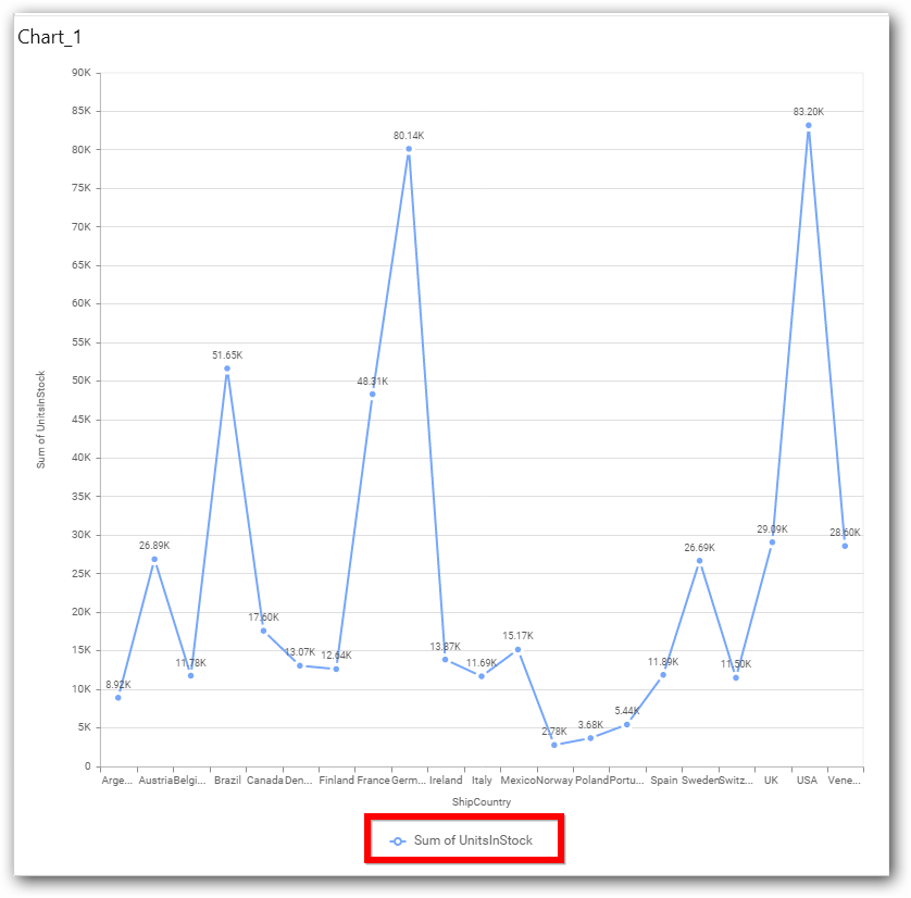
Show Legend
This allows you to toggle the visibility of legend in chart and also changing the legend text position (selecting through combo box).
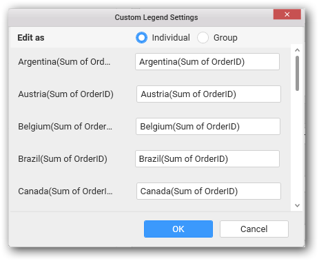
Enabling this option of Custom Legend Text will allow you to define a custom text (through the text area) to display for each legend series (selecting through the combo box) in chart.
Custom Legend Settings
You can customize the legend text through the Custom Legend Settings dialog. This dialog will show the legend text list as labels at left and corresponding text area at right to add the formatted text to display instead. When a column is added into Row section, this dialog will show two options Individual and Group at top in addition, to toggle between.
Individual
Selecting Individual option will allow you to define a custom text (through the text area) to display for each legend series in chart with the default format:
{{ : Row }} ({{ : Value }})
Where, Row represents the value of dimension column added to Row section and Value represents the value of the measure column added to Value section.
Group
Enabling Group option will allow you to set the display format and define a custom text (through the text area) to display for each legend series based on the specified format.
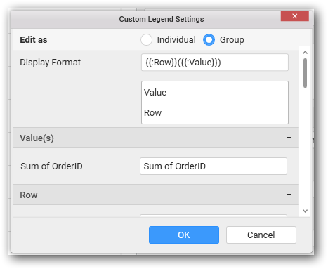
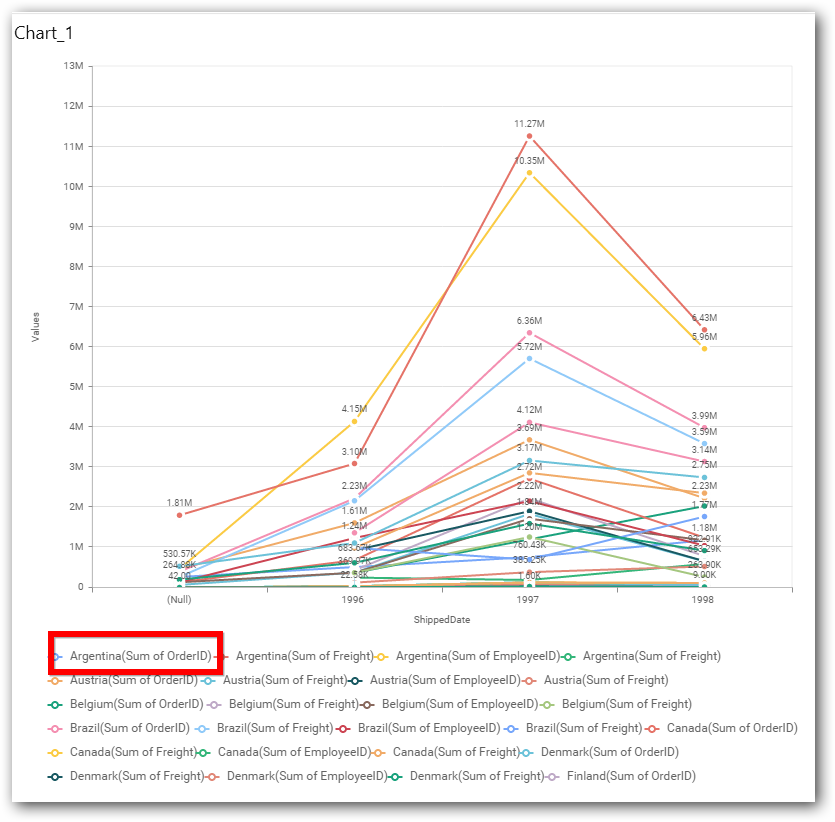
For example, If Display Format is {{ : Row }} ({{ : Value }}), then Legend series will display like Argentina (Sum of Order ID)
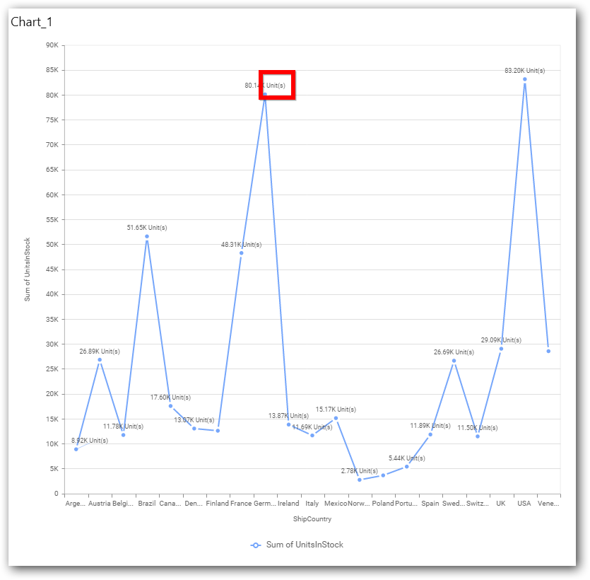
Show Value Labels
This allows you to toggle the visibility of value labels.
Value Label Rotation
This allows you to define the rotation angle for the value labels to display.
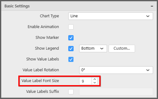
Value Label Font Size
This allows you to define the font size for the value labels to display. Text will get collapsed,
if it exceeds the size of the bar. Default font size for the Value label is 9 pixels.
Value Labels Suffix
This allows you to set suffix to the value labels.
Filter Settings
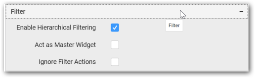
Hierarchical Filtering
This allows you to define the behavior of top n filtering which can be flat or hierarchical, in this line chart widget.
Act as Master Widget
This allows you to define this line chart widget as a master widget such that its filter action can be made to listen by other widgets in the dashboard.
Ignore Filter Actions
This allows you to define this line chart widget to ignore responding to the filter actions applied on other widgets in dashboard.
Link Settings
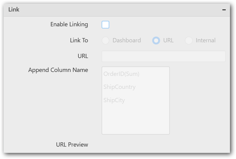
To configure the linking to URL or dashboard with the widget through its settings. For more details, refer Linking.
Container Settings
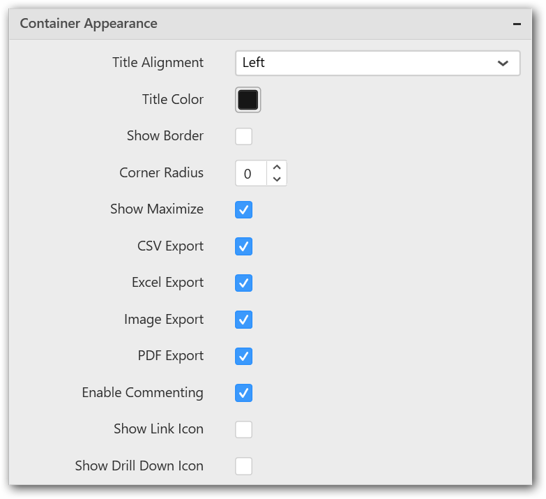
Title Alignment
This allows you to handle the alignment of widget title to either left, center or right.
Title Color
This allows you to apply text color to the widget title.
Show Border
This allows you to toggle the visibility of border surrounding the widget.
Corner Radius
This allows you to apply the specified radius to the widget corners. Value can be between 0 and 10.
Show Maximize
This allows you to enable/disable the maximized mode of this line chart widget. The visibility of the maximize icon in widget header will be defined based on this setting in viewer.
CSV Export
This allows you to enable/disable the CSV export option for this line chart widget. Enabling this allows you to export the summarized data of the widget view to CSV format in viewer.
Excel Export
This allows you to enable/disable the Excel export option for this line chart widget. Enabling this allows you to export the summarized data of the widget view to XLSX format in viewer.
Image Export
This allows you to enable/disable the image export option for this line chart widget. Enabling this allows you to export the view of the widget to image format (*.JPG) in viewer.
Enable Comment
This allows you to enable/disable comment for dashboard widget. For more details refer here
Axis Settings
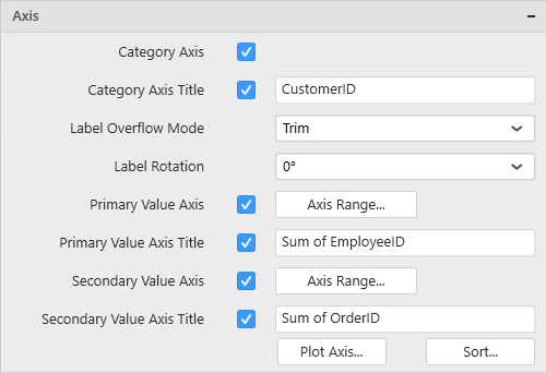
This section allows you to customize the axis settings in chart.
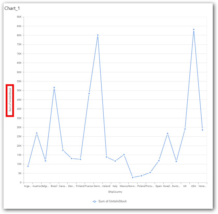
Category Axis
This allows to enable/edit the option of Category Axis. It will reflect in chart area x-axis name.
Category Axis Title
This allows you to toggle the visibility of Category axis title.
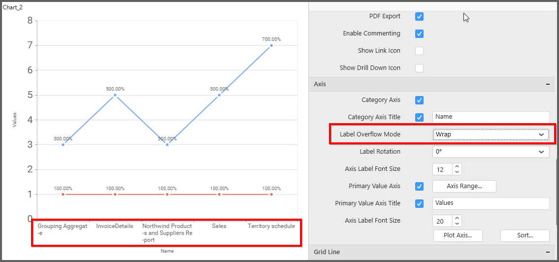
Label overflow mode
This allows you to handle the display mode of the overlapping labels.
Trim
This option trims the end of overlapping label in the axis.
Hide
This option hides the overlapping label in the axis.
Wrap
This option wraps the lengthy label text in the axis.
Label Rotation
This allows you to define the rotation angle for the category axis labels to display.
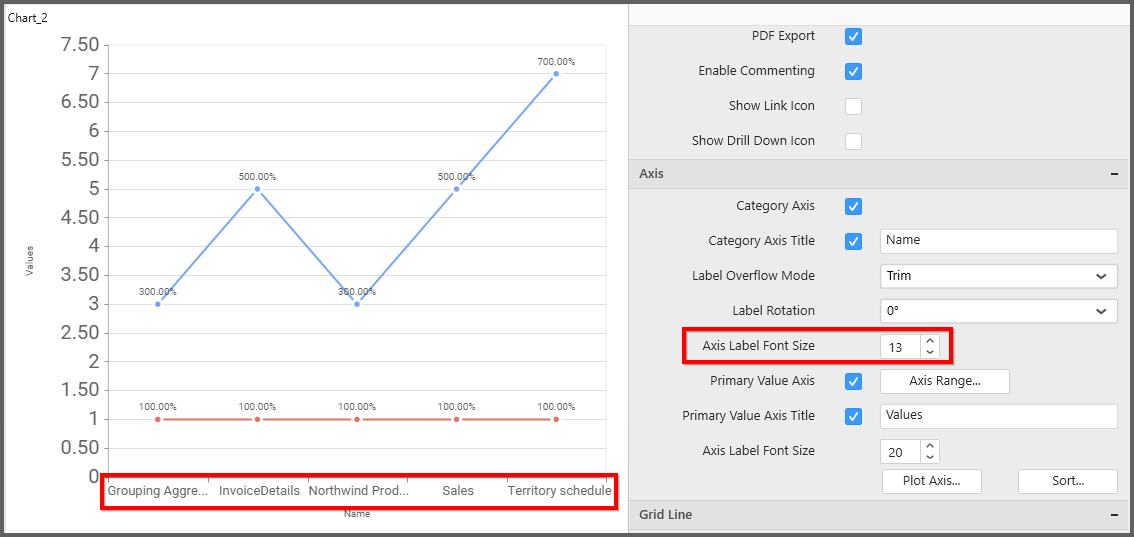
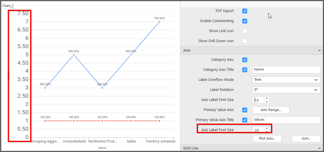
Axis Label Size
This allows you to increase or decrease the font size of the category axis label. Default font size for the category axis label was 10 pixels.
Primary Value Axis
This allows you to enable or edit the option of Primary Value Axis. It will reflect in chart area y-axis name.
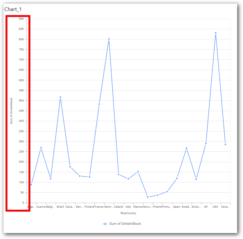
Primary Value Axis Title
This allows you to toggle the visibility of primary value axis title.
Axis Label Size
This allows you to increase or decrease the font size of the primary axis label. Default font size for the primary axis label was 10 pixels.
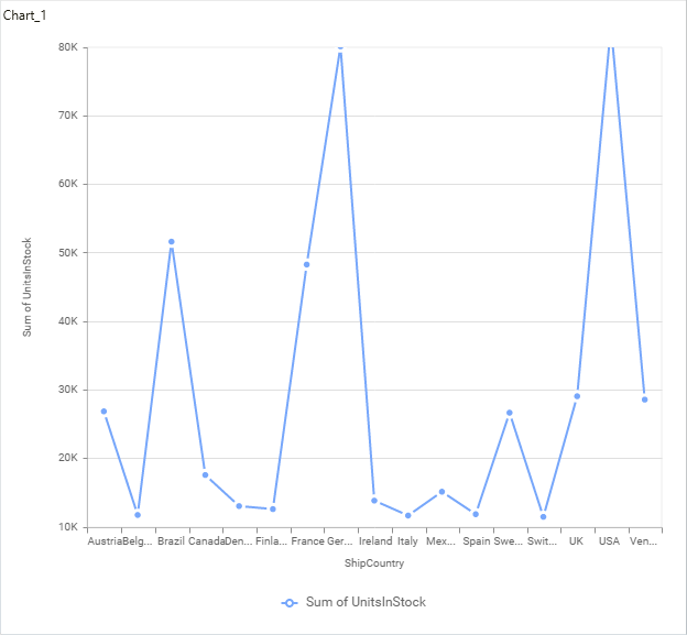
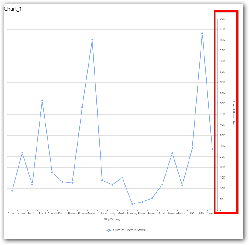
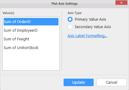
Primary Value Axis Range
This allows you to set user-defined range with valid interval for primary value axis. The axis range can be set from Axis Range Settings dialog and this can be opened on clicking the Axis Range button in primary axis property pane.
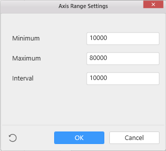
Axis Range Settings
You can customize the axis range values through Axis Range Settings dialog. This dialog will show the options to set minimum range, maximum range and interval values.
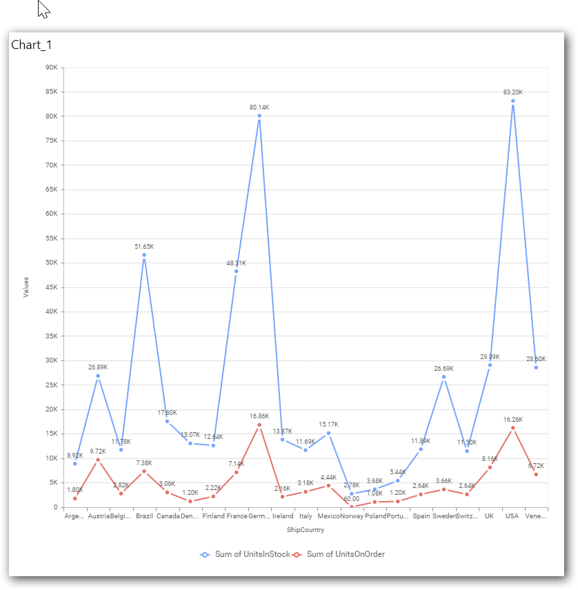
Below Chart demonstrate the Axis Range support, with the above shown min, max and interval values.
Secondary Value Axis
This allows to enable/edit the option of Secondary Value Axis. It will reflected in chart area secondary y-axis name.
Secondary Value Axis Title
This allows you to toggle the visibility of secondary value axis title.
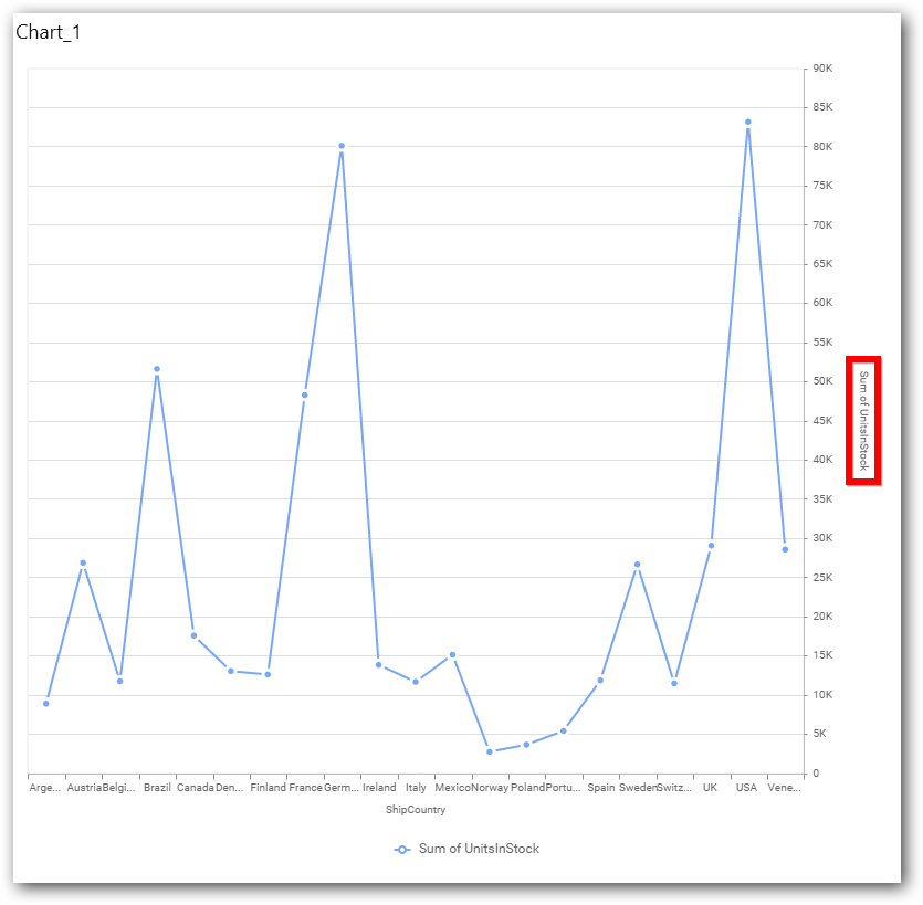
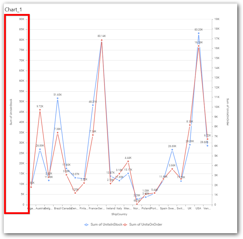
Secondary Value Axis Range
This allows you to set user-defined range with valid interval for secondary value axis. The axis range can be set from Axis Range Settings dialog and this can be opened on clicking Axis Range button in secondary axis property pane.

Below Chart demonstrate the Axis Range support, with the above shown min, max and interval values.
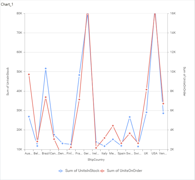
Plot Axis Settings
This allows you to define which measure column need to be plotted against which value axis (primary or secondary).
Primary Value Axis
Secondary Value Axis
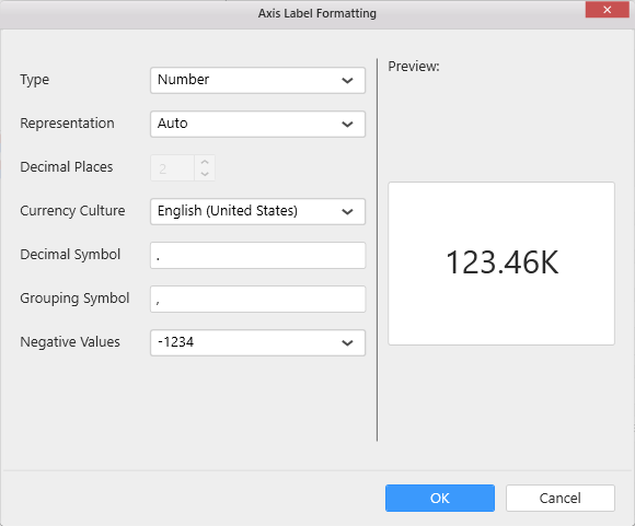
Axis Format Settings
This allows you to handle different formatting options like display type, denominations, decimal places, currency culture and negative value display format to the value axis labels. Click on Axis Label Formatting button in Plot Axis Settings window will launch the following editor to configure settings.
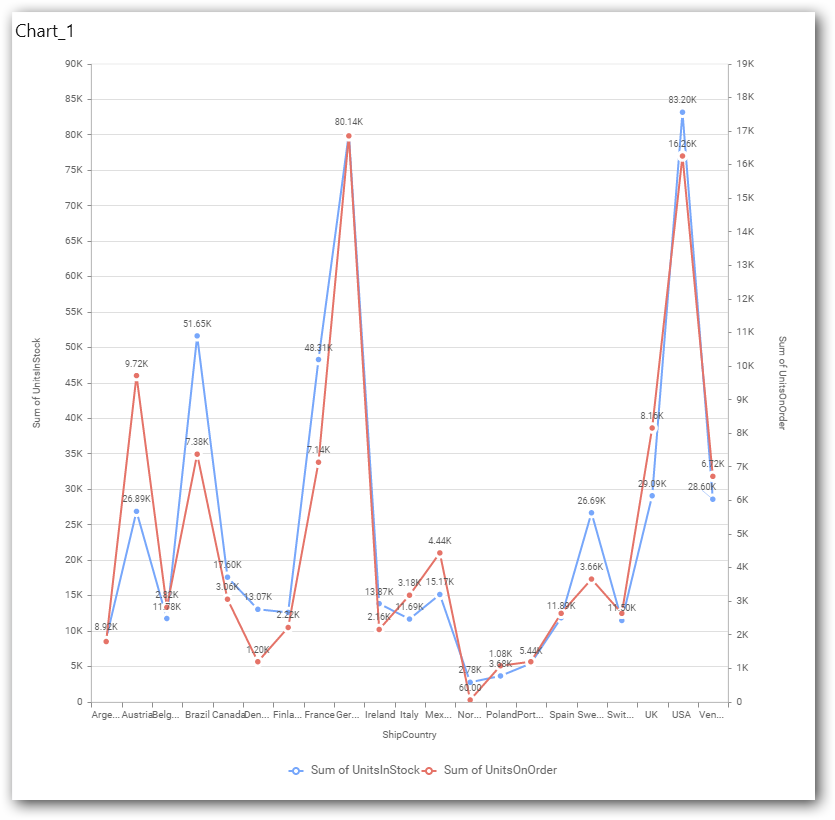
Sort Order
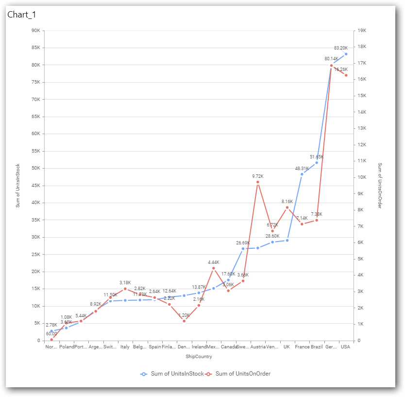
This allows you to define the sorting of chart based on any of the measures that you dropped and its order through this option. Following screenshot illustrates the Ascending sort order.
Grid Line Settings
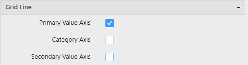
To define the visibility of Category axis lines, Primary Value axis through the respective options. If Secondary Value Axis was enabled, you can define visibility of that line too.
Primary Value Axis
This allows you to toggle the visibility of Primary Value Axis gridlines.
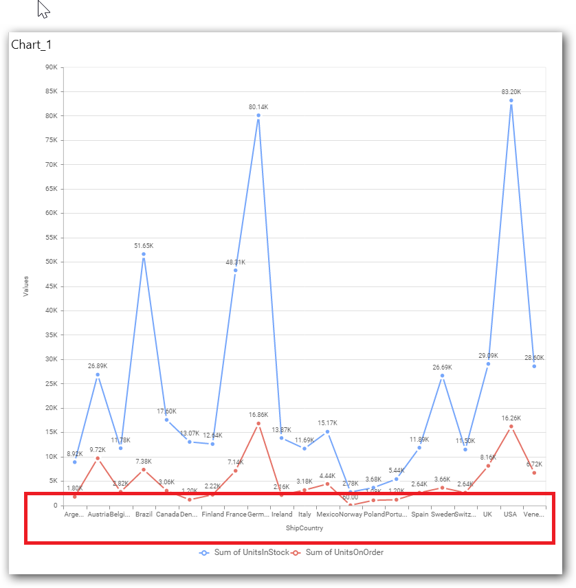
Category Axis
This allows you to toggle the visibility of Category Axis gridlines.
Secondary Value Axis
This allows you to toggle the visibility of Secondary Value Axis gridlines.
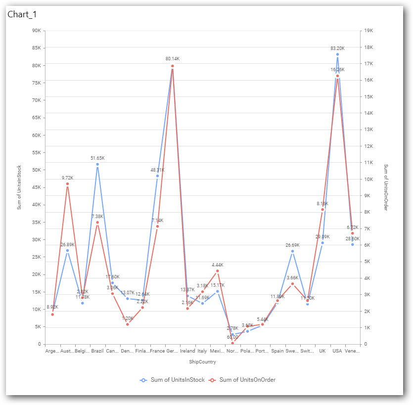
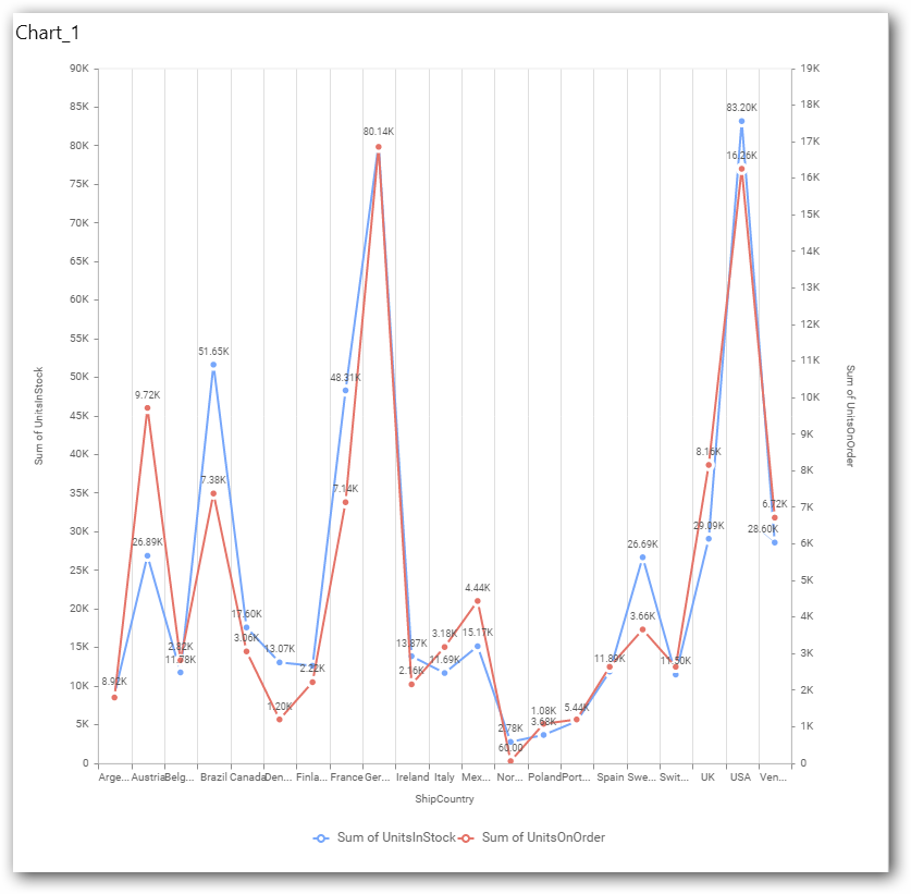
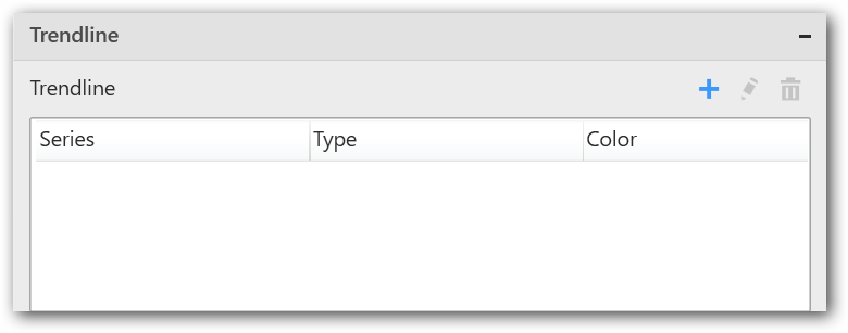
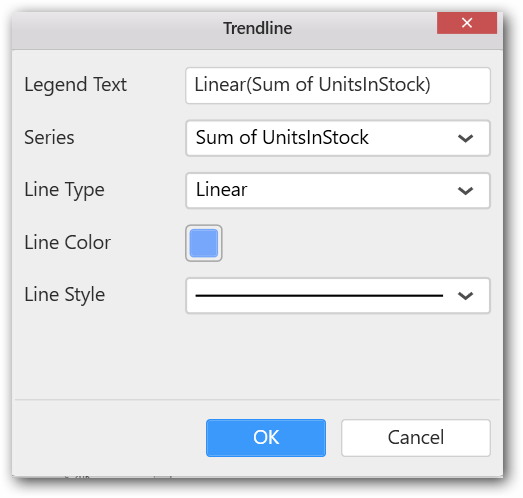
Trend Line Settings
You can add trend line to chart based on dropped measure that you select. You can also customize its legend text, line type and line color. Trend line is not visible, by default.
After applying these settings it will reflect in chart like below.
You have options to edit or delete the added trend lines.
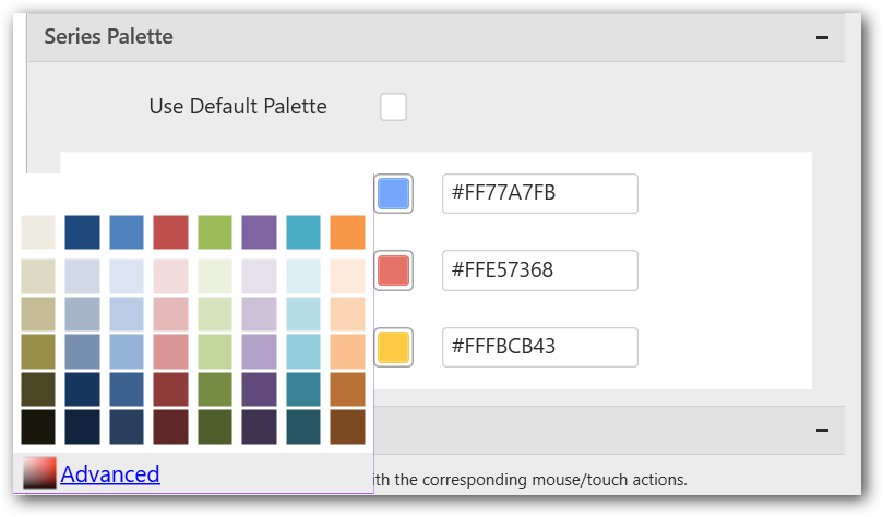
Series Palette
This allows you to customize the chart series color through Series Palette section.
Use Default Palette
This allows you to toggle the series color between default palette and custom palette. By default, the property is toggled on and default palette will be applied to series.
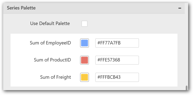
By toggle off the Use Default Palette, you can customize the series colors. This section shows, list of series’ labels on the left-hand side and corresponding series color on the right-hand side. By clicking on the colored square, color picker will be opened. You can choose a color. And, you can also change the series color by changing the corresponding Hexadecimal value in the right-hand side.