How can I help you?
Customization
Customization of DateRangePicker will be easier with its flexible customization options.
Setting Dimension
Height and width of the DateRangePicker can be changed using corresponding API (Height,Width) like below code examples.
Add the following code in your CSHTML page to render DateRangePicker with customized Height and Width.
     @*Add the following code example to the corresponding CSHTML page to render DateRangePicker widget with customized height and width*@

     @Html.EJ().DateRangePicker("DateRange").Height("50").Width("300")
Rounded Corners
ShowRoundedCorner property is used to add rounded borders to the input and popup elements. By default, ShowRoundedCorners property will be disabled state. we can enable the property by setting ShowRoundedCorner as true.
Add the following code in your CSHTML page to render DateRangePicker widget with rounded corners.
  	 @*Add the following code example to the corresponding CSHTML page to render DateRangePicker widget with rounded corners*@

	 @Html.EJ().DateRangePicker("DateRange").ShowRoundedCorner(true)
Persistence
The value of DateRangePicker can be sustained even after form post back and page refreshing by enabling the EnablePersistence API like below code example.
     @*Add the following code example to the corresponding CSHTML page to enable state persistence in rendered DateRangePicker widget*@

     @Html.EJ().DateRangePicker("DateRange").EnablePersistence(true)
The DateRangePicker Model value will be stored in local storage / cookies of browser before page refreshes and reinitialized with the restored model after refresh.
Preset Ranges
We can make use of Ranges API for easy selection of preset ranges from the popup. Each preset range will have a label which will be displayed on the right side of the popup with user-defined name. By clicking the labels the associated date ranges will get updated in the popup, automatically.
@*Add the following code example to the corresponding CSHTML page to enable state persistence in DateRangePicker widget*@
@{List<Object> lastWeek = new List<Object>() { DateTime.Today.AddDays(-7),DateTime.Today.AddDays(-1)};}
@{List<Object> lastMonth = new List<Object>() { DateTime.Today.AddMonths(-1), DateTime.Today.AddDays(-1) };}
@{List<Object> lastYear = new List<Object>() { DateTime.Today.AddYears(-1), DateTime.Today.AddDays(-1) };}
@{List<Object> special = new List<Object>() { "12/25/2017", "1/1/2018" };}
@Html.EJ().DateRangePicker("DateRange").Value("05/28/2016-06/27/2017").Ranges(e => e.Add().Label("Last Week").Range(lastWeek)).Ranges(p => p.Add().Label("Last Month").Range(lastMonth)).Ranges(m=>m.Add().Label("Last Year").Range(lastYear)).Ranges(n => n.Add().Label("Special Week").Range(special)).Width("60%")
~~~
Execute the above code to render the following output.
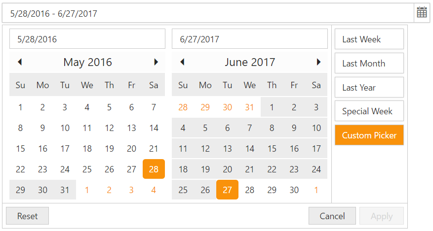
DateRangePicker with preset ranges
{:.caption}
## TimePicker Option
The date ranges can also be selected with start time and end time by enable the TimePicker in popup using **EnableTimePicker** API. Each calendar will have separate Time Pickers in which we can select start time along with start date and end time along with end date. Please check with the below code example to enable the time picker.
~~~ cshtml
@*Add the following code example to the corresponding CSHTML page to render DateRangePicker with TimePicker widget*@
@Html.EJ().DateRangePicker("DateRange").EnableTimePicker(true)Execute the above to render the following output.
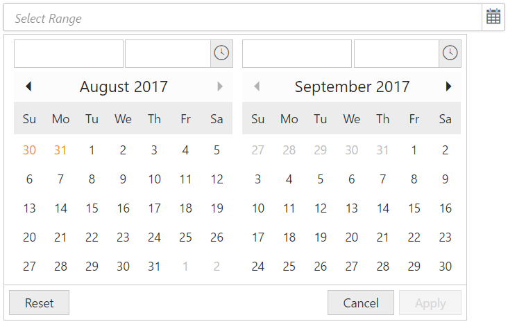
DateRangePicker with TimePicker option