Behavior-Settings
26 Sep 20171 minute to read
DateRangePicker has some default behavior settings which helps you to perform more operations by built-in.
Value
DateRangePicker value can be selected through picking two date values from available two calendars on popup or you can set it by using Value property.
Add the following code in your CSHTML page to render DateRangePicker with value.
@Html.EJ().DateRangePicker("DateRangePick").Value("5/12/2017 - 12/5/2017").ClientSideEvents(p => p.Change("onChange")) function onChange(args) {
//args contains entire model of DateRangePicker to get the value of all properties.
//alert DateRangePicker shows the start date and end date.
alert(" start date is : " + args.startDate + " \n end date is : " + args.endDate);
}Separator
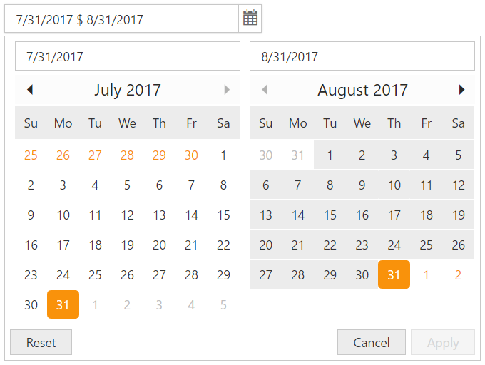
The value of the DateRangePicker popup will be presented with two date strings which is separated by Separator (e.g “11/1/2016 - 11/2/2017”).By default , the symbol “-“ separates the two date strings of the value and this can be changed using API called Separator. Please check with below code example to set the separator using Separator API.
Add the following code in your CSHTML page to render DateRangePicker widget with value separated by separator.
@Html.EJ().DateRangePicker("DateRangePick").Value("7/31/2017 $ 8/31/2017").Width("25%").Separator("$")Execute the above code to render the following output.
DateRangePicker