How can I help you?
Description in Xamarin StepProgressBar (Step Progress Bar)
20 Jan 202514 minutes to read
Each step in a multi-step process has a different operation. To provide self-explanatory information about a step, description can be shown on either side. A primary description will be on the right or bottom of the step, and a secondary description will be on the left or top of the step.
StepProgressBar overview
The following overview image illustrates the major elements presented in StepProgressBar.
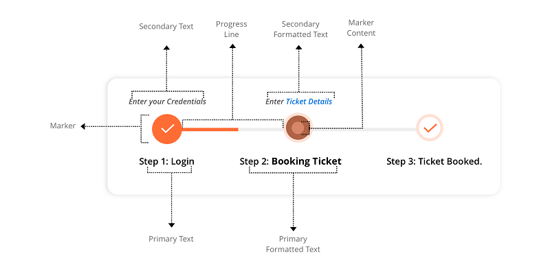
Text
The primary and secondary description for a step view can be set using the PrimaryText and SecondaryText properties as demonstrated in the following code example.
<progressBar:SfStepProgressBar Orientation="Horizontal" HorizontalOptions="Center" VerticalOptions="Center">
		<progressBar:StepView PrimaryText="Completed" SecondaryText="Task" Status="Completed"/>
	</progressBar:SfStepProgressBar>
SfStepProgressBar stepProgress = new SfStepProgressBar();
stepProgress.Orientation = StepOrientation.Vertical;
StepView step1 = new StepView();
step1.SecondaryText = "Task";
step1.PrimaryText = "Completed";
step1.Status = StepStatus.Completed;
stepProgress.Children.Add(step1);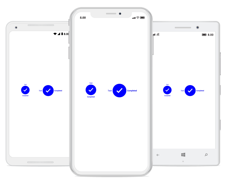
Formatted text
To customize the description with different formatting style, PrimaryFormattedText and SecondaryFormattedText can be used. The following code example explains how to set PrimaryFormattedText and SecondaryFormattedText to a step view.
<progressBar:SfStepProgressBar Orientation="Vertical" >
<progressBar:StepView Status="Completed">
<progressBar:StepView.PrimaryFormattedText>
<FormattedString>
<Span x:Name="span1" ClassId="1" Text="Ordered and Approved" FontSize="13" FontAttributes="Bold" TextColor="Blue"/>
<Span x:Name="span2" ClassId="2" Text=" Your Order has been placed." FontAttributes="Italic,Bold" FontSize="12" TextColor="DarkBlue"/>
<Span x:Name="span3" ClassId="3" Text=" Sat, 27th Oct " FontSize="12" FontAttributes="Italic" TextColor="Blue"/>
</FormattedString>
</progressBar:StepView.PrimaryFormattedText>
</progressBar:StepView>
</progressBar:SfStepProgressBar>SfStepProgressBar stepProgress = new SfStepProgressBar();
stepProgress.Orientation = StepOrientation.Vertical;
StepView step1 = new StepView();
step1.Status = StepStatus.Completed;
stepProgress.CompletedStepStyle.MarkerSize = 50;
stepProgress.CompletedStepStyle.MarkerContentSize = 25;
step1.PrimaryFormattedText = new FormattedString();
step1.PrimaryFormattedText.Spans.Add(new Span { Text = "Ordered and Approved", FontSize = 13, FontAttributes = FontAttributes.Bold, TextColor = Color.Blue });
step1.PrimaryFormattedText.Spans.Add(new Span { Text = "\nYour Order has been placed", FontSize = 12, FontAttributes = FontAttributes.Italic | FontAttributes.Bold, TextColor = Color.DarkBlue });
step1.PrimaryFormattedText.Spans.Add(new Span { Text = "\nSat, 27th Oct", FontSize = 12, FontAttributes = FontAttributes.Italic, TextColor = Color.Blue });
stepProgress.Children.Add(step1);NOTE
To learn more about defining formats for different span in a text, refer to FormattedString.

Customize description
Using TitleAlignment and TitleSpace, the description alignment and space between the description and marker can be customized, respectively. The following code example explains how to customize the TitleSpace and TitleAlignment properties.
<progressBar:SfStepProgressBar x:Name="stepProgress" Orientation="Horizontal" TitleAlignment="Center" TitleSpace="50">
    <progressBar:SfStepProgressBar.CompletedStepStyle>
        <progressBar:StepStyle x:TypeArguments ="progressBar:CompletedStepState" MarkerSize="50" MarkerContentSize="25" />
    </progressBar:SfStepProgressBar.CompletedStepStyle>
    <progressBar:StepView Status="Completed" PrimaryText="Completed"  SecondaryText="Task">
    </progressBar:StepView>
</progressBar:SfStepProgressBar>
SfStepProgressBar stepProgress = new SfStepProgressBar();
stepProgress.Orientation = StepOrientation.Horizontal;
stepProgress.TitleSpace = 50;
stepProgress.TitleAlignment = StepTitleAlignment.Center;
stepProgress.CompletedStepStyle.MarkerSize = 50;
stepProgress.CompletedStepStyle.MarkerContentSize = 25;
StepView step1 = new StepView();
step1.Status = StepStatus.Completed;
step1.SecondaryText = "Task";
step1.PrimaryText = "Completed";
stepProgress.Children.Add(step1);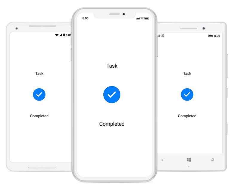
StepProgressBar Image Customization
The StepProgressBar control provides support for customizing the image in StepView. The following code example explains how to set an image in step view.
Initialize view model
public class Details
    {
        public StepStatus DeatilStepStatus { get; set; }
        public int ProgressValue { get; set; }
        public string Title { get; set; }
    }
Next, create a view model class and initialize a model object as demonstrated in the following code sample.
public class ViewModel : INotifyPropertyChanged
    {
        public ObservableCollection<Details> InfoCollection { get; set; }

        public ShipmentViewModel()
        {
            InfoCollection = new ObservableCollection<Details>();
            InfoCollection.Add(CreateShipmentInfo("Ordered and Approved", StepStatus.Completed, 100));
            InfoCollection.Add(CreateShipmentInfo("Packed", StepStatus.Completed, 100));
            InfoCollection.Add(CreateShipmentInfo("Shipped", StepStatus.InProgress, 60));
            InfoCollection.Add(CreateShipmentInfo("Delivered", StepStatus.NotStarted, 0));
        }

        public Details CreateShipmentInfo(string title,StepStatus status, int progress)
        {
            Details shipment = new Details()
            {
                Title = title,
                DeatilStepStatus = status,
                ProgressValue = progress

            };

            return shipment;
        }

        public event PropertyChangedEventHandler PropertyChanged;
    }
Image insertion
using System;
using System.Collections.Generic;
using System.Globalization;
using System.Text;
using Xamarin.Forms

namespace StepProgressBar
{
    public class ImageFileToImageSourceConverter : IValueConverter
    {
        public object Convert(object value, Type targetType, object parameter, CultureInfo culture)
        {
            var path = "xamarin.png";
            return ImageSource.FromFile(path);
        }

        public object ConvertBack(object value, Type targetType, object parameter, CultureInfo culture)
        {
            throw new NotImplementedException();
        }
    }
}
Define the appearance of StepView
<ContentPage.Resources>
        <ResourceDictionary>
            <local:ImageFileToImageSourceConverter x:Key="ImageFileToImageSourceConverter" />
        </ResourceDictionary>
    </ContentPage.Resources>

    <ContentPage.BindingContext>
        <local:Viewmodel/>
    </ContentPage.BindingContext>
    <ContentPage.Content>
    <StackLayout>
            <stepProgressBar:SfStepProgressBar Orientation="Vertical" HorizontalOptions="Center" VerticalOptions="CenterAndExpand" BindableLayout.ItemsSource="{Binding InfoCollection}">
                <stepProgressBar:SfStepProgressBar.NotStartedStepStyle>
                    <stepProgressBar:StepStyle x:TypeArguments="stepProgressBar:NotStartedStepState"
                            MarkerContentSize="15"
                            ProgressLineColor="Gray"
                            MarkerSize="20"
                            MarkerStrokeColor="Gray"
                            MarkerStrokeWidth="2" />
                </stepProgressBar:SfStepProgressBar.NotStartedStepStyle>

                <stepProgressBar:SfStepProgressBar.InProgressStepStyle>
                    <stepProgressBar:StepStyle x:TypeArguments="stepProgressBar:InProgressStepState"
                            MarkerContentSize="20" ProgressLineColor="DodgerBlue"
                            MarkerSize="30"
							MarkerStrokeColor="Gray"
                            MarkerContentFillColor="Gray"
                            MarkerFillColor="Transparent"
                            MarkerStrokeWidth="2" />
                </stepProgressBar:SfStepProgressBar.InProgressStepStyle>

                <stepProgressBar:SfStepProgressBar.CompletedStepStyle>
                    <stepProgressBar:StepStyle x:TypeArguments="stepProgressBar:CompletedStepState"
                            MarkerContentSize="25" ProgressLineColor="DodgerBlue"
                            MarkerSize="40" MarkerStrokeColor="DodgerBlue"
                            MarkerFillColor="Transparent"
                            MarkerContentFillColor="DodgerBlue"
                            MarkerStrokeWidth="2" />
                </stepProgressBar:SfStepProgressBar.CompletedStepStyle>

                <BindableLayout.ItemTemplate>
                    <DataTemplate>
                        <stepProgressBar:StepView x:Name="step" ProgressValue="{Binding ProgressValue}" PrimaryText="Info" BackgroundColor="Transparent" ImageSource="{Binding Converter={StaticResource ImageFileToImageSourceConverter}}" Status="{Binding DeatilStepStatus}">
                            <stepProgressBar:StepView.PrimaryFormattedText>
                                <FormattedString>
                                    <Span Text="{Binding Title}" FontAttributes="Bold"></Span>
                                </FormattedString>
                            </stepProgressBar:StepView.PrimaryFormattedText>
                        </stepProgressBar:StepView>
                    </DataTemplate>
                </BindableLayout.ItemTemplate>
            </stepProgressBar:SfStepProgressBar>
    </StackLayout>
    </ContentPage.Content>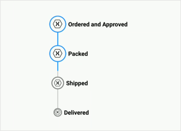
You can download the entire source of this demo from here