Visual Customization in Xamarin Radio Button (SfRadioButton)
8 Aug 20234 minutes to read
Customizing a state color
The default state colors can be customized using the CheckedColor and UncheckedColor properties. The checked state color is updated to the CheckedColor property value when the state is changed to the checked. The unchecked state color is updated to the UncheckedColor property value when the state is changed to unchecked.
<syncfusion:SfRadioGroup x:Name="radioGroup">
<syncfusion:SfRadioButton x:Name="check" Text="RadioButton" IsChecked="True" CheckedColor="Green"/>
<syncfusion:SfRadioButton x:Name="uncheck" Text="RadioButton" UncheckedColor="Violet"/>
</syncfusion:SfRadioGroup>
SfRadioGroup radioGroup = new SfRadioGroup();
SfRadioButton check = new SfRadioButton();
check.Text = "RadioButton";
check.IsChecked = true;
check.CheckedColor = Color.Green;
SfRadioButton uncheck = new SfRadioButton();
uncheck.Text = "RadioButton";
uncheck.UncheckedColor = Color.Violet;
radioGroup.Children.Add(check);
radioGroup.Children.Add(uncheck);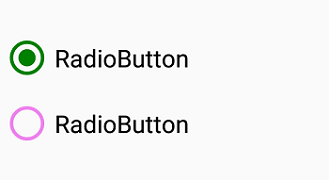
BorderWidth
The border thickness of the circle in the RadioButton control can be customized using the BorderWidth property.
<syncfusion:SfRadioGroup >
<syncfusion:SfRadioButton Text="Checked State" IsChecked="True" BorderWidth="3"/>
<syncfusion:SfRadioButton Text="UnChecked State" BorderWidth="3"/>
</syncfusion:SfRadioGroup>
SfRadioGroup radioGroup = new SfRadioGroup();
SfRadioButton check = new SfRadioButton();
check.Text = "Checked State";
check.IsChecked = true;
check.BorderWidth = 3;
SfRadioButton uncheck = new SfRadioButton();
uncheck.Text = "UnChecked State";
uncheck.BorderWidth = 3;
radioGroup.Children.Add(check);
radioGroup.Children.Add(uncheck);
NOTE
BorderWidth support has not been provided for Android Platform.
Setting a caption text appearance
You can customize the display text appearance of the SfRadioButton control using the following properties:
-
TextColor: Changes the color of the text. -
HorizontalTextAlignment: Changes the horizontal alignment of the caption text. -
FontFamily: Changes the font family of the caption text. -
FontAttributes: Sets font attributes(bold/italic/none) of the caption text. -
FontSize: Sets font size of the caption text.
<syncfusion:SfRadioButton x:Name="radioButton" Text="RadioButton" IsChecked="True" TextColor="Violet" HorizontalTextAlignment="Center" FontFamily="Arial" FontAttributes="Bold" FontSize="20"/>SfRadioButton radioButton = new SfRadioButton();
radioButton.Text = "RadioButton";
radioButton.IsChecked = true;
radioButton.TextColor = Color.Violet;
radioButton.HorizontalTextAlignment = TextAlignment.Center;
radioButton.FontFamily = "Arial";
radioButton.FontAttributes = FontAttributes.Bold;
radioButton.FontSize = 20;
LineBreakMode
The LineBreakMode allows you to wrap or truncate the text. The default value of this property is NoWrap. The following other options are available in LineBreakMode:
-
NoWrap- Avoids the text wrap. -
WordWrap- Wraps the text by words. -
CharacterWrap- Wraps the text by character. -
HeadTruncation- Truncates the text at the start. -
MiddleTruncation- Truncates the text at the center. -
TailTruncation- Truncates the text at the end.
This demo can be downloaded from this link.
Size customization
The ControlSize property is used to customize the RadioButton control size.
<StackLayout>
    <syncfusion:SfRadioButton Text="RadioButton" ControlSize="60"/>
</StackLayout>
StackLayout stackLayout = new StackLayout();
SfRadioButton radioButton = new SfRadioButton();
radioButton.Text = "Radio Button";
radioButton.ControlSize = 60;
stackLayout.Children.Add(radioButton);NOTE
ControlSizeis not applicable for Android Platform.
See also
How to wrap text in Xamarin.Forms radio button (SfRadioButton)