Badge Customization in Xamarin Badge View (SfBadgeView)
10 Oct 202311 minutes to read
The BadgeSettings property helps you customize the basic look and feel of the badge view.
BadgeSettings contains the sub elements such as badge types, positions, icons, colors, and alignments. You can customize the background color, text color, stroke color, width, offset, and font attributes.
Font customization
The font can be customized using the FontSize, FontAttributes, and FontFamily properties.
<badge:SfBadgeView BadgeText="48" HorizontalOptions="Center" VerticalOptions="Center">
        <badge:SfBadgeView.Content>
            <Button Text ="Primary" WidthRequest="120" HeightRequest="60" />
        </badge:SfBadgeView.Content>
        <badge:SfBadgeView.BadgeSettings>
            <badge:BadgeSetting FontSize="15" FontAttributes="Bold">
                <badge:BadgeSetting.FontFamily>
                    <OnPlatform x:TypeArguments="x:String" iOS="Chalkduster" Android="serif" WinPhone="Chiller" />
                </badge:BadgeSetting.FontFamily>
            </badge:BadgeSetting>
        </badge:SfBadgeView.BadgeSettings>
</badge:SfBadgeView>
SfBadgeView sfBadgeView = new SfBadgeView();
sfBadgeView.HorizontalOptions = LayoutOptions.Center;
sfBadgeView.VerticalOptions = LayoutOptions.Center;
sfBadgeView.BadgeText = "48";
Button button = new Button();
button.Text = "Primary";
button.WidthRequest = 120;
button.HeightRequest = 60;
sfBadgeView.Content = button;
BadgeSetting badgeSetting = new BadgeSetting();
badgeSetting.FontAttributes = FontAttributes.Bold;
badgeSetting.FontSize = 15;
badgeSetting.FontFamily = Device.RuntimePlatform == Device.iOS ? "Chalkduster" : Device.RuntimePlatform == Device.Android ? "serif" : "Chiller";
sfBadgeView.BadgeSettings = badgeSetting;
Content = sfBadgeView;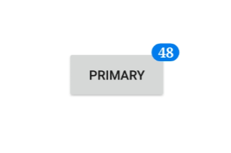
Stroke customization
The stroke color and stroke width of the badge view can be customized using the Stroke and StrokeWidth properties, respectively.
<badge:SfBadgeView BadgeText="30" HorizontalOptions="Center" VerticalOptions="Center">
        <badge:SfBadgeView.Content>
            <Button Text ="Primary" WidthRequest="120" HeightRequest="60"/>
        </badge:SfBadgeView.Content>
        <badge:SfBadgeView.BadgeSettings>
            <badge:BadgeSetting Stroke="Orange" StrokeWidth="2" />
        </badge:SfBadgeView.BadgeSettings>
</badge:SfBadgeView>
SfBadgeView sfBadgeView = new SfBadgeView();
sfBadgeView.BadgeText = "30";
sfBadgeView.HorizontalOptions = LayoutOptions.Center;
sfBadgeView.VerticalOptions = LayoutOptions.Center;
Button button = new Button();
button.Text = "Primary";
button.WidthRequest = 120;
button.HeightRequest = 60;
sfBadgeView.Content = button;
BadgeSetting badgeSetting = new BadgeSetting();
badgeSetting.Stroke = Color.Orange;
badgeSetting.StrokeWidth = 2;
sfBadgeView.BadgeSettings = badgeSetting;
Content = sfBadgeView;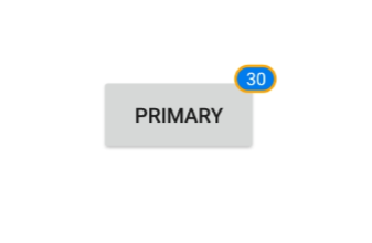
Text customization
The text color and margin of badge view can be changed using the TextColor and TextPadding properties, respectively.
<badge:SfBadgeView BadgeText="45" HorizontalOptions="Center" VerticalOptions="Center">
        <badge:SfBadgeView.Content>
            <Button Text ="Primary" WidthRequest="120" HeightRequest="60"/>
        </badge:SfBadgeView.Content>
        <badge:SfBadgeView.BadgeSettings>
            <badge:BadgeSetting TextColor="LightYellow" TextPadding="10"/>
        </badge:SfBadgeView.BadgeSettings>
</badge:SfBadgeView>
SfBadgeView sfBadgeView = new SfBadgeView();
sfBadgeView.HorizontalOptions = LayoutOptions.Center;
sfBadgeView.VerticalOptions = LayoutOptions.Center;
sfBadgeView.BadgeText = "45";
Button button = new Button();
button.WidthRequest = 120;
button.HeightRequest = 60;
button.Text = "Primary";
sfBadgeView.Content = button;
BadgeSetting badgeSetting = new BadgeSetting();
badgeSetting.TextColor = Color.LightYellow;
badgeSetting.TextPadding = 10;
sfBadgeView.BadgeSettings = badgeSetting;
Content = sfBadgeView;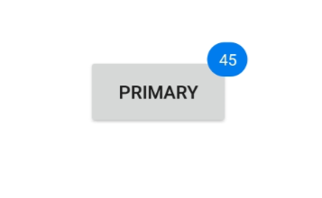
Predefined styles
You can change the colors of the badge using the BadgeType property. The badge supports the following eight different essential colors for various situations:
- Dark
- Error
- Info
- Light
- Primary
- Secondary
- Success
- Warning
<badge:SfBadgeView BadgeText="8" HorizontalOptions="Center" VerticalOptions="Center">
        <badge:SfBadgeView.Content>
            <Image Source="BadgeFacebook.png" HeightRequest="70" WidthRequest="60"/>
        </badge:SfBadgeView.Content>
        <badge:SfBadgeView.BadgeSettings>
            <badge:BadgeSetting BadgeType="Error" Offset="-5,10"/>
        </badge:SfBadgeView.BadgeSettings>
</badge:SfBadgeView>
SfBadgeView sfBadgeView = new SfBadgeView();
sfBadgeView.HorizontalOptions = LayoutOptions.Center;
sfBadgeView.VerticalOptions = LayoutOptions.Center;
sfBadgeView.BadgeText = "8";
Image image = new Image();
image.Source = "BadgeFacebook.png";
image.HeightRequest = 70;
image.WidthRequest = 60;
sfBadgeView.Content = image;
BadgeSetting badgeSetting = new BadgeSetting();
badgeSetting.BadgeType = BadgeType.Error;
badgeSetting.Offset = new Point(-5, 10);
sfBadgeView.BadgeSettings = badgeSetting;
Content = sfBadgeView;
Badge background customization
Set the BadgeType to None. You can customize the color of the badge view using the BackgroundColor property.
<badge:SfBadgeView BadgeText="48" HorizontalOptions="Center" VerticalOptions="Center" >
        <badge:SfBadgeView.Content>
            <Button Text ="Primary" WidthRequest="120" HeightRequest="60"/>
        </badge:SfBadgeView.Content>
        <badge:SfBadgeView.BadgeSettings>
            <badge:BadgeSetting BadgeType="None" BackgroundColor="Green" />
        </badge:SfBadgeView.BadgeSettings>
</badge:SfBadgeView>
SfBadgeView sfBadgeView = new SfBadgeView();
sfBadgeView.HorizontalOptions = LayoutOptions.Center;
sfBadgeView.VerticalOptions = LayoutOptions.Center;
sfBadgeView.BadgeText = "48";
Button button = new Button();
button.Text = "Primary";
button.HeightRequest = 60;
button.WidthRequest = 120;
sfBadgeView.Content = button;
BadgeSetting badgeSetting = new BadgeSetting();
badgeSetting.BadgeType = BadgeType.None;
badgeSetting.BackgroundColor = Color.Green;
sfBadgeView.BadgeSettings = badgeSetting;
Content = sfBadgeView;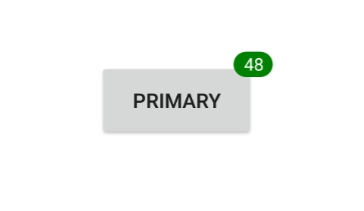
Setting corner radius of the badge
The CornerRadius property is used to reduce the radius of the corners.
<badge:SfBadgeView BadgeText="100" HorizontalOptions="Center" VerticalOptions="Center" >
        <badge:SfBadgeView.Content>
            <Button Text ="Primary" WidthRequest="120" HeightRequest="60"/>
        </badge:SfBadgeView.Content>
        <badge:SfBadgeView.BadgeSettings>
            <badge:BadgeSetting CornerRadius="5"/>
        </badge:SfBadgeView.BadgeSettings>
</badge:SfBadgeView>
SfBadgeView sfBadgeView = new SfBadgeView();
sfBadgeView.HorizontalOptions = LayoutOptions.Center;
sfBadgeView.VerticalOptions = LayoutOptions.Center;
sfBadgeView.BadgeText = "100";
Button button = new Button();
button.Text = "Primary";
button.HeightRequest = 60;
button.WidthRequest = 120;
sfBadgeView.Content = button;
BadgeSetting badgeSetting = new BadgeSetting();
badgeSetting.CornerRadius = 5;
sfBadgeView.BadgeSettings = badgeSetting;
Content = sfBadgeView;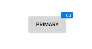
Alignment of badge
You can align the badge view using the Center, Start, and End properties of BadgeAlignment property.
<badge:SfBadgeView BadgeText="20" HorizontalOptions="Center" VerticalOptions="Center" >
        <badge:SfBadgeView.Content>
            <Label Text="START" BackgroundColor="LightGray" HorizontalTextAlignment="Center" VerticalTextAlignment="Center"
                   WidthRequest="100" HeightRequest="60" TextColor="Black" />
        </badge:SfBadgeView.Content>
        <badge:SfBadgeView.BadgeSettings>
            <badge:BadgeSetting BadgeAlignment="Center" CornerRadius="0"/>
        </badge:SfBadgeView.BadgeSettings>
</badge:SfBadgeView>
SfBadgeView sfBadgeView = new SfBadgeView();
sfBadgeView.HorizontalOptions = LayoutOptions.Center;
sfBadgeView.VerticalOptions = LayoutOptions.Center;
sfBadgeView.BadgeText = "20";
Label label = new Label();
label.Text = "START";
label.HeightRequest = 60;
label.WidthRequest = 100;
label.BackgroundColor = Color.LightGray;
label.HorizontalTextAlignment = TextAlignment.Center;
label.VerticalTextAlignment = TextAlignment.Center;
label.TextColor = Color.Black;
sfBadgeView.Content = label;
BadgeSetting badgeSetting = new BadgeSetting();
badgeSetting.BadgeAlignment = BadgeAlignment.Start;
badgeSetting.CornerRadius = 0;
sfBadgeView.BadgeSettings = badgeSetting;
Content = sfBadgeView;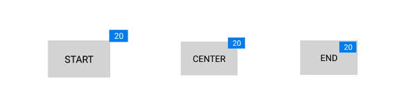
See also
How to add a custom icon to the badge in Xamarin.Forms badge view (SfBadgeView)