Editors
8 Jan 202523 minutes to read
The data form supports several built-in editors as follows:
| Editor name | Editor class | Supported Data Type/Attribute | Input control loaded |
|---|---|---|---|
| Text | The String type property and any other type apart from the below specified cases. | ||
| MultilineText | The String type property with multi line text. [DataType(DataType.Multiline)] | ||
| Numeric | The property of Int, Double, Float, Decimal, Long types and also its nullable property. | ||
| Percent | The property of Int, Double, Float, Decimal, Long types and also its nullable property with [DataType(“Percent”)] attribute. | ||
| Currency | The property of Int, Double, Float, Decimal, Long types and also its nullable property with [DataType(DataType.Currency)] attribute. | ||
| Date | DateTime type property and the property with [DataType(DataType.Date)] and [DataType(DataType.DateTime)] attributes. | ||
| Time | The property with [DataType(DataType.Time)] attribute. | ||
| NumericUpDown | Int or Double type property. | ||
| Segment | Enum type property. | ||
| Bool | Bool type property. | ||
| Switch | Bool type property. | ||
| Picker | Enum and List type property. [EnumDataTypeAttribute] | ||
| DropDown | Enum and List type property. [EnumDataTypeAttribute] | ||
| Password | The String type property and property with [DataType(DataType.Password)] attribute. |
Text editor
In the text editor, the EditText is loaded.
Loading upper case keyboard in EditText
You can load upper case letters keyboard by setting the InputType as TextFlagCapCharacters.
dataForm.AutoGeneratingDataFormItem += DataForm_AutoGeneratingDataFormItem;
private void DataForm_AutoGeneratingDataFormItem(object sender, AutoGeneratingDataFormItemEventArgs e)
{
    if (e.DataFormItem != null && e.DataFormItem.Name == "Name")
    {
        (e.DataFormItem as DataFormTextItem).InputType = Android.Text.InputTypes.TextFlagCapCharacters;
    }
}
Multiline Text editor
In the MultilineText editor, the EditText is loaded.
And MultilineText editor height will auto expand/reduce based on the line wraps in editor , which allowing text to be readable without scrolling the editor.
[DataType(DataType.MultilineText)]
public String Address { get; set; }
Numeric editor
In the numeric editor, the SfNumericTextBox is loaded.
Change maximum NumberDecimalDigits in the numeric editor
In the SfNumericTextBox, two decimal digits will be displayed by default. You can change the number of decimal digits being displayed by setting the MaximumNumberDecimalDigits property in the DataFormNumericItem.
dataForm.AutoGeneratingDataFormItem += DataForm_AutoGeneratingDataFormItem;
private void DataForm_AutoGeneratingDataFormItem(object sender, AutoGeneratingDataFormItemEventArgs e)
{
    if (e.DataFormItem != null && e.DataFormItem.Name == "Amount")
    {
        (e.DataFormItem as DataFormNumericItem).MaximumNumberDecimalDigits = 3;
    }
}
Date editor
In the date editor, the SfDatePicker will be loaded.
Setting null value in date editor
In SfDatePicker, the default date value (1/01/0001) is displayed by default. You can also set the null value by adding nullable DateTime data type for the date picker property in data form, which allows you to set the null value and display the empty value in date editor.
[DataType(DataType.Date)]
[Display(Name ="Birth Date")]
public DateTime? BirthDate { get; set; }
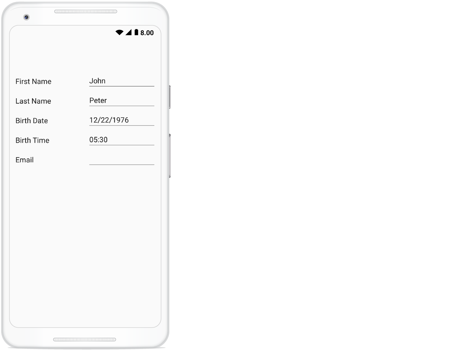
Customizing format in date editor
In the SfDatePicker, short date will be shown by default. You can change the applied format by setting the Format property in DataFormDateItem.
dataForm.AutoGeneratingDataFormItem += DataForm_AutoGeneratingDataFormItem;

private void DataForm_AutoGeneratingDataFormItem(object sender, AutoGeneratingDataFormItemEventArgs e)
{

    if (e.DataFormItem != null && e.DataFormItem.Name == "Date")
    {
        (e.DataFormItem as DataFormDateItem).Format = "ddd, MMM d, yyyy";
    }
}
Setting MaximumDate and MinimumDate in date editor
You can customize the maximum and minimum allowable dates in the SfDatePicker by setting MaximumDate and MinimumDate in the DataFormDateItem respectively.
dataForm.AutoGeneratingDataFormItem += DataForm_AutoGeneratingDataFormItem;

private void DataForm_AutoGeneratingDataFormItem(object sender, AutoGeneratingDataFormItemEventArgs e)
{
    if (e.DataFormItem != null && e.DataFormItem.Name == "Date")
    {
        (e.DataFormItem as DataFormDateItem).MinimumDate = new DateTime(2017, 5, 5);
        (e.DataFormItem as DataFormDateItem).MaximumDate = new DateTime(2017, 9, 2);
    }
}
Time editor
In the time editor, the SfTimePicker will be loaded.
Setting null value in time editor
In SfTimePicker, the default time value (12:00 AM) is displayed by default. You can also set the null value by adding nullable DateTime data type for the time picker property in data form, which allows you to set the null value and display the empty value in time editor.
[DataType(DataType.Time)]
[Display(Name = "Birth Time")]
public DateTime? BirthTime { get; set; }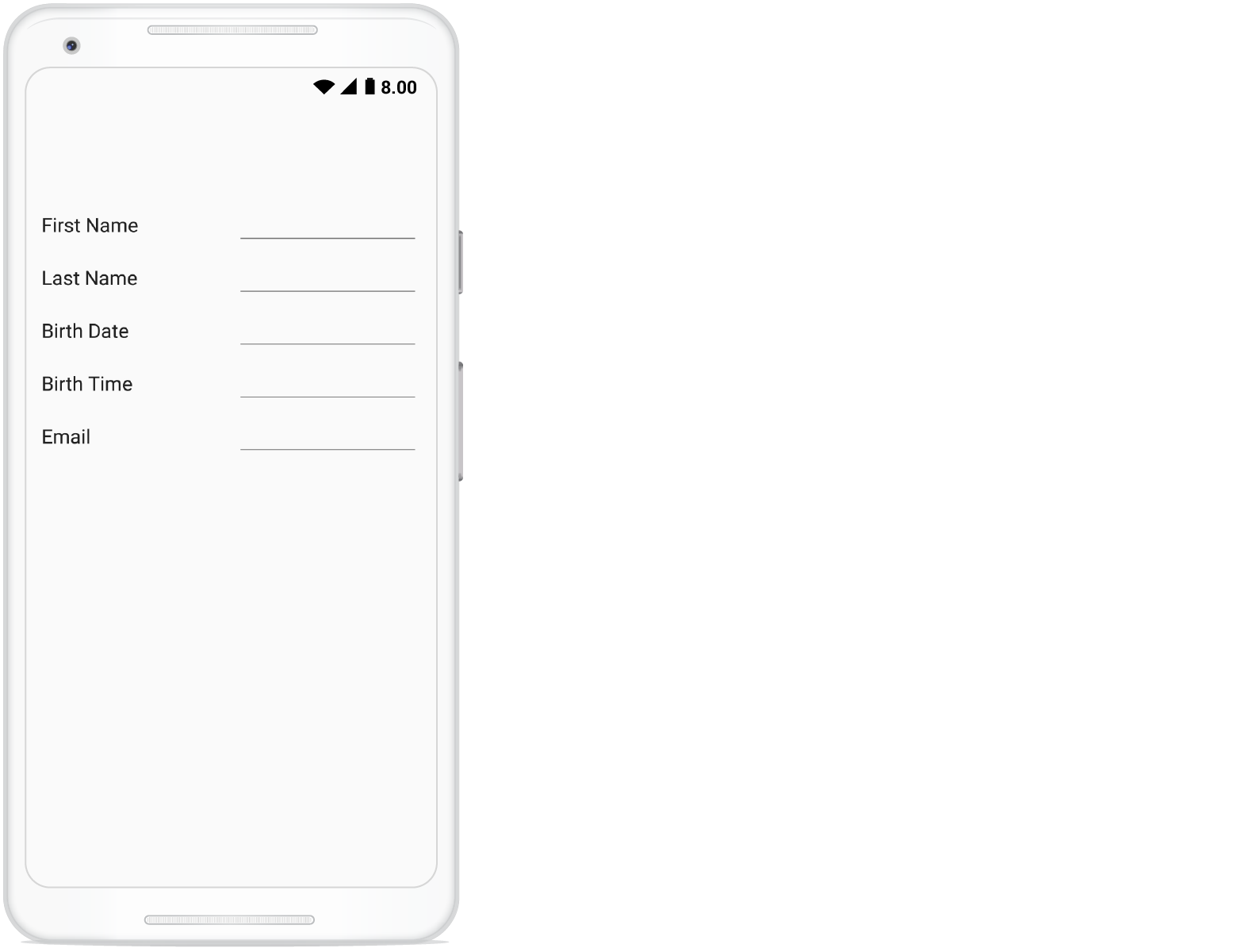
Customizing format in time editor
In the SfTimePicker, short time will be shown by default. You can change the applied format by setting the Format property in DataFormTimeItem.
dataForm.AutoGeneratingDataFormItem += DataForm_AutoGeneratingDataFormItem;

private void DataForm_AutoGeneratingDataFormItem(object sender, AutoGeneratingDataFormItemEventArgs e)
{
    if (e.DataFormItem != null && e.DataFormItem.Name == "BirthTime")
        (e.DataFormItem as DataFormTimeItem).Format = "HH:mm";
}
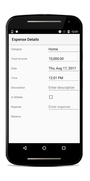
CheckBox editor
In CheckBox editor, the CheckBox control is loaded.By default, for bool data type property, CheckBox editor will be loaded in data form.
[Display(Name = "Is Billable")]
 public bool IsBillable { get; set; } = true;

[Display(Name = "Registered Member")]
public bool RegisteredMember { get; set; }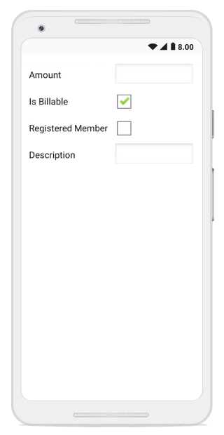
Switch Editor
In switch editor, Switch is loaded, and DataForm Switch editor supports bool data type property.
To add Switch editor in DataForm, register the editor as Switch for the required property using the RegisterEditor method.
dataForm.RegisterEditor("CellularData", "Switch");
dataForm.RegisterEditor("AirplaneMode", "Switch");

[Display(Name ="Cellular Data")]
public bool CellularData { get; set; } = true;

[Display(Name = "Airplane Mode")]
public bool AirplaneMode { get; set; }
Drop down editor
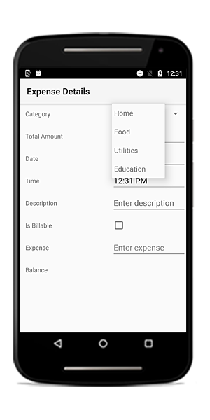
In the drop down editor, the Spinner will be loaded.
Customizing ItemsSource of spinner
By default, the ItemsSource for spinner is auto-generated for enum types and collection type properties. For other types, you can set the ItemsSource by using the SourceProvider.
Using SourceProvider
private string _ItemName;
public string ItemName
{
    get
    {
        return _ItemName;
    }
    set
    {
        _ItemName = value;
    }
}
public class SourceProviderExt : SourceProvider
{
    public override IList GetSource(string sourceName)
    {
        var list = new List<string>();
        if (sourceName == "ItemName")
        {
            list.Add("Item1");
            list.Add("Item2");
            list.Add("Item3");
        }
        return list;
    }
}
dataForm.SourceProvider = new SourceProviderExt();
dataForm.RegisterEditor("ItemName", "DropDown");
Using ItemsSource property
You can also set the ItemsSource for drop down editor by using the ItemsSource property in the DataFormDropDownItem.
dataForm.AutoGeneratingDataFormItem += DataForm_AutoGeneratingDataFormItem;

private void DataForm_AutoGeneratingDataFormItem(object sender, AutoGeneratingDataFormItemEventArgs e)
{
    if (e.DataFormItem != null && e.DataFormItem.Name == "Name")
    {
        var list = new List<string>();
        list.Add("Home");
        list.Add("Food");
        list.Add("Utilities");
        list.Add("Education");
        (e.DataFormItem as DataFormDropDownItem).ItemsSource = list;
    }
}
You can also change the ItemsSource at runtime.
private void Button_Click(object sender, EventArgs e)
{
    var dataFormItem = dataForm.ItemManager.DataFormItems["Name"];
    if (dataFormItem.Name == "Name")
    {
        var list = new List<string>();
        list.Add("Home");
        list.Add("Food");
        list.Add("Utilities");
        list.Add("Education");
        (dataFormItem as DataFormDropDownItem).ItemsSource = list;
    }
}
Picker editor
In the picker editor, the SfPicker will be loaded.
Changing title in the SfPicker
You can show some text in the SfPicker popup by using the Title property in the DataFormPickerItem.
dataForm.AutoGeneratingDataFormItem += DataForm_AutoGeneratingDataFormItem;

private void DataForm_AutoGeneratingDataFormItem(object sender, AutoGeneratingDataFormItemEventArgs e)
{
    if (e.DataFormItem != null && e.DataFormItem.Name == "Name")
    {
        (e.DataFormItem as DataFormPickerItem).Title = "Expense Category";
    }
}
Customizing ItemsSource of SfPicker
By default, the ItemsSource for picker is auto-generated for enum type and collection type properties. For other types, you can set the ItemsSource by using SourceProvider.
Using SourceProvider
private string _ItemName;
public string ItemName
{
    get
    {
        return _ItemName;
    }
    set
    {
        _ItemName = value;
    }
}
public class SourceProviderExt : SourceProvider
{
    public override IList GetSource(string sourceName)
    {
        var list = new List<string>();
        if (sourceName == "ItemName")
        {
            list.Add("Item1");
            list.Add("Item2");
            list.Add("Item3");
        }
        return list;
    }
}
dataForm.SourceProvider = new SourceProviderExt();
dataForm.RegisterEditor("ItemName", "Picker");
Using event
You can also set ItemsSource for picker editor by using the ItemsSource property in the DataFormPickerItem.
dataForm.AutoGeneratingDataFormItem += DataForm_AutoGeneratingDataFormItem;

private void DataForm_AutoGeneratingDataFormItem(object sender, AutoGeneratingDataFormItemEventArgs e)
{
    if (e.DataFormItem != null && e.DataFormItem.Name == "Name")
    {
        var list = new List<string>();
        list.Add("Home");
        list.Add("Food");
        list.Add("Utilities");
        list.Add("Education");
        (e.DataFormItem as DataFormPickerItem).ItemsSource = list;
    }
}
Changing ItemsSource of picker at run time
You can also change the ItemsSource at runtime.
private void Button_Click(object sender, EventArgs e)
{
    var dataFormItem = dataForm.ItemManager.DataFormItems["Name"];
    if (dataFormItem.Name == "Name")
    {
        var list = new List<string>();
        list.Add("Home");
        list.Add("Food");
        list.Add("Utilities");
        list.Add("Education");
        (dataFormItem as DataFormPickerItem).ItemsSource = list;
    }
}
Loading complex type property values in picker
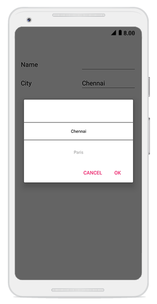
You can display the complex type property values in picker editor by using the GetSource override method of SourceProvider class, which is used to get source list as complex property values for picker editor and set it to SourceProvider property of SfDataForm. You need to use AutoGeneratingDataFormItem event to set DisplayMemberPath and ValueMemberPath property value DataFormPickerItem for complex type property.
NOTE
Class cannot be directly set as data type for picker editor in this complex type scenario.
dataForm.SourceProvider = new SourceProviderExt();
dataForm.RegisterEditor("City", "Picker");
dataForm.DataObject = new ContactInfo();
dataForm.AutoGeneratingDataFormItem += DataForm_AutoGeneratingDataFormItem;

private void DataForm_AutoGeneratingDataFormItem(object sender, AutoGeneratingDataFormItemEventArgs e)
{
    if (e.DataFormItem != null && e.DataFormItem.Name == "City")
    {
        (e.DataFormItem as DataFormPickerItem).DisplayMemberPath = "City";
        (e.DataFormItem as DataFormPickerItem).ValueMemberPath = "PostalCode";
    }
}

public class SourceProviderExt : SourceProvider
{
    public override IList GetSource(string sourceName)
    {
        if (sourceName == "City")
        {
            List<Address> details = new List<Address>();
            details.Add(new Address() { City = "Chennai", PostalCode = 1 });
            details.Add(new Address() { City = "Paris", PostalCode = 2 });
            details.Add(new Address() { City = "Vatican", PostalCode = 3 });

            return details;
        }
       return new List<string>();
    }
}

public class ContactInfo
{
    public String FirstName { get; set; }
    public string City { get; set; }
}

public class Address
{
    public int PostalCode { get; set; }
    public string City { get; set; }
}
You can download the entire source code of this demo for Xamarin.Forms from here DataFormPickerEditor
NumericUpDown editor
In the numeric editor, the SfNumericUpDown will be loaded.
Changing SpinButtonAlignment in NumericUpDown
By default, up down button will be displayed in right side. You can change its alignment by using the SpinButtonAlignment property in the DataFormNumericUpDownItem.
dataForm.AutoGeneratingDataFormItem += DataForm_AutoGeneratingDataFormItem;
private void DataForm_AutoGeneratingDataFormItem(object sender, AutoGeneratingDataFormItemEventArgs e)
{
    if (e.DataFormItem != null && e.DataFormItem.Name == "Quantity")
        (e.DataFormItem as DataFormNumericUpDownItem).SpinButtonAlignment = SpinButtonAlignment.Both;
}
Changing step value in numeric up down
You can change the next increment and decrement values by using the StepValue property in the DataFormNumericUpDownItem. The default value of step value is 1.
dataForm.AutoGeneratingDataFormItem += DataForm_AutoGeneratingDataFormItem;

private void DataForm_AutoGeneratingDataFormItem(object sender, AutoGeneratingDataFormItemEventArgs e)
{
    if (e.DataFormItem != null && e.DataFormItem.Name == "Quantity")
        (e.DataFormItem as DataFormNumericUpDownItem).StepValue = 2;
}
Setting Maximum and Minimum value in numeric up down
You can set minimum and maximum values for numeric up down by using Minimum and Maximum properties values respectively.
dataForm.AutoGeneratingDataFormItem += DataForm_AutoGeneratingDataFormItem;

private void DataForm_AutoGeneratingDataFormItem(object sender, AutoGeneratingDataFormItemEventArgs e)
{
    if (e.DataFormItem != null && e.DataFormItem.Name == "Quantity")
    {
        (e.DataFormItem as DataFormNumericUpDownItem).Maximum = 100;
        (e.DataFormItem as DataFormNumericUpDownItem).Minimum = 0;
    }
}
Enabling auto reverse in numeric up down
In the SfNumericUpDown, once maximum and minimum values reached, the value will be unchanged. You can enable the cyclic behavior by setting the AutoReverse to true in the DataFormNumericUpDownItem.
dataForm.AutoGeneratingDataFormItem += DataForm_AutoGeneratingDataFormItem;

private void DataForm_AutoGeneratingDataFormItem(object sender, AutoGeneratingDataFormItemEventArgs e)
{
    if (e.DataFormItem != null && e.DataFormItem.Name == "Quantity")
    {
        (e.DataFormItem as DataFormNumericUpDownItem).AutoReverse = true;
    }
}
Changing CultureInfo in numeric up down and numeric text box
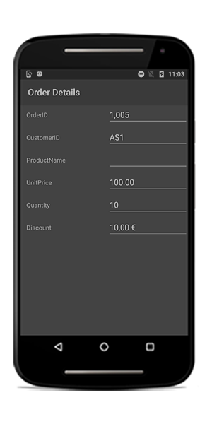
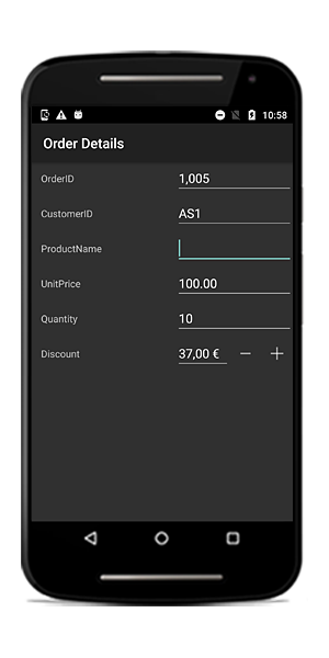
You can change the culture in SfNumericTextBox and SfNumericUpDown by using the CultureInfo property in the DataFormNumericItemBase.
SfNumericTextBox
private double _discount = 10;

[DataType(DataType.Currency)]
public double Discount
{
    get
    {
        return _discount;
    }
    set
    {
        _discount = value;
        RaisePropertyChanged("Discount");
    }
}
dataForm.AutoGeneratingDataFormItem += DataForm_AutoGeneratingDataFormItem;

private void DataForm_AutoGeneratingDataFormItem(object sender, AutoGeneratingDataFormItemEventArgs e)
{
    if (e.DataFormItem != null && e.DataFormItem.Name == "Discount")
    {
        (e.DataFormItem as DataFormNumericItem).CultureInfo = new Java.Util.Locale("fr", "FR");
    }
}
SfNumericUpDown
dataForm.RegisterEditor("Discount", "NumericUpDown");
dataForm.AutoGeneratingDataFormItem += DataForm_AutoGeneratingDataFormItem;
private void DataForm_AutoGeneratingDataFormItem(object sender, AutoGeneratingDataFormItemEventArgs e)
{
    if (e.DataFormItem != null && e.DataFormItem.Name == "Discount")
    {
        (e.DataFormItem as DataFormNumericUpDownItem).FormatString = "c";
        (e.DataFormItem as DataFormNumericUpDownItem).CultureInfo = new Java.Util.Locale("fr", "FR");
    }
}
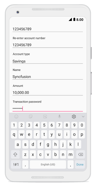
Password editor
In the password editor, the EditText is loaded.
private string password;

[Display(ShortName = "Transaction password", Prompt = "Enter password")]
[DataType(DataType.Password)]
public string Password
{
    get { return this.password; }
    set
    {
        this.password = value;
        RaisePropertyChanged("Password");
        this.RaiseErrorChanged("Password");
    }
}