Layout in Xamarin.Android DataForm (SfDataForm)
8 Jan 202524 minutes to read
Overview
The data form supports linear and grid layouts. The DataFormLayoutManager creates the DataFormItemView, DataFormGroupItemView, and manages layout of label, editor, and validation label.
Linear layout support
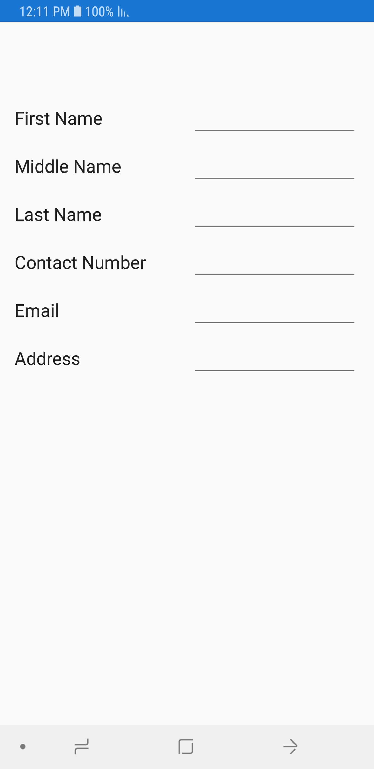
By default, the data form arranges the fields one-by-one. It is applicable for both label positions: left and top.
When the label position is Left, the linear layout is shown as follows:
When the label position is Top, the linear layout is shown as follows:

Grid layout support
By default, the data form arranges one data field per row. It is possible to have more than one date fields per row by setting the ColumnCount property which provides grid like layout for the data form.
dataForm.ColumnCount = 2;NOTE
Setting the
ColumnCountproperty to SfDataForm does not arrange the data field in a group according to the column count. To set the column count for data fields in the data form group, refer to loading different layout for data form group
When the label position is Left, the grid layout is shown as follows:

When the label position is Top, the grid layout is shown as follows:

Label visibility
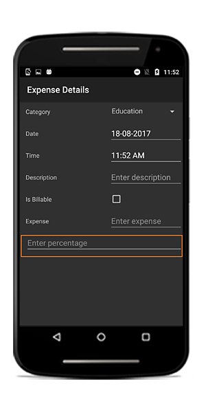
You can hide the label by defining the DisplayOptions attribute or by handling AutoGeneratingDataFormItem event. In this case, only the editor will be loaded.
Using attributes
private double? percentage;

[DisplayOptions(ShowLabel = false)]
[Display(Prompt = "Enter percentage")]
public double? Percentage
{
    get
    {
        return percentage;
    }
    set
    {
        percentage = value;
        RaisePropertyChanged("Percentage");
    }
}
Using event
private void DataForm_AutoGeneratingDataFormItem(object sender, AutoGeneratingDataFormItemEventArgs e)
{
    if (e.DataFormItem != null && e.DataFormItem.Name == "Percentage")
    {
        e.DataFormItem.PlaceHolderText = "Enter percentage";
        e.DataFormItem.ShowLabel = false;
    }
}
Label position
Labels can be positioned either top or left side of the editor. By using the LabelPosition property, you can layout the label associated with editor.
By default, the label will be positioned at left side of the editor.
dataForm.LabelPosition = LabelPosition.Top;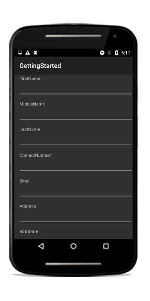
Changing label position of the DataFormItem
You can change the label position using the LabelPosition property in DataFormItem, and it will be handled in the AutoGeneratingDataFormItem event.
<dataForm:SfDataForm x:Name="dataForm" DataObject="{Binding ContactsInfo}"  AutoGeneratingDataFormItem="DataForm_AutoGeneratingDataFormItem">
</dataForm:SfDataForm>dataForm.RegisterEditor("Gender", "Segment");
dataForm.AutoGeneratingDataFormItem += DataForm_AutoGeneratingDataFormItem;
private void DataForm_AutoGeneratingDataFormItem(object sender, AutoGeneratingDataFormItemEventArgs e)
{
if (e.DataFormItem != null)
{
if (e.DataFormItem.Name.Equals("Gender") || e.DataFormItem.Name.Equals("Address"))
{
e.DataFormItem.LabelPosition = LabelPosition.Top;
}
}
}Loading images for label
You can load image instead of label by defining attribute or by handling the AutoGeneratingDataFormItem event.
Using attributes
To show the image as label, use the ImageSource property in DisplayOptions attribute. Images will be taken from …\Resources\drawable folder.
private string firstName;
[DisplayOptions(ImageSource = Resource.Drawable.Name)]
public string FirstName
{
    get { return this.firstName; }
    set
    {
        this.firstName = value;
    }
}
Using event
By using the ImageSource property in the DataFormItem, you can load the image as label.
dataForm.AutoGeneratingDataFormItem += DataForm_AutoGeneratingDataFormItem;
private void DataForm_AutoGeneratingDataFormItem(object sender, AutoGeneratingDataFormItemEventArgs e)
{
    if (e.DataFormItem != null)
    {
        if (e.DataFormItem.Name == "FirstName")
            e.DataFormItem.ImageSource = BitmapFactory.DecodeResource(dataForm.Context.Resources, Resource.Drawable.Name);
    }
}
Changing order of the DataFormItem
You can change the order of the DataFormItem by using attributes or by handling AutoGeneratingDataFormItem event.
Using attributes
You can set the order by using the Order property in display attribute.
public class ContactsInfo
{
    private string lastName;
    private string contactNo;
    public ContactsInfo()
    {

    }

    [Display(Order = 2)]
    public string ContactNumber
    {
        get { return contactNo; }
        set
        {
            this.contactNo = value;
        }
    }

    private string firstName;
    [Display(Order = 0)]
    public string FirstName
    {
        get { return this.firstName; }
        set
        {
            this.firstName = value;
        }
    }

    [Display(Order = 1)]
    public string LastName
    {
        get { return this.lastName; }
        set
        {
            this.lastName = value;
        }
    }
}
Using event
You can change the fields order by using the Order property in the DataFormItem.
dataForm.AutoGeneratingDataFormItem += DataForm_AutoGeneratingDataFormItem;

private void DataForm_AutoGeneratingDataFormItem(object sender, AutoGeneratingDataFormItemEventArgs e)
{
    if (e.DataFormItem != null)
    {
        if (e.DataFormItem.Name == "FirstName")
            e.DataFormItem.Order = 0;
    }
}
Grouping data fields
It is possible to group some fields and set group name in the data form. You can expand or collapse the group by tapping the group item.
Grouping can be achieved by defining attributes or by handling the AutoGeneratingDataFormItem event.
Using attributes
public class ContactsInfo
{
    private string lastName;
    private string contactNo;
    private string email;
    private DateTime? birthDate;

    public ContactsInfo()
    {

    }

    private string firstName;
    [Display(GroupName = "Name")]
    public string FirstName
    {
        get { return this.firstName; }
        set
        {
            this.firstName = value;
        }
    }

    private string middleName;
    [Display(GroupName = "Name")]
    public string MiddleName
    {
        get { return this.middleName; }
        set
        {
            this.middleName = value;
        }
    }
    [Display(GroupName = "Name")]
    public string LastName
    {
        get { return this.lastName; }
        set
        {
            this.lastName = value;
        }
    }
    [Display(GroupName ="Details", ShortName = "ContactNo.")]
    public string ContactNumber
    {
        get { return contactNo; }
        set
        {
            this.contactNo = value;
        }
    }

    [Display(GroupName = "Details")]
    public string Email
    {
        get { return email; }
        set
        {
            email = value;
        }
    }

    [Display(GroupName = "Details")]
    public DateTime? BirthDate
    {
        get { return birthDate; }
        set
        {
            birthDate = value;
        }
    }
}
Using event
dataForm.AutoGeneratingDataFormItem += DataForm_AutoGeneratingDataFormItem;
private void DataForm_AutoGeneratingDataFormItem(object sender, AutoGeneratingDataFormItemEventArgs e)
{
    if (e.DataFormItem != null)
    {
        if (e.DataFormItem.Name == "FirstName" || e.DataFormItem.Name == "MiddleName" || e.DataFormItem.Name == "LastName")
            e.DataFormItem.GroupName = "Name";
        else
            e.DataFormItem.GroupName = "Details";
    }
}

Changing order of the DataFormGroupItem
You can change the order of the DataFormGroupItem by using attributes. You can set the order of data form items in group by using the Order property along with GroupName property in display attribute.
public class ContactInfo
{
    private string lastName;
    private string contactNo;
    public ContactInfo()
    {

    }

    private string firstName;
    [Display(Order = 0, GroupName = "Name")]
    public string FirstName
    {
        get { return this.firstName; }
        set
        {
            this.firstName = value;
        }
    }

    [Display(Order = 2, GroupName = "Name")]
    public string LastName
    {
        get { return this.lastName; }
        set
        {
            this.lastName = value;
        }
    }

    private string middleName;
    [Display(Order =1, GroupName = "Name")]
    public string MiddleName
    {
        get { return this.middleName; }
        set
        {
            this.middleName = value;
        }
    }

    private string email;
    [Display(Order = 1, GroupName = "Details")]
    public string Email
    {
        get { return email; }
        set
        {
            this.email = value;
        }
    }

    [Display(Order = 0, GroupName = "Details")]
    public string ContactNumber
    {
        get { return contactNo; }
        set
        {
            this.contactNo = value;
        }
    }
}
Changing group name for group
You can change the GroupName for the group in the AutoGeneratingDataFormItem event.
dataForm.AutoGeneratingDataFormItem += DataForm_AutoGeneratingDataFormItem;
private void DataForm_AutoGeneratingDataFormItem(object sender, AutoGeneratingDataFormItemEventArgs e)
{
    if (e.DataFormGroupItem != null && e.DataFormGroupItem.GroupName == "Name")
        e.DataFormGroupItem.GroupName = "Name Group";
}
Loading different layout for group
You can load linear or grid layout for the particular group by handling the AutoGeneratingDataFormItem event.
By setting the ColumnCount property in the data form, non-grouped items only will be arranged in the grid layout. To load the grid layout, set the ColumnCount for the DataFormGroupItem.
dataForm.AutoGeneratingDataFormItem += DataForm_AutoGeneratingDataFormItem;

private void DataForm_AutoGeneratingDataFormItem(object sender, AutoGeneratingDataFormItemEventArgs e)
{
    if (e.DataFormGroupItem != null && e.DataFormGroupItem.GroupName == "Name")
        e.DataFormGroupItem.ColumnCount = 2;
}
Loading linear and grid layout for the group
public class ContactsInfo
{
    private string lastName;
    private string contactNo;
    private string email;
    private DateTime? birthDate;

    public ContactsInfo()
    {

    }

    private string firstName;
    [Display(GroupName = "Name")]
    public string FirstName
    {
        get { return this.firstName; }
        set
        {
            this.firstName = value;
        }
    }

    [Display(GroupName = "Name")]
    public string LastName
    {
        get { return this.lastName; }
        set
        {
            this.lastName = value;
        }
    }
    [Display(GroupName ="Details", ShortName = "ContactNo.")]
    public string ContactNumber
    {
        get { return contactNo; }
        set
        {
            this.contactNo = value;
        }
    }

    [Display(GroupName = "Details")]
    public string Email
    {
        get { return email; }
        set
        {
            email = value;
        }
    }

    [Display(GroupName = "Details")]
    public DateTime? BirthDate
    {
        get { return birthDate; }
        set
        {
            birthDate = value;
        }
    }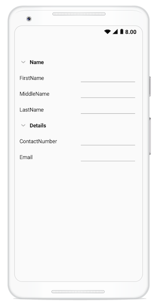
}dataForm.AutoGeneratingDataFormItem += DataForm_AutoGeneratingDataFormItem;
private void DataForm_AutoGeneratingDataFormItem(object sender, AutoGeneratingDataFormItemEventArgs e)
{
if (e.DataFormGroupItem != null && e.DataFormGroupItem.GroupName == "Name")
e.DataFormGroupItem.ColumnCount = 2;
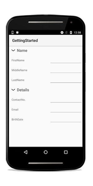
}In the following image, for the Name group, the grid layout is loaded and for the Details group, linear layout is loaded:
Setting different column count
You can also set different ColumnCount for each group.
dataForm.AutoGeneratingDataFormItem += DataForm_AutoGeneratingDataFormItem;

private void DataForm_AutoGeneratingDataFormItem(object sender, AutoGeneratingDataFormItemEventArgs e)
{
    if (e.DataFormGroupItem != null)
    {
        if (e.DataFormGroupItem.GroupName == "Name")
            e.DataFormGroupItem.ColumnCount = 2;
        else if (e.DataFormGroupItem.GroupName == "Details")
            e.DataFormGroupItem.ColumnCount = 3;
    }
}
Loading group in collapsed state
By default, the group will be loaded in expanded state. You can collapse the group by setting the IsExpanded property to false in the DataFormGroupItem.
dataForm.AutoGeneratingDataFormItem += DataForm_AutoGeneratingDataFormItem;

private void DataForm_AutoGeneratingDataFormItem(object sender, AutoGeneratingDataFormItemEventArgs e)
{
    if (e.DataFormGroupItem != null && e.DataFormGroupItem.GroupName == "Name")
        e.DataFormGroupItem.IsExpanded = false;
}
Restricting the group expanding and collapsing
You can set restrict the group being expanded or collapsed by setting the AllowExpandCollapse to false in the DataFormGroupItem.
In this case, the group will be shown without expander.

Programmatically expand or collapse group
You can expand or collapse the group programmatically by using ExpandGroup and CollapseGroup methods respectively.
dataForm.ExpandGroup("Group1");

dataForm.CollapseGroup("Group1");
Customizing DataFormLayoutManager
To customize the layout, override the DataFormLayoutManager and assign to the SfDataForm.LayoutManager property.
public class DataFormLayoutManagerExt : DataFormLayoutManager
{
    public DataFormLayoutManagerExt(SfDataForm dataForm) : base(dataForm)
    {

    }
}
dataForm.LayoutManager = new DataFormLayoutManagerExt(dataForm);
Customizing label and editor
By using DataFormLayoutManager class , you can customize the generated label by overriding the GenerateViewForLabel method and also you can customize the editor by overriding the OnEditorCreated method.Here, BackgroundColor and TextColor of label and editor is customized.
public class DataFormLayoutManagerExt : DataFormLayoutManager
{
    public DataFormLayoutManagerExt(SfDataForm dataForm) : base(dataForm)
    {

    }
    protected override View GenerateViewForLabel(DataFormItem dataFormItem)
    {
        var label = base.GenerateViewForLabel(dataFormItem);
        if (label is TextView)
        {
            (label as TextView).SetBackgroundColor(Color.Rgb(255, 149, 34));
            (label as TextView).SetTextColor(Color.White);
        }
        return label;
    }

    protected override void OnEditorCreated(DataFormItem dataFormItem, View editor)
    {
        if (editor is EditText)
            (editor as EditText).SetTextColor (Color.White);
        editor.SetBackgroundColor(Color.Rgb(0, 115, 220));
    }
}
dataForm.LayoutManager = new DataFormLayoutManagerExt(dataForm);
Changing editor padding
You can change the editor padding by overriding the GetLeftPaddingForEditor method.
public class ContactsInfo
{
    private string lastName;
    public ContactsInfo()
    {

    }


    private string firstName;
    [DisplayOptions(ImageSource = Resource.Drawable.Name)]
    public string FirstName
    {
        get { return this.firstName; }
        set
        {
            this.firstName = value;
        }
    }


    [Display(Prompt = "Enter last name")]
    [DisplayOptions(ShowLabel = false)]
    public string LastName
    {
        get { return this.lastName; }
        set
        {
            this.lastName = value;
        }
    }


}dataForm.LayoutManager = new DataFormLayoutManagerExt(dataForm);
public class DataFormLayoutManagerExt : DataFormLayoutManager
{
public DataFormLayoutManagerExt(SfDataForm dataForm) : base(dataForm)
{
}
protected override int GetLeftPaddingForEditor(DataFormItem dataFormItem)
{
if (dataFormItem.Name == "LastName")
return 35;
return base.GetLeftPaddingForEditor(dataFormItem);
}
}Here, the LastName padding is customized.

Label width customization
You can set label and editor width proportionally by using LabelWidth and EditorWidth properties.
dataForm.LabelWidth = 1;
dataForm.EditorWidth = 2;
Here, the available width is divided into proportionally for editor (2) and label (1).
NOTE
It is applicable only when
LabelPositionis Left.
By default, the available width is divided equally for editor and label.
Spanning rows and columns
You can increase row height and column width by defining the DisplayOptions attribute.
Row span
You can increase the row height by using the RowSpan property in theDisplayOptions attribute.
private string firstName;
[DisplayOptions(RowSpan = 2)]
public string FirstName
{
    get { return this.firstName; }
    set
    {
        this.firstName = value;
    }
}
Here, FirstName field’s row height is increased.

Column span
When the grid layout is used, you can increase the column width by using the ColumnSpan property in the DisplayOptions attribute.
dataForm.ColumnCount = 2;private string firstName;
[DisplayOptions(ColumnSpan = 2)]
public string FirstName
{
get { return this.firstName; }
set
{
this.firstName = value;
}
}
Change DataFormItem visibility at runtime
You can change the field visibility by using the IsVisible property in the DataFormItem.
var dataFormItem = dataForm.ItemManager.DataFormItems["Name"];
if (dataFormItem.Name == "Name")
{
    dataFormItem.IsVisible = false;
}
Here, the Name field will be hidden.
Programmatically scroll to specific editor
You can programmatically scroll to specific editor using the ScrollTo method by passing the property name.
dataForm.ScrollTo("BirthDate")
Changing the height of DataFormItem
You can define the height of each DataFormItem using the Height property, and it will be handled in the AutoGeneratingDataFormItem event.
You can define the Height as described as follows.
- You can directly set the exact
Heightvalue. - You can use the
AutoFitLabelto size the height ofDataFormItem, so that it fits to the label text that it contains.
dataForm.AutoGeneratingDataFormItem += DataForm_AutoGeneratingDataFormItem;
private void DataForm_AutoGeneratingDataFormItem(object sender, AutoGeneratingDataFormItemEventArgs e)
{
    if (e.DataFormItem != null)
    {
        if (e.DataFormItem.Name == "Comments" || e.DataFormItem.Name == "Improvement")
        {
            e.DataFormItem.AutoFitLabel = true;
        }
        if (e.DataFormItem.Name == "Suggestion")
        {
            e.DataFormItem.Height = 400;
        }
    }
}